
@pamfilico/feedback
v2.1.9
Published
Feedback components for Material UI and other frameworks
Downloads
221
Maintainers
 gpamfilis
Readme
@pamfilico/feedback
A pure React feedback component library for Material UI. Works with any React framework (Next.js, Vite, Create React App, Remix, etc.).
Installation
All React Projects (18 or 19)
npm install @pamfilico/feedback
npm install react-canvas-draw
Note: Starting with v2.1.0, react-canvas-draw is no longer bundled and must be installed separately in your project. This gives you more control over versioning and allows you to apply any necessary patches for React 19 compatibility.
For React 19 projects, you may need to install react-canvas-draw with the --legacy-peer-deps flag:
npm install react-canvas-draw --legacy-peer-depsMigrating from v2.0.x to v2.1.0
Version 2.1.0 removes Next.js as a dependency, making this a pure React library:
What changed:
- Removed Next.js dependency (no longer required)
- Removed
react-canvas-drawfrom package dependencies (install separately) - Replaced Next.js-specific code with standard React patterns
Action required:
- Install
react-canvas-drawin your project:npm install react-canvas-draw - If using React 19, add
--legacy-peer-depsflag when installing react-canvas-draw - No code changes needed in your application - the API remains exactly the same
Quick Start
Material UI Feedback Button
import { MaterialFeedbackButton } from "@pamfilico/feedback/material";

function App() {
  return (
    <MaterialFeedbackButton
      meta={{ user_email: "[email protected]", visitor_id: "abc123" }}
      apiBasePath="/api/v1/feedback"
      additionalHeaders={{ "Authorization": "Bearer token" }}
    />
  );
}
Examples
Basic Usage (Drawer Variant)
import { MaterialFeedbackButton } from "@pamfilico/feedback/material";

export default function MyApp() {
  return (
    <>
      {/* Your app content */}
      <MaterialFeedbackButton
        meta={{ user_email: "[email protected]" }}
        apiBasePath="/api/v1/feedback"
      />
    </>
  );
}
Dialog Variant (Centered Form)
If you prefer a centered dialog form instead of a right-side drawer:
<MaterialFeedbackButton
  meta={{ user_email: "[email protected]" }}
  apiBasePath="/api/v1/feedback"
  formAsDialog={true}  // Shows form as centered dialog
/>
With Custom Metadata
Pass any custom data you want to include with feedback submissions:
<MaterialFeedbackButton
  meta={{
    user_email: session?.user?.email,
    user_id: session?.user?.id,
    visitor_id: analytics.visitorId,
    company_id: user?.companyId,
    subscription_tier: "pro",
    custom_field: "any value"
  }}
  apiBasePath="/api/v1/feedback"
  additionalHeaders={{
    "Authorization": `Bearer ${token}`,
    "X-Custom-Header": "value"
  }}
/>
Conditional Display
<MaterialFeedbackButton
  meta={{ user_email: user?.email }}
  apiBasePath="/api/v1/feedback"
  hideIfNoMeta={true}  // Only show if meta is provided
/>
With App ID Tracking
The appId prop is automatically merged into the meta object:
<MaterialFeedbackButton
  meta={{ user_email: "[email protected]", visitor_id: "xyz789" }}
  apiBasePath="/api/v1/feedback"
  appId="my-app-production"  // Automatically added to meta as app_id
/>
Next.js App Router Example
// app/layout.tsx
import { MaterialFeedbackButton } from "@pamfilico/feedback/material";
import { auth } from "@/lib/auth";

export default async function RootLayout({ children }) {
  const session = await auth();

  return (
    <html>
      <body>
        {children}
        <MaterialFeedbackButton
          meta={{
            user_email: session?.user?.email,
            user_id: session?.user?.id,
            user_name: session?.user?.name
          }}
          apiBasePath="/api/v1/feedback"
          formAsDialog={true}
        />
      </body>
    </html>
  );
}
Button Placement
Position the feedback button anywhere on screen:
// Bottom positions
<MaterialFeedbackButton placement="bottom-right" />  // Default
<MaterialFeedbackButton placement="bottom-left" />
<MaterialFeedbackButton placement="bottom-center" />

// Top positions
<MaterialFeedbackButton placement="top-right" />
<MaterialFeedbackButton placement="top-left" />
<MaterialFeedbackButton placement="top-center" />

// Side positions (rotated vertically)
<MaterialFeedbackButton placement="right-middle" />
<MaterialFeedbackButton placement="left-middle" />

// Parent positioning - use as inline button
<div className="my-toolbar">
  <button>Save</button>
  <button>Cancel</button>
  <MaterialFeedbackButton placement="parent" userEmail="[email protected]" />
</div>
Features:
- The
parentplacement makes the button follow normal document flow instead of being fixed, perfect for toolbars or inline usage - Side placements (
right-middle,left-middle) are automatically rotated 90° for vertical display - On small screens (< 600px), only the icon is shown to save space
Button Color Customization
Customize the button color to match your app's theme:
// Red (default)
<MaterialFeedbackButton color="error" userEmail="[email protected]" />

// Blue
<MaterialFeedbackButton color="primary" userEmail="[email protected]" />

// Green
<MaterialFeedbackButton color="success" userEmail="[email protected]" />

// Orange
<MaterialFeedbackButton color="warning" userEmail="[email protected]" />

// Purple
<MaterialFeedbackButton color="secondary" userEmail="[email protected]" />

// Light Blue
<MaterialFeedbackButton color="info" userEmail="[email protected]" />
Internationalization (i18n)
The component supports multiple languages out of the box. All UI text, form labels, validation messages, and notifications are translatable:
// English (default)
<MaterialFeedbackButton
  userEmail="[email protected]"
  locale="en"
/>

// Greek (Ελληνικά)
<MaterialFeedbackButton
  userEmail="[email protected]"
  locale="el"
/>
Supported Languages:
en- English (default)el- Greek (Ελληνικά)
What gets translated:
- Button text
- Form labels and placeholders
- Validation error messages
- Feedback type options (Bug, Feature Request, Other)
- Drawing tool buttons (Reset, Undo, Close)
- Success/error notifications
- Screen size labels (Mobile, Tablet, Desktop)
- All help text and instructions
Adding new languages:
To add support for additional languages:
- Create a new translation file in
src/locales/[language-code].json - Copy the structure from
en.jsonand translate all values - Update the
Localetype insrc/locales/index.tsto include your language code - Import and add your translations to the
translationsobject
Example for Spanish (es):
// src/locales/index.ts
import enTranslations from './en.json';
import elTranslations from './el.json';
import esTranslations from './es.json'; // Your new translation

export type Locale = 'en' | 'el' | 'es'; // Add 'es'

const translations: Record<Locale, Translations> = {
  en: enTranslations,
  el: elTranslations,
  es: esTranslations, // Add your translations
};
Components
MaterialFeedbackButton
A floating feedback button that opens a fullscreen dialog for creating feedback. When clicked, it automatically captures a screenshot of the current page and opens a dialog where users can draw annotations on the screenshot and submit their feedback.
Key Features:
- 📸 Automatic screenshot capture - Captures the entire page when the button is clicked
- ✏️ Interactive annotation canvas - Draw directly on the screenshot with customizable brush
- 🎨 Drawing tools - Clear canvas, undo last stroke, brush color/size controls
- 📝 Feedback form - Type selection (bug/feature/other), description field
- 📱 Device detection - Automatically detects and stores device type (mobile/tablet/desktop)
- 🔄 Manual upload fallback - If auto-capture fails, users can upload their own screenshot
- 🌐 URL tracking - Automatically captures the current URL where feedback was submitted
- 🎨 Customizable button color - Choose from error, primary, secondary, success, info, or warning colors
- 🌍 Internationalization (i18n) - Built-in support for multiple languages (English and Greek included)
- 📱 Mobile-optimized UI - Separate mobile and desktop components with optimized layouts
Props
| Prop | Type | Default | Description |
|------|------|---------|-------------|
| meta | Record<string, any> \| null | null | Custom metadata object to include with feedback (e.g., user info, analytics IDs, etc.) |
| apiBasePath | string | "/api/feedback" | API endpoint for feedback submission |
| additionalHeaders | Record<string, string> | {} | Additional headers for API requests |
| hideIfNoMeta | boolean | false | Hide button if no meta provided |
| appId | string | undefined | Application identifier - automatically merged into meta as app_id |
| formAsDialog | boolean | false | Show form as centered dialog instead of drawer (desktop only) |
| placement | 'bottom-right' \| 'bottom-left' \| 'bottom-center' \| 'top-right' \| 'top-left' \| 'top-center' \| 'right-middle' \| 'left-middle' \| 'parent' | 'bottom-right' | Button position on screen. Side positions are rotated vertically. Use 'parent' for inline positioning |
| color | 'error' \| 'primary' \| 'secondary' \| 'success' \| 'info' \| 'warning' | 'error' | Button color theme (red, blue, purple, green, light blue, orange) |
| locale | string | 'en' | Language locale for UI text. Supports 'en' (English) and 'el' (Greek). Falls back to 'en' for invalid values |
Submission Data Schema
When a user submits feedback, the component sends a POST request to your API endpoint with the following data structure:
{
  feedbackType: "bug" | "feature" | "other";  // Type of feedback (camelCase for compatibility)
  description: string;                 // User's feedback description
  image: string;                       // Base64 encoded screenshot image (data:image/png;base64,...)
  drawings: {                         // Canvas drawing data for annotations
    lines: Array<{
      points: Array<{x: number, y: number}>;
      brushColor: string;
      brushRadius: number;
    }>;
    width: number;                    // Canvas width
    height: number;                   // Canvas height
  } | null;
  current_url: string;                 // URL where feedback was submitted
  material_ui_screensize: "mobile" | "tablet" | "desktop";  // Device type
  meta: Record<string, any>;           // Custom metadata (includes app_id if provided)
}
Example Submission:
{
  "feedbackType": "bug",
  "description": "The submit button is not working on the checkout page",
  "image": "data:image/png;base64,iVBORw0KGgoAAAANSUhEUg...",
  "drawings": {
    "lines": [
      {
        "points": [{"x": 100, "y": 150}, {"x": 102, "y": 152}],
        "brushColor": "#ff0000",
        "brushRadius": 2
      }
    ],
    "width": 1920,
    "height": 1080
  },
  "current_url": "https://example.com/checkout",
  "material_ui_screensize": "desktop",
  "meta": {
    "user_email": "[email protected]",
    "user_id": "123",
    "visitor_id": "abc-def-ghi",
    "app_id": "my-app-production"
  }
}
FeedbackPageComponent
A complete feedback list page with inline editing capabilities. Displays user feedback items with pagination and opens a fullscreen dialog for editing.
import { FeedbackPageComponent } from "@pamfilico/feedback/material";

function FeedbackPage() {
  return (
    <FeedbackPageComponent
      fetchFeedbacksUrl="https://api.example.com/api/v1/feedback"
      editingUrl="https://api.example.com/api/v1/feedback"  // Optional: for edit operations
      additionalHeaders={{ "EPICWORK-TOKEN": token }}
      onClickEditButtonFeedbackItem={(id) => console.log("Editing:", id)}
    />
  );
}
Key Points:
fetchFeedbacksUrl: Used for fetching the paginated list. Pagination params (page,limit) are automatically appended.editingUrl: Used for GET/PUT operations on individual feedback items. ThefeedbackIdis automatically appended (e.g.,${editingUrl}/${feedbackId}).
Props
| Prop | Type | Required | Description |
|------|------|----------|-------------|
| fetchFeedbacksUrl | string | Yes | Full URL for fetching paginated feedback list. Pagination params (page, limit) are automatically appended as query parameters |
| editingUrl | string | No | Base URL for edit operations. feedbackId is automatically appended for GET/PUT requests (e.g., ${editingUrl}/${feedbackId}). Optional if you don't need inline editing |
| additionalHeaders | Record<string, string> | No | Authentication headers for API requests |
| onClickEditButtonFeedbackItem | (feedbackId: string) => void | No | Optional callback when edit button is clicked |
Features
- 📋 Paginated feedback list
- ✏️ Inline editing with fullscreen dialog
- 🔄 Auto-refresh after updates
- 📱 Device type indicators (mobile/tablet/desktop)
- 🎨 Type-based color coding (bug/feature/other)
- 🖼️ Screenshot previews with annotation support
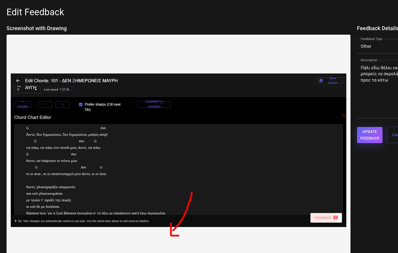
FeedbackEditPageComponent
A wrapper component that handles fetching feedback data and rendering the appropriate edit component (Desktop or Mobile) based on the original submission device.
import {
  FeedbackEditPageComponent,
  DesktopEditFeedbackComponent,
  MobileEditFeedbackComponent
} from "@pamfilico/feedback/material";

function EditFeedback({ feedbackId }) {
  return (
    <FeedbackEditPageComponent
      editingUrl="https://api.example.com/api/v1/feedback"
      feedbackId={feedbackId}
      additionalHeaders={{ "EPICWORK-TOKEN": token }}
      onUpdate={(id) => router.push("/feedback")}
      onCancel={() => router.push("/feedback")}
      desktopComponent={DesktopEditFeedbackComponent}
      mobileComponent={MobileEditFeedbackComponent}
    />
  );
}
Note: The feedbackId is automatically appended to editingUrl for GET/PUT requests.
Props
| Prop | Type | Required | Description |
|------|------|----------|-------------|
| editingUrl | string | Yes | Base URL for edit operations. feedbackId is automatically appended (e.g., ${editingUrl}/${feedbackId}) |
| feedbackId | string | Yes | ID of feedback to edit |
| additionalHeaders | Record<string, string> | No | Authentication headers |
| onUpdate | (feedbackId: string) => void | No | Callback when feedback is updated |
| onCancel | () => void | No | Callback when editing is cancelled |
| desktopComponent | React.ComponentType | Yes | Desktop edit component |
| mobileComponent | React.ComponentType | Yes | Mobile edit component |
DesktopEditFeedbackComponent
Edit component optimized for desktop/tablet devices with side-by-side screenshot annotation and form.
Props
| Prop | Type | Required | Description |
|------|------|----------|-------------|
| feedback | any | Yes | Feedback object to edit |
| editingUrl | string | Yes | Base URL for edit operations. feedbackId is automatically appended from feedback.id |
| additionalHeaders | Record<string, string> | No | Authentication headers |
| onUpdate | (feedbackId: string) => void | No | Callback after successful update |
| onCancel | () => void | No | Callback when cancelled |
MobileEditFeedbackComponent
Edit component optimized for mobile devices with stacked screenshot and form layout.
Props
Same as DesktopEditFeedbackComponent.
API Requirements
All feedback components expect your backend API to implement these endpoints:
POST /api/v1/feedback
Used by: MaterialFeedbackButton
Creates a new feedback submission.
Request Body:
{
  user_email: string | null;          // Optional - user's email
  feedbackType: "bug" | "feature" | "other";  // Optional - type of feedback
  description: string;                // Optional - feedback description
  image: string;                      // Optional - base64 data URL or S3 URL
  current_url: string;                // Optional - URL where feedback submitted
  drawings: {                         // Optional - drawing annotation data
    lines: Array<{
      points: Array<{x: number, y: number}>;
      brushColor: string;
      brushRadius: number;
    }>;
    width: number;
    height: number;
  } | null;
  material_ui_screensize: "mobile" | "tablet" | "desktop";  // Optional - device type
  softwarefast_task_id: string;      // Optional - external task tracker ID
}
Expected Response:
{
  "success": true,
  "message": "Feedback received!",
  "data": {
    "id": "uuid-string",
    "user_id": "uuid-string",
    "type_of": "bug",
    "message": "Description text",
    "created_at": "2025-01-01T12:00:00"
  }
}
GET {fetchFeedbacksUrl}?page=1&limit=20
Used by: FeedbackPageComponent
Returns paginated list of feedback items. The component automatically appends page and limit query parameters to the fetchFeedbacksUrl prop. Additional query parameters (like user_id) can be included directly in the fetchFeedbacksUrl string.
Response:
{
  "success": true,
  "data": {
    "items": [
      {
        "id": "uuid-1",
        "user_id": "user-uuid",
        "type_of": "bug",
        "message": "The button doesn't work",
        "image": "https://storage.example.com/feedback/screenshot.png",
        "drawings": {
          "lines": [...],
          "width": 1920,
          "height": 1080
        },
        "current_url": "https://example.com/page",
        "material_ui_screensize": "desktop",
        "softwarefast_task_id": "TASK-123",  // Optional: external task tracking ID
        "created_at": "2025-10-07T10:00:00Z",
        "last_updated": "2025-10-07T10:30:00Z"
      }
    ],
    "pagination": {
      "page": 1,
      "limit": 20,
      "total_count": 50,
      "total_pages": 3,
      "has_next": true,
      "has_prev": false
    }
  }
}
Feedback Item Schema:
{
  id: string;                        // Unique feedback identifier
  user_id: string | null;            // User who submitted (can be null)
  type_of: "bug" | "feature" | "other";
  message: string;                   // Feedback description
  image: string | null;              // URL to stored screenshot (not base64)
  drawings: {                        // Drawing annotation data
    lines: Array<{
      points: Array<{x: number, y: number}>;
      brushColor: string;
      brushRadius: number;
    }>;
    width: number;
    height: number;
  } | null;
  current_url: string | null;       // URL where feedback was submitted
  material_ui_screensize: "mobile" | "tablet" | "desktop" | null;
  softwarefast_task_id: string | null;  // Optional external tracking
  created_at: string;                // ISO 8601 timestamp
  last_updated: string;              // ISO 8601 timestamp
}
GET {editingUrl}/{feedbackId}
Used by: FeedbackEditPageComponent
Returns a single feedback item for editing. The component automatically constructs the URL by appending the feedbackId to the editingUrl prop.
Example Request: GET https://api.example.com/api/v1/feedback/uuid-1
Response:
{
  "success": true,
  "data": {
    "id": "uuid-1",
    "user_id": "user-uuid",
    "type_of": "bug",
    "message": "The button doesn't work",
    "image": "https://storage.example.com/feedback/screenshot.png",
    "drawings": {
      "lines": [...],
      "width": 1920,
      "height": 1080
    },
    "current_url": "https://example.com/page",
    "material_ui_screensize": "desktop",
    "softwarefast_task_id": null,
    "created_at": "2025-10-07T10:00:00Z",
    "last_updated": "2025-10-07T10:00:00Z"
  }
}
PUT {editingUrl}/{feedbackId}
Used by: DesktopEditFeedbackComponent, MobileEditFeedbackComponent
Updates an existing feedback item. The component automatically constructs the URL by appending feedback.id to the editingUrl prop.
Example Request: PUT https://api.example.com/api/v1/feedback/uuid-1
Request Body:
{
  "feedbackType": "bug",
  "description": "Updated description with more details",
  "image": "data:image/png;base64,iVBORw0KGg...",  // Can be base64 data URL or existing URL
  "drawings": {
    "lines": [
      {
        "points": [{"x": 100, "y": 150}],
        "brushColor": "#ff0000",
        "brushRadius": 2
      }
    ],
    "width": 1920,
    "height": 1080
  }
}
Expected Response:
{
  "success": true,
  "data": {
    "id": "uuid-1",
    "message": "Feedback updated successfully"
  }
}
Storage Recommendations
Screenshot Storage:
- When receiving
imagefield from MaterialFeedbackButton (base64 data URL), decode and store the image in your cloud storage (S3, Cloud Storage, etc.) - Store the public URL in the
imagefield of your database - Return the URL (not base64) in GET responses to reduce payload size
- When updating feedback, accept either base64 data URLs or existing URLs in the
imagefield
Drawings Storage:
- Store the
drawingsobject as JSON in your database - This allows the edit components to reload and continue editing annotations
- The drawings data is relatively small (~1-5KB per feedback item)
Features
- 📸 Automatic screenshot capture
- ✏️ Drawing annotations on screenshots
- 📱 Responsive design with device detection
- 🎨 Material UI themed
- 🔄 Manual upload fallback
- 🌐 Customizable API endpoint
- 📋 Complete feedback management UI
- 🔐 Flexible authentication header support
- 📄 Pagination support
- 🖼️ Screenshot preview and editing
License
MIT