
@pimred/carousel
v0.1.3
Published
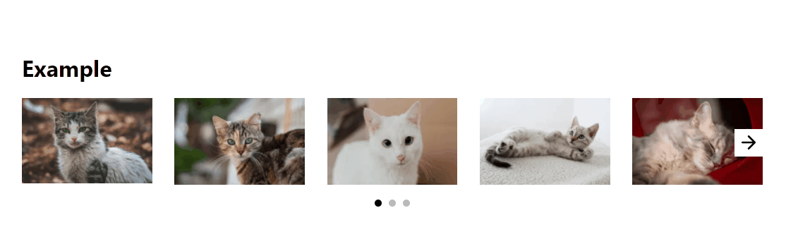
React carousel

Readme
@pimred/carousel
Installation
npm install @pimred/carousel
Usage
Basic example
import Carousel from '@pimred/carousel'

const MyComponent = () => {
  return (
    <Carousel>
      ...
    </Carousel>
  )
}
You can use component with hocs
import { Carousel as _Carousel, withArrows, withAutoplay, withBaseHoc, withDots } from '@pimred/carousel'

const Carousel = withBaseHoc(withAutoplay(withDots(withArrows(_Carousel))))

const MyComponent = () => {
  return (
    <Carousel>
      ...
    </Carousel>
  )
}
Props you can send to Carousel | Option name | Type | Required | Default | Description | | ------------------ | ----------- | ----------- | ----------- | -------------------------------------------------- | | activePage | Number | no | 1 | If you want your slider to start from specific page | | disableDots | Bool | no | false | To disable dots on every display size (desktop, mobile) | | disableDotsOnMobile | Bool | no | false | To disable dots only on mobile | | disableArrows | Bool | no | false | To disable arrows on every display size (desktop, mobile) | | disableArrowsOnMobile | Bool | no | false | To disable arrows only on mobile | | arrowLeftStyle | Object | no | {} | Inline style for left arrow, this will append to default style | | arrowRightStyle | Object | no | {} | Inline style for right arrow, this will append to default style | | arrowsClassName | CSS class | no | '' | CSS, SCSS classname which will override existing style | | delay | Number | no | 3000 | Delay between slides if hoc autoPlay is included | | stopAutoplay | Bool | no | false | To stop autoplay (e.g. if you have modal and you want to stop when modal is opened) |
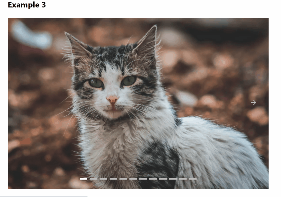
Example override values
File App.js
import React from 'react'
import { Carousel as _Carousel, withArrows, withAutoplay, withBaseHoc, withDots } from '@pimred/carousel'
import '@pimred/carousel/dist/index.css'

import './App.css'
import { items } from './items'

const Carousel = withBaseHoc(withAutoplay(withDots(withArrows(_Carousel))))

function App () {
  const slides = items.map((item, index) => {
    return (
      <div
        key={`slider-item-${index}`}
      >
        <img
          src={item.secureUrl}
          width={item.width}
          height={item.height}
        />
      </div>
    )
  })
  return (
    <div className='App'>
      <h1>Example 2</h1>
      <div className='cover-slider-override'>
        <CarouselOneItem>
          {slides}
        </CarouselOneItem>
      </div>
    </div>
  )
}

export default App
File items.js
export const items = [
  {
    secureUrl : 'https://picsum.photos/1200/600',
    width     : 1200,
    height    : 600
  },
  {
    secureUrl : 'https://picsum.photos/1000/500',
    width     : 1000,
    height    : 500
  },
  {
    secureUrl : 'https://picsum.photos/1100/550',
    width     : 1100,
    height    : 550
  },
  {
    secureUrl : 'https://picsum.photos/1020/510',
    width     : 1020,
    height    : 510
  },
  {
    secureUrl : 'https://picsum.photos/1000/500',
    width     : 1000,
    height    : 500
  },
  {
    secureUrl : 'https://picsum.photos/900/450',
    width     : 900,
    height    : 450
  },
  {
    secureUrl : 'https://picsum.photos/940/470',
    width     : 940,
    height    : 470
  },
  {
    secureUrl : 'https://picsum.photos/1140/570',
    width     : 1140,
    height    : 570
  },
  {
    secureUrl : 'https://picsum.photos/1160/580',
    width     : 1160,
    height    : 580
  },
  {
    secureUrl : 'https://picsum.photos/1040/520',
    width     : 1040,
    height    : 520
  },
  {
    secureUrl : 'https://picsum.photos/1060/530',
    width     : 1060,
    height    : 530
  },
  {
    secureUrl : 'https://picsum.photos/1080/540',
    width     : 1080,
    height    : 540
  }
]
File App.css
img {
  width  : 100%;
  height : auto;
}

.cover-slider-override .pimred-slider-carousel-item {
  align-self  : end;
  width       : 100%;
  /* scroll-snap-align: center; */ /* Enable this for centering slides on change*/
}

.cover-slider-override .pimred-slider-dot {
  height            : 5px;
  width             : 30px;
  background-color  : #bbb;
  display           : inline-block;
  cursor            : pointer;
  border-radius     : 0;
}

.cover-slider-override .pimred-slider-dot-active {
  background-color: white;
}

.cover-slider-override .pimred-slider-dots {
  margin-top  : -60px;
  position    : relative;
}

.cover-slider-override .pimred-slider-left-arrow-icon {
  background-color  : transparent;
  cursor            : pointer;
}

.cover-slider-override .pimred-slider-right-arrow-icon {
  background-color  : transparent;
  cursor            : pointer;
}

.cover-slider-override .pimred-slider-left-arrow {
  padding-left: 40px
}

.cover-slider-override .pimred-slider-right-arrow {
  padding-right: 40px
}

.cover-slider-override .pimred-slider-right-arrow:hover svg {
  stroke: white;
}
.cover-slider-override .pimred-slider-right-arrow:hover {
  cursor: pointer;
}

.cover-slider-override .pimred-slider-left-arrow:hover svg {
  stroke: white;
}
.cover-slider-override .pimred-slider-left-arrow:hover {
  cursor: pointer;
}

.cover-slider-override svg {
  stroke: #bbb;
}
Example override values items per page
// Function for calculating items per page
@function getWidth($perPage: 1, $marginLeft: 3) {
  $result: (math.div(100, $perPage) - $marginLeft) + math.div($marginLeft, $perPage);
  @return $result;
}
/*
javascript syntax for function
const getWidth = (perPage = 1, marginLeft = 3) => {
  return ( ( 100 / perPage ) - marginLeft ) + ( marginLeft / perPage )
}
*/
.pimredMl3 {
  margin-left: 3%;
}
@media (min-width: 576px) {
  .pimredCarouselItem {
    width: 100%;
    // getWidth(1, 3); One item per page, 3 because marginLeft
  }
}

@media (min-width: 768px) {
  .pimredCarouselItem {
    width: 48.5%;
    // getWidth(2, 3); Two items per page, 3 because marginLeft
  }
}

@media (min-width: 992px) {
  .pimredCarouselItem {
    width: 31.33%;
    // getWidth(3, 3); Three items per page, 3 because marginLeft
  }
}

@media (min-width: 1200px) {
  .pimredCarouselItem {
    width: 17.6%;
    // getWidth(5, 3); Five items per page, 3 because marginLeft
  }
}
Development
First, build the dist filesnpm run build
Then, publish to npmnpm publish --access public