
@plaso-design/pro-table
v3.14.8
Published
🏆 Use Ant Design Table like a Pro!
Maintainers
 hudianlao48
Readme
@ant-design/pro-table
ProTable was created to solve the problem of having to write a lot of sample code for tables in a project, so a lot of common logic was encapsulated in it. These wrappers can be simply categorized as pre-defined behaviors and pre-defined logic.
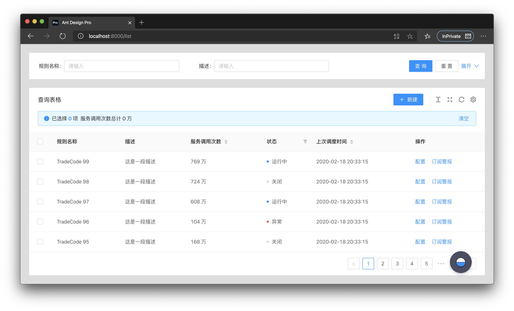
ProTable puts a layer of wrapping on top of antd's Table, supports some presets, and encapsulates some behaviors. Only api's that differ from antd Table are listed here.
request
request is the most important API of ProTable, request takes an object. The object must have data and success in it, and total is also required if manual paging is needed. request takes over the loading settings and re-executes them when the query form is queried and the params parameters are modified. Also the query form values and params parameters are brought in. The following is an example.
<ProTable<DataType, Params>
  // params is a parameter that needs to be self-contained
  // This parameter has higher priority and will override the parameters of the query form
  params={params}
  request={async (
    // The first parameter params is the combination of the query form and params parameters
    // The first parameter will always have pageSize and current, which are antd specifications
    params: T & {
      pageSize: number;
      current: number;
    },
    sort,
    filter,
  ) => {
    // Here you need to return a Promise, and you can transform the data before returning it
    // If you need to transform the parameters you can change them here
    const msg = await myQuery({
      page: params.current,
      pageSize: params.pageSize,
    });
    return {
      data: msg.result,
      // Please return true for success.
      // otherwise the table will stop parsing the data, even if there is data
      success: boolean,
      // not passed will use the length of the data, if it is paged you must pass
      total: number,
    };
  }}
/>
ProTable
| Property | Description | Type | Default Value |
| --- | --- | --- | --- |
| request | How to get dataSource | (params?: {pageSize,current},sort,filter) => {data,success,total} | - |
| params | Additional parameters used for request query, once changed will trigger reloading | object | - |
| postData | Process the data obtained through request | (data: T[]) => T[] | - |
| defaultData | Default data | T[] | - |
| dataSource | Table data, protable recommends using request to load | T[] | - |
| onDataSourceChange | Triggered when Table data changes | (dataSource: T[]) => void | - |
| actionRef | Reference to Table action for custom triggering | MutableRefObject<ActionType> | - |
| formRef | The form instance of the query form can be obtained for some flexible configuration | MutableRefObject<FormInstance> | - |
| toolBarRender | Render toolbar, support returning a dom array, will automatically increase margin-right | (action) => ReactNode[] | - |
| onLoad | Triggered after the data is loaded, it will be triggered multiple times | (dataSource: T[]) => void | - |
| onLoadingChange | Triggered when loading is modified, usually caused by network requests | (loading:boolean)=>void | - |
| onRequestError | Triggered when data loading fails | (error) => void | - |
| tableClassName | className of the encapsulated table | string | - |
| tableStyle | style of the encapsulated table | CSSProperties | - |
| options | table toolbar, not displayed when set to false | {{ density?: boolean, fullScreen?: boolean \| function, reload?: boolean \| function, reloadIcon?: React.ReactNode, densityIcon?: React.ReactNode, setting?: boolean \| SettingOptionType }} | { fullScreen: false, reload :true, density: true, setting: true} |
| search | Whether to display the search form, when the object is passed in, it is the configuration of the search form | false | SearchConfig | - |
| dateFormatter | Convert moment format data to a specific type, false will not be converted | "string" | "number" | ((value: Moment, valueType: string) => string | number) |false | "string" |
| defaultSize | Default size | SizeType | - |
| beforeSearchSubmit | Make some changes before searching | (params:T)=>T | - |
| onSizeChange | The table size has changed | (size:'default' \|'middle' \|'small') => void | - |
| type | pro-table type | "form" | - |
| form | antd form configuration | FormProps | - |
| onSubmit | Triggered when the form is submitted | (params: U) => void | - |
| onReset | Triggered when the form is reset | () => void | - |
| columnEmptyText | Display when it is empty, display - when it is not set, false can turn off this function | string | false | false |
| tableRender | Custom rendering table function | (props,dom,domList:{ toolbar,alert,table}) => ReactNode | - |
| toolbar | Transparent transmission of ListToolBar configuration items | ListToolBarProps | - |
| tableExtraRender | The main function of the custom table | (props: ProTableProps<T, U>, dataSource: T[]) => ReactNode; | - |
| manualRequest | Do you need to manually trigger the first request? When configured as true, the search form cannot be hidden | boolean | false |
| editable | Related configuration of editable table | TableRowEditable | - |
| cardBordered | Border of Card components around Table and Search | boolean \| {search?: boolean, table?: boolean} | false |
| ghost | Ghost mode, that is, whether to cancel the padding of the table content area. | boolean | false |
| debounceTime | Debounce time | number | 10 |
| revalidateOnFocus | Automatically re-request when the window is focused | boolean | false |
| columnsState | Column Status Control, you can operate the display hide | ColumnStateType | - |
RecordCreator
| Property | Description | Type | Default Value |
| --- | --- | --- | --- |
| record | The row data to be added, generally contains a unique key | T | {} |
| position | Where does the line increase, start or end | top | bottom | bottom |
| (...buttonProps) | ButtonProps of antd | ButtonProps | — |
ColumnStateType
| Property | Description | Type | Default |
| --- | --- | --- | --- |
| defaultValue | The default value of the column status, only for the first time. Used for resetting value | Record <string, ColumnsState>; | |
| value | Column status, support controlled mode | Record <string, ColumnsState>; | |
| onChange | Column status After changing | (value: Record <string, ColumnsState>) => void | |
| PersistenceKey | The key of the persistence column is used to determine if it is the same table | string \| Number | |
| PersistenceType | The type of persistence column, localStorage is also existing after closing the browser, sessionStorage closes the browser will be lost | localStorage \| sessionStorage | |
Search Search form
| Property | Description | Type | Default Value |
| --- | --- | --- | --- |
| filterType | Filter form type | 'query' | 'light' | 'query' |
| searchText | Search button text | string | Search |
| resetText | reset button text | string | reset |
| submitText | The text of the submit button | string | Submit |
| labelWidth | Label width | 'number' | 'auto' | 80 |
| span | Configure the number of columns in the query form | 'number' | 'ColConfig' | defaultColConfig |
| className | Encapsulated search Form className | string | - |
| collapseRender | Collapse button render | ((collapsed: boolean,showCollapseButton?: boolean) => ReactNode)|false | - |
| defaultCollapsed | Whether to collapse by default | boolean | true |
| collapsed | collapsed | boolean | - |
| onCollapse | Collapse button event | (collapsed: boolean) => void; | - |
| optionRender | Custom action bar | ((searchConfig,formProps,dom) => ReactNode[])|false | - |
| showHiddenNum | Whether to show the number of hidden items after storing | boolean | false |
editable edit line configuration
| Property | Description | Type | Default Value |
| --- | --- | --- | --- |
| type | Type of editable table, single or multiple | single | multiple | - |
| form | Form instance of editable form, use Form.useForm to generate and use | FormInstance | - |
| formProps | form properties can be configured, but onFinish is not supported | `FormProps' | - |
| editableKeys | Row being edited, controlled attributes. The defaultkey will use the configuration of rowKey,if there is no configuration, it will use theindex, it is recommended to use rowKey | Key[] | - |
| onChange | Triggered when row data is modified | (editableKeys: Key[], editableRows: T[]) => void | - |
| onSave | Triggered when a row is saved | (key: Key, row: T,originRow:T,newLine?:newLineConfig) => Promise<any> | - |
| saveText | Text for saving a row | React.ReactNode | Save |
| onDelete | Triggered when a row is deleted | (key: Key, row: T) => Promise<any> | - |
| deleteText | Text for deleting a row | React.ReactNode | Delete |
| onCancel | Triggered when cancel editing a line | (key: Key, row: T,originRow:T,newLine?:newLineConfig) => Promise<any> | - |
| cancelText | Text for canceling the editing of a row | React.ReactNode | Cancel |
| actionRender | Custom edit mode action bar | (row: T, config: ActionRenderConfig<T>) => ReactNode[] | - |
| deletePopconfirmMessage | The pop-up confirmation box prompt message when deleting | ReactNode | Delete this line? |
| onlyOneLineEditorAlertMessage | Only one line can be edited | ReactNode | Only one line can be edited at the same time |
| onlyAddOneLineAlertMessage | Only one line can be added at the same time | ReactNode | Only add one line |
ColConfig
const defaultColConfig = {
  xs: 24,
  sm: 24,
  md: 12,
  lg: 12,
  xl: 8,
  xxl: 6,
};
Install
Using npm:
$ npm install --save @ant-design/pro-tableor using yarn:
$ yarn add @ant-design/pro-table