@prashantnegi878/quick-status
v2.0.3
Published
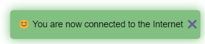
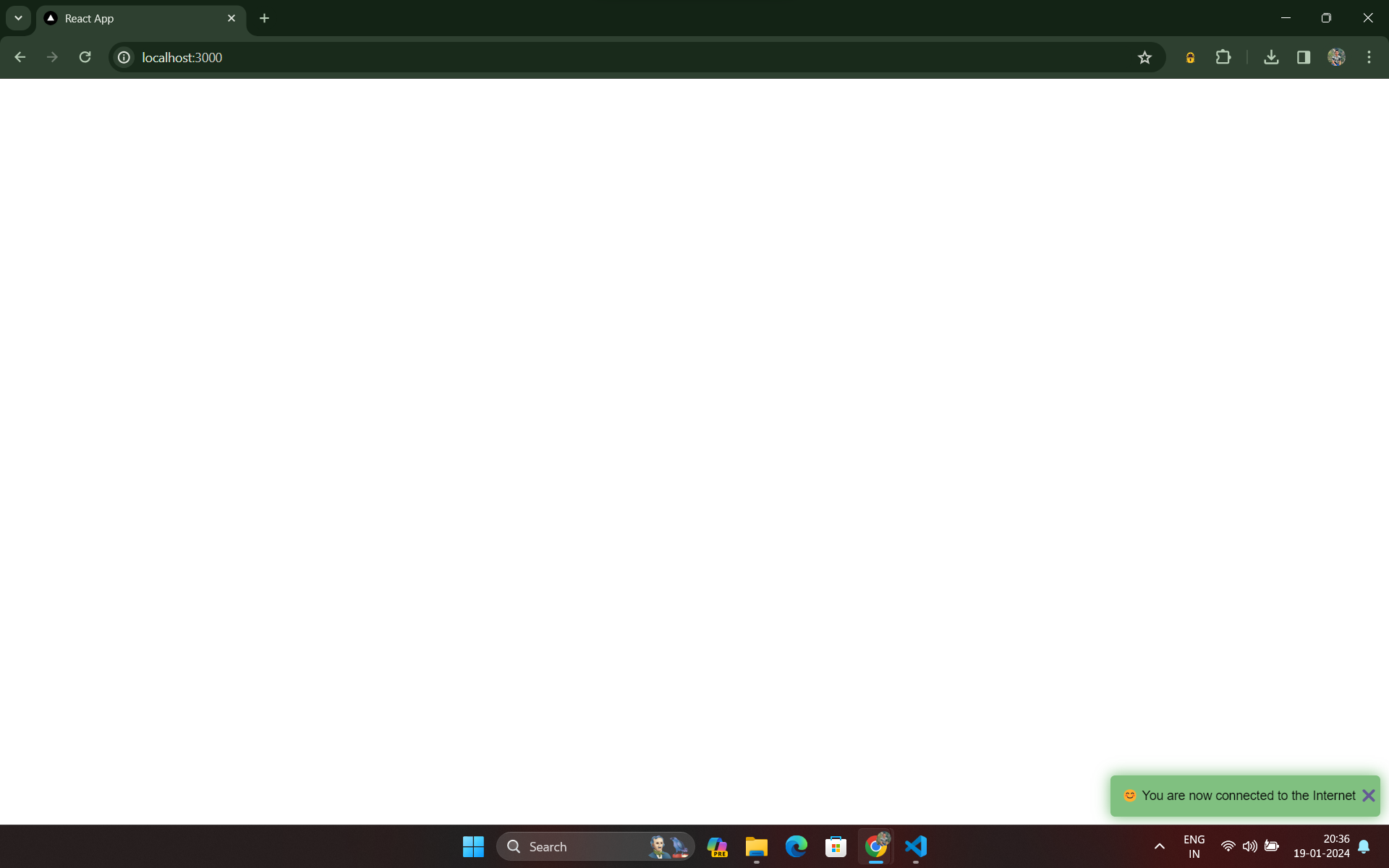
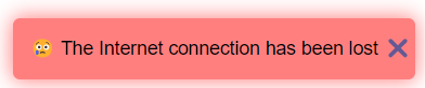
Online/Offline Status Indicator
Downloads
26
Maintainers
 prashantnegi878
Readme
Quick Status
React-TypeScript Library for Online/Offline Status Popup
Quick Status is a lightweight and easy-to-use React TypeScript library designed to enhance user experience by providing a visual indicator when the user goes offline or comes back online.
Installation
Install Quick Status in your project using npm :
npm install @prashantnegi878/quick-status
Usage
Quick Status is designed to be a hassle-free solution for providing real-time feedback to users regarding their online status.
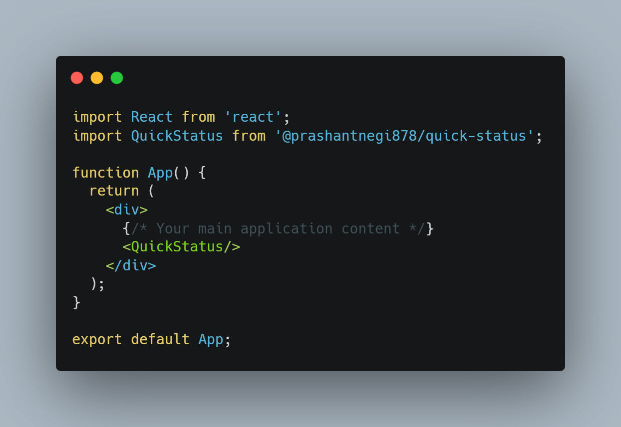
Without optional parameters:
import React from 'react';
import QuickStatus from '@prashantnegi878/quick-status';
function App() {
return (
<div>
{/* Your main application content */}
<QuickStatus/>
</div>
);
}
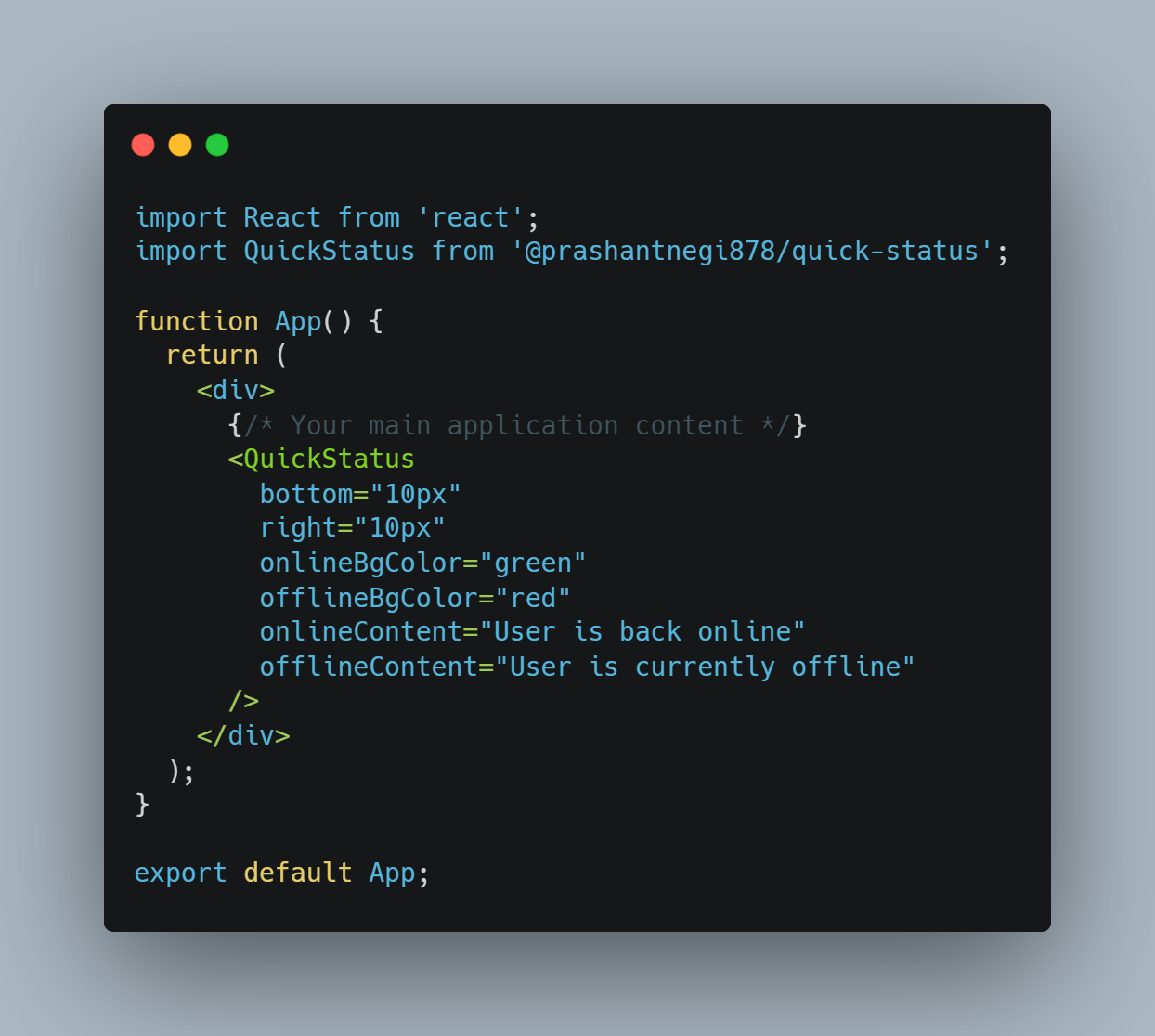
export default App;With optional parameters:
import React from 'react';
import QuickStatus from '@prashantnegi878/quick-status';

function App() {
  return (
    <div>
      {/* Your main application content */}
      <QuickStatus
        bottom="10px"
        right="10px"
        onlineBgColor="green"
        offlineBgColor="red"
        onlineContent="User is back online"
        offlineContent="User is currently offline"
      />
    </div>
  );
}
export default App;
Configuration Options
Quick Status offers a range of customizable parameters to tailor the appearance and messaging of the online/offline status popup according to your project's needs.
- bottom (Optional):
Example: bottom='10px'
Adjusts the distance of the component from the bottom of the screen.
- right (Optional):
Example: right='10px'
Sets the distance of the component from the right side of the screen.
- onlineBgColor (Optional):
Example: onlineBgColor='green'
Specifies the color of the component when the user comes back online.
- offlineBgColor (Optional):
Example: offlineBgColor='red'
Defines the color of the component when the user goes offline.
- onlineContent (Optional):
Example: onlineContent='User is back online'
Content to display when the user is back online. This can be plain text or JSX.
- offlineContent (Optional):
Example: offlineContent='User is currently offline'
Content to display when the user is offline. This can be plain text or JSX.
Features:
Simple Integration: Incorporate the library into your project with minimal effort using the QuickStatus tag.
Customizable Appearance: Tailor the appearance of the popup to suit your application's design. Adjust the distance from the bottom and right of the screen using the optional bottom and right parameters.
Dynamic Colors: Define the colors that best match your application's aesthetic with the onlineBgColor and offlineBgColor parameters, allowing you to choose distinct colors for online and offline states.
Informative Content: Keep your users informed with customizable content for both online and offline states. Utilize the onlineContent and offlineContent parameters to display messages or JSX elements.
Code Snippits
Usage without conditional parameters:
Usage with conditional parameters:
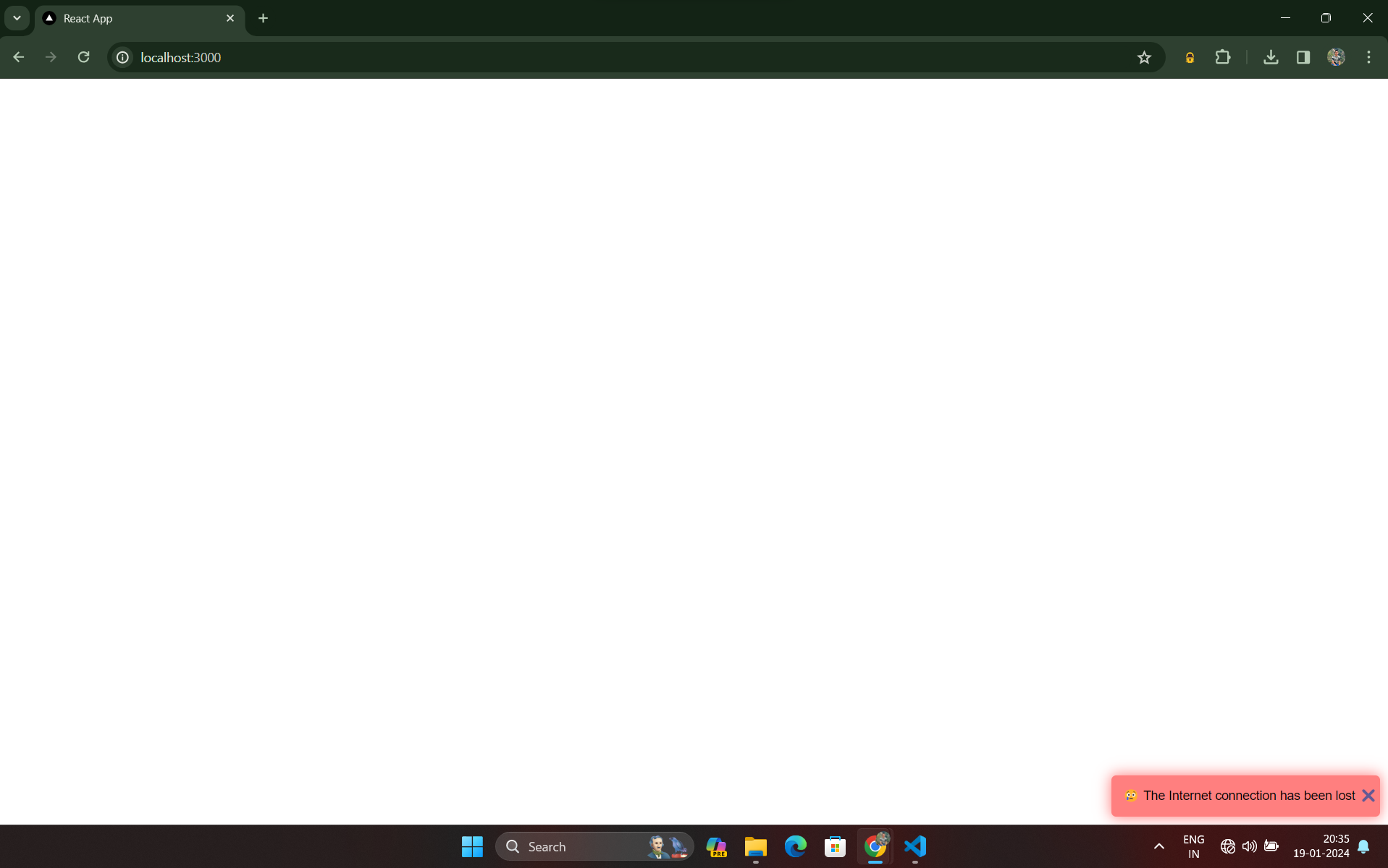
Component Snapshots
When user is Offline:
When user is back Online: