
@pravinrd/awesome-grid
v0.2.17
Published
Awesome Data Grid Component!
Maintainers
 pravinrd
Readme
Awesome Grid React Component
Awesome Grid is a feature-rich, themeable React data grid/table with client-side sorting, filtering, grouping, totals, column visibility, drag-and-drop ordering, resizable columns, CSV export, and optional virtualization for large datasets. It also supports personalization stored in IndexedDB.
Features
- Client-side sorting, filtering, grouping, and totals
- Column visibility + Drag-and-Drop ordering
- Resizable columns with persistence
- CSV/PDF export
- Theme switcher (light/dark/purple)
- Virtualized rendering for large datasets (All rows mode)
- Date filtering with HTML5 date input
- Personalization stored in IndexedDB
Install
npm install @pravinrd/awesome-gridUsage
import { AwesomeGrid } from "@pravinrd/awesome-grid";
import "@pravinrd/awesome-grid/style.css";

export default function App() {
  return (
    <AwesomeGrid
      apiEndpoint="/api/orders"
      storageKey="orders-grid"
      rowKey="id"
      theme="light"
      currency="USD"
      pageSizeOptions={[10, 25, 50, 100, 0]}
      defaultPageSize={25}
      dateFormat={{
        locale: "en-US",
        options: { year: "numeric", month: "2-digit", day: "2-digit" },
      }}
      dateSeparator="/"
      computedColumns={[
        {
          key: "totalWithTax",
          label: "Total + Tax",
          formula: (row) => Number(row.total || 0) * 1.18,
        },
      ]}
    />
  );
}
Screenshots & GIFs
Theme selection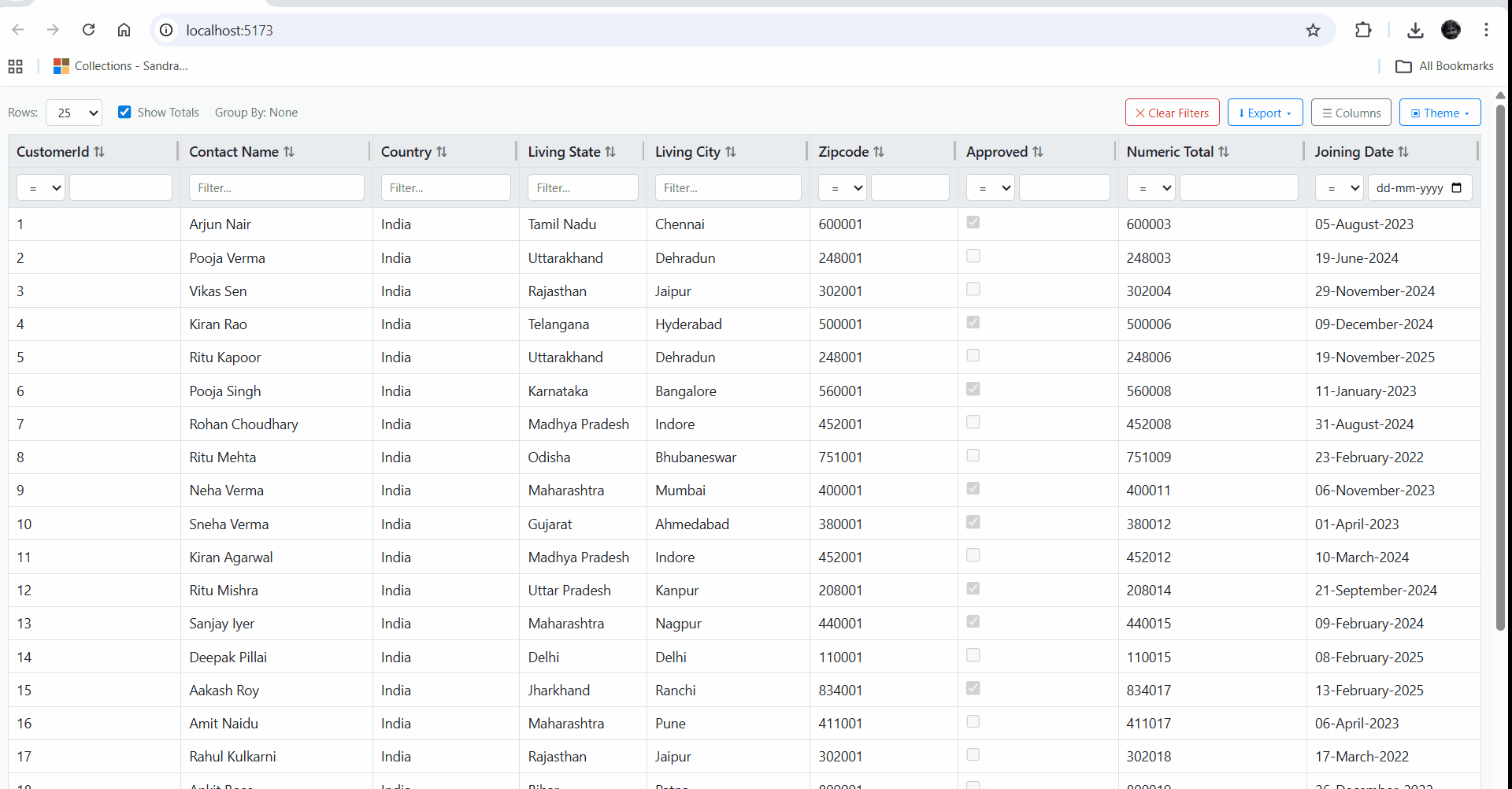
Filtering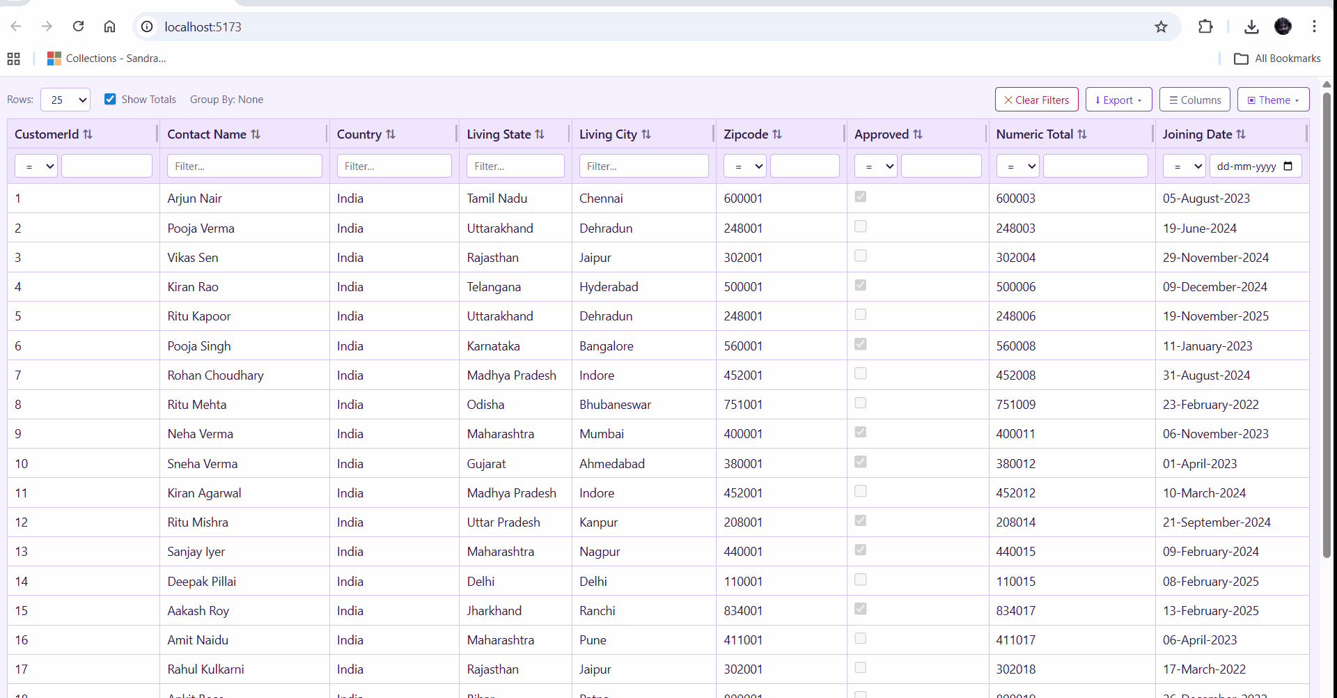
Grouping drill-down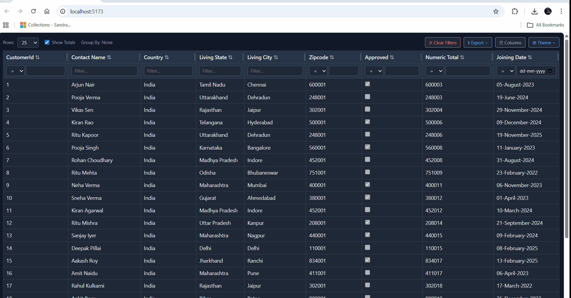
Column resizing
Drawer personalization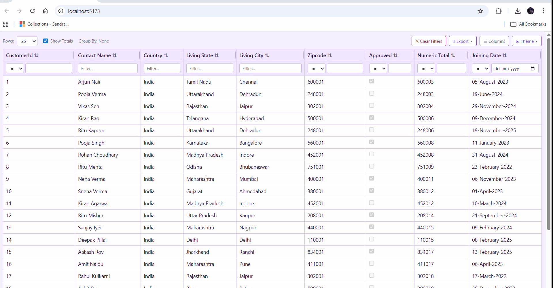
Virtualization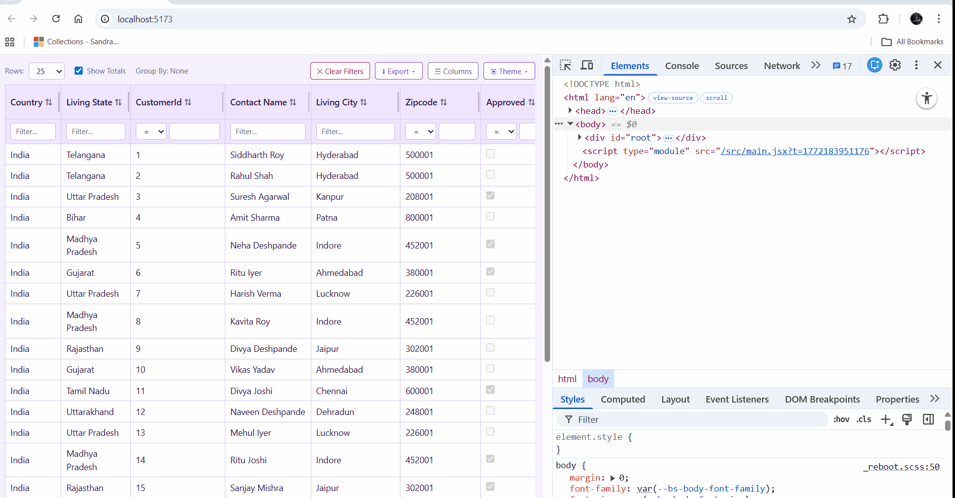
API Contract (Expected Response Shape)
The component expects a JSON response with data and columns.
Example response:
{
  "columns": [
    {
      "key": "CustomerId",
      "label": "Customer Id",
      "format": null,
      "type": "Int32"
    },
    {
      "key": "ContactName",
      "label": "Contact Name",
      "format": null,
      "type": "String"
    },
    {
      "key": "City",
      "label": "Living City",
      "format": null,
      "type": "String"
    }
  ],
  "data": [
    {
      "CustomerId": 1,
      "ContactName": "Kiran Shah",
      "City": "Patna",
      "State": "Bihar",
      "Country": "India",
      "ZipCode": "800001",
      "Approved": false,
      "JoiningDate": "2024-07-01T14:33:39.8623856+05:30"
    },
    {
      "CustomerId": 2,
      "ContactName": "Rohan Kulkarni",
      "City": "Ahmedabad",
      "State": "Gujarat",
      "Country": "India",
      "ZipCode": "380001",
      "Approved": false,
      "JoiningDate": "2022-06-06T14:33:39.8623899+05:30"
    },
    {
      "CustomerId": 3,
      "ContactName": "Amit Mehta",
      "City": "Jaipur",
      "State": "Rajasthan",
      "Country": "India",
      "ZipCode": "302001",
      "Approved": true,
      "JoiningDate": "2021-07-24T14:33:39.8623901+05:30"
    }
  ],
  "totalCount": 200
}
Notes
columnscan be an array of strings or objects.- String format:
["id", "customer_name", "order_date", "total"] - Object format:
{ key: "order_date", label: "Order Date" }
- String format:
datais an array of objects; keys are normalized tocamelCase.- Date detection is automatic when values can be parsed as valid dates.
Props
| Prop | Type | Default | Description |
| --- | --- | --- | --- |
| apiEndpoint | string | required | API URL that returns data + columns. |
| rowKey | string | required | Unique key field for each row (e.g., id). |
| theme | "light" \| "dark" \| "purple" | "light" | Theme for the table UI. |
| storageKey | string | apiEndpoint | Override the IndexedDB key used for persisting preferences. Use a unique value per grid instance to avoid collisions. |
| currency | "INR" \| "USD" | "INR" | Currency used for totals row formatting. |
| computedColumns | Array<{ key, label, formula }> | [] | Add computed columns from row data. |
| pageSizeOptions | number[] | [50, 100, 500, 1000, 0] | Page size choices; 0 means "All". |
| defaultPageSize | number | first option | Initial page size. Must exist in pageSizeOptions. |
| dateFormat | { locale, options } | en-US, {year,month,day} | Intl date formatting options. |
| dateSeparator | "/" \| "-" | "/" | Separator between date parts. |
dateFormat.options.month values
numeric->12-digit->01short->Janlong->Januarynarrow->J
Export
import { AwesomeGrid } from "@pravinrd/awesome-grid";Styling
AwesomeGrid ships with a bundled stylesheet. Import it once in your app:
import "@pravinrd/awesome-grid/style.css";Personalization Persistence (IndexedDB)
AwesomeGrid stores personalization in IndexedDB (not LocalStorage) so settings survive refreshes:
- Theme
- Column order + visibility
- Grouping selections
- Aggregate columns
- Column widths
Use a unique storageKey per grid instance if you render multiple grids on the same page:
<AwesomeGrid apiEndpoint="/api/orders" rowKey="id" storageKey="orders-grid" />
<AwesomeGrid apiEndpoint="/api/customers" rowKey="id" storageKey="customers-grid" />
License
MIT