
@qkix/strapi-plugin-better-blocks
v0.23.9
Published
An enhanced Rich Text (Blocks) field for Strapi with inline color picker and more
Downloads
1,601

Maintainers
 kkukielka
Readme
Table of Contents
- Features
- Compatibility
- Installation
- Configuration
- Usage
- Custom Color Presets
- Media Embeds (CSP Configuration)
- Frontend Rendering
- Adding Your Own Block Type
- Contributing
- License
Feature showcase
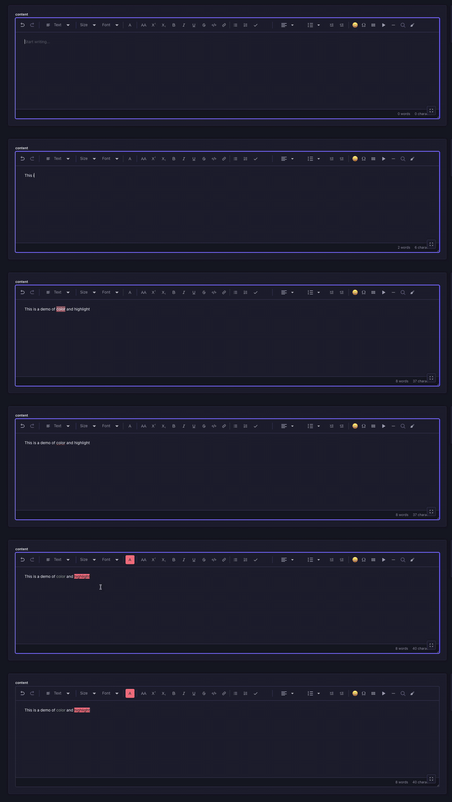
Text color & background highlight
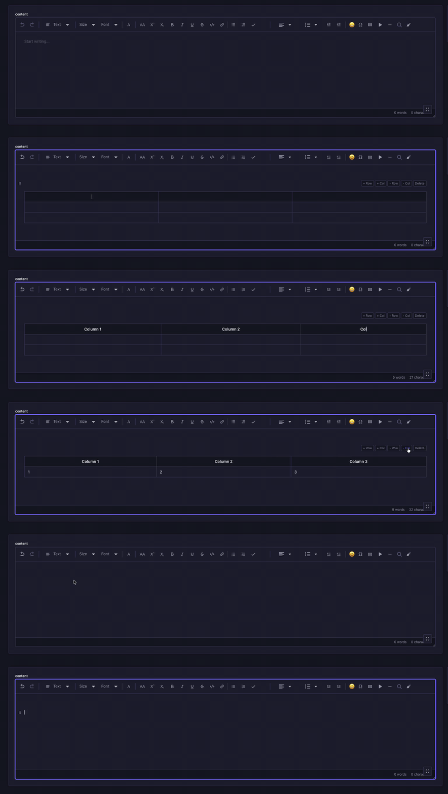
Tables
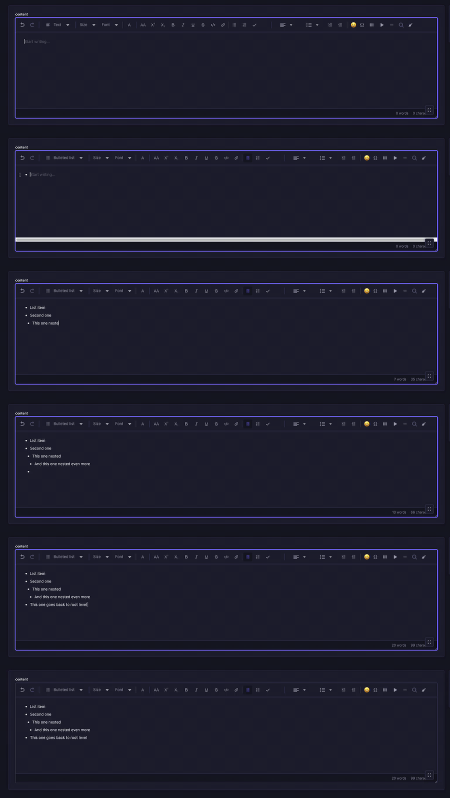
Nested lists
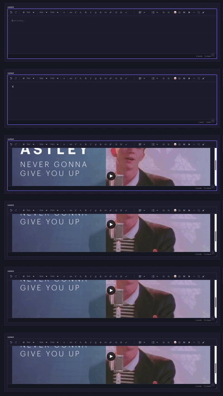
Media embeds (YouTube / Vimeo)
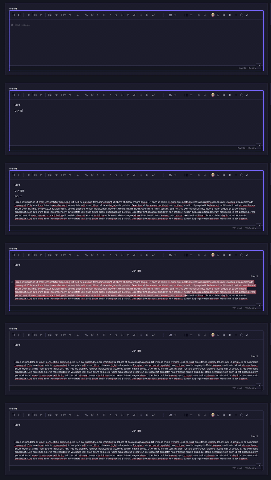
Text alignment
Line height & indentation
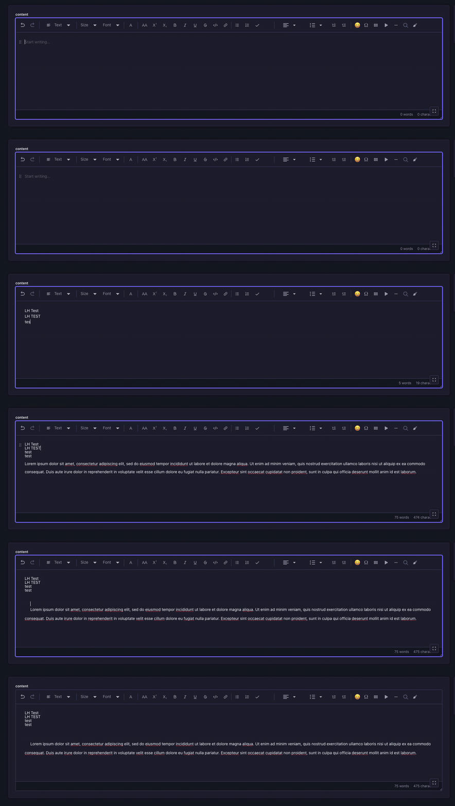
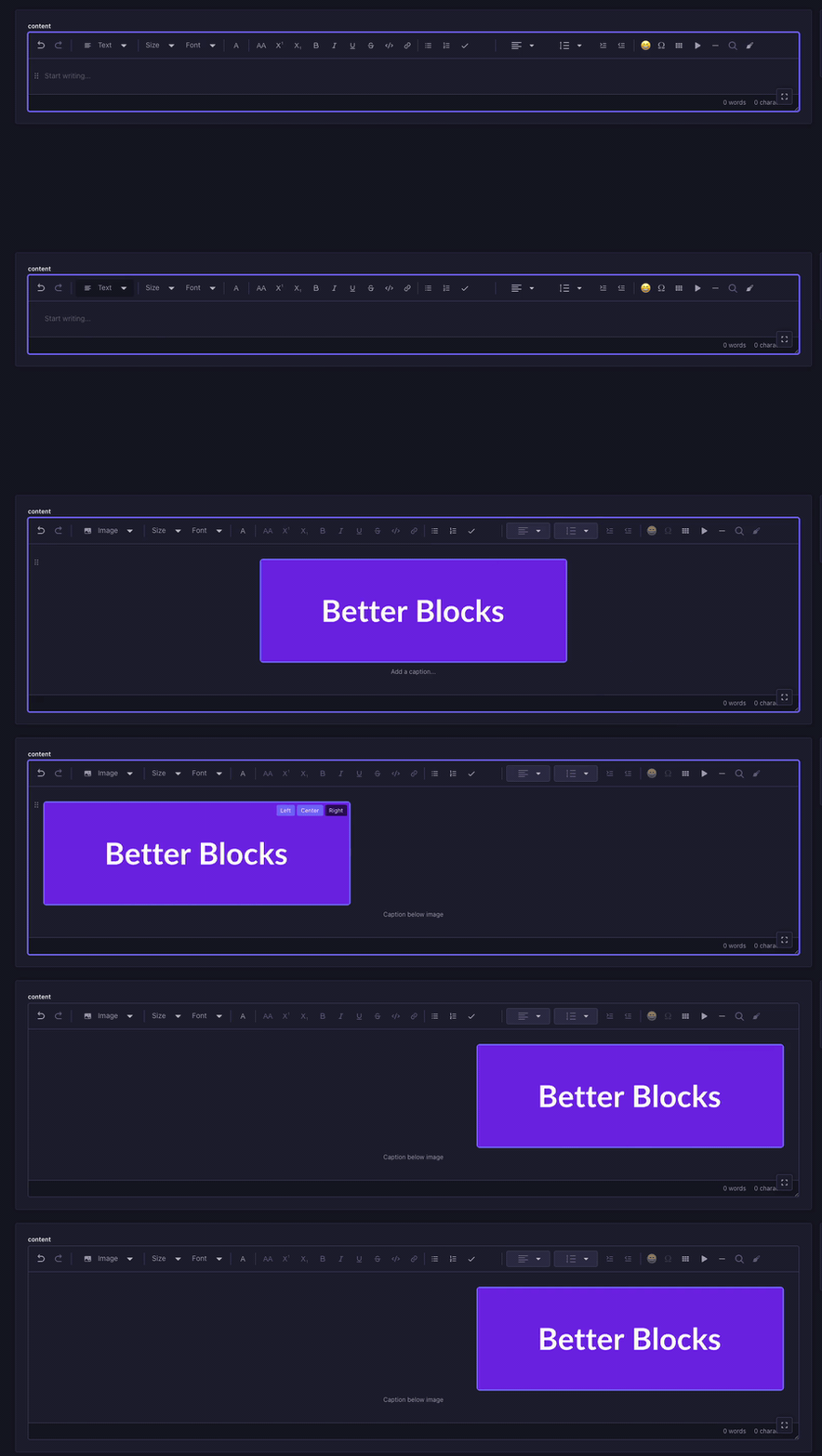
Image captions & alignment
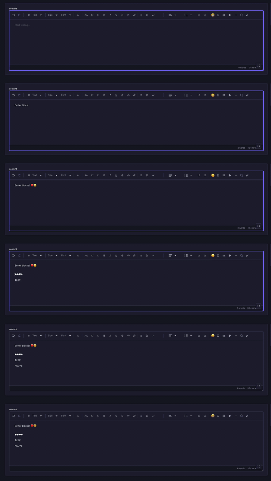
Emoji & special character pickers
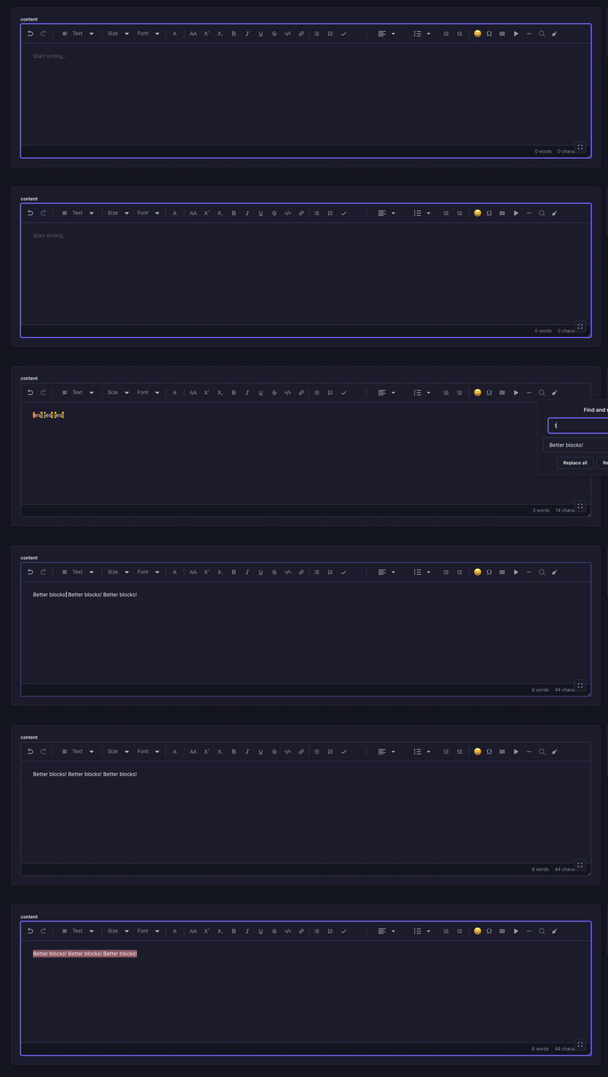
Find & replace
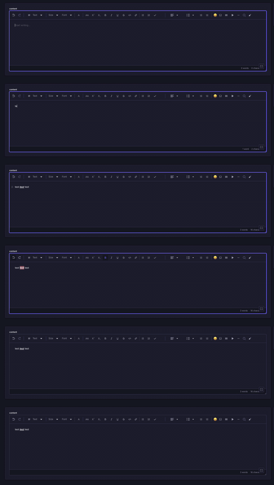
Undo / redo, remove formatting & word count
Features
- Inline Text Color — Apply foreground color to selected text from a configurable palette
- Background Highlight — Apply background color to selected text for highlighting
- Live Preview Button — The toolbar button reflects the currently active text and highlight colors
- Customizable Palettes — Define custom color presets per field via Content-Type Builder
- Dark & Light Mode — Fully compatible with both Strapi themes
- Drop-in Replacement — Works as a custom field alongside the native Rich Text (Blocks) field
- Markdown Paste Support — Paste CommonMark or GitHub Flavored Markdown (GFM) from tools like ChatGPT, Claude, DeepSeek, Kimi, docs, and issue trackers, and convert headings, lists, task lists, tables, links, code, quotes, horizontal rules, LaTeX math, and inline marks into rich Better Blocks content automatically
- Nested Lists — Infinitely nestable ordered and unordered lists with per-level format switching (Tab to indent, Shift+Tab to outdent)
- To-do Lists — Checkbox list items with click-to-toggle and strikethrough on checked items
- Tables — Insert tables with header row, add/remove rows and columns via hover toolbar
- Embeds (generic iframe / URL) — Insert any third-party embed from the
+Insert menu, the/embedslash command, or the toolbar's media button. Two modes: URL (YouTube, Vimeo, Loom, Wistia, Dailymotion and api.video are converted to an iframe automatically) and Embed code (paste any platform's<iframe>snippet). The pasted markup is never stored verbatim — the iframe is rebuilt from an attribute allowlist over an https-onlysrc, so scripts, event handlers and unknown attributes cannot survive into your frontend. Live preview in the editor, plus aspect ratio (16:9 / 21:9 / 4:3 / 1:1 / custom), alignment, caption and an accessible title. Supersedes the older YouTube/Vimeo-only media embed block, which still renders existing content but is no longer inserted - Video (provider-aware) — Insert a video from the
+Insert menu or the/videoslash command. Source it from the Media Library, a direct URL, or a hosting provider — Mux, api.video and Cloudinary URLs are detected automatically, and a bare Mux playback ID fills in the stream URL and poster frame for you. Whenstrapi-plugin-mux-video-uploaderis installed and configured, a Mux button lists and searches your Mux assets inline with thumbnails. Set a poster image, title, caption, WebVTT captions/transcript, alignment, aspect ratio, and player behavior (controls, autoplay, muted, loop) - Math (LaTeX / KaTeX) — Inline and block math rendered with KaTeX; insert from the toolbar, the
/mathslash command, the blocks selector, or by typing$$(block) /$…$(inline), then edit in a full-screen modal with a side-by-side source editor and live preview. Block math supports multi-line equations via\\and LaTeX environments such asalignedandcases - Diagrams (Mermaid) — Block-level Mermaid diagrams (flowcharts, sequence, class, state, ER, pie, and more) rendered to SVG; insert from the blocks selector, the
/mermaidslash command, or by typing```mermaidthen a space, then edit the definition in a full-screen modal with live preview and zoom controls. Theme follows Strapi's light/dark mode - Callouts / Admonitions — GitHub-style callouts in five variants (
Note,Tip,Important,Warning,Caution) with an optional custom title and nested rich-text content (paragraphs, lists, links). Insert from the blocks selector or the/note,/tip,/important,/warning,/cautionslash commands; switch variant, edit the title, or remove from the header popover. Colors follow Strapi's design tokens and adapt to light/dark mode - Details / Collapsible — GitHub-style collapsible
<details>/<summary>sections for managing content density. Insert from the blocks selector or the/detailsslash command; edit the summary label and toggle open/closed-by-default (defaultOpen) from the header. Holds full rich-text block content (paragraphs, lists, tables, images) and supports nesting. Admins can set the default summary text and choose a GitHub-minimal (default) or Custom (bordered + background) style. Stored as{ "type": "details", "summary": "…", "defaultOpen": false, "children": [...] } - Button (WordPress-style CTA) — Insert a styled call-to-action button from the blocks selector or by typing
[button]then a space. Two modes: Link (URL + open-in-new-tab + ARIA label) and File (pick any asset from the Media Library to render a download button with optional file size and type icon, and choose direct download or preview-in-new-tab). A full-screen editor with live preview controls alignment, background/text colors (including hover colors), border radius, font size/weight, padding presets, border, and a custom CSS class. One-click style presets (Primary / Secondary / Outline / Filled) keep CTAs on-brand. Admins can set default button colors and customize the presets. Stored as{ "type": "button", "buttonType": "link" | "file", "label": "…", "alignment": "center", "link": {…} | "file": {…}, "style": {…} } - Audio (HTML5 player) — Insert an audio block from the
+Insert menu, the/audioslash command, or by typing[audio]then a space. Pick a file from the Media Library (upload included) or paste a direct URL, with a live native<audio>preview in the editor. Set an optional title and caption, block alignment (left / center / right / none), and player behavior: controls, autoplay, loop, and preload (none / metadata / auto). Stored as{ "type": "audio", "file": {…}, "title": "…", "caption": "…", "player": {…}, "alignment": "center" } - Horizontal Line — Insert
<hr>dividers between content blocks - Text Alignment — Per-block left, center, right, and justify alignment
- Undo / Redo — Toolbar buttons wired to Slate's built-in history
- Remove Formatting — One-click button to strip all marks from selected text
- Link Decorators — "Open in new tab" option with
target="_blank"andrel="noopener noreferrer" - Word & Character Count — Live counter displayed at the bottom of the editor
- Line Height — Per-block line spacing control (1, 1.15, 1.5, 2, 2.5, 3)
- Indent / Outdent — Block-level indentation buttons (up to 6 levels)
- Image Captions — Editable figcaption below images
- Image Alignment — Left, center, and right alignment for images via hover buttons
- Emoji Picker — Searchable popup grid with 130+ common emojis
- Special Characters — Categorized picker for currency, math, arrows, Greek, legal symbols and more
- Find and Replace — Search with real-time highlighting (yellow for all matches, orange for active), prev/next navigation, replace and replace all
- Font Family — Inline font family selector (Arial, Georgia, Times New Roman, and more)
- Font Size — Inline font size selector (10px to 48px)
- Slash Commands — Type
/to open a block insertion menu with search, arrow key navigation, and Enter to select - Auto Text Transformations — Automatic symbol replacement on space:
(c)→ ©,1/2→ ½,--→ —,->→ →, and more - Editor Placeholder — "Start writing..." placeholder shown when the editor is empty
- Responsive Toolbar — Wraps to multiple rows on smaller screens so all buttons remain accessible
- Full Blocks Editor — Paragraphs, headings, lists, links, quotes, code blocks, and all standard text modifiers (bold, italic, underline, strikethrough, code, uppercase, superscript, subscript)
Compatibility
| Strapi Version | Plugin Version | | -------------- | -------------- | | v5.x | v0.x |
Strapi v5 only. The plugin is built against the v5 Document Service and the v5 admin APIs, and there is no v4 branch.
Installation
# Using yarn
yarn add @qkix/strapi-plugin-better-blocks

# Using npm
npm install @qkix/strapi-plugin-better-blocks
After installation, rebuild your Strapi admin panel:
yarn build
# or
npm run build
Configuration
1. Enable the plugin
Add the plugin to your Strapi configuration in config/plugins.ts (or config/plugins.js):
// config/plugins.ts
export default () => ({
  'better-blocks': {
    enabled: true,
  },
});
Details / Collapsible defaults (optional)
Set plugin-wide defaults for the collapsible Details block. These apply to every Better Blocks field, and can still be overridden per field in the Content-Type Builder.
// config/plugins.ts
export default () => ({
  'better-blocks': {
    enabled: true,
    config: {
      details: {
        defaultSummary: 'Show more', // summary label for newly inserted blocks
        style: 'custom', // 'github' (minimal) | 'custom' (bordered + tinted background)
      },
    },
  },
});
Mux video hosting (optional)
The Video block works out of the box with the Media Library and direct URLs. To also browse your Mux library from inside the editor, install the community Mux plugin alongside Better Blocks:
yarn add strapi-plugin-mux-video-uploader// config/plugins.ts
export default ({ env }) => ({
'better-blocks': { enabled: true },
'mux-video-uploader': {
enabled: true,
config: {
accessTokenId: env('MUX_ACCESS_TOKEN_ID'),
secretKey: env('MUX_SECRET_KEY'),
},
},
});Create the credentials in the Mux dashboard under Settings → Access Tokens with Full Access. Once they are set, the video block's source picker grows a Mux button that lists and searches your Mux assets with thumbnails.
Notes:
- Only assets uploaded through the Mux plugin appear - the plugin lists its
own
mux-assetrecords, not everything in your Mux account. - Assets with a signed playback policy are shown but not selectable: signed playback needs a short-lived JWT minted per request, and a token stored in the document body would expire.
- Better Blocks detects the plugin by calling its asset-list route, not its
mux-settingsroute - the latter reports "not configured" unless a webhook signing secret is also set, which listing assets does not require.
Button defaults (optional)
Set plugin-wide default colors for newly inserted Button blocks, and customize the Style presets (Primary / Secondary / Outline / Filled) offered in the editor's "Style preset" picker so authors deploy on-brand CTAs in one click. These apply to every Better Blocks field, and can still be overridden per field in the Content-Type Builder (and per button in the editor).
// config/plugins.ts
export default () => ({
  'better-blocks': {
    enabled: true,
    config: {
      button: {
        defaultStyle: {
          backgroundColor: '#4945ff',
          textColor: '#ffffff',
        },
        // Brand variants for the "Style preset" picker (each applies
        // background, text and border; the rest of the styling is untouched).
        presets: {
          primary: {
            backgroundColor: '#4945ff',
            textColor: '#ffffff',
            border: 'none',
          },
          secondary: {
            backgroundColor: '#dcdce4',
            textColor: '#32324d',
            border: 'none',
          },
          outline: {
            backgroundColor: 'transparent',
            textColor: '#4945ff',
            border: '2px solid #4945ff',
          },
          filled: {
            backgroundColor: '#32324d',
            textColor: '#ffffff',
            border: 'none',
          },
        },
      },
    },
  },
});
Button JSON shape (for frontend renderers)
A button is stored as a single block. buttonType selects the rendering mode:
{
  "type": "button",
  "buttonType": "link", // "link" | "file"
  "label": "Get started",
  "alignment": "center", // "left" | "center" | "right"

  // Link mode
  "link": {
    "url": "https://example.com",
    "target": "_blank", // "_self" | "_blank" | "_parent" | "_top"
    "rel": "noopener noreferrer", // auto-added when target is "_blank"
    "ariaLabel": "Get started",
  },

  // File mode (instead of `link`)
  "file": {
    "id": 123,
    "url": "/uploads/whitepaper.pdf",
    "name": "Product Whitepaper.pdf",
    "size": 5242880, // bytes
    "ext": ".pdf",
    "mime": "application/pdf",
  },
  "showFileSize": true,
  "showFileIcon": true,
  "filePreview": false, // false → download the file, true → open/preview in a new tab

  "style": {
    "variant": "custom", // "primary" | "secondary" | "outline" | "filled" | "custom"
    "backgroundColor": "#4945ff",
    "textColor": "#ffffff",
    "borderRadius": "4px",
    "fontSize": "16px",
    "fontWeight": "600",
    "padding": "12px 24px",
    "border": "none",
    "hoverBackgroundColor": "#3732c9",
    "hoverTextColor": "#ffffff",
  },
  "cssClass": "my-cta",
}
Render link mode as <a href={link.url} target={link.target} rel={link.rel}>. For file
mode, honour filePreview: when true open the file in a new tab
(<a href={file.url} target="_blank" rel="noopener noreferrer">), otherwise force a
download (<a href={file.url} download={file.name}>) - optionally prefixing
file.name/size with showFileIcon/showFileSize. Only the keys for the active mode are
present. style.variant records the selected preset for the editor UI; renderers can
ignore it.
Audio JSON shape (for frontend renderers)
An audio block is a void block referencing a Media Library asset (or an external URL) plus display and player settings:
{
  "type": "audio",
  "file": {
    "id": 123, // Media Library file id (absent when inserted from a raw URL)
    "url": "/uploads/episode.mp3", // direct URL (backend-prefixed for Media Library assets)
    "name": "episode.mp3",
    "ext": ".mp3",
    "mime": "audio/mpeg",
    "size": 5242880, // bytes
    "provider": "local", // local | cloudinary | …
  },
  "title": "Episode 1: Introduction", // optional - key omitted when empty
  "caption": "Our first podcast episode", // optional - key omitted when empty
  "player": {
    "autoplay": false,
    "loop": false,
    "controls": true,
    "preload": "metadata", // "none" | "metadata" | "auto"
  },
  "alignment": "center", // "left" | "center" | "right" | "none"
}
Render as a native HTML5 <audio src={file.url} controls={player.controls} autoPlay={player.autoplay}
loop={player.loop} preload={player.preload}> wrapped in an alignment container (left/center/right
map to flex-start/center/flex-end; none flows full-width). Include fallback text and a download
link inside <audio> for unsupported browsers, and associate the caption via aria-describedby.
file.url is already backend-prefixed for Media Library assets, and the title/caption keys are
omitted when empty. See the full React/Astro renderer contract on issue #43.
Embed JSON shape (for frontend renderers)
A generic embed is a void block. embedHtml is the only field a renderer
needs - it is already sanitized (rebuilt from an attribute allowlist, https-only
src), so render it as-is and ignore url / iframe, which exist to
round-trip the editor UI:
{
  "type": "embed",
  "source": "url", // "url" | "iframe" - which input the author used
  "url": "https://www.youtube.com/watch?v=abc12345678", // source: "url" only
  "iframe": "<iframe src=…>", // source: "iframe" only - the raw paste
  "embedHtml": "<iframe src=\"https://www.youtube.com/embed/abc12345678\" …></iframe>",
  "embedSrc": "https://www.youtube.com/embed/abc12345678", // hoisted for host checks
  "provider": "youtube", // youtube | vimeo | loom | wistia | dailymotion | api-video | generic
  "thumbnail": "https://img.youtube.com/vi/abc12345678/hqdefault.jpg", // when derivable
  "aspectRatio": "16:9", // "16:9" | "21:9" | "4:3" | "1:1" | "custom"
  "customAspectRatio": "3 / 2", // only when aspectRatio is "custom"
  "alignment": "center", // "left" | "center" | "right" | "none"
  "caption": "A video explaining the feature", // optional
  "title": "Product Demo", // optional - becomes the iframe's accessible name
}
Wrap embedHtml in an alignment container (left/center/right map to
flex-start/center/flex-end; none flows full-width) and a box with CSS
aspect-ratio. Convert aspectRatio for CSS by replacing : with /
("16:9" → 16 / 9); when it is "custom", use customAspectRatio verbatim.
Render caption as a <figcaption>. Optional keys are omitted when empty.
Deprecated: the older
media-embedblock ({ type: "media-embed", url, originalUrl }) is no longer inserted by the editor, but renderers should keep handling it so content authored before theembedblock still displays.
Video JSON shape (for frontend renderers)
{
  "type": "video",
  "provider": "mux", // "local" | "mux" | "api-video" | "cloudinary" | "custom"
  "url": "https://stream.mux.com/def456.m3u8", // playback URL or direct file URL
  "assetId": "abc123", // provider asset id, when known
  "playbackId": "def456", // provider playback id, when known
  "file": {
    // present when sourced from the Media Library (provider: "local")
    "id": 123,
    "name": "demo.mp4",
    "ext": ".mp4",
    "mime": "video/mp4",
    "size": 5242880, // bytes
    "duration": 132.4, // seconds, when reported
    "provider": "local",
  },
  "poster": "https://image.mux.com/def456/thumbnail.jpg", // optional
  "title": "Introduction Video", // optional
  "caption": "Watch this to get started", // optional
  "transcript": "https://example.com/captions.vtt", // optional WebVTT
  "player": {
    "autoplay": false,
    "loop": false,
    "muted": false,
    "controls": true,
  },
  "alignment": "center", // "left" | "center" | "right" | "none"
  "aspectRatio": "16:9",
  "customAspectRatio": "3 / 2", // only when aspectRatio is "custom"
}
Note player is nested rather than flattened onto the node, matching the
sibling audio block so renderers only learn one shape.
Rendering rules:
provider: "local"/"custom"with a direct file URL - a native<video src={url} poster={poster} controls={player.controls} autoPlay={player.autoplay} loop={player.loop} muted={player.muted}>. Add<track kind="captions" src={transcript}>whentranscriptis set, and associatecaptionviaaria-describedby.- HLS/DASH sources (
urlending in.m3u8/.mpd, i.e. most Mux assets)- a bare
<video>only plays these in Safari. Use the provider's player (<mux-player playback-id={playbackId}>for Mux) or attachhls.js.
- a bare
provider: "mux"-playbackIdalone is enough for a public playback policy; no credentials are needed on the frontend. Assets with a signed policy are intentionally not selectable in the editor, because they need a short-lived JWT minted per request and a token baked into the document body would expire.
Apply alignment and aspectRatio exactly as for the embed block. Optional
keys are omitted when empty.
Table JSON shape (for frontend renderers)
A table is a table block holding table-row children, each holding
table-cell or table-header-cell children. Cells contain inline content -
text leaves with marks, links, inline math - so render their children through
the same inline renderer used for paragraphs, never as plain text.
{
  "type": "table",
  "children": [
    {
      "type": "table-row",
      "children": [
        {
          "type": "table-header-cell",
          "colSpan": 2, // absent means 1
          "children": [{ "type": "text", "text": "Spans two columns" }],
        },
        {
          "type": "table-header-cell",
          "children": [{ "type": "text", "text": "Plain header" }],
        },
      ],
    },
    {
      "type": "table-row",
      "children": [
        {
          "type": "table-cell",
          "align": "center", // absent means "left"
          "children": [{ "type": "text", "text": "Centered", "bold": true }],
        },
        // ...two more cells; the first row's colSpan:2 cell covers two columns
      ],
    },
  ],
}
Rendering rules:
alignmaps totext-align. Absent meansleft- left-aligned cells store nothing, so documents authored before alignment existed stay valid.colSpan/rowSpanmap to the HTML attributes of the same name. Absent means 1, so unmerged cells - the overwhelming majority - carry neither key. A spanned-over slot has no node at all: the cell that covers it simply carries the span, exactly like hand-written HTML.table-header-cellrenders as<th scope="col">,table-cellas<td>. When the first row consists entirely of header cells, wrap it in<thead>and the rest in<tbody>. Authors toggle this per table, so don't assume a header row exists.- A
rowSpannever crosses the header/body divide. The editor won't merge across it and normalizes away any span that does, because HTML doesn't allow a cell to span<thead>into<tbody>- so<thead>is always exactly the leading header rows, and no cell straddles the two groups.
2. Restart Strapi
yarn develop3. Add a Better Blocks field
- Go to Content-Type Builder
- Select or create a content type
- Click Add new field
- Switch to the CUSTOM tab
- Select Better Blocks
- Configure the field name and color settings
- Save and wait for Strapi to restart
Usage
Once added to a content type, the Better Blocks field provides an enhanced Rich Text editor with:
Text Color
- Select text in the editor
- Click the A button in the toolbar
- Switch to the Text tab
- Choose a color from the palette
- Click Remove color to reset
Background Highlight
- Select text in the editor
- Click the A button in the toolbar
- Switch to the Highlight tab
- Choose a background color from the palette
- Click Remove highlight to reset
The toolbar button shows a live preview of the active colors — the icon color reflects the text color, and the button background reflects the highlight color.
Math (LaTeX)
Insert a math block from the toolbar, the /math slash command, the blocks selector, or by typing $$ (block) / $…$ (inline). The editor opens in a full-screen modal with a source editor and live preview. Press Cmd/Ctrl + Enter to save.
A single block can render multi-line equations — there is no need to create a separate block per line. Use the LaTeX line break \\, and an alignment environment when you want the lines to line up:
\begin{aligned}
  2x + 3y &= 5 \\
  x - y   &= 1
\end{aligned}
Other supported environments include cases (piecewise), gathered (centered lines), and matrix / pmatrix / bmatrix. A bare \\ outside an environment also breaks to a new (centered) line:
E = mc^2 \\
a^2 + b^2 = c^2
Pressing Enter in the source editor only adds a line break to your LaTeX source for readability — it does not create a new block. The rendered line break comes from the LaTeX
\\.
Custom Color Presets
You can customize both text and background color palettes per field in the Content-Type Builder:
Text Colors
In the field's Base settings:
- Disable default text colors — Check to replace default colors with your own
- Custom text color presets — One color per line in
Label:#HEXformat
Example:
Black:#000000
White:#FFFFFF
Brand Red:#E53E3E
Brand Blue:#3182CE
Background Colors
- Disable default background colors — Check to replace default highlights with your own
- Custom background color presets — One color per line in
Label:#HEXformat
Example:
Warning:#FED7D7
Info:#BEE3F8
Success:#C6F6D5
Neutral:#EDF2F7
Default Palettes
Text colors: Teal, Dark, Gray, Light Gray, Silver, Medium Gray, White
Background colors: Yellow, Green, Blue, Pink, Purple, Orange, Gray, Teal, Red, Cyan
Media Embeds (CSP Configuration)
If you use the embed or video blocks, you need to update your Strapi security middleware so the editor can load thumbnails, posters and embed iframes.
In config/middlewares.ts:
export default [
  'strapi::logger',
  'strapi::errors',
  {
    name: 'strapi::security',
    config: {
      contentSecurityPolicy: {
        directives: {
          'img-src': [
            "'self'",
            'data:',
            'blob:',
            'https://img.youtube.com',
            'https://image.mux.com',
            'https://res.cloudinary.com',
          ],
          'media-src': ["'self'", 'data:', 'blob:', 'https://stream.mux.com'],
          'frame-src': [
            "'self'",
            'https://www.youtube.com',
            'https://player.vimeo.com',
            'https://www.loom.com',
            'https://fast.wistia.net',
            'https://www.dailymotion.com',
            'https://embed.api.video',
          ],
        },
      },
    },
  },
  'strapi::cors',
  'strapi::poweredBy',
  'strapi::query',
  'strapi::body',
  'strapi::session',
  'strapi::favicon',
  'strapi::public',
];
Without this, thumbnails and in-editor embed previews are blocked by the Content Security Policy in the Strapi admin panel. Add only the hosts you actually use.
If you paste an embed code from a provider not in that list, add its iframe host
to frame-src too — the editor tells you which provider it detected, and an
embed whose host is missing simply renders as an empty frame in the admin. The
saved content is unaffected and still renders on your frontend.
Live social-embed previews
A social embed shows a compact card in the editor, with a Show live post
button that swaps in the real post. The preview uses each platform's script-free
iframe embed (no widget JavaScript runs in the admin), so it only needs those
hosts added to frame-src:
'frame-src': [
  "'self'",
  'https://platform.twitter.com', // X / Twitter
  'https://www.instagram.com',
  'https://www.facebook.com',
  'https://www.tiktok.com',
  'https://www.linkedin.com',
  'https://assets.pinterest.com',
],
Add only the platforms you enable. Without them the card still works - clicking Show live post just renders an empty frame, since the admin CSP blocks it. Third-party frames load only after that click, never on page load.
Frontend Rendering
Three companion renderers read this content, one per framework. Each supports every Better Blocks feature - text colors, background highlights, images, and all standard block types - and each is native to its framework rather than a wrapper around another one:
| Renderer | For |
| ------------------------------------------------------------------------------------------------------------------------------ | ----------------------------------------------- |
| @qkix/better-blocks-react-renderer | React / Next.js |
| @qkix/better-blocks-astro-renderer | Astro - zero client-side JavaScript |
| @qkix/better-blocks-vue-renderer | Vue 3 / Nuxt - with a Nuxt module for the setup |
# Using yarn
yarn add @qkix/better-blocks-react-renderer

# Using npm
npm install @qkix/better-blocks-react-renderer
import { BlocksRenderer } from '@qkix/better-blocks-react-renderer';
const MyComponent = ({ content }) => {
return <BlocksRenderer content={content} />;
};See each renderer's own documentation for its props, custom renderers and framework-specific notes.
Requirements
- Node.js ≥ 20.0.0
- Strapi v5.x
- Slate 0.94.1 (bundled with Strapi)
Adding Your Own Block Type
Another Strapi plugin - or your own admin customization in
src/admin/app.tsx - can add a block type to the editor. Call registerBlock
from register(), which runs before any editor is mounted.
import { registerBlock } from '@qkix/strapi-plugin-better-blocks/strapi-admin';
import { Transforms } from 'slate';

export default {
  register() {
    registerBlock({
      type: 'key-figure',
      // What it holds: 'void' (attributes only, the default), 'inline' (text),
      // or 'blocks' (nested blocks). Slate's void handling follows from this.
      content: 'void',

      // Needed to be offered in the "+" Insert menu and the slash command. A
      // block without all three still renders, it just is not offered.
      icon: KeyFigureIcon,
      label: 'Key figure',
      insert: (editor) => {
        Transforms.insertNodes(editor, {
          type: 'key-figure',
          value: '42',
          // Slate refuses a document whose nodes are not elements, and an
          // element is something with a children array. A void block saved
          // without this placeholder takes the whole editor down.
          children: [{ type: 'text', text: '' }],
        });
      },

      renderElement: ({ attributes, children, element }) => (
        <div {...attributes} contentEditable={false}>
          {element.value}
          {children}
        </div>
      ),
    });
  },
};
Registering is the only supported way in. Editing this package to add a block is how the editor, the renderers and the validator ended up with four separate hardcoded lists of block types in the first place.
registerBlock throws if the type shadows a built-in or is registered twice -
either one would otherwise surface much later as a block that mysteriously does
not appear.
The rest of the pipeline
The same definition object is understood by the core and every renderer, so a
package writes type and content once:
| Where | What it adds |
| ----------------------------------------------- | ------------------------------------------------- |
| registerBlock here | the editor: rendering, Insert menu, slash command |
| validateDocument(doc, { blocks }) in the core | validate, so the block is not "unknown" |
| migrateDocument(doc, { blocks }) in the core | migrate, called for every node of the type |
| blockPlugins on any renderer | component, so the front end draws it |
A renderer given no plugin for a type renders nothing for it - content authored with a registered block is not lost, it is simply not drawn until the front end knows about it too.
See @qkix/better-blocks-core
for the definition shape, and examples/strapi-app/src/admin/app.tsx for a
working registration.
Contributing
Contributions are welcome! This package lives in a monorepo together with the React, Astro and Vue renderers - CONTRIBUTING.md covers the whole workspace. The easiest way to get started is with Docker:
# Clone the repository
git clone https://github.com/qkix/strapi-plugins.git
cd strapi-plugin-better-blocks

docker compose up --build
That builds the plugin and starts a Strapi v5 app (SQLite) at
http://localhost:1337/admin, seeded with showcase articles and an admin
account ([email protected] / admin12#). The renderer examples come up
alongside it on http://localhost:5173 (React), http://localhost:4321 (Astro)
and http://localhost:3000 (Nuxt), showing the same content.
To see the field itself, open any article, or add it to your own content type via Content-Type Builder → Add new field → CUSTOM tab → Better Blocks.
Development workflow
- Make changes to the plugin source in
packages/strapi-plugin-better-blocks/admin/src/orserver/src/ - Rebuild and restart:
The plugin is compiled into the image, so a plaindocker compose up --buildrestartwill not pick up source changes.
Full reset
To wipe the seeded database and uploaded media and start fresh:
docker compose down -v && docker compose up --buildWithout Docker
pnpm install
pnpm build   # the plugin, the core and every renderer

pnpm --filter @qkix/example-strapi-app develop
Run the checks the way CI does:
pnpm lint
pnpm typecheck
pnpm test
Community & Support
- GitHub Issues — Bug reports and feature requests
- GitHub Discussions — Questions and ideas
Support this project
This plugin is built and maintained in my free time, and it's free for everyone. If it has saved you time on a project, you can help keep it caffeinated and actively developed:
Every coffee goes toward fixing bugs, reviewing PRs, writing docs, and shipping the features you ask for. Thank you! ☕
Roadmap
What is worth building next, what is deliberately not planned, and why: ROADMAP.md.