@quasiris/docusaurus-qsc-search
v1.7.5
Published
Quasiris search bar plugin that include a search results page for Docusaurus.


Readme
@quasiris/docusaurus-qsc-search
Install package
npm i @quasiris/docusaurus-qsc-searchUsage package
In your Docusaurus project:
- Add search plugin to docusaurus.config.js file:
plugins: [
    [
      '@quasiris/docusaurus-qsc-search',
      {
        apiEndpoint: 'YOUR_API_URL',
        suggestEndpoint: 'YOUR_SUGGESTS_API_URL',
        resultKey: 'YOUR_RESULTS_KEY',
        //Optional
        searchParameters: {
          // your search parameters
        },
      },
    ],
],- Swizzle the Navbar/Content component to add your SearchBar directly into the navbar's layout.
npm run swizzle @docusaurus/theme-classic Navbar/Content -- --wrapThis will create a Navbar/Content component in your src/theme directory.
- Update the Navbar/Content component to include your SearchBar in the top-right corner.
Here's how your src/theme/Navbar/Content/index.tsx should look:
import React from 'react';
import Content from '@theme-original/Navbar/Content';
import SearchBar from '@quasiris/docusaurus-qsc-search/SearchBar';
import { usePluginData } from '@docusaurus/useGlobalData';

interface PluginData {
  apiEndpoint: string;
  suggestEndpoint: string;
  resultKey: string;
  searchParameters: {};
}

export default function ContentWrapper(props) {
  const { apiEndpoint, suggestEndpoint,resultKey,searchParameters } = usePluginData('@quasiris/docusaurus-qsc-search') as PluginData;

  return (
    <>
      <Content {...props} />
      <div className="navbar__search-container">
        <SearchBar apiEndpoint={apiEndpoint} suggestEndpoint={suggestEndpoint} resultKey={resultKey} searchParameters={searchParameters} />
      </div>
    </>
  );
}- Optional: include your SearchBar in the Nav Bar top-center including a search result page.
Here's how your src/theme/Navbar/Content/index.tsx should look:
export default function ContentWrapper(props) {
  const { suggestEndpoint, resultKey, searchParameters } = usePluginData('@quasiris/docusaurus-qsc-search') as PluginData;
  const windowSize = useWindowSize();

  const searchContainerClass = windowSize === 'desktop' ? 'desktop-search' : 'mobile-search';
  return (
    <>
      <Content {...props} />
      <div className={`navbar__search-container ${searchContainerClass}`}>
        <SearchBar
          apiEndpoint={apiEndpoint}
          suggestEndpoint={suggestEndpoint}
          resultKey={resultKey}
          resultPage={true}
          searchParameters={searchParameters}
        />
      </div>
    </>
  );
}
In your src/theme/Navbar/Content/index.tsx, the searchContainerClass is determined based on the window size. The windowSize is typically obtained using a hook like useWindowSize from Docusaurus, which detects the current viewport size. By assigning these classes, you can customize the appearance and behavior of the search bar responsively.
Enabling Navigation with resultPage: true
Setting the resultPage prop to true in the SearchBar component:
<SearchBar
  apiEndpoint={apiEndpoint}
  suggestEndpoint={suggestEndpoint}
  resultKey={resultKey}
  resultPage={true}
  searchParameters={searchParameters}
/>
enables users to navigate to a dedicated search results page upon submitting a query, either by pressing Enter or clicking the search icon. This functionality enhances the user experience by providing a full-page view of search results, which is particularly useful for displaying extensive or detailed information.
- Ensure Proper Styling:
If the SearchBar doesn't align perfectly, you may need to adjust its styles. For example, you can add custom CSS to ensure it fits well within the navbar.
Add the following to your src/css/custom.css:
.navbar__search-container {
  display: flex;
  align-items: center;
}
@media (max-width: 568px) {
  .navbar--fixed-top {
    display: flex;
    flex-direction: column;
    width: 100vw;
    box-sizing: border-box;
    height: auto;
  }

  .navbar__search-container {
    justify-content: center;
  }
  .navbar__inner {
    position: relative !important;
  }
}
/* if SearchBar in the Nav Bar Top-Center */
.desktop-search {
  position: absolute !important;
  left: 50% !important;
  transform: translateX(-50%) !important;
  max-width: 550px !important;
  width: 100% !important;
}
.mobile-search {

}
- Customize Styles:
Override CSS variables or target global classes in your project's src/css/custom.css.
/* global plugin overrides */
.qsc-search-container{
--search-container-padding: 2rem;
--search-container-width: 400px;
}
/* search input overrides */
.qsc-search-input{
color: #850000;
}
/* light theme overrides */
[data-theme='light'] .qsc-search-container {
--search-results-background-color: #25b1bb;
--search-result-hover-color: #9c9c9c;
--search-input-border-color: #4e3bf6;
--search-input-border:1px solid #4e3bf6;
--search-results-border-color: #850000;
}
/* Dark theme overrides */
[data-theme='dark'] .qsc-search-container {
--search-results-background-color: #700e0e;
--search-result-hover-color: #25b1bb;
--search-input-border-color: #3b82f6;
--search-results-border-color: #2d2d2d;
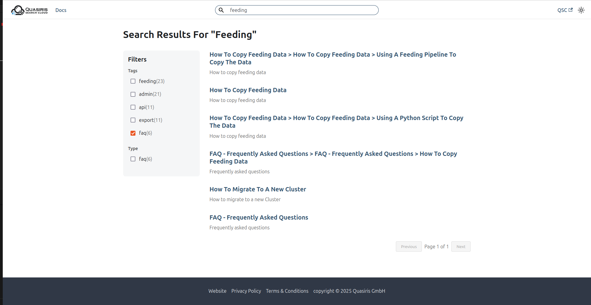
}Top-Right Search Bar
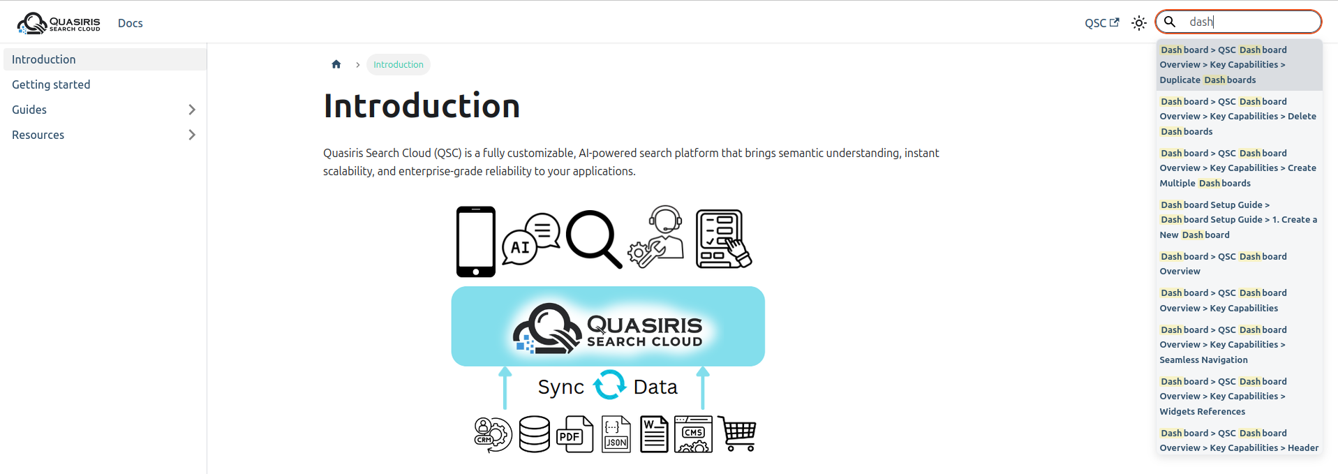
Center Search Bar
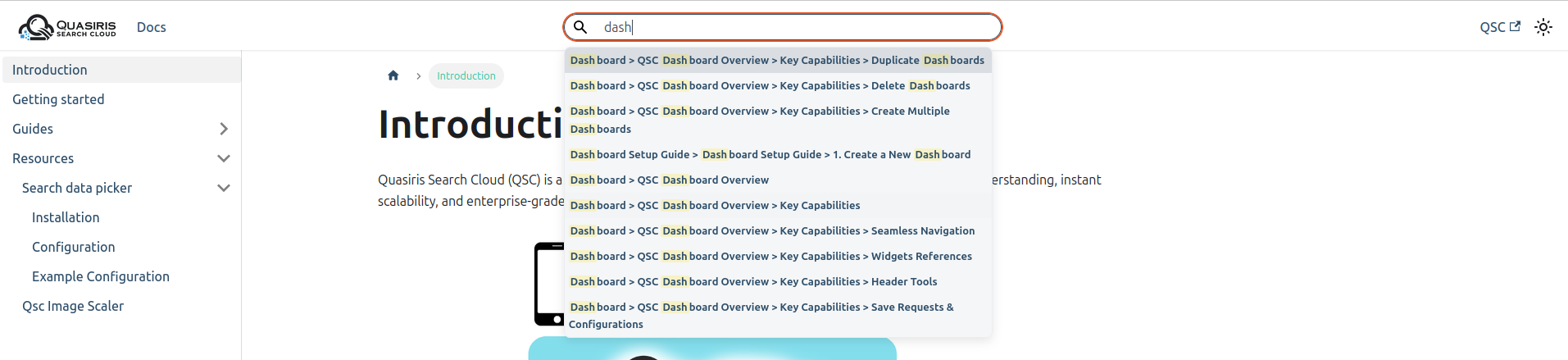
Search Results Page