
@quoin/nepali-datepicker-reactjs
v1.2.4
Published
Nepali Datepicker Reactjs
Downloads
290


Readme
@sbmdkl/nepali-datepicker-reactjs

A simple and reusable Datepicker component for React Read Full Documentation.
Installation
npm install @sbmdkl/nepali-datepicker-reactjs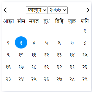
Usage
//Class Component
import React from 'react';

import Calendar from '@sbmdkl/nepali-datepicker-reactjs';
import '@sbmdkl/nepali-datepicker-reactjs/dist/index.css';

class App extends React.Component {
	state = { date: '' };

	onChange = ({ bsDate, adDate }) => {
		this.setState({ date: bsDate });
	};

	render() {
		return (
			<div>
				<Calendar onChange={this.onChange} />
			</div>
		);
	}
}

export default App;
//Functional Component
import React, { useState } from 'react';
import Calendar from '@sbmdkl/nepali-datepicker-reactjs';
import '@sbmdkl/nepali-datepicker-reactjs/dist/index.css';
function App() {
const [date, setDate] = useState('');
const handleDate = ({ bsDate, adDate }) => {
setDate({ date: bsDate });
};
return (
<div>
<h1>Nepali Date Picker for React</h1>
<Calendar onChange={handleDate} theme='deepdark' />
</div>
);
}
export default App;User guide
Props
| Prop name | Description | Default value | Example values |
| ----------- | ------------------------------------------------------------------------------------------------------------------------------------- | ------------- | ------------------------------------------ |
| className | Custom class to input field of calendar. | n/a | 'form-control' |
| defaultDate | Default date to start the calendar. Date format must be YYYY-MM-DD and in english number | n/a | "YYYY/MM/DD" |
| dateFormat | Input Date Format. Supported values are: YYYY,YYY,YY, M, MM, MMMM, D, DD, DDD, DDDD. | YYYY-MM-DD | "YYYY/MM/DD" |
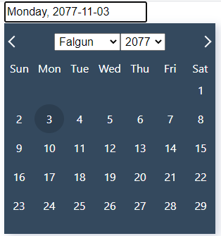
| language | Language options are: en or ne. Shows the calendar in different language. | ne | "ne" |
| minDate | Mininum date, below minimum date (included) all dates are disabled. Date format must be YYYY-MM-DD and in english number | n/a | "2077-10-20" |
| maxDate | Maximum date, above maximum date (included) all dates are disabled. Date format must be YYYY-MM-DD and in english number | n/a | "2077-12-05" |
| onChange | Function called when the user clicks an item on the most detailed view available. Returns both selected nepali date and english date. | n/a | (value) => alert('New date is: ', value) |
| style | Custom style to input field of calendar. | n/a | {{color:'red'}} |
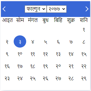
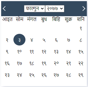
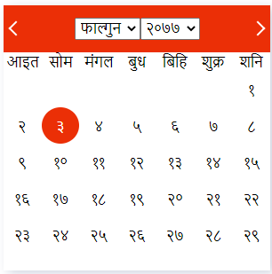
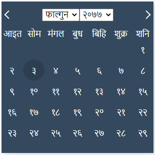
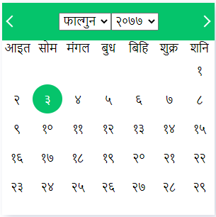
| theme | Use multi theme availabe by defaults. Theme supports : red blue green dark deepdark default. | default | "red" |
| hideDefaultValue | hide initial date value in the input | false | true |
| placeholder | Your custom placeholder | n/a | "Select Date" |
dateFormat
Format the date to provide various output based on format string
Date Format output will auto change with the language.
If language is set to english en, then YYYY will shows 2077, 2078 ...,
similarily output of DDDD will shows Sunday, Monday ...
dateFormat Usage
<Calendar onChange={this.onChange} dateFormat='DDDD, YYYY-MM-DD' />output: सोमवार, २०७७-११-०३
<Calendar onChange={this.onChange} dateFormat='DDDD, MMMM DD, YYYY' />output: शुक्रवार, फाल्गुन १४, २०७७
<Calendar onChange={this.onChange} language='en' dateFormat='DDDD, MMMM DD, YYYY' />output: Friday, Falgun 14, 2077
Get Ad date of selected Date
// both Ad and BS dates are passed to onChange on each date selected
onChange = ({ bsDate, adDate }) => {
	this.setState({ date: bsDate });
};
Using with language and theme
import React from 'react';

import Calendar from '@sbmdkl/nepali-datepicker-reactjs';
import '@sbmdkl/nepali-datepicker-reactjs/dist/index.css';

class App extends React.Component {
	state = { date: '' };

	onChange = ({ bsDate, adDate }) => {
		this.setState({ date: bsDate });
	};

	render() {
		return (
			<div>
				<Calendar
					onChange={this.onChange}
					language='en'
					theme='deepdark'
					dateFormat='DDDD, YYYY-MM-DD'
				/>
			</div>
		);
	}
}

export default App;
Output:
License
MIT © Shubham Dhakal