
@react-theming/storybook-addon
v1.1.10
Published
Develop themes and themable components with Emotion, Styled Components, Material-UI and your custom solution


Readme

Storybook Addon @ React Theming
Storybook addon for Styled Components, Emotion, Material-UI and any other theming solution. Allows to develop themed components in isolation.
npm i --save-dev @react-theming/storybook-addon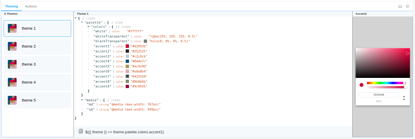
Features :dizzy:
- Universal - can be used with any styling library
- Switching between themes from addon panel.
- Change a color and see how it affects to your components
- Easily copy-paste paths of nesting theme props into your code
- Auto changes background
- Supports dark Storybook theme
- Keep selected theme on stories updates
Usage
specify addon in .storybook/main.js
// .storybook/main.js

module.exports = {
  stories: ['../src/**/*.stories.js'],
  addons: ['@react-theming/storybook-addon'],
};
or in .storybook/addons.js for older versions of Storybook
import '@react-theming/storybook-addon/register';
Then you'll need to add a decorator with a ThemeProvider of your library. This project is not related to any particular styling solutions, instead, you can use any of theme providers you're using in your project.
import ThemeProvider from 'library-of-your-choice';
import { withThemes } from '@react-theming/storybook-addon';
import { theme } from '../src/theme';

// create decorator
const themingDecorator = withThemes(ThemeProvider, [theme]);
ThemeProvider should accept a theme via theme props. This is usually the case for the most common styling libraries like Styled Components, Emotion, Material-UI.
In case of non standard ThemeProvider you can pass providerFn function in options:
const providerFn = ({ theme, children }) => {
  return <ThemeProvider theme={muTheme}>{children}</ThemeProvider>;
};

const themingDecorator = withThemes(null, [theme], { providerFn });
Use your output of the selected value
// .storybook/preview.js

import { ThemeProvider } from 'styled-components';
import { addDecorator } from '@storybook/react';
import { withThemes } from '@react-theming/storybook-addon';

import { theme } from '../src/theme';
Example getCustomFieldSnippet
const selectedValue = {
  name: "accent5",
  namespace: ["palette", "colors"],
  type: "color",
  value: "#ac924d"
}


const getCustomFieldSnippet = selectedValue => {
  const { namespace, name } = selectedValue;
  const path = namespace.join('.');
  const fullPath = `${path}.${name}`;
  const themeProp = `\${({ theme }) => theme.${fullPath}}`;
  return themeProp;
};

// The snippet Func function takes the SelectedValue parameter and returns a string
addDecorator(withThemes(ThemeProvider, [theme], { getCustomFieldSnippet }));
Example getCustomValueSnippet
By default, the addon outputs colors in HEX format, if you need some kind of add-in, then pass the colorSnippet parameter.
const getCustomValueSnippet = ({value, name, type}) => {
  // Here is your code
  return value
};

// The colorSnipept function accepts an object consisting of { value : HEX, name: string, type: color}
addDecorator(withThemes(ThemeProvider, [theme], { getCustomValueSnippet }));
BACKGROUND COLOR
This addon has ability to auto change background color when it detect a dark theme. By default it checks if the theme name contains 'dark'.
You can customize this behavior by passing onThemeSwitch function:
export const onThemeSwitch = context => {
  const { theme } = context;
  const background = theme.name === 'Dark theme' ? '#2c2f33' : 'white';
  const parameters = {
    backgrounds: {
      default: background,
    },
    // Pass backgrounds: null to disable background switching at all
  };
  return {
    parameters,
  };
};

const themingDecorator = withThemes(null, [theme], { onThemeSwitch });
This way you can have own checks of what the theme is selected and pass what ever color you need.
!important: The addon change background color on each theme selecting. In some scenarios you might want to disable this behavior e.g. if you already using addon-backgrounds. You can disable background switching by passing backgrounds: null in parameters.
Below the use cases for most popular styling libraries:
Using with Emotion
// .storybook/preview.js

import { ThemeProvider } from '@emotion/react';
import { addDecorator } from '@storybook/react';
import { withThemes } from '@react-theming/storybook-addon';

import { theme } from '../src/theme';

// pass ThemeProvider and array of your themes to decorator
addDecorator(withThemes(ThemeProvider, [theme]));
💅 Using with Styled Components
// .storybook/preview.js

import { ThemeProvider } from 'styled-components';
import { addDecorator } from '@storybook/react';
import { withThemes } from '@react-theming/storybook-addon';

import { theme } from '../src/theme';

// pass ThemeProvider and array of your themes to decorator
addDecorator(withThemes(ThemeProvider, [theme]));
Using with Material-UI
// theme.js
import { red } from '@material-ui/core/colors';

// A custom theme for this app
const theme = {
  palette: {
    primary: {
      main: '#556cd6',
    },
    secondary: {
      main: '#19857b',
    },
    error: {
      main: red.A400,
    },
    background: {
      default: '#fff',
    },
  },
};

export default theme;
// .storybook/preview.js
import { ThemeProvider } from '@material-ui/core';
import { createMuiTheme } from '@material-ui/core/styles';
import { addDecorator } from '@storybook/react';
import { withThemes } from '@react-theming/storybook-addon';
import theme from '../src/theme';
const providerFn = ({ theme, children }) => {
const muTheme = createMuiTheme(theme);
return <ThemeProvider theme={muTheme}>{children}</ThemeProvider>;
};
// pass ThemeProvider and array of your themes to decorator
addDecorator(withThemes(null, [theme], { providerFn }));// index.js
import React from 'react';
import ReactDOM from 'react-dom';
import { ThemeProvider } from '@material-ui/core/styles';
import { createMuiTheme } from '@material-ui/core/styles';
import App from './App';
import theme from './theme';
ReactDOM.render(
<ThemeProvider theme={createMuiTheme(theme)}>
<App />
</ThemeProvider>,
document.querySelector('#root'),
);
There is an example app with CRA, Material-UI and Storybook Addon Demo Source