
@real-native/charts
v1.1.1
Published
Friendly, customizable charts for React Native powered by Victory Native


Readme
@real-native/charts
Friendly, customizable charts for React Native and web, powered by Victory Native and Skia.











Web compatibility
100% of chart types render on web in the tested Chromium setup (17/17).
Validated on October 5, 2026 with the production Storybook build and
example/e2e/charts.spec.ts. Each test checks a visible canvas,
nonzero dimensions, rendered image output and the absence of page errors.
| Validation scope | Result | | --- | --- | | Chart types in Chromium | 17/17 passed (100%) | | Firefox | Pending validation | | Safari | Pending validation | | Unit test branch coverage | 95.67% (354/370 branches), 103 passing tests |
The web percentage measures chart type rendering in this setup. Browser-wide compatibility,
accessibility and every interaction are separate checks tracked in the roadmap.
Web apps need React Native Web, a GestureHandlerRootView, and Skia's CanvasKit WASM loaded
before rendering charts. The example Storybook demonstrates this setup.
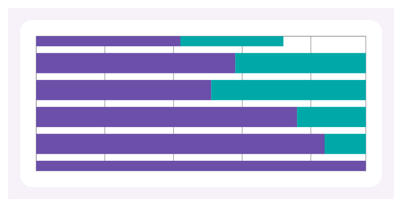
Chart gallery
Actual screenshots from the web Storybook. Images use GitHub raw URLs so the gallery also works when this README is displayed outside the repository, including npm.
| Chart | Chart |
| --- | --- |
| Line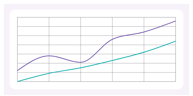 | Bar
| Bar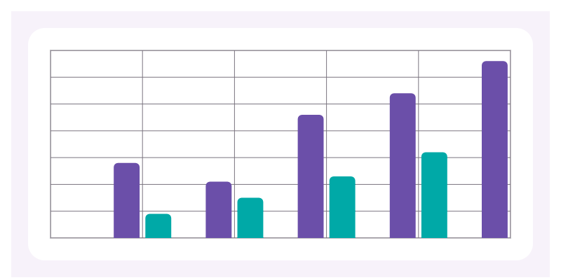 |
| Horizontal Bar
|
| Horizontal Bar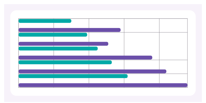 | Horizontal Stacked Bar
 |
| Stacked Bar
|
| Stacked Bar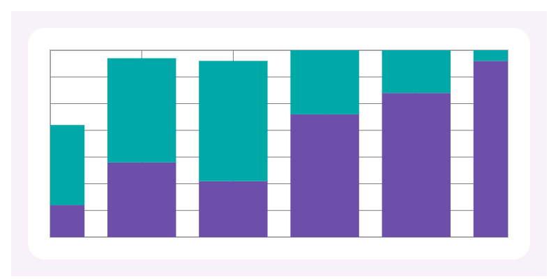 | Area
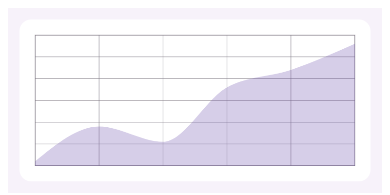 |
| Stacked Area
|
| Stacked Area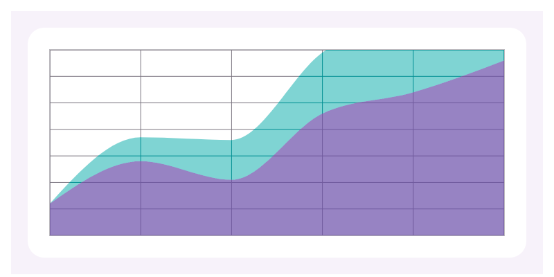 | Area Range
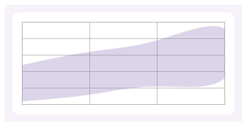 |
| Scatter
|
| Scatter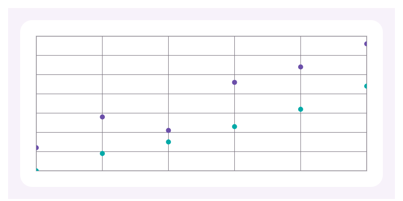 | Bubble
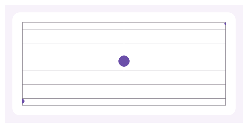 |
| Sparkline
|
| Sparkline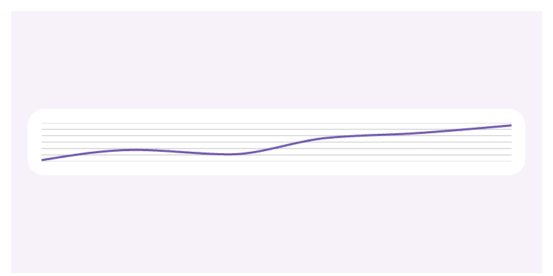 | Histogram
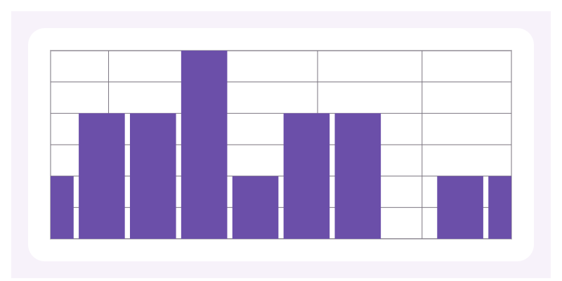 |
| Lollipop
|
| Lollipop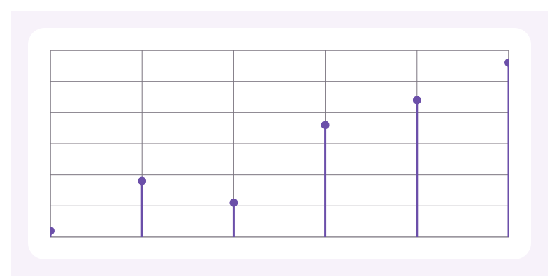 | Candlestick
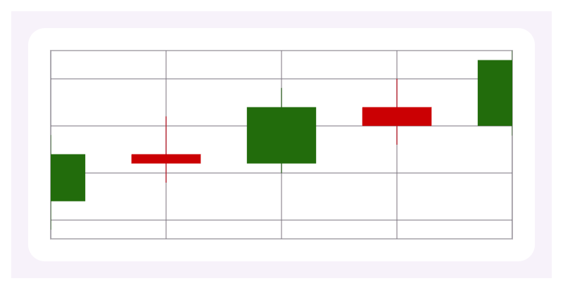 |
| Combo
|
| Combo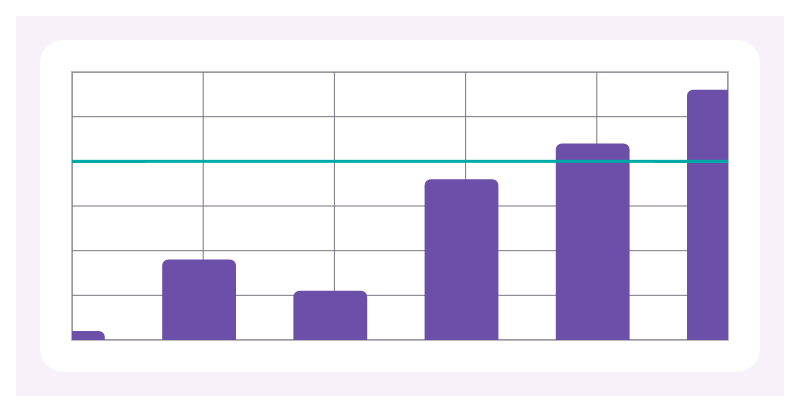 | Pie
| Pie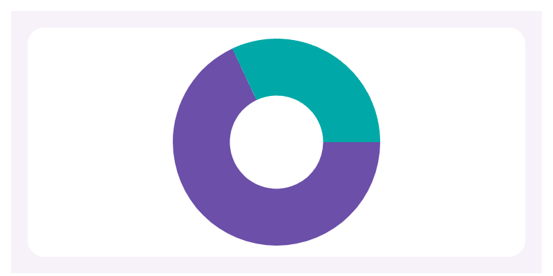 |
| Gauge
|
| Gauge | — |
| — |
Installation
Use Node >=20.19.0. The library declares React >=19, React Native >=0.79,
Skia >=2.6 <3, Victory Native >=42 <43, Gesture Handler >=2 and
Reanimated >=3.19.1. These peer ranges are not a tested compatibility matrix;
choose versions supported by your React Native or Expo release.
Expo (Reanimated 4)
Install the library and Victory Native, then let Expo select compatible native dependencies:
npm install @real-native/charts 'victory-native@^42'
npx expo install @shopify/react-native-skia react-native-gesture-handler \
  react-native-reanimated react-native-worklets
npx expo install --check
Check that Expo's selected versions satisfy the peer ranges above. The repository example uses Expo 57, React Native 0.86.3, Skia 2.6.2 and Reanimated 4.5.1. Reanimated 4 requires the New Architecture and a compatible Worklets version. See Reanimated compatibility.
Keep babel-preset-expo in babel.config.js; it configures the Reanimated/Worklets
plugin automatically. See Expo's Reanimated installation.
If maintaining custom Babel plugins, ensure the Worklets transform runs once and last.
For development builds, rebuild the native app after changing native dependencies:
npx expo run:ios
npx expo run:android
These commands generate native projects when needed. For an existing custom native project, apply the corresponding native installation steps below. Expo Go requires the native versions bundled with its SDK; use a development build when your dependencies differ.
React Native CLI (Reanimated 4)
In an existing React Native app with the New Architecture enabled:
npm install @real-native/charts 'victory-native@^42' \
  '@shopify/react-native-skia@^2.6' react-native-gesture-handler \
  'react-native-reanimated@^4' react-native-worklets
Choose the Reanimated and Worklets pair using the compatibility table.
Merge this configuration into your existing babel.config.js, placing the plugin last:
module.exports = {
  presets: ['module:@react-native/babel-preset'],
  plugins: ['react-native-worklets/plugin'],
};
Install iOS pods, then rebuild your target app:
npx pod-install
npm run ios
# Or rebuild Android:
npm run android
Skia, Gesture Handler and Reanimated are native dependencies; restarting JavaScript alone is insufficient after installing them. Follow the Skia installation guide and Reanimated native setup for platform prerequisites.
Reanimated 3 versus 4
| Configuration | Reanimated 3 | Reanimated 4 |
| --- | --- | --- |
| Library peer range | >=3.19.1 <4 | >=4 within this library's declared range |
| Separate react-native-worklets | Do not install for Reanimated 3 | Required; select a compatible version |
| Babel plugin for custom/CLI builds | react-native-reanimated/plugin | react-native-worklets/plugin |
| Plugin order | Last | Last |
| Native architecture | Check RN/version compatibility | New Architecture required |
For an app already using a supported Reanimated 3 setup, keep version 3 and use its own plugin:
module.exports = {
  presets: ['module:@react-native/babel-preset'],
  plugins: ['react-native-reanimated/plugin'],
};
Use one plugin matching the installed major version. This library's Reanimated 3 peer range is not confirmation that every RN/Skia combination works; native device validation is pending. Consult the Reanimated migration guide before switching to version 4.
After a Babel change, clear Metro's cache:
# Expo:
npx expo start --clear
# React Native CLI:
npm start -- --reset-cache
Root view for native and web
Wrap your application or chart screen with GestureHandlerRootView and give it room to render.
Place the wrapper near the application root, as described in the
Gesture Handler root view guide.
import { StyleSheet } from 'react-native';
import { GestureHandlerRootView } from 'react-native-gesture-handler';
import ChartScreen from './ChartScreen';

const styles = StyleSheet.create({ root: { flex: 1 } });

export default function App() {
  return (
    <GestureHandlerRootView style={styles.root}>
      <ChartScreen />
    </GestureHandlerRootView>
  );
}
ChartScreen should default-export a component containing your charts.
On web, use the deferred import shown below instead of importing ChartScreen here.
Web: React Native Web and CanvasKit
For an Expo web app, install the web packages and copy the WASM asset into the public directory:
npx expo install react-dom react-native-web @expo/metro-runtime
npx setup-skia-web public
Run setup-skia-web again after upgrading Skia so the JavaScript and WASM versions match.
The deployment must serve public/canvaskit.wasm as /canvaskit.wasm with the
application/wasm content type, rather than returning the app's HTML fallback.
For a deployment under a subpath, adjust locateFile to that public asset URL.
Create App.web.tsx with a deferred chart import. This follows the loader used in
this repository's Storybook and Skia's web setup:
import { WithSkiaWeb } from '@shopify/react-native-skia/lib/module/web';
import { ActivityIndicator, StyleSheet } from 'react-native';
import { GestureHandlerRootView } from 'react-native-gesture-handler';

const loadChartScreen = () => import('./ChartScreen');
const skiaOptions = { locateFile: (file: string) => `/${file}` };
const styles = StyleSheet.create({ root: { flex: 1 } });

export default function App() {
  return (
    <GestureHandlerRootView style={styles.root}>
      <WithSkiaWeb
        getComponent={loadChartScreen}
        opts={skiaOptions}
        fallback={<ActivityIndicator accessibilityLabel="Loading charts" />}
      />
    </GestureHandlerRootView>
  );
}
Import @real-native/charts inside ChartScreen, after CanvasKit has loaded.
Avoid eager imports of chart modules from the web entry point. For server-rendered apps,
render the loader only on the client and keep chart imports out of server execution.
Start Expo web:
npx expo start --webVite
@real-native/charts/vite configures Vite for React Native Web, Skia, Reanimated and
Victory Native. Install the web packages next to the chart peers and copy CanvasKit:
npm install react-dom react-native-web
npm install -D vite vite-plugin-rnw
npx setup-skia-web public
// vite.config.ts
import { realNativeCharts } from '@real-native/charts/vite';
import { defineConfig } from 'vite';
export default defineConfig({
plugins: [realNativeCharts()],
});The plugin wraps vite-plugin-rnw (react-native →
react-native-web, web extensions, __DEV__ and Flow support) and adds what charts need:
- Victory Native is resolved from its TypeScript source and transformed with the Worklets
Babel plugin (
react-native-reanimated/pluginon Reanimated 3). - Vite's
?v=query is stripped from Babel file names so Worklets can compile dependencies. - Skia's
AssetRegistryimport resolves to React Native Web's implementation. - Skia and Reanimated's CommonJS dependencies (
react-reconciler,its-fine,scheduler, …) are prebundled for development.
It accepts the vite-plugin-rnw options; any babel.plugins you pass run after the chart
plugins. Render charts behind WithSkiaWeb exactly as in the Expo example above, with the
entry point mounting App through react-dom/client.
Storybook's React Native Web framework already includes vite-plugin-rnw; the repository's
Storybook configuration shows the equivalent setup there. For other
bundlers, consult Reanimated web support.
The current web validation covers Chromium and all 17 chart types. iOS, Android, Firefox, Safari and consumer apps installed from the npm tarball remain separate roadmap checks.
Usage
import { BarChart, LineChart } from '@real-native/charts';

const data = [
  { month: 1, revenue: 12 },
  { month: 2, revenue: 18 },
  { month: 3, revenue: 15 },
];

export function RevenueChart() {
  return (
    <LineChart
      accessibilityLabel="Monthly revenue"
      data={data}
      xKey="month"
      series={[{ key: 'revenue', label: 'Revenue', color: '#6750a4' }]}
      curve="monotoneX"
    />
  );
}
Axis tick labels are drawn with Skia, so they only render when a font is available.
Pass a font file as axes.fontSource (with an optional fontSize, default 12) and the
chart loads it; formatLabel, tickCount and labelColor take effect once it is set:
<LineChart
  accessibilityLabel="Monthly revenue"
  data={data}
  xKey="month"
  series={[{ key: 'revenue' }]}
  axes={{
    fontSource: require('./assets/Inter-Regular.ttf'),
    fontSize: 12,
    y: { formatLabel: (value) => `$${value}` },
  }}
/>
To share one loaded font across charts, load it yourself with Skia's useFont and pass
it as axes.font; it takes precedence over fontSource.
To skip Skia fonts entirely, set axes.labelMode: 'native'. Tick labels are then drawn
as React Native Text next to the plot, using the platform's fonts, labelColor and an
optional axes.labelStyle. Room is reserved below and left of the plot; adjust it with
axes.labelSpace ({ x: 20, y: 40 } by default) if long labels are clipped:
<LineChart
  accessibilityLabel="Monthly revenue"
  data={data}
  xKey="month"
  series={[{ key: 'revenue' }]}
  axes={{ labelMode: 'native', labelStyle: { fontFamily: 'Inter' } }}
/>
Native labels are available on vertical cartesian charts. Horizontal bar charts keep canvas labels.
Pass axes={false} to hide axes, grid lines and labels, or axes={{ grid: false }} to drop
only the grid lines while keeping the frame and labels:
<BarChart accessibilityLabel="Revenue by month" data={data} xKey="month" series={series} axes={false} />Charts animate data changes by default, except when the system requests reduced motion
(read with Reanimated's useReducedMotion). Passing animate explicitly overrides that:
animate={false} always disables it and animate always enables it.
BarChart shares the same data, series, axes, theme, and animation configuration:
<BarChart
  accessibilityLabel="Revenue by month"
  data={data}
  xKey="month"
  series={[{ key: 'revenue', color: '#6750a4' }]}
  groupPadding={0.25}
  barPadding={0.1}
  cornerRadius={6}
/>
StackedBarChart displays series as cumulative segments for each category:
<StackedBarChart
  accessibilityLabel="Revenue by channel"
  data={data}
  xKey="month"
  series={[
    { key: 'revenue', color: '#6750a4' },
    { key: 'cost', color: '#00a6a6' },
  ]}
  innerPadding={0.2}
/>
HorizontalBarChart is useful for rankings and longer category labels:
<HorizontalBarChart
  accessibilityLabel="Revenue by month"
  data={data}
  xKey="month"
  series={[{ key: 'revenue', color: '#6750a4' }]}
/>
HorizontalStackedBarChart combines cumulative series with horizontal categories:
<HorizontalStackedBarChart
  accessibilityLabel="Revenue by channel"
  data={data}
  xKey="month"
  series={[
    { key: 'revenue', color: '#6750a4' },
    { key: 'cost', color: '#00a6a6' },
  ]}
/>
AreaChart adds curve selection, fill opacity, and missing-data handling:
<AreaChart
  accessibilityLabel="Revenue trend"
  data={data}
  xKey="month"
  series={[{ key: 'revenue', color: '#6750a4', fillOpacity: 0.28 }]}
  curve="monotoneX"
  connectMissingData
/>
StackedAreaChart shows how each series contributes to a cumulative total:
<StackedAreaChart
  accessibilityLabel="Revenue composition"
  data={data}
  xKey="month"
  series={[
    { key: 'revenue', fillOpacity: 0.7 },
    { key: 'cost', fillOpacity: 0.5 },
  ]}
  curve="monotoneX"
/>
AreaRangeChart fills the interval between lower and upper values:
<AreaRangeChart
  accessibilityLabel="Revenue forecast"
  data={forecast}
  xKey="month"
  lowerKey="minimum"
  upperKey="maximum"
  curve="monotoneX"
/>
ScatterChart renders one point set per series and supports three marker shapes:
<ScatterChart
  accessibilityLabel="Revenue scatter"
  data={data}
  xKey="month"
  series={[{ key: 'revenue', color: '#6750a4' }]}
  radius={6}
  shape="circle"
/>
BubbleChart scales each point using a third numeric field:
<BubbleChart
  accessibilityLabel="Revenue by deal size"
  data={segments}
  xKey="name"
  yKey="revenue"
  sizeKey="customers"
/>
CandlestickChart renders typed open-high-low-close financial data:
<CandlestickChart
  accessibilityLabel="Weekly price"
  data={prices}
  xKey="day"
  openKey="open"
  highKey="high"
  lowKey="low"
  closeKey="close"
/>
ComboChart overlays line series on grouped bars using a shared scale:
<ComboChart
  accessibilityLabel="Revenue and margin"
  data={data}
  xKey="month"
  barSeries={[{ key: 'revenue' }]}
  lineSeries={[{ key: 'target', strokeWidth: 3 }]}
/>
SparklineChart renders a compact, axis-free trend for cards and lists:
<SparklineChart
  accessibilityLabel="Revenue trend"
  data={data}
  xKey="month"
  series={[{ key: 'revenue', color: '#6750a4' }]}
/>
HistogramChart groups raw numeric values into adjacent frequency bins:
<HistogramChart
  accessibilityLabel="Response time distribution"
  values={[12, 18, 18, 21, 24, 24, 24, 30]}
  binCount={6}
/>
LollipopChart combines thin stems with markers for lightweight comparisons:
<LollipopChart
  accessibilityLabel="Revenue by month"
  data={data}
  xKey="month"
  yKey="revenue"
  radius={6}
/>
PieChart accepts labeled values, assigns theme colors, and can also render as a donut:
<PieChart
  accessibilityLabel="Revenue share"
  data={[
    { label: 'Product', value: 70 },
    { label: 'Services', value: 30 },
  ]}
  innerRadius="45%"
/>
GaugeChart displays a value against a maximum as a configurable arc:
<GaugeChart
  accessibilityLabel="Goal progress"
  value={72}
  max={100}
  innerRadius="70%"
  valueColor="#6750a4"
/>
Labels and empty state
The library ships no user-facing text, so every chart requires an accessibilityLabel
in your app's language. When there is no usable data, the chart shows nothing by default.
Pass emptyLabel to show and announce a message (drawn in the theme's labelColor),
or renderEmpty for custom content:
<LineChart
  accessibilityLabel="Ingresos mensuales"
  emptyLabel="Sin datos"
  data={data}
  xKey="month"
  series={[{ key: 'revenue' }]}
/>
Screen readers then announce Ingresos mensuales: Sin datos when the chart is empty.
To let screen reader users hear the data, append describeSeries to the label. It lists each
plottable point using your formatters and separators, with no built-in wording:
import { describeSeries } from '@real-native/charts';

const number = new Intl.NumberFormat('es-ES');
const description = describeSeries(data, {
  xKey: 'month',
  yKey: 'revenue',
  formatY: (value) => number.format(value),
});

<LineChart
  accessibilityLabel={`Ingresos mensuales. ${description}`}
  data={data}
  xKey="month"
  series={[{ key: 'revenue' }]}
/>;
The result reads Jan, 42, Feb, 58, …. Points the chart skips (invalid X or Y values) are
skipped here too, and numeric X values are read in ascending order, as drawn. Call it once
per series for multi-series charts. Long series produce long announcements, so consider
summarizing large datasets instead.
Data edge cases
- Empty datasets, empty series, and datasets without usable values render an empty state inside the existing chart layout; the renderer is not mounted. See Labels and empty state for what it shows.
- Cartesian X values must be strings or finite numbers. Rows with invalid X values
are discarded. Invalid Y values (
NaN, infinity, or nonnumeric values) become missing values; they are never converted to zero.connectMissingDataretains its existing behavior. - Bubbles, candlesticks, and area ranges require complete finite numeric samples.
- A lone valid sample in line, area, and sparkline charts is shown as a marker. Single area ranges show their endpoints; stacked areas mark cumulative values. Constant series, including zero, retain their values and use Victory's expanded scales.
- Pie charts ignore nonpositive and nonfinite slice values. An all-zero pie shows the empty state. Gauge continues to clamp values to its valid range.
- Histograms ignore nonfinite observations and invalid domains. Invalid bin counts default to 10; finite counts are clamped to 1–1,000 to bound allocations.
Explore these cases under Examples / Edge Cases in Storybook.
Testing with Jest
Charts depend on Victory Native, Skia and Reanimated, whose published sources Jest cannot load untransformed. Map the library to its Jest stand-ins instead:
// jest.config.js
module.exports = {
  preset: 'react-native',
  moduleNameMapper: {
    '^@real-native/charts$': '@real-native/charts/jest',
  },
};
Or mock it per test file with
jest.mock('@real-native/charts', () => require('@real-native/charts/jest'));.
Each chart renders an accessible View that keeps accessibilityLabel, testID, height and
style, so screens can be queried with getByLabelText or getByTestId. The stand-ins draw no
data, so assert on your own props and copy rather than on chart output.
useChartPointSelection and defaultChartTheme are the real implementations.
Example app
Type checking and declaration builds use TypeScript 7.0.2 through the
@typescript/native npm alias. The typescript dependency aliases
@typescript/typescript6 for tools that require the JavaScript compiler API,
including ESLint, Bob's declaration processing and TypeDoc. Both the library
and the Expo example use this setup; tsc --version reports 7.0.2.
Internal library imports use @/ to refer to src/. TypeScript, Jest, Metro and
Storybook resolve this alias during development. npm run build rewrites it to
relative paths in CommonJS, ESM, declarations and the native sources in lib/native.
Published packages use those native sources, so consumers need no alias configuration.
The Expo development app consumes the package directly from src through Metro:
npm run example
npm run example:ios
npm run example:android
Storybook
Install the example dependencies once, then start Storybook from the repository root:
npm --prefix example install
npm run storybook
Open http://localhost:6006 to explore all 17 charts. The example installation also copies the CanvasKit WASM files required by Skia on web.
npm run storybook:build
npm run storybook:preview
npm run test:e2e
npm run test:e2e:dev
The browser tests require Chromium (cd example && npx playwright install chromium).
Performance measurements
Examples / Large Datasets renders 1,000, 10,000 or 50,000 points for line, area, stacked area, scatter, bubble, bar, histogram, sparkline and candlestick charts. The data comes from a fixed seed, so every run measures the same input, and animation is off. Each story reports:
- commit: from the start of React's render until it commits.
- settle: until the main thread is quiet for three frames. This includes Victory's layout pass, its follow-up renders and Skia drawing.
Use Update data to measure an update with a new seed. To run every chart and size against the production Storybook build:
npm run test:perfEach case mounts three times (PERF_RUNS changes this), updates three times per mount, and
prints medians as PERF {…} lines; the raw samples are attached to the Playwright report.
Timings depend on the machine, so compare runs on the same one.
Stable props and updates
Chart components use shallow memoization. Keep data, series, palette arrays,
styles, and formatter callbacks stable with module constants or useMemo /
useCallback when they are reused. Update data and series immutably: replace the
array when its contents change instead of mutating it in place.
Internally, axes and theme configuration retain their references when their values are unchanged. Theme changes do not re-prepare Cartesian data. Histogram bins depend on domain endpoints rather than the domain array reference.
Custom overlays
renderOverlay draws React Native content over the chart, with each point's position, so
custom labels don't have to copy the chart's padding and layout maths. It receives
points (keyed by series, in plotting order) and chartBounds, in pixels relative to the
chart view:
<LineChart
  accessibilityLabel="Monthly revenue"
  data={data}
  xKey="month"
  series={[{ key: 'revenue' }]}
  renderOverlay={({ points }) =>
    points.revenue.map((point) =>
      point.y === null ? null : (
        <Text key={point.index} style={{ position: 'absolute', left: point.x - 20, top: point.y - 20, width: 40, textAlign: 'center' }}>
          {point.yValue}
        </Text>
      ),
    )
  }
/>
Each point has index, xValue, yValue, x and y (null for missing values). In bar
charts, x is the center of the bar group. Overlays are available on line, area, bar,
scatter, bubble, lollipop, combo, area range and candlestick charts; stacked and horizontal
charts don't support them yet.
Tooltip selection
useChartPointSelection() provides activePoint, selectPoint(index) and
clearPoint(). Render it inside the tooltip overlay so pointer movement updates
only that overlay. Requests within a frame are coalesced to the latest index;
reselecting the same index does not update React state. Pending work is cancelled
on unmount. This hook uses React and requestAnimationFrame on RN and Web.
The caller maps coordinates to a point index, renders the tooltip, and clears the selection when data changes (or remounts the overlay with a data/period key). The Rewards stories demonstrate hover, focus, tap and touch drag for evenly spaced buckets. Selection on tap/drag release persists; leaving a hover target or cancelling a touch clears it.