
@redbluenat/react-native-expandable-flatlist
v1.0.3
Published
Animated expandable FlatList
Maintainers
 redbluenat
Readme
React Native Expandable Flatlist
Description
React Native Expandable Flatlist component for React Native, with support for iOS, Android, and React Native Web. It works with custom components and styles.
Library is using react-native-reanimated version 2 for animations. Make sure you have installed it.
Support: RN >=0.59.0
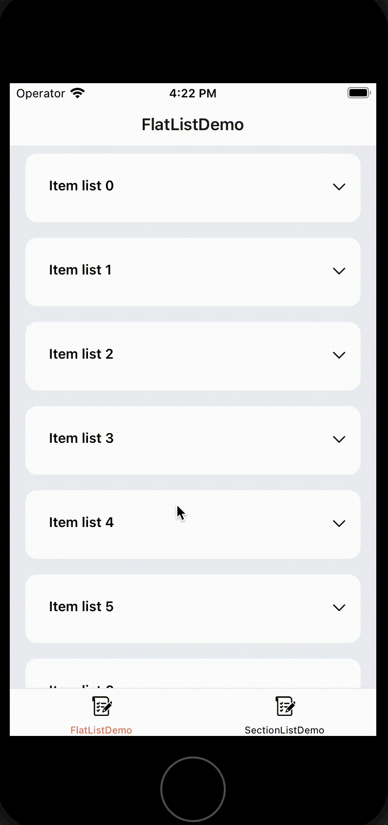
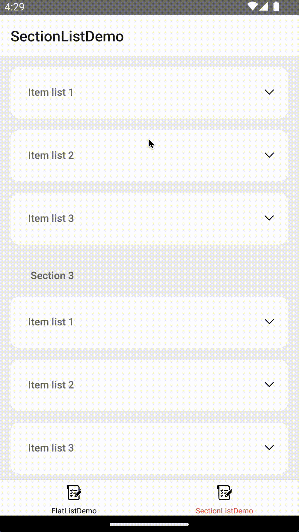
Demo
| Android | iOS |
| :-----------------------------------------------------------------------------------------------------------------------------: | :-----------------------------------------------------------------------------------------------------------------: |
|  |
|  |
|
|
|  |
|  |
|
Getting started
Installation
Install the package with npm.
npm install @redbluenat/react-native-expandable-flatlistor with yarn
yarn add @redbluenat/react-native-expandable-flatlistRun example
 cd example
 yarn install
 cd ios
 pod install
 cd ..
 yarn android or yarn ios
Flatlist Example
import React from 'react';
import {SafeAreaView, Text, View, Image, StyleSheet} from 'react-native';

import ExpandableList from '@redbluenat/react-native-expandable-flatlist';

const LIST_ITEMS = 25;

const FlatListDemo = () => {
  function generateData() {
    let data: string[] = [];
    for (let i = 0; i < LIST_ITEMS; i++) {
      data.push('Item list ' + i);
    }
    return data;
  }

  return (
    <SafeAreaView style={styles.container}>
      <ExpandableList
        sectionList={false}
        listData={generateData()}
        expandItemHeight={250}
        initialNumToRender={10}
        renderExpandListItem={({item}) => (
          <View style={styles.expandItemStyle}>
            <Text style={styles.expandText}>{item} expanded</Text>
            <Image source={require('../assets/leo.png')} style={styles.image} />
          </View>
        )}
        duration={500}
        defaultItemHeight={70}
        listItemStyle={styles.itemList}
        renderItem={({item}) => (
          <View style={styles.itemListContainer}>
            <View style={styles.leftItemSection}>
              <Text style={styles.itemText}>{item}</Text>
            </View>
            <View style={styles.rightItemSection}>
              <Image
                source={require('../assets/chevron.png')}
                style={styles.icon}
              />
            </View>
          </View>
        )}
      />
    </SafeAreaView>
  );
};

export default FlatListDemo;

const styles = StyleSheet.create({
  container: {backgroundColor: '#EFF0F4', flex: 1},
  scrollView: {
    height: '100%',
  },
  itemList: {
    backgroundColor: 'white',
    borderRadius: 12,
    marginVertical: 8,
    marginHorizontal: 16,
  },
  sectionListConfiner: {
    justifyContent: 'center',
    marginLeft: 24,
    flexDirection: 'row',
    marginTop: 24,
    marginBottom: 12,
  },
  itemListContainer: {
    justifyContent: 'center',
    marginLeft: 24,
    flexDirection: 'row',
    marginTop: 24,
    marginBottom: 12,
  },
  leftItemSection: {flex: 0.9},
  rightItemSection: {flex: 0.1},
  icon: {width: 20, height: 20},
  image: {width: 100, height: 100, marginTop: 10},
  itemText: {fontWeight: '600'},
  expandItemStyle: {
    marginLeft: 24,
    marginTop: 24,
    marginBottom: 12,
  },
  expandText: {fontSize: 20, fontWeight: 'bold'},
});
Section list Example
import React from 'react';
import {Text, View, Image, StyleSheet} from 'react-native';

import ExpandableList from '@redbluenat/react-native-expandable-flatlist';

const SectionListDemo = () => {
  return (
    <ExpandableList
      sectionList={true}
      sectionData={[
        {
          data: ['Item list 1', 'Item list 2', 'Item list 3'],
          title: 'Section 1',
        },
        {
          data: ['Item list 1', 'Item list 2', 'Item list 3'],
          title: 'Section 2',
        },
        {
          data: ['Item list 1', 'Item list 2', 'Item list 3'],
          title: 'Section 3',
        },
      ]}
      expandItemHeight={200}
      duration={500}
      renderExpandListItem={({item}) => (
        <View style={styles.expandItemStyle}>
          <Text style={styles.expandText}>{item} expanded</Text>
        </View>
      )}
      renderSectionHeader={title => (
        <View style={styles.sectionListConfiner}>
          <View style={styles.leftItemSection}>
            <Text style={styles.itemText}>{title}</Text>
          </View>
        </View>
      )}
      sectionListHeaderStyle={styles.sectionListConfiner}
      defaultItemHeight={70}
      sectionItemStyle={styles.itemList}
      listItemStyle={styles.itemList}
      renderItem={item => {
        return (
          <View style={styles.sectionListConfiner}>
            <View style={styles.leftItemSection}>
              <Text style={styles.itemText}>{item.item}</Text>
            </View>
            <View style={styles.rightItemSection}>
              <Image
                source={require('../assets/chevron.png')}
                style={styles.icon}
              />
            </View>
          </View>
        );
      }}
    />
  );
};

export default SectionListDemo;

const styles = StyleSheet.create({
  container: {backgroundColor: '#EFF0F4', flex: 1},
  scrollView: {
    height: '100%',
  },
  itemList: {
    backgroundColor: 'white',
    borderRadius: 12,
    marginVertical: 8,
    marginHorizontal: 16,
  },
  sectionListConfiner: {
    justifyContent: 'center',
    marginLeft: 24,
    flexDirection: 'row',
    marginTop: 24,
    marginBottom: 12,
  },
  itemListContainer: {
    justifyContent: 'center',
    marginLeft: 24,
    flexDirection: 'row',
    marginTop: 24,
    marginBottom: 12,
  },
  leftItemSection: {flex: 0.9},
  rightItemSection: {flex: 0.1},
  icon: {width: 20, height: 20},
  itemText: {fontWeight: '600'},
  expandItemStyle: {
    marginLeft: 24,
    marginTop: 24,
    marginBottom: 12,
  },
  expandText: {fontSize: 20, fontWeight: 'bold'},
});
Attributes
Properties for this component:
| Prop | Type | Default | Description |
| ------------------------------ | ------------ | ------------- | -------------------------------------------------------------------------------------------------------------------------------------------------------------------------------------------------- |
| sectionList (Required) | boolean | | Set to false makes the component uses a flat list, and set to true uses a section list. |
| expandItemHeight (Required) | number | | It is the value of the item when expanded. |
| defaultItemHeight (Required) | number | | It is the value of the item when not expanded. |
| sectionData | object | | Section list data {title: string; data:any[];}[] |
| listData | object | | Flatlist data:any[] |
| sectionItemStyle | style object | {} | Custom section item style. |
| listItemStyle | style object | {} | Custom flatlist item style. |
| sectionListHeaderStyle | style object | {} | Custom header section style. |
| duration | number | 500ms | Duration for expanding item. |
| easing | object | true | { x1: number; y1: number; x2: number; y2: number } Worklet that drives the easing curve for the animation. |
| onItemPress(isExpand: boolean) | function | | Callback for the item press. |
| renderItem | function | | Function for rendering the list item. |
| renderExpandListItem | function | | Function for rendering the expanded item. |
| renderSectionHeader | function | | Function for rendering the section header. |
Author & support
Natalia MS - Github