
@repomadness/theme-toggle
v0.0.4
Published
A custom theme toggle and provider for React apps
Downloads
30

Readme
repomadness theme toggle 🌗

A lightweight, framework-agnostic custom theme toggle and theme provider for React apps, powered by global CSS variables and the data-theme attribute for easy theming. Designed to isolate styling framework and app logic.
features
- easy plug-and-play in any React app
- toggles between
lightanddarkmodes - global CSS variaables via
data-themeondocument.documentElement - shared theme state across components with no need for a global state manager
- CSS framework agnostic - works with plain CSS or any styling solution
installation
Peer dependencies:
reactreact-dommotion
npm install @repomadness/theme-toggleusage
This package contains:
<ThemeProvider />- wrapper to apply theme based on thedata-themeattribute<ThemeToggle />- toggle switch that controls the theme state globallyuseTheme()- hook to programmatically access theme
ThemeProvider
Wrap your app with the ThemeProvider to apply the data-theme attribute (light or dark) to the <html> tag and manage your CSS variable state globally.
// main.tsx or App.tsx
import { ThemeProvider } from "@repomadness/theme-toggle";

<ThemeProvider>
  <App />
</ThemeProvider>;
ThemeToggle
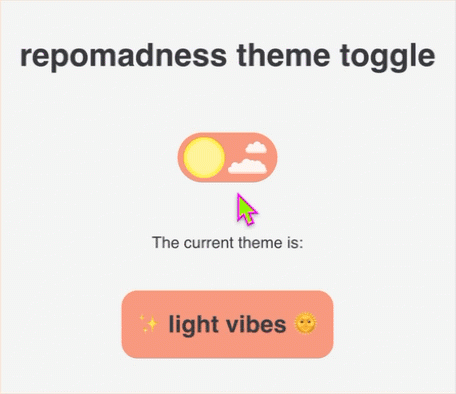
Give your app consumers the ability to control the theme state by adding the ThemeToggle component anywhere in your app.
// Settings.tsx
import { ThemeToggle } from "@repomadness/theme-toggle";

export default function Settings() {
  return (
    <div>
      <h1>App settings</h1>
      <ThemeToggle />
    </div>
  );
}
useTheme()
You can use the useTheme() hook to programmatically access the theme.
import { useTheme } from "@repomadness/theme-toggle";

const { theme, toggleTheme } = useTheme();

console.log(theme); // "light" or "dark"
toggleTheme(); // manually switch theme
style with CSS variables
Use [data-theme="light"] and [data-theme="dark"] to define your themes.
:root {
  --color-bg: white;
  --color-text: black;
}

[data-theme="dark"] {
  --color-bg: black;
  --color-text: white;
}

body {
  background-color: var(--color-bg);
  color: var(--color-text);
}
development
To run locally:
npm installTo run Storybook dev:
npm run storybookComponent and functional testing with Chromatic configured in chromatic.config.json. Tests can be ran locally via Visual Tests addon in Storybook.
For now, manual publishing to npm through CLI:
npm version patch
npm publish