@reusejs/react-components
v3.1.8
Published
React components for admonitions
Downloads
77


Readme
Admonition components
React components for admonitions
Definition
<Definition name="Definition name">

Definition text

</Definition>
This will generate a component that looks like this
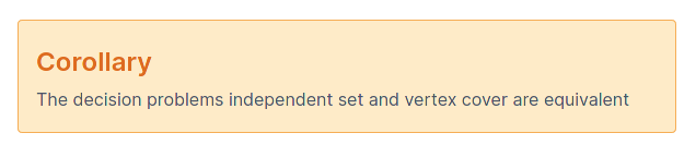
Corollary
I've never needed to add a title, so this just takes a child
<Corollary>

Definition text

</Corollary>
Which looks like this:
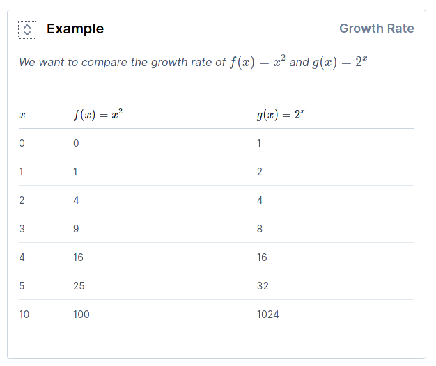
Example
The example component keeps the main text hidden until you toggle it. This keeps the amount of text on the page down, while allowing for more detail
<Example title="Title">

Content

</Example>
Closed this looks like:

Then on pressing the toggle it looks like:
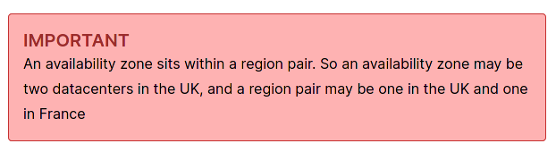
Important
Important is for important notes, so doesn't take a title
<Important>

An important note

</Important>
This looks like this:
Lemma
This doesn't have a title, but might need one at some point, raise an issue if it's required
Implemented like this
<Lemma>

Lemma text

</Lemma>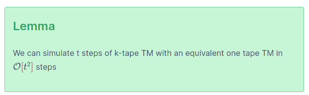
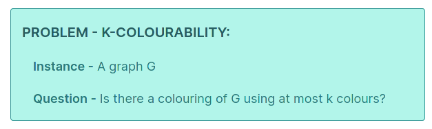
Problem
This is defined differently to the others, as all decision problems follow the same structure
<Problem name="k-colourability" instance="A graph G" question="Is there a colouring of G using at most k colours?"/>And looks like this:
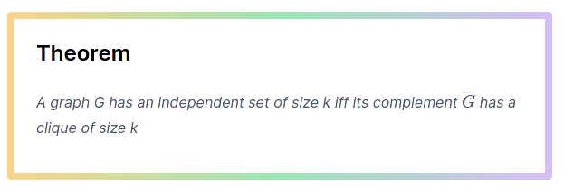
Theorem
Theorem has the option of name for adding a title, and takes the main content as a child like so:
<Theorem name="Theorem name">

Theorem content

</Theorem>
And looks like this: