
@rocketcamp/material-formbuilder
v0.0.10
Published
A form builder component library for Material UI
Downloads
20
Maintainers
 rocketcamp
Readme
material-formbuilder
A form builder component library for Material UI
Install
npm install --save @rocketcamp/material-formbuilderUsage
import React from "react";
import FormBuilder from "@rocketcamp/material-formbuilder";
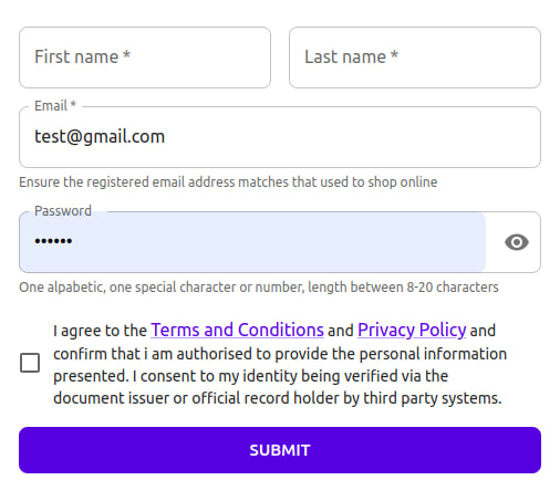
function RegistrationPage() {
const handleSubmit = (data) => {
// data in FormData format
};
return (
<FormBuilder
disabled={isLoading}
fields={[
{
name: "firstname",
label: "First name",
width: 1 / 2,
required: true,
},
{
name: "lastname",
label: "Last name",
width: 1 / 2,
required: true,
},
{
name: "email",
label: "Email",
type: "email",
required: true,
helper:
"Ensure the registered email address matches that used to shop online",
error: "Email is not valid",
},
{
name: "password",
label: "Password",
type: "password",
required: true,
helper:
"One alpabetic, one special character or number, length between 8-20 characters",
},
{
name: "agree",
type: "checkbox",
required: true,
label: "Checkbox label",
},
]}
handleSubmit={handleSubmit}
/>
);
}
export default RegisterPage;API
The FormBuilder component accepts the following properties:
disabled(boolean): Disables all form fields when set totrue.fields(array): An array of field configurations. Each field configuration object should have the following properties:name(string): The name of the field.label(string): The label text for the field.width(number): The width of the field as a fraction (e.g.,1/2for 50% width).required(boolean): Specifies whether the field is required or not.type(string, default: "text"): The type of the field. Valid types include:"text": Text input field."email": Email input field."password": Password input field."integer": Number input field."checkbox": Checkbox field."select": Select field.- Custom types: You can define custom types to extend the functionality of the library.
helper(string): Helper text to provide additional information or instructions for the field.error(string): Error message to display for the field when validation fails.
handleSubmit(function): A callback function that is called when the form is submitted. It receives the form data in FormData format as an argument.
Note: You can customize and extend the field types based on your requirements, add custom types, and enhance the functionality of the library as needed.