
@rupa-ui/react
v0.6.0
Published
Accessible React components for the Rupa design system, themed by @rupa-ui/tokens.

Maintainers
 raihanevanza_
Readme
@rupa-ui/react
Storybook · GitHub · @rupa-ui/tokens · @rupa-ui/react · @rupa-ui/react-native
Accessible React components for the Rupa design system, themed by @rupa-ui/tokens.
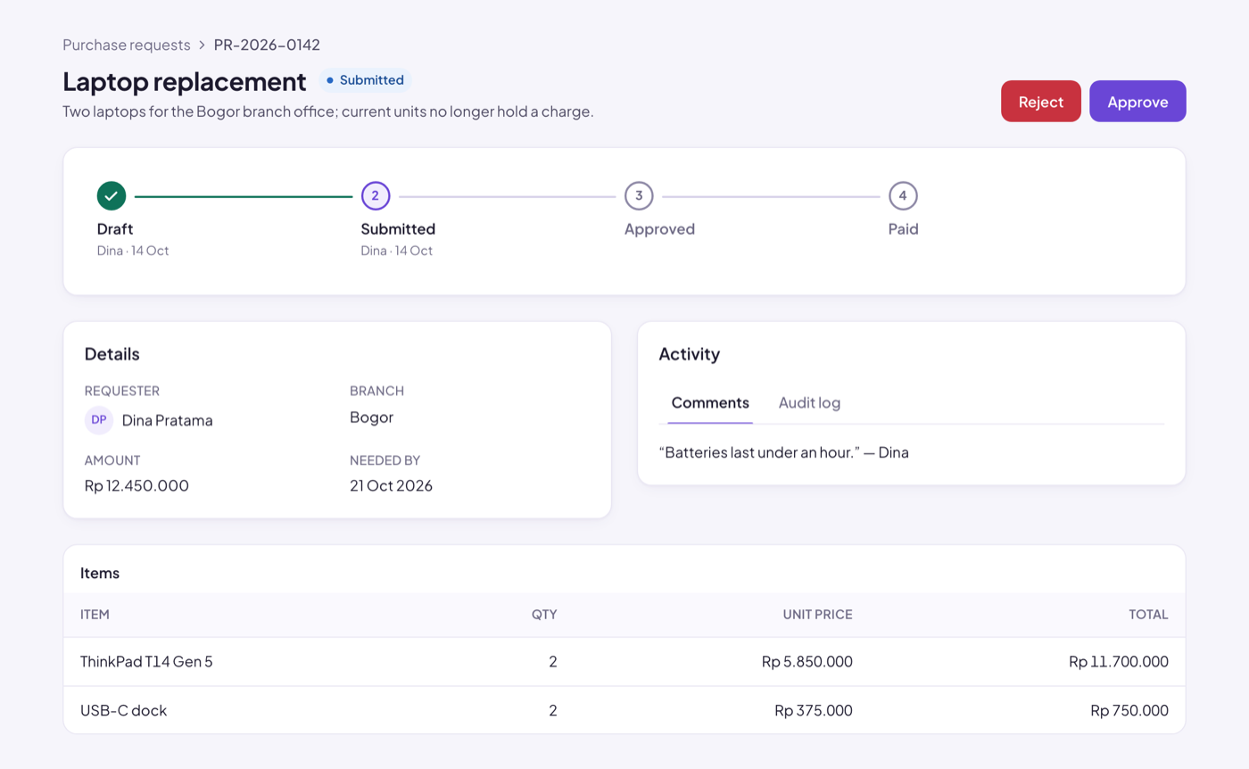
Live examples in Storybook: every component and variant, with controls, in every brand and mode (toolbar).
npm install @rupa-ui/reactimport '@rupa-ui/react/styles.css' // tokens + components
import '@rupa-ui/react/base.css' // optional document defaults
import { Button, ConfirmDialog, ToastProvider, useToast } from '@rupa-ui/react'Set the brand and mode on <html data-brand="violet" data-theme="dark">, or use ThemeProvider / useTheme().
Components: Alert, Avatar, Badge, Button, Card, Checkbox, ConfirmDialog, Dialog, Field, IconButton, InfoList, Input, Meter, MultiSelect, NativeSelect, PageHeader, Pagination, Segmented, Select, Skeleton, Spinner, StateView, StatusFlow, Switch, Table, Tabs, Textarea, TextField, Toast, Tooltip.
- WCAG 2.2 AA: axe-clean in every theme, keyboard-tested, visible focus, 44 px touch targets.
- Every built-in label can be replaced through props (for bilingual apps).
- ESM, tree-shakable per component (
Buttonalone is under 1 kB), React 18 and 19,'use client'for Next.js.
Docs and live examples: Rupa Storybook.