
@rupa-ui/tokens
v0.2.2
Published
Design tokens for Rupa: multi-brand colors with light and dark modes, typography, spacing, and chart palettes, for CSS, Tailwind, JS, and React Native.

Maintainers
 raihanevanza_
Readme
@rupa-ui/tokens
Storybook · GitHub · @rupa-ui/tokens · @rupa-ui/react · @rupa-ui/react-native
Design tokens for the Rupa design system: three brands (violet, signal, latte) × light and dark modes, typography, spacing, radius, shadows, motion, and validated chart palettes.
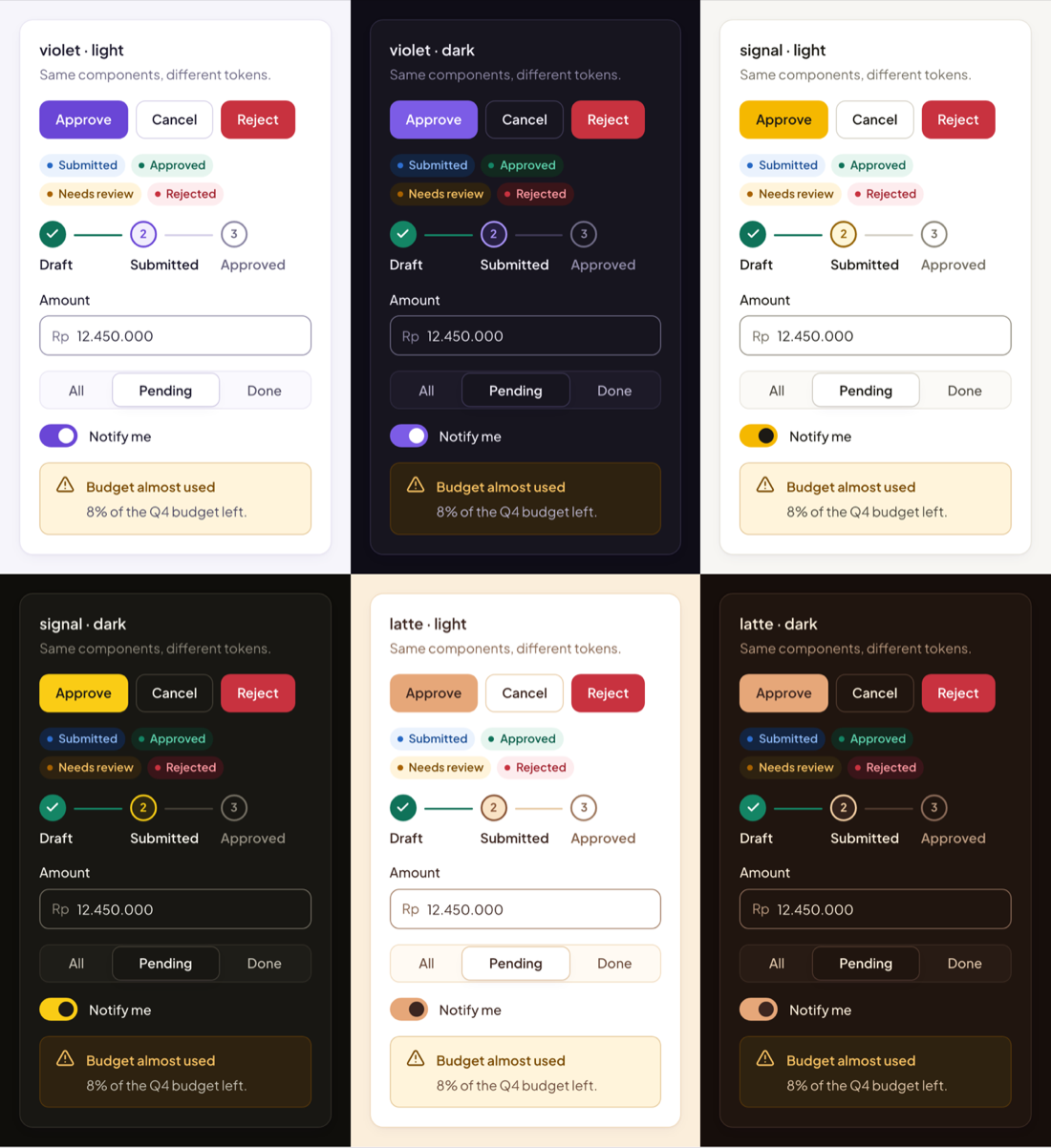
See every token in Storybook: colors, type, spacing, radius, shadows, and chart palettes, plus all brands and modes on one page.
npm install @rupa-ui/tokensCSS
@import '@rupa-ui/tokens/css';

.card {
  background: var(--rupa-color-surface);
  color: var(--rupa-color-ink);
  border-radius: var(--rupa-radius-xl);
  box-shadow: var(--rupa-shadow-card);
}
Theme with attributes on any element (nesting works):
<html data-brand="signal" data-theme="dark"></html>data-theme: light | dark | system. The .dark class works too.
Tailwind
/* v4 */
@import 'tailwindcss';
@import '@rupa-ui/tokens/css';
@import '@rupa-ui/tokens/tailwind/v4.css';
// v3: tailwind.config.js
import rupa from '@rupa-ui/tokens/tailwind/preset'
export default { presets: [rupa], content: ['./src/**/*.{ts,tsx}'] }JavaScript
import { colors, tokens, cssVar } from '@rupa-ui/tokens'

colors.violet.dark.primary // '#7c5ce6'
cssVar('color-ink') // 'var(--rupa-color-ink)'
React Native
Ready-made components on these tokens: @rupa-ui/react-native.
import { palettes, font, space, shadows } from '@rupa-ui/tokens/react-native'

const p = palettes.signal.dark
const styles = StyleSheet.create({
  title: { color: p.ink, ...font('semibold'), padding: space['4'] },
  card: { backgroundColor: p.surface, boxShadow: shadows.signal.dark.card },
})
Guarantees
Checked on every build: text pairs ≥ 4.5:1, UI pairs ≥ 3:1 in every brand and mode; chart series pass lightness, chroma, color-vision-deficiency separation, and 3:1 against the surface.
Requires browsers with light-dark() (Chrome/Edge 123+, Firefox 120+, Safari 17.5+).