
@sakit-sa/react-button
v1.1.0
Published
This is a button component for React
Downloads
25
Maintainers
 saeed.abdilar
Readme
@sakit-sa/react-button
Simple, easy button for React

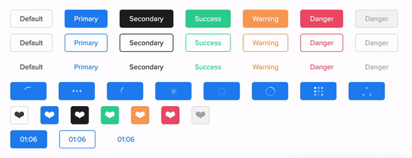
Button
Live Playground
For examples of the react-button in action, go to https://abdilar.github.io/react-button.
OR
To run that demo on your own computer:
- Clone this repository
npm installnpm run storybook- Visit http://localhost:6006/
Getting Started
Install
npm install @sakit-sa/react-buttonUsage
import React from 'react';

import Button, {SPINNER, COLOR, TARGET, ROUNDED, SIZE, TYPE, VARIANT} from '@sakit-sa/react-button';
import '@sakit-sa/react-button/dist/index.css';

const App = () => (
  <Button>Button</Button>
);
Props
Name | Type | Default | Description
-----|------|-------|-----
isLoading|boolean|false|Boolean value to control whether the spinner is shown.
spinnerClasses|object|{}|Apply classes to the control spinner.
spinnerName|string|uikit|Specifies the name of the spinner (name includes: uikit, puff, grid, oval, rings, ball-triangle, tail-spin, three-dots).
spinnerRatio|number|-|Specifies the size of the spinner.
activeTimer|boolean|false|Boolean value to control whether the countdown timer is shown.
time|number|0|The value of the timer base on second.
timeClasses|object|{}|Apply classes to the control countdown timer.
timeFormat|string|MM:SS|Formats a time value.
className|object|{}|Apply classes to the control button.
size|string|small|Specifies the size of the button (size includes: small, medium, large, xlarge).
id|string|react-button-[randomNumber]|The unique identifier for the component.
round|string|low|Specifies the round border of the button. (round includes: empty, low, more, fully).
type|string|button|Specifies the type of the button. (type includes: button, submit, reset).
variant|string|contained|Specifies the variant of the button. (variant includes: contained, outlined, text).
color|string|primary|Specifies the color of the button. (color includes: primary, secondary, success, danger, warning, default).
href|string|-|Sets a hyperlink and uses anchor tag instead of a button.
hrefTarget|string|_blank|Specifies the target of anchor tag. (hrefTarget includes: _blank, _self, _parent, _top).
isIcon|boolean|false|Boolean value to control whether is the icon button.
disabled|boolean|false|Boolean value to control the button is disabled.
animatable|boolean|false|Boolean value to show an animation effect when clicking on the button.
children*|node|- (Required)|Contents to be displayed within root element.
onClick|function|-|Trigger when Clicking on the button.
onCompleteTime|function|-|Trigger when countdown timer is zero.
className Token
button content
See examples for more information (go to https://abdilar.github.io/react-button/?path=/story/theme-prop--class-name)
spinnerClasses Token
wrapper spinner
See examples for more information (go to https://abdilar.github.io/react-spinner/?path=/story/theme-prop--class-name)
timeClasses Token
wrapperClass symbolClass digitClass hourClass minuteClass secondClass hourWrapperClass minuteWrapperClass secondWrapperClass
See examples for more information (go to https://abdilar.github.io/countdown-timer/?path=/story/theme--class-name)
License
MIT Licensed. © Copyright Saeed Abdilar