
@salilvnair/dui
v1.0.17
Published
Daakia UI component library — shared across ck8t and daakia
Downloads
1,710

Maintainers
 salilvnair
Readme
@salilvnair/dui
Daakia UI — a React 19 + TypeScript component library of 281 components, every colour a CSS variable, and a Monaco-backed editor you only pay for if you use it.




Live demo · Component catalog · Theming · Changelog

Ninety seconds of it. The full walkthrough is here as an mp4, and the thing itself is live — every component has a playground, examples you can copy, and a props table.
Table of contents
- Why this exists
- Install
- Quick start
- What you get
- Component catalog
- Theming
- The code editor — Monaco is optional
- Extending MarkdownView's language support
- TypeScript
- Local development
- Screenshots, video and the demo site
- Publishing to npm
- License
Why this exists
DUI was extracted from daakia and ck8t so the two could stop maintaining the same forty components twice. That origin is visible in what it is good at — dense, professional, tool-shaped UI: tables that sort, panels that split, an editor that takes breakpoints, a file browser, a props table, a request flow. It is not a marketing-site kit.
Three things follow from being a library two real apps depend on:
- Nothing is a hard dependency that does not have to be. Monaco,
vis-network and the rest are optional peers.
dist/index.jscontains zero references to any of them, and that is checked at release, not just claimed. - Retheming is a colour change, not a fork. Every token is a
--color-*custom property. Override a variable on:root, or on one container to theme a single panel differently. - One size prop, threaded through everything.
xxs–xxxlset once on<DuiProvider>, overridable per instance, consistent between a button and the select next to it.
Install
npm install @salilvnair/dui react react-dom zustandImport the stylesheet once, in your app's entry point:
import '@salilvnair/dui/style.css';Quick start
import { DuiProvider, ButtonView, TextInputView } from '@salilvnair/dui';
import '@salilvnair/dui/style.css';

export function App() {
  const [value, setValue] = useState('');
  return (
    <DuiProvider size="md">
      <TextInputView placeholder="Search…" value={value} onChange={setValue} />
      <ButtonView variant="primary" onClick={handleSubmit}>Submit</ButtonView>
    </DuiProvider>
  );
}
DuiProvider is optional — every component works standalone with sensible
defaults. Wrap your app in it when you want one place to set the default size
or accent colour for the whole tree.
What you get
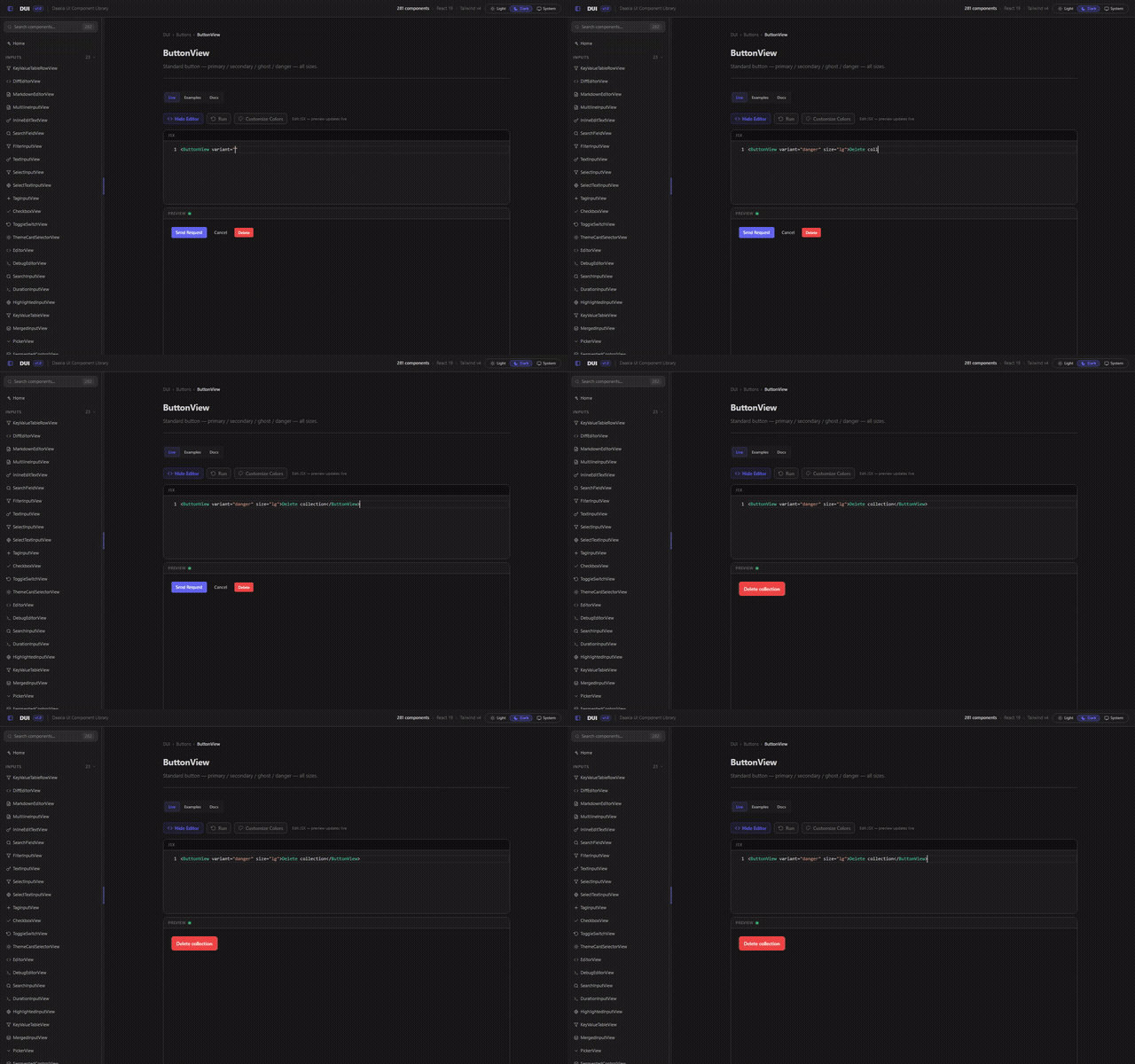
A playground on every component
Every one of the 281 components opens on an editable JSX snippet with a live preview under it. Change a prop, see it, copy the line out.
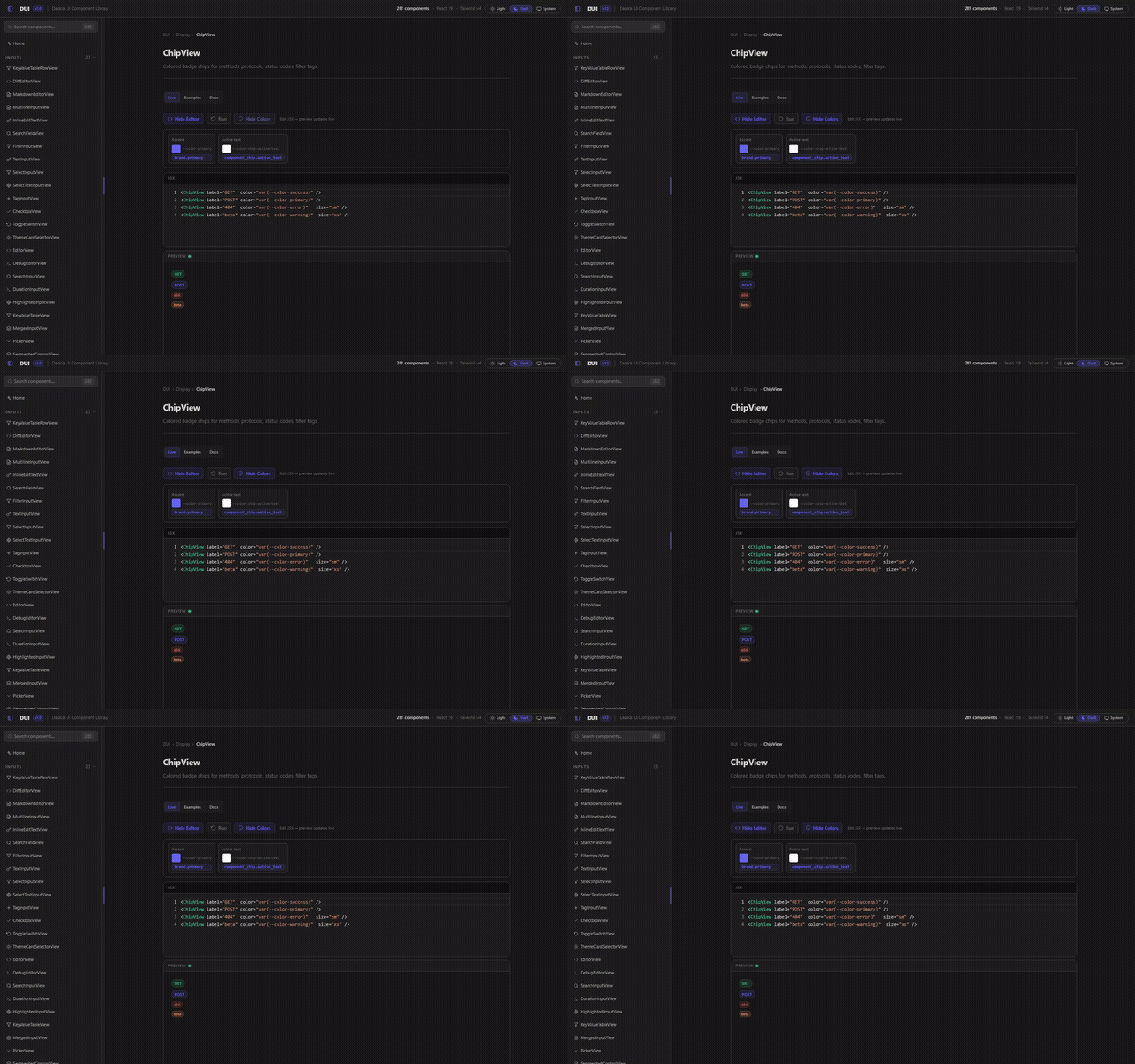
Every colour is a variable
Theming is not a config file you rebuild — it is a CSS custom property. The showcase exposes the variables each component reads, so you can drag one and watch what it touches before writing a line.
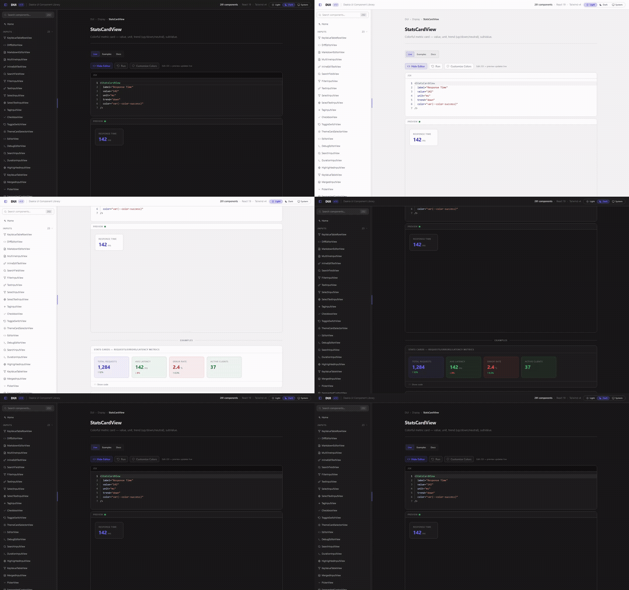
Light and dark, both first-class
Not a dark theme with a light afterthought. Every token is defined for both
grounds, and the switch is a data-theme attribute.
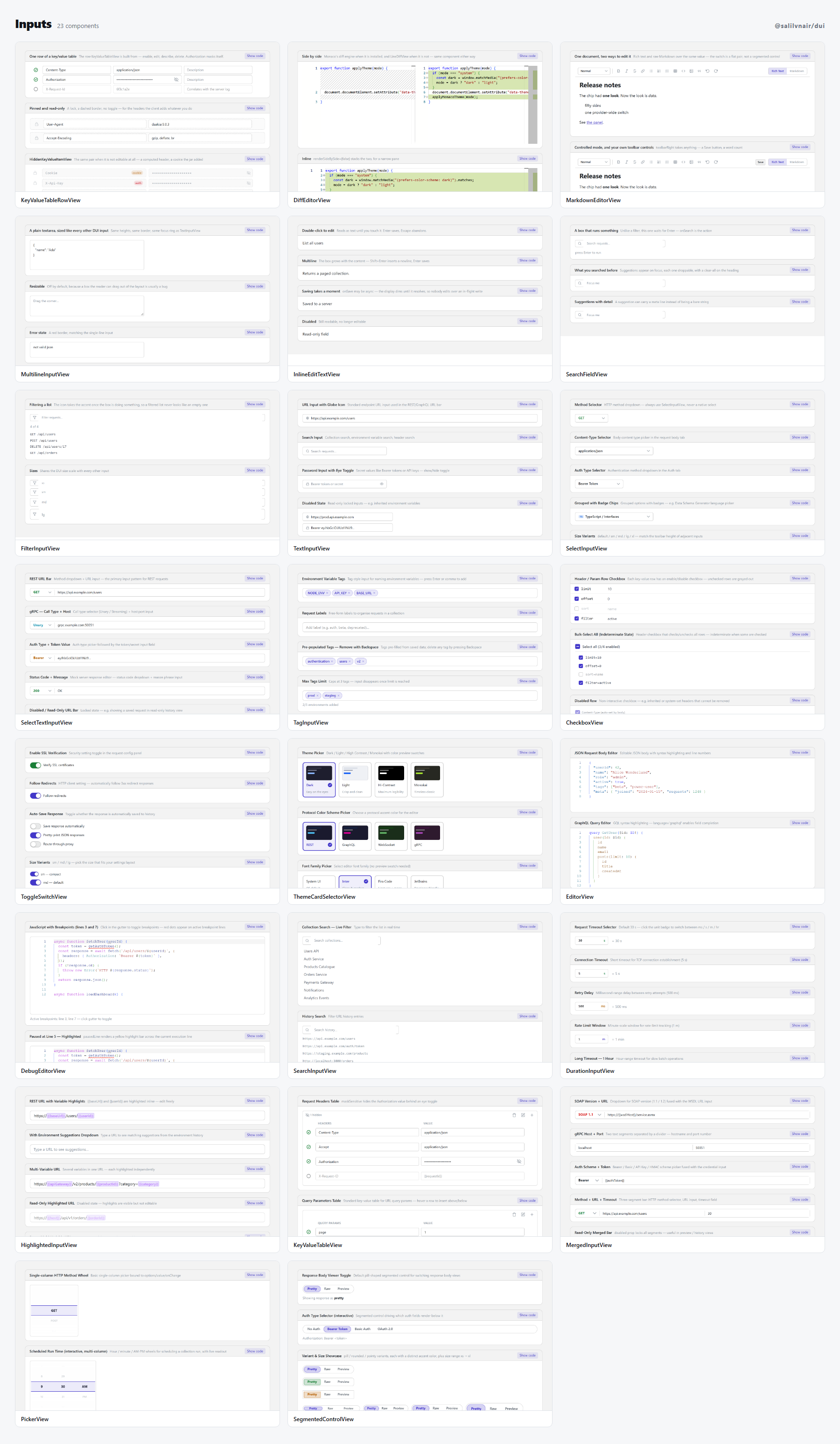
Every group has a light contact sheet too, in
media/sheets-light/ —
the same components, the same captures, the other theme. Two of them:
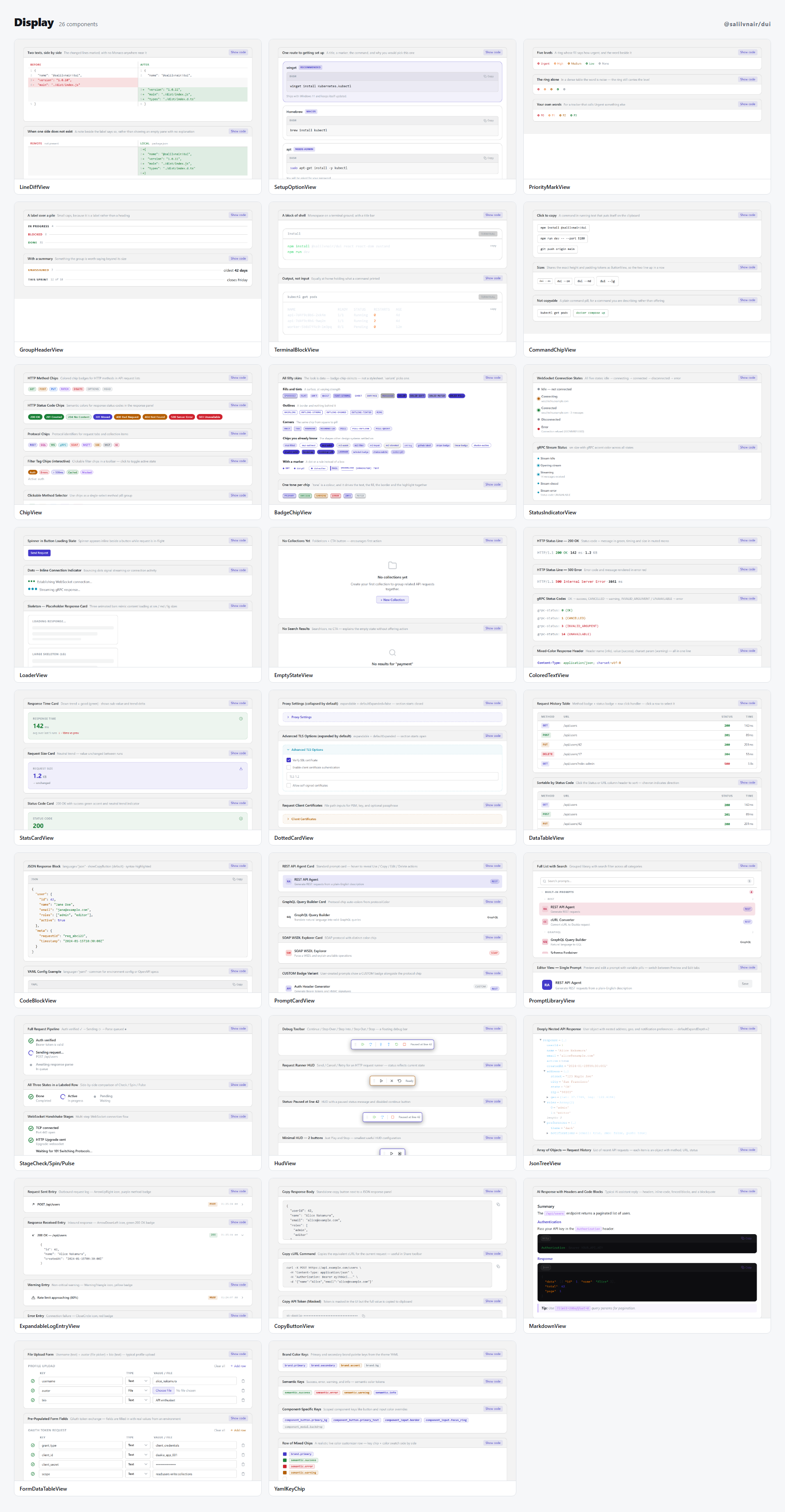
Or add ?theme=light to any component's address in the
live demo.
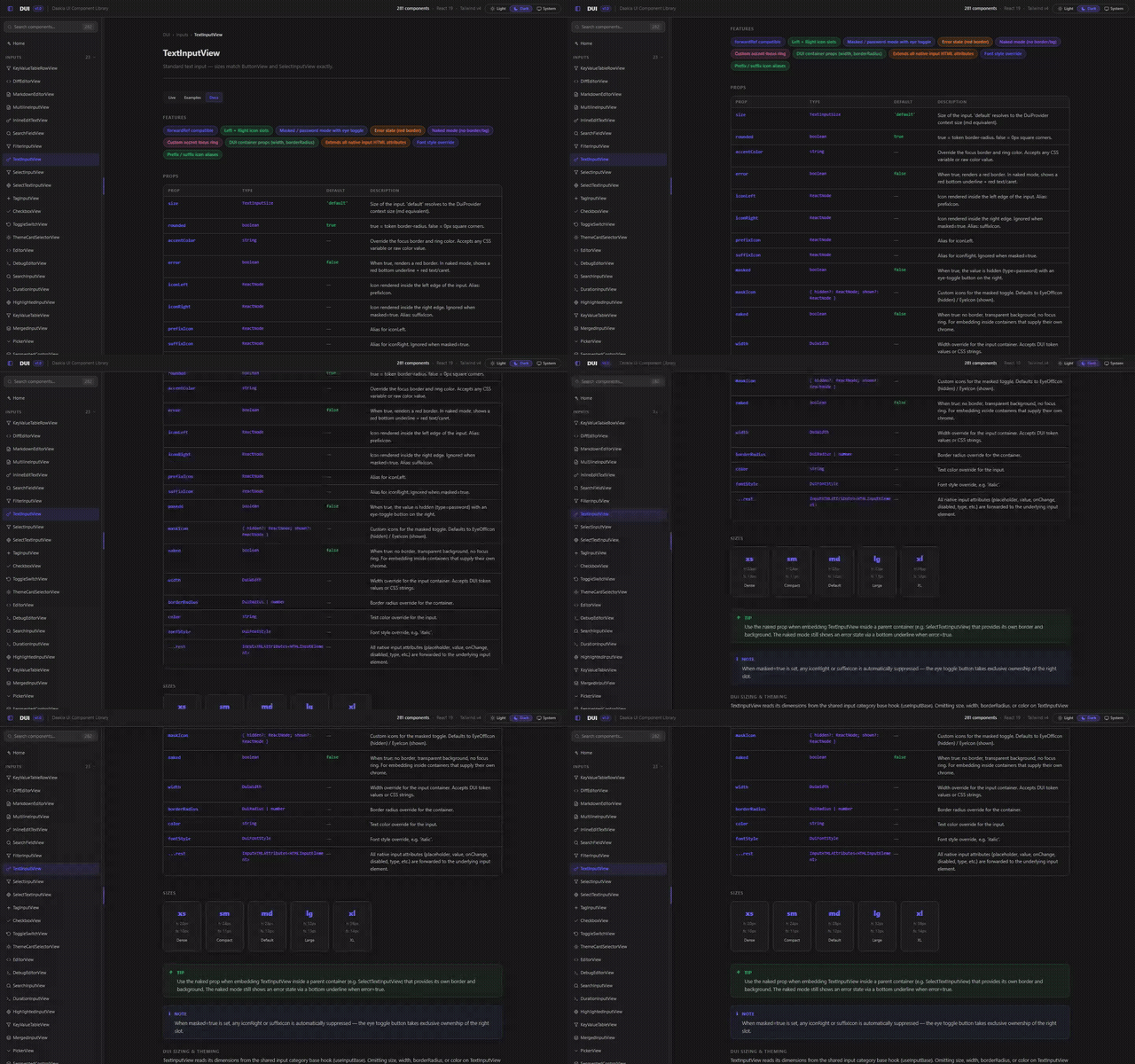
Every prop documented, in the app
Each component carries its own props table — name, type, default, and what it does — beside the examples rather than in a separate site that drifts.
And the rest of it
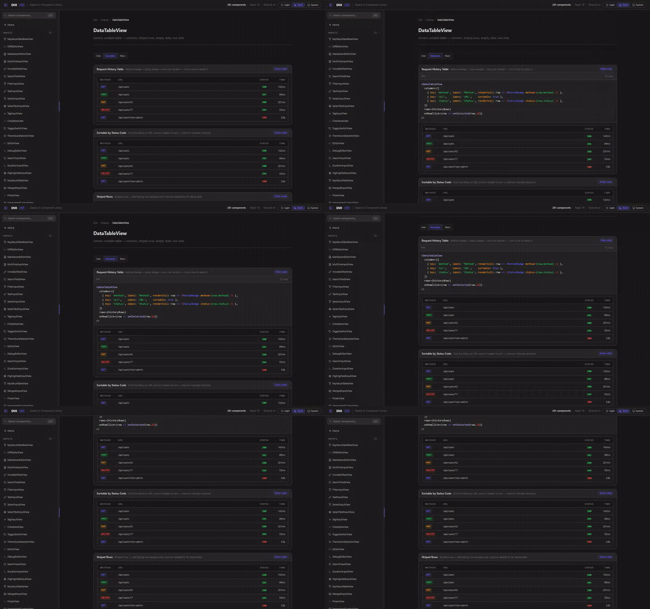
Tables and data grids — sorting, sticky headers, editable cells, column visibility, pagination, virtualisation.
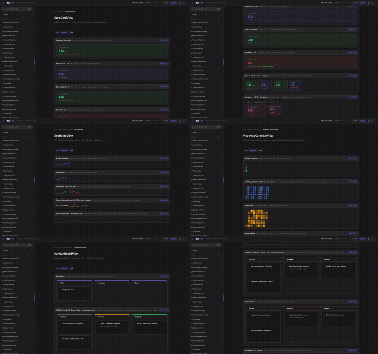
Dashboards — stat cards, sparklines, heatmap calendars, a kanban board.
Overlays — modals that stack themselves, drawers off any edge, popovers, tooltips, action sheets, a spotlight tour.
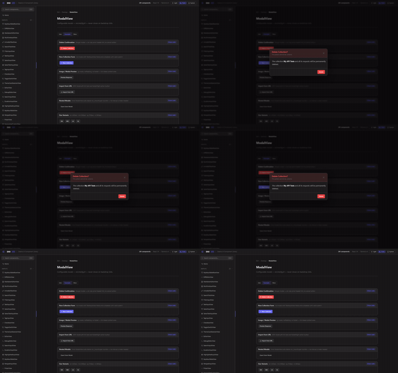
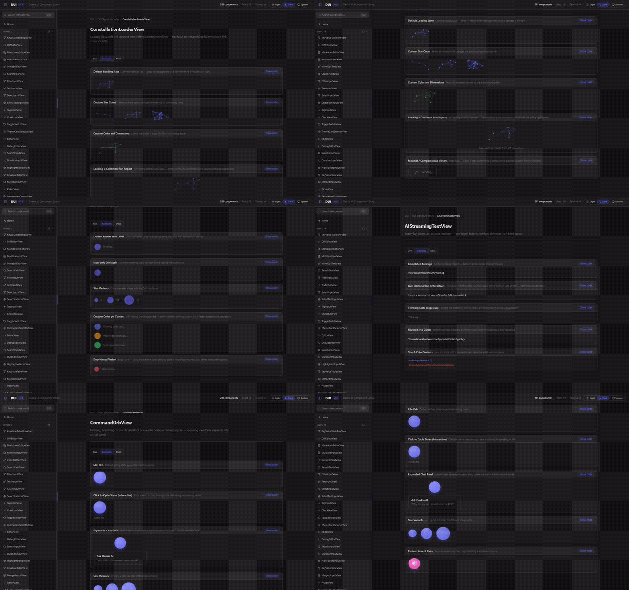
Motion — loaders, streaming text, a command orb, and the signature series.
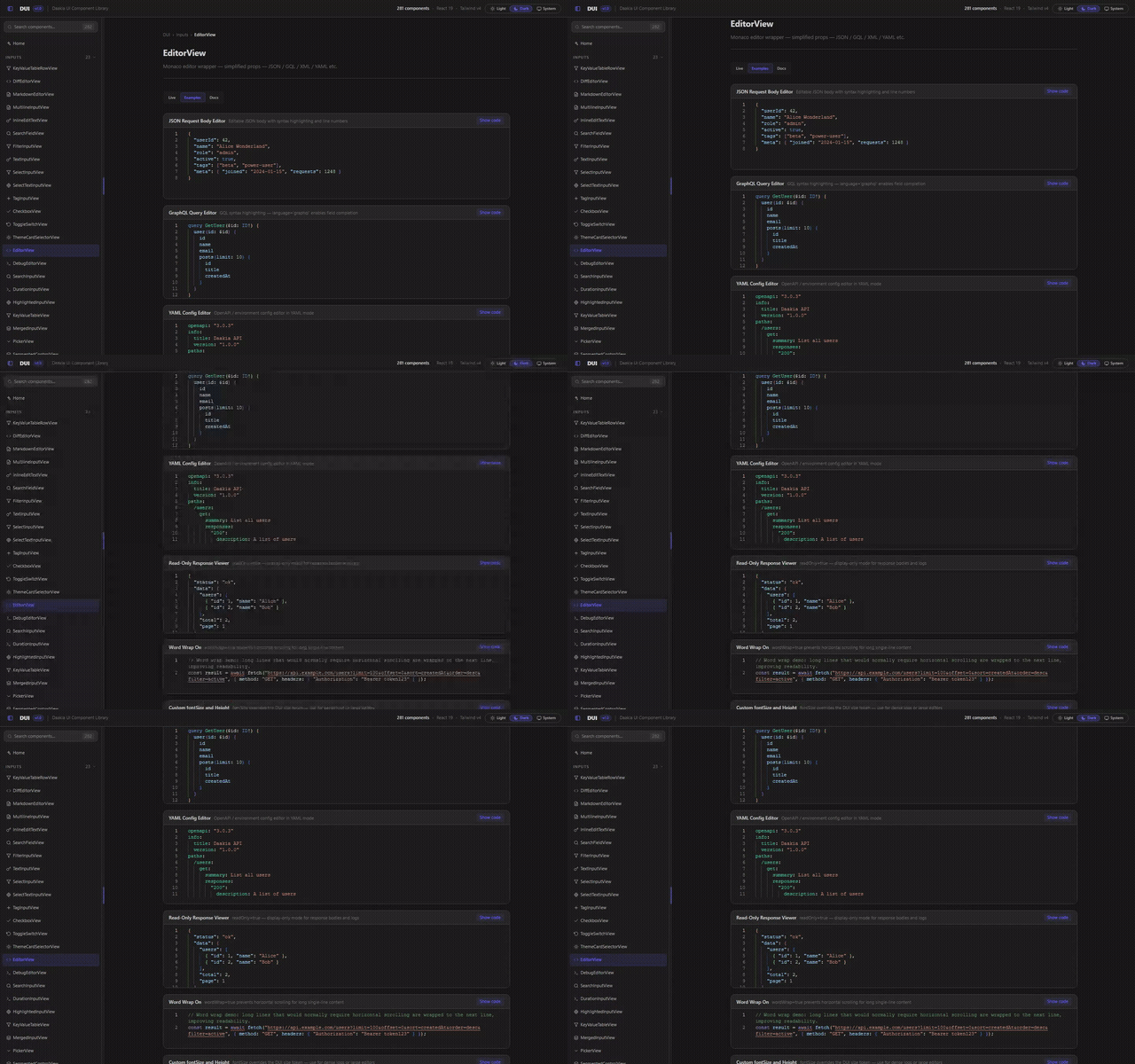
The editor, with Monaco installed or without it — see Monaco is optional.
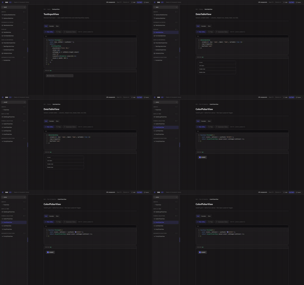
All 281 of them, searchable — the showcase's sidebar is the fastest way to find the component you half-remember.
Component catalog
281 components across 18 groups. Every name links to that component running in the live demo; every group opens to a contact sheet and a table of what is in it.
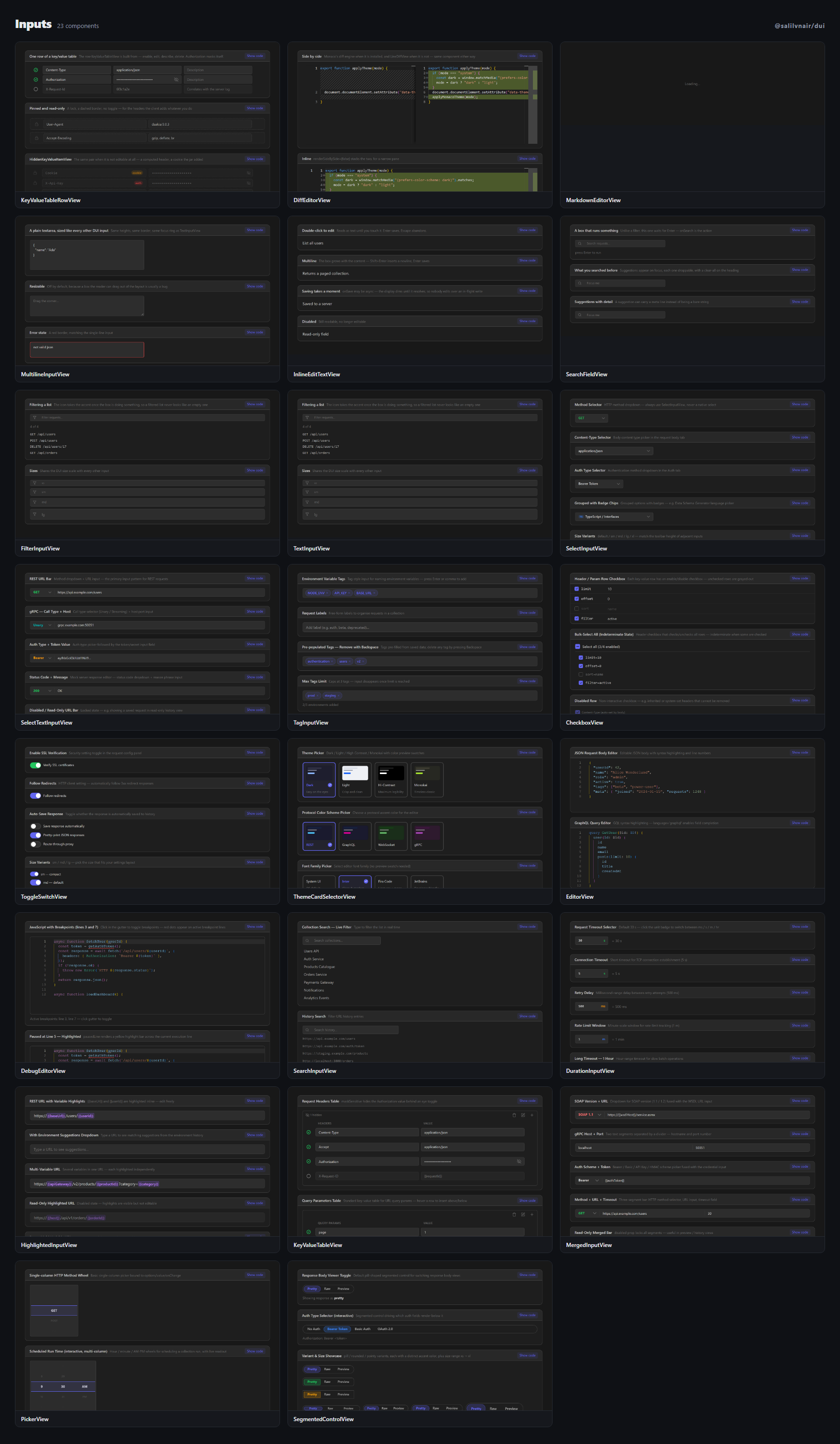
| Component | What it is |
| --- | --- |
| KeyValueTableRowView | The row KeyValueTableView is built from, exported on its own — and HiddenKeyValueItemView, the same pair when it cann… |
| DiffEditorView | The diff twin of EditorView — a line diff out of the box, upgrading itself to Monaco the moment a consumer opts in. |
| MarkdownEditorView | A rich editor over one Markdown document — rich text and raw source over the same value, and dialogs the host cannot… |
| MultilineInputView | The textarea wearing the same clothes as the rest of the input family — same heights, border and focus ring. |
| InlineEditTextView | A field that does not look like one — reads as text until double-clicked, and its onSave may be async. |
| SearchFieldView | The filter box's sibling that runs something — Enter acts, and it offers what you searched before. |
| FilterInputView | The box above a list that narrows it — acts on every keystroke, and keeps saying it is a filter rather than a search. |
| TextInputView | Standard text input — sizes match ButtonView and SelectInputView exactly. |
| SelectInputView | Portal dropdown with keyboard nav — replaces all StyledDropdown usages. |
| SelectTextInputView | Combined method selector + URL input in one bordered pill — URL bar pattern. |
| TagInputView | Multi-value tag input — Enter or comma to add, Backspace to remove. |
| CheckboxView | Checkbox — checked / unchecked / indeterminate / disabled — with accent colors. |
| ToggleSwitchView | On/off toggle with sm/md/lg sizes, accent color, label positions, disabled state. |
| ThemeCardSelectorView | Card-based theme picker with color swatch previews and checkmark selection. |
| EditorView | Monaco editor wrapper — simplified props — JSON / GQL / XML / YAML etc. |
| DebugEditorView | Monaco editor with breakpoint gutter, paused-line highlight, and variable-hover tooltips. |
| SearchInputView | URL-bar style search input with optional prefix icon and suffix clear button. |
| DurationInputView | Number input with ms / s / m / hr unit selector dropdown. |
| HighlightedInputView | {{variable}} highlighted URL input with autocomplete dropdown — the Daakia URL bar. |
| KeyValueTableView | KV table — toolbar · add/delete/bulk-clear · enable toggle · maskSensitive · autocompleteKeys · showDescription · pin… |
| MergedInputView | Unified single-border input bar — merge select dropdowns, text inputs, inline buttons, and dividers into one pill. |
| PickerView | Scrollable wheel picker — single column or multi-column (hour/min/AM-PM) — momentum scroll, snap, and depth-fade anim… |
| SegmentedControlView | Pill-shaped segmented control — solid sliding indicator with a springy bounce transition — pill / rounded / pointy sh… |
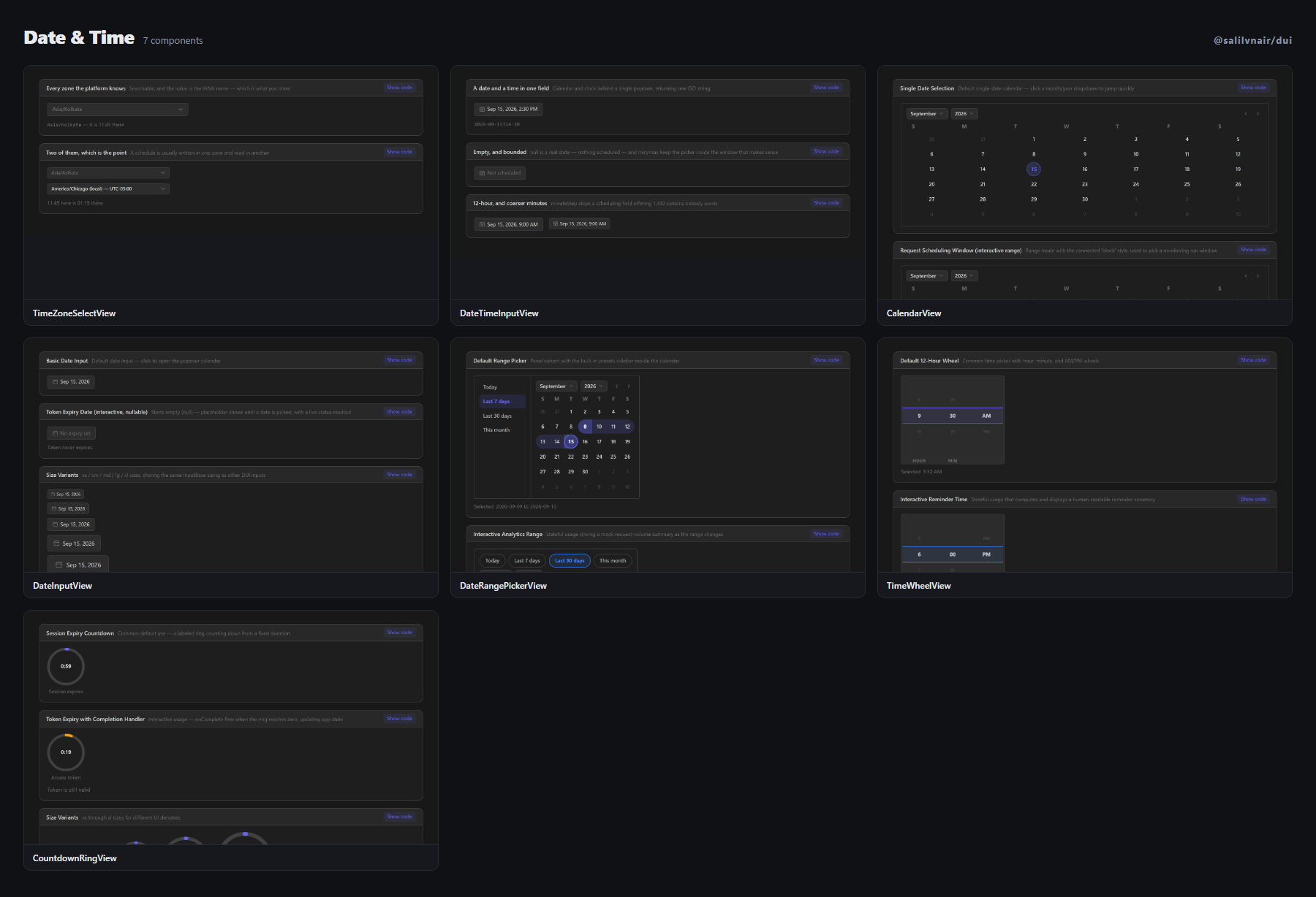
| Component | What it is |
| --- | --- |
| TimeZoneSelectView | Every zone the platform knows, searchable — from the platform rather than a bundled table, so it does not go stale. |
| DateTimeInputView | A date and a time in one field, returning one ISO string — with null as a real state rather than an empty one. |
| CalendarView | Month grid calendar — single / range / multi select, min/max bounds, animated month transitions. |
| DateInputView | Text field trigger + CalendarView popover — the standard date field pattern. |
| DateRangePickerView | Range calendar + quick presets (Today / Last 7 days / Last 30 days / This month). |
| TimeWheelView | Prop-driven wrapper over PickerView columns for hour/minute/AM-PM — 12h or 24h mode, configurable minute step. |
| CountdownRingView | Circular countdown ring + digit readout — target Date or durationSeconds, onComplete callback. |
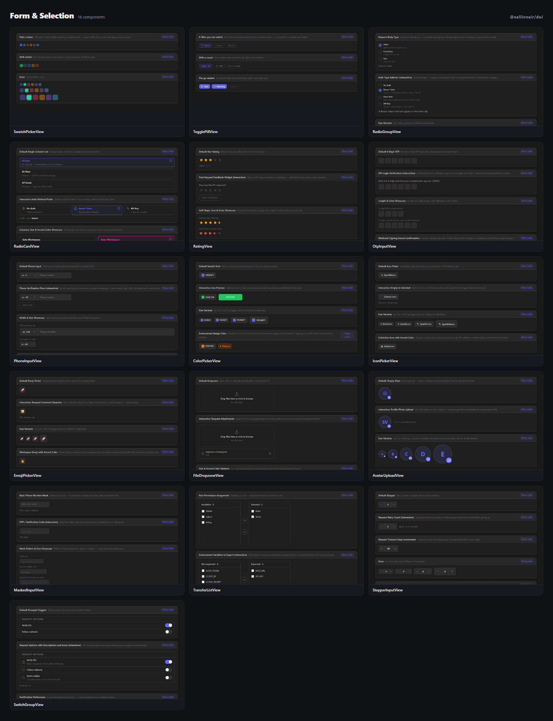
| Component | What it is |
| --- | --- |
| SwatchPickerView | Choosing between things identified by colour. |
| TogglePillView | A chip that is a control — the pill above a list that switches one facet on and off, with an optional count inside it. |
| RadioGroupView | Radio list with optional descriptions — vertical or horizontal layout. |
| RadioCardView | Big selectable cards — plan pickers, mode selectors — grid layout via columns. |
| RatingView | Star or heart rating input — half-step precision, hover preview, read-only mode. |
| OtpInputView | Auto-advance OTP/PIN boxes — paste splits across cells, onComplete callback. |
| PhoneInputView | Country-code select + number field in one bordered pill. |
| ColorPickerView | Swatch grid + native hue canvas + hex input, popover trigger. |
| IconPickerView | Searchable grid over every DUI icon — popover trigger. |
| EmojiPickerView | Categorized emoji grid with search — popover trigger. |
| FileDropzoneView | Drag-drop upload zone — per-file progress bars, remove action. |
| AvatarUploadView | Circular avatar preview with a camera-overlay upload button. |
| MaskedInputView | Pattern-masked text input — 9=digit, A=letter, *=any, literal separators auto-insert. |
| TransferListView | Dual listbox — available ↔ selected — move one or move-all controls. |
| StepperInputView | Numeric +/- stepper — iOS UIStepper pattern — min/max/step. |
| SwitchGroupView | Settings.app-style grouped toggle rows — section header, per-row description, disabled state. |
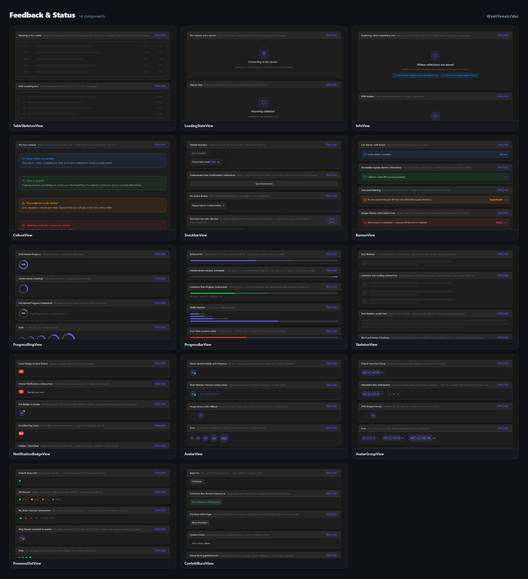
| Component | What it is |
| --- | --- |
| TableSkeletonView | The placeholder a table shows while its rows load — declared with the same column widths, so nothing jumps when the d… |
| LoadingStateView | The screen shown while something is fetched — the subject drawn large, and a component that says so itself once the w… |
| InfoView | An explanatory block for settings and empty states — what this is, and where on disk it lives, with paths as pills ra… |
| CalloutView | The titled block that interrupts a page to say something the reader needs — info, tip, warning, danger. |
| SnackbarView | Single-line bottom bar + action, auto-dismiss timer pauses on hover — distinct from the stacked-corner ToastView. |
| BannerView | Persistent dismissible top strip — info / success / warning / danger variants. |
| ProgressRingView | Circular determinate/indeterminate progress — distinct from GaugeView (metric gauge). |
| ProgressBarView | Linear progress — buffer fill and striped-indeterminate variants. |
| SkeletonView | Composable shimmer primitives — text / block / avatar / row — for custom loading layouts. |
| NotificationBadgeView | Dot/count badge overlay anchor for icons and avatars. |
| AvatarView | Image or initials fallback, with an optional presence-status dot. |
| AvatarGroupView | Stacked overlapping avatars with a "+N" overflow bubble. |
| PresenceDotView | Tiny online/away/busy/offline status primitive. |
| ConfettiBurstView | Canvas confetti burst triggered imperatively via ref — fire() from any event handler. |
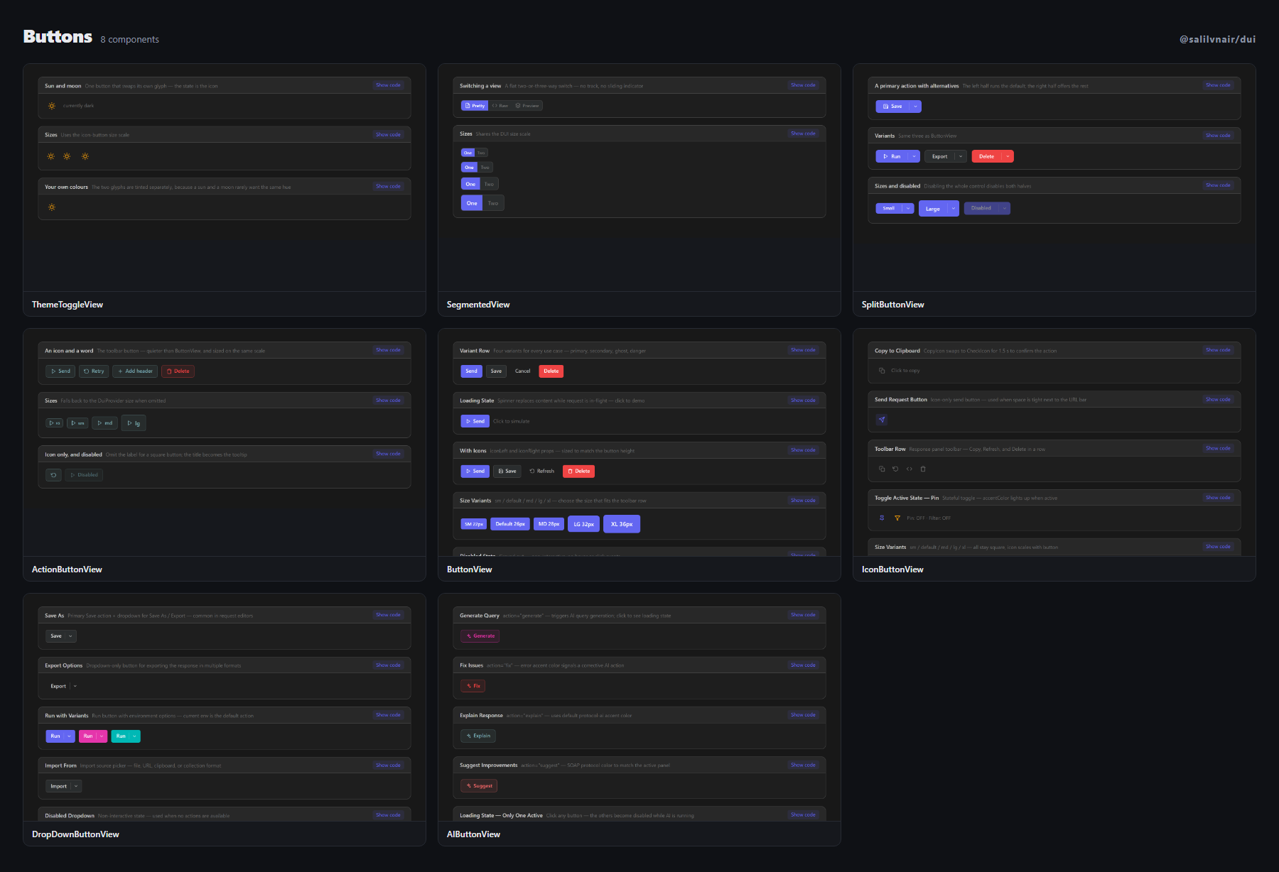
| Component | What it is |
| --- | --- |
| ThemeToggleView | One button, two states — the sun and the moon tinted independently, for a header with no room for three segments. |
| SegmentedView | The flat cousin of SegmentedControlView — no track, no sliding indicator, for switching a view rather than operating… |
| SplitButtonView | A default action and its close relatives in one control — Save, with Save As and Export behind the chevron. |
| ActionButtonView | The toolbar button — quieter than ButtonView, louder than IconButtonView, and sized on the same scale as both. |
| ButtonView | Standard button — primary / secondary / ghost / danger — all sizes. |
| IconButtonView | Square icon-only buttons — ghost / filled — toggle support — all sizes. |
| DropDownButtonView | Split button — primary action + chevron dropdown — Save as, Export as, etc. |
| AIButtonView | AI action button — generate · fuzz · explain · fix · ask · suggest — loading state. |
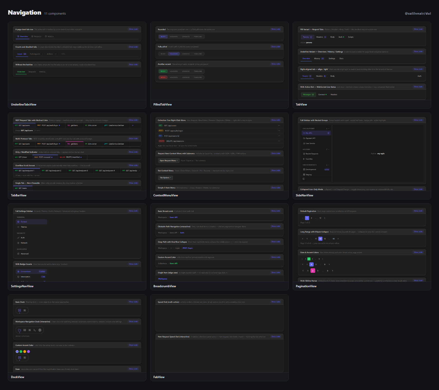
| Component | What it is |
| --- | --- |
| UnderlineTabsView | The page-level tab row — active marked by a rule rather than a box, with counts beside the labels. |
| PilledTabView | A compact tab row for inside a panel — a filled pill marks the active one, rounded or fully pilled. |
| TabView | pill · underline variants — sliding indicator, badges, dots — all with accentColor. |
| TabBarView | Editor-style protocol tab bar — store-free, drag-free, scroll arrows, dirty dot. |
| ContextMenuView | Recursive context menu with submenus — portal rendered — collection tree style. |
| SideNavView | Collapsible left sidebar nav with nested items and icon-only collapse mode. |
| SettingsNavView | Settings-style grouped nav with badges, descriptions, active state. |
| BreadcrumbView | Path breadcrumb trail with overflow-collapse into a "…" for long paths. |
| PaginationView | Page number control with ellipsis collapse for long ranges. |
| DockView | Floating icon dock — icons magnify as the cursor approaches. |
| FabView | Floating action button — standard, extended (with label), or speed-dial with sub-actions. |
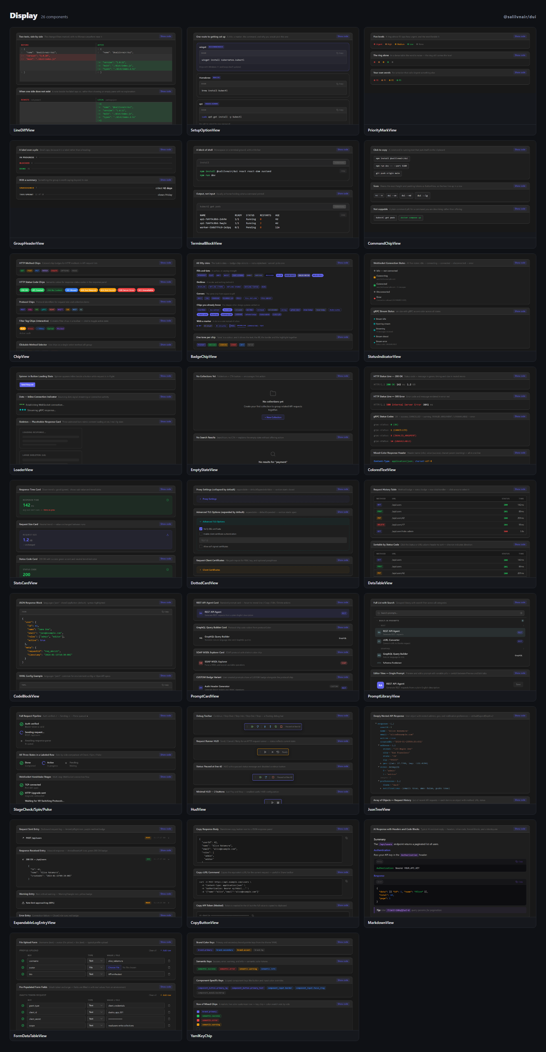
| Component | What it is |
| --- | --- |
| LineDiffView | Two texts side by side with the changed lines marked — and no Monaco anywhere near it. |
| SetupOptionView | One card per route to getting installed — winget, Homebrew, apt — turning a wall of platform instructions into a list… |
| PriorityMarkView | The priority marker on an issue row — the ring is the signal, the word is a courtesy that a dense table can drop. |
| GroupHeaderView | The row above a group in a grouped list or a board column — set as a label, not a heading, so eight of them do not re… |
| TerminalBlockView | Commands and their output on a terminal ground — a terminal, whether it holds what you type or what came back. |
| CommandChipView | A command rendered inline that copies itself when clicked — for the places a reader is about to retype something they… |
| ChipView | Colored badge chips for methods, protocols, status codes, filter tags. |
| BadgeChipView | The pill that labels a thing — fifty skins, chosen by variant or set for the whole product by DuiProvider. |
| StatusIndicatorView | Connection status dot — idle · connecting · connected · disconnected · error. |
| LoaderView | Loading states — spinner · dots · skeleton · pulse · progress-bar. |
| EmptyStateView | Empty state placeholder with icon, title, message, and optional CTA button. |
| ColoredTextView | Token-colored text — HTTP status lines, gRPC codes, SOAP faults. |
| StatsCardView | Colorful metric card — value, unit, trend (up/down/neutral), subValue. |
| DottedCardView | Dotted-border expandable card — useful for optional config sections. |
| DataTableView | Generic sortable table — columns, striped rows, empty state, row click. |
| CodeBlockView | Read-only code block — language label, copy button, optional line numbers. |
| PromptCardView | Single prompt library row card — colored avatar initials, title, description, protocol badge, CUSTOM badge, hover act… |
| PromptLibraryView | Full Prompt Library panel — list (search + sections + categories) + editor (avatar header + tabs + preview/edit toggl… |
| StageCheck/Spin/Pulse | Step-level status indicators — completed (check), active (spin), pending (pulse) — for multi-step pipelines and reque… |
| HudView | Generic floating draggable toolbar — store-free counterpart of DebugHud. |
| JsonTreeView | Recursive JSON / object / array value tree with editor-style token colors. |
| ExpandableLogEntryView | Expandable log row with icon, title, colored badge, timestamp chip, and chevron. |
| CopyButtonView | Icon-only button that copies text to clipboard. |
| MarkdownView | Renders Markdown (GFM) with syntax-highlighted code blocks, inline code, tables, task lists, blockquotes, and copy-bu… |
| FormDataTableView | Multipart/form-data key-value table with file upload support. |
| YamlKeyChip | Compact type-labeled chip for YAML/JSON keys. |
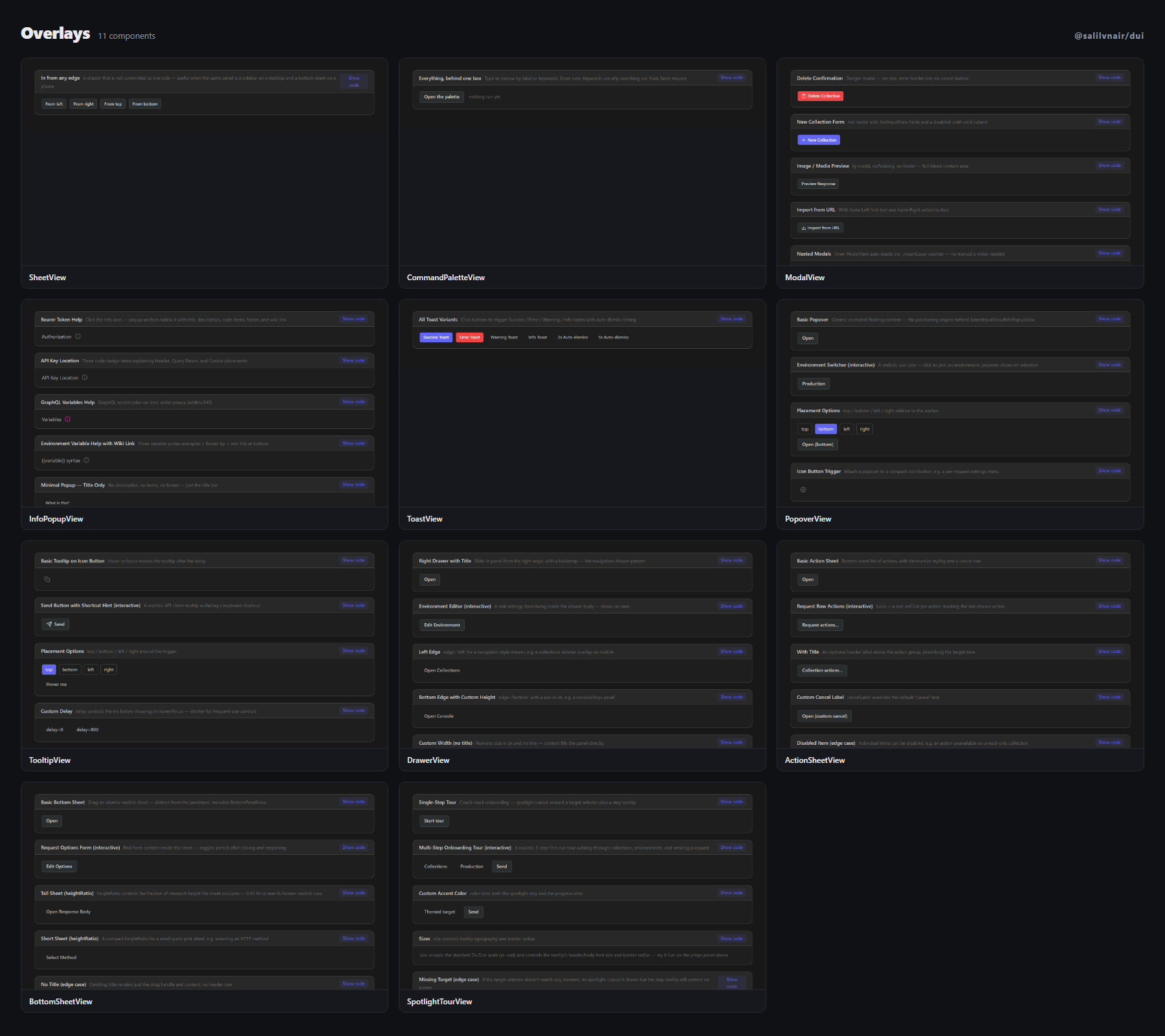
| Component | What it is |
| --- | --- |
| SheetView | A panel that slides in from any edge — for content that is a sidebar on a wide screen and a bottom sheet on a narrow… |
| CommandPaletteView | The Ctrl+K box. |
| ModalView | Configurable modal — sm/md/lg/xl — never closes on backdrop click. |
| InfoPopupView | Help popup anchored near a ? |
| ToastView | Toast notification stack — success · error · warning · info — auto-dismiss. |
| PopoverView | Generic anchored floating-content primitive — the positioning engine behind SelectInputView/InfoPopupView, exposed st… |
| TooltipView | Hover/focus tooltip primitive — top/bottom/left/right placement, configurable delay. |
| DrawerView | Slide-in overlay panel from any edge, with backdrop — navigation-drawer pattern. |
| ActionSheetView | Bottom list of actions + destructive styling + cancel. |
| BottomSheetView | Drag-to-dismiss mobile sheet — distinct from the persistent, resizable BottomPanelView. |
| SpotlightTourView | Coach-mark onboarding — spotlight cutout around a target selector + step tooltip + progress dots. |
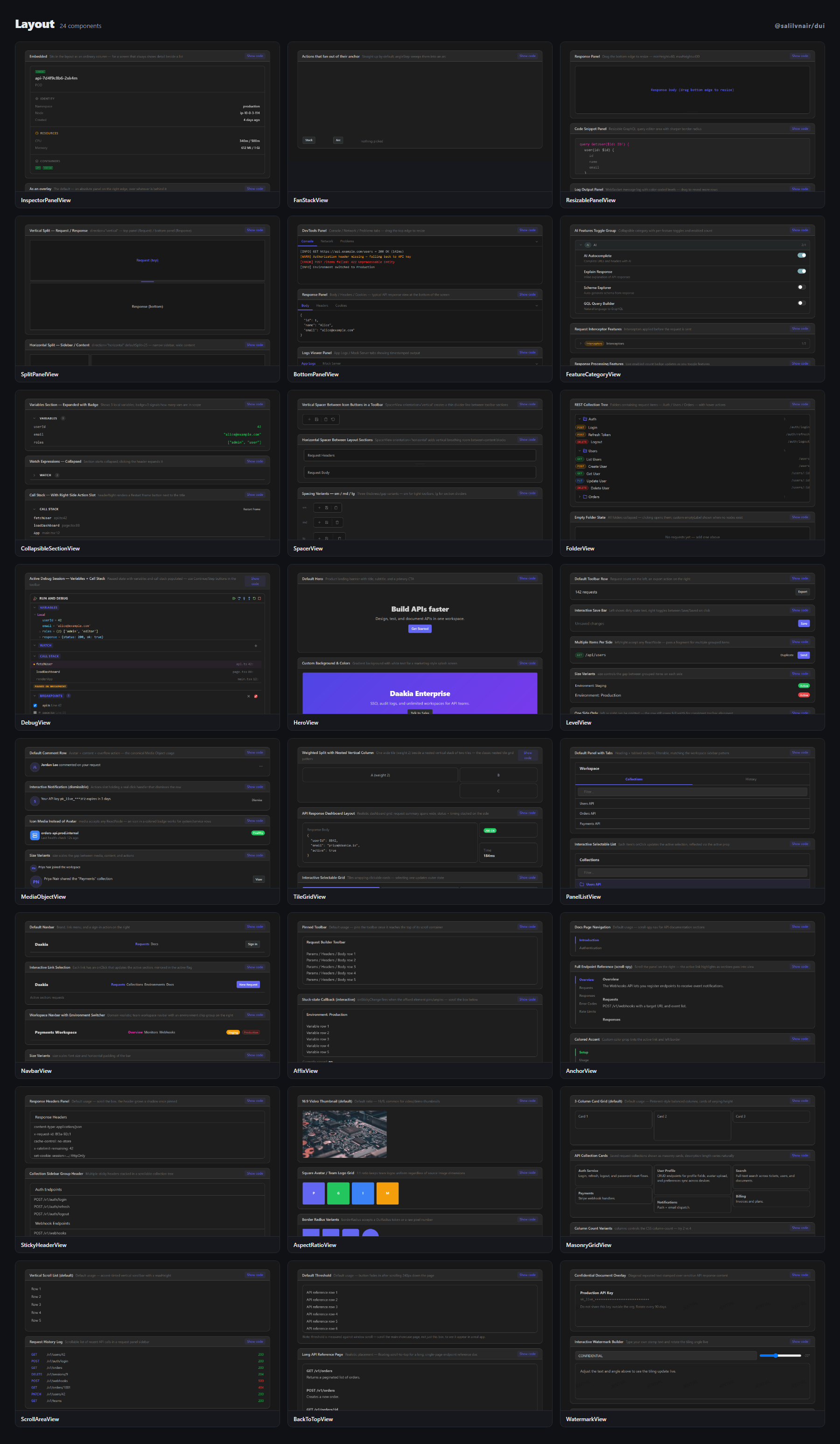
| Component | What it is |
| --- | --- |
| InspectorPanelView | The detail panel beside a list — an overlay on a narrow screen and a permanent third column on a wide one, from one p… |
| FanStackView | A small set of actions that spring out of a floating anchor — straight up, or swept into an arc. |
| ResizablePanelView | Single-pane panel with bottom-edge drag handle to resize height — no store dependency. |
| SplitPanelView | Split-pane container — horizontal or vertical — drag pill, double-click to reset. |
| BottomPanelView | DevTools-style resizable bottom panel with tab bar and collapse toggle. |
| FeatureCategoryView | Expandable feature category with toggle switches and enabled count badge. |
| CollapsibleSectionView | Expandable section with chevron toggle, colored chip title, count badge, and a right-side action slot. |
| SpacerView | Thin divider line for separating groups in icon rails, toolbars, or any flex container. |
| FolderView | Generic folder tree component with expand/collapse, hover action buttons, DUI ContextMenuView on 3-dot, and DUI Modal… |
| DebugView | Editor-style Run & Debug sidebar panel — Variables (scoped tree), Watch expressions, Call Stack, Breakpoints. |
| HeroView | Banner section — title/subtitle/CTA, size-driven min-height. |
| LevelView | Space-between horizontal toolbar row primitive. |
| MediaObjectView | Avatar/icon + content + actions row. |
| TileGridView | Nested ancestor/parent/child tile grid. |
| PanelListView | Heading + tabs + filterable block list. |
| NavbarView | Top app bar — brand, link menu, burger collapse on narrow widths. |
| AffixView | Sticky-on-scroll wrapper — pins once it reaches offsetTop. |
| AnchorView | Scroll-spy in-page navigation — highlights the section in view, click to jump. |
| StickyHeaderView | Sticky section header that grows a shadow once pinned. |
| AspectRatioView | Fixed aspect-ratio box for image/video containers. |
| MasonryGridView | Pinterest-style column-balanced layout — pure CSS columns, no JS measurement. |
| ScrollAreaView | Custom accent-tinted scrollbar container primitive. |
| BackToTopView | Floating scroll-to-top button — fades in past a scroll threshold. |
| WatermarkView | Repeated diagonal text/logo overlay. |
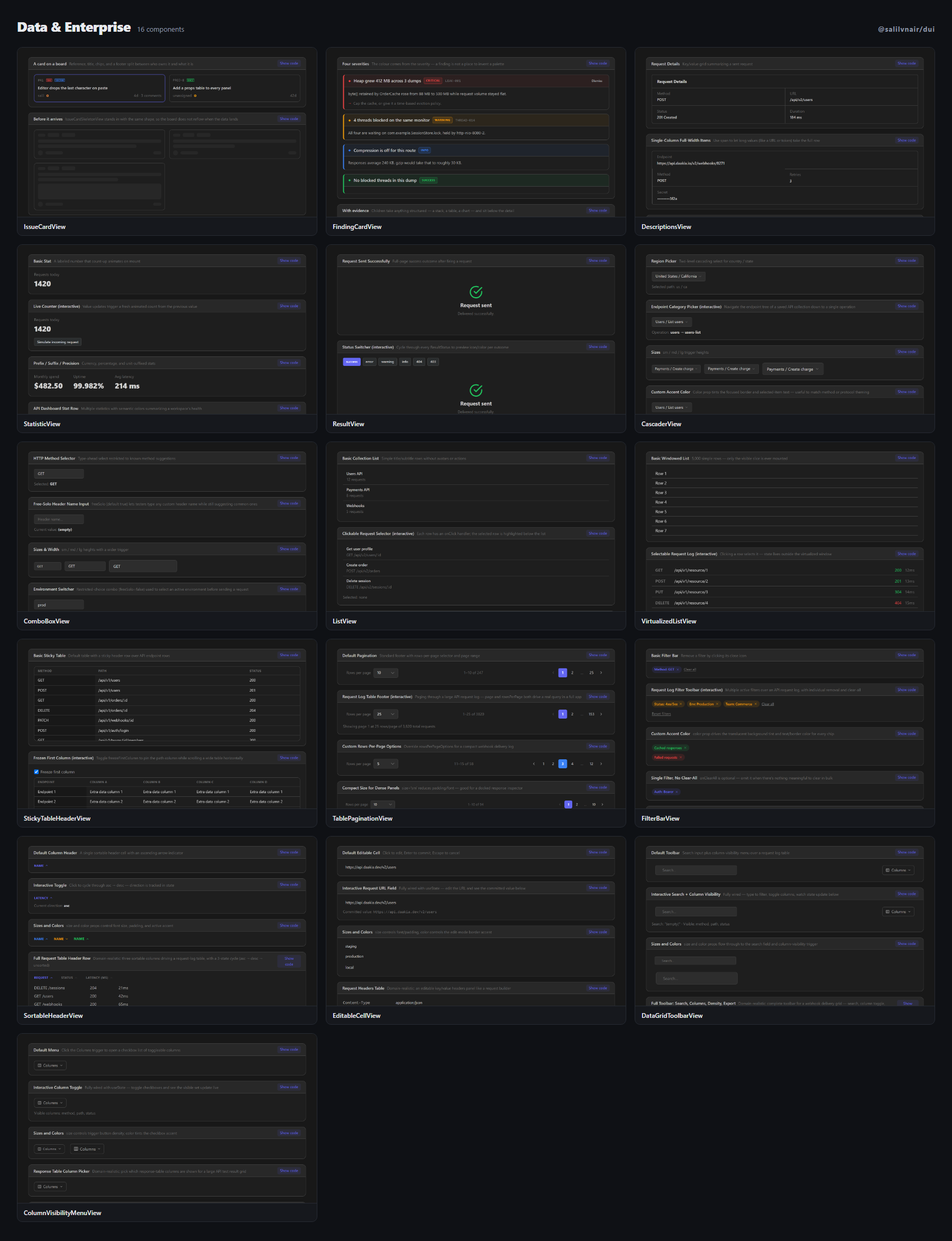
| Component | What it is |
| --- | --- |
| IssueCardView | The card a tracker board is built from — everything but the title is a slot, with a matching skeleton so the board ne… |
| FindingCardView | One finding from an analysis — with remediation kept apart from the detail, because what was found and what to do are… |
| DescriptionsView | Read-only label/value grid for entity detail views. |
| StatisticView | Inline animated big-number stat with prefix/suffix. |
| ResultView | Full-page outcome state — success / error / 404 / 403 / warning / info. |
| CascaderView | Multi-level cascading select — region/category trees. |
| ComboBoxView | Free-text input + filtered dropdown suggestions — autocomplete pattern. |
| ListView | Generic avatar/title/subtitle/action list primitive. |
| VirtualizedListView | Windowed rendering for large lists — only mounts rows in (or near) the viewport. |
| StickyTableHeaderView | Sticky header + optional frozen first column for wide/tall tables. |
| TablePaginationView | Rows-per-page selector + page-number footer. |
| FilterBarView | Chip-based row of active filters with a clear-all action. |
| SortableHeaderView | Clickable table column header with a sort-direction arrow indicator. |
| EditableCellView | Click-to-edit table cell — Enter commits, Escape cancels. |
| DataGridToolbarView | Table toolbar — search + column-visibility + density cycle + export. |
| ColumnVisibilityMenuView | Checkbox menu to toggle table column visibility. |
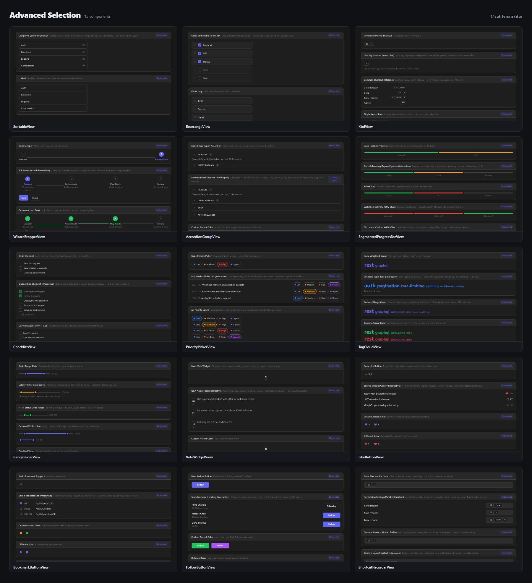
| Component | What it is |
| --- | --- |
| SortableView | Reordering for rows you draw yourself — it supplies the handle, the drop indicator and the indices, nothing else. |
| RearrangeView | The column-picker shape — which fields to show and in what order, both questions in one list. |
| KbdView | Hotkey hint chip, composes multiple keys with a "+" separator. |
| WizardStepperView | Multi-step form wizard progress header. |
| AccordionGroupView | Managed single/multi-open accordion group, built on CollapsibleSectionView. |
| SegmentedProgressBarView | Multi-segment progress — e.g. |
| ChecklistView | Todo-style checklist — strikethrough + faded once complete. |
| PriorityPickerView | Low/medium/high/urgent selector with color-coded dots. |
| TagCloudView | Weighted tag cloud — font size scales with relative weight. |
| RangeSliderView | Dual-handle min/max range — distinct from the single-handle SliderView. |
| VoteWidgetView | Upvote/downvote counter control. |
| LikeButtonView | Animated heart/like toggle button — pop animation on like. |
| BookmarkButtonView | Animated bookmark/save toggle button. |
| FollowButtonView | Follow/following state-toggle button — reveals "Unfollow" on hover. |
| ShortcutRecorderView | Captures a keybinding — click to record, press keys, renders via KbdView. |
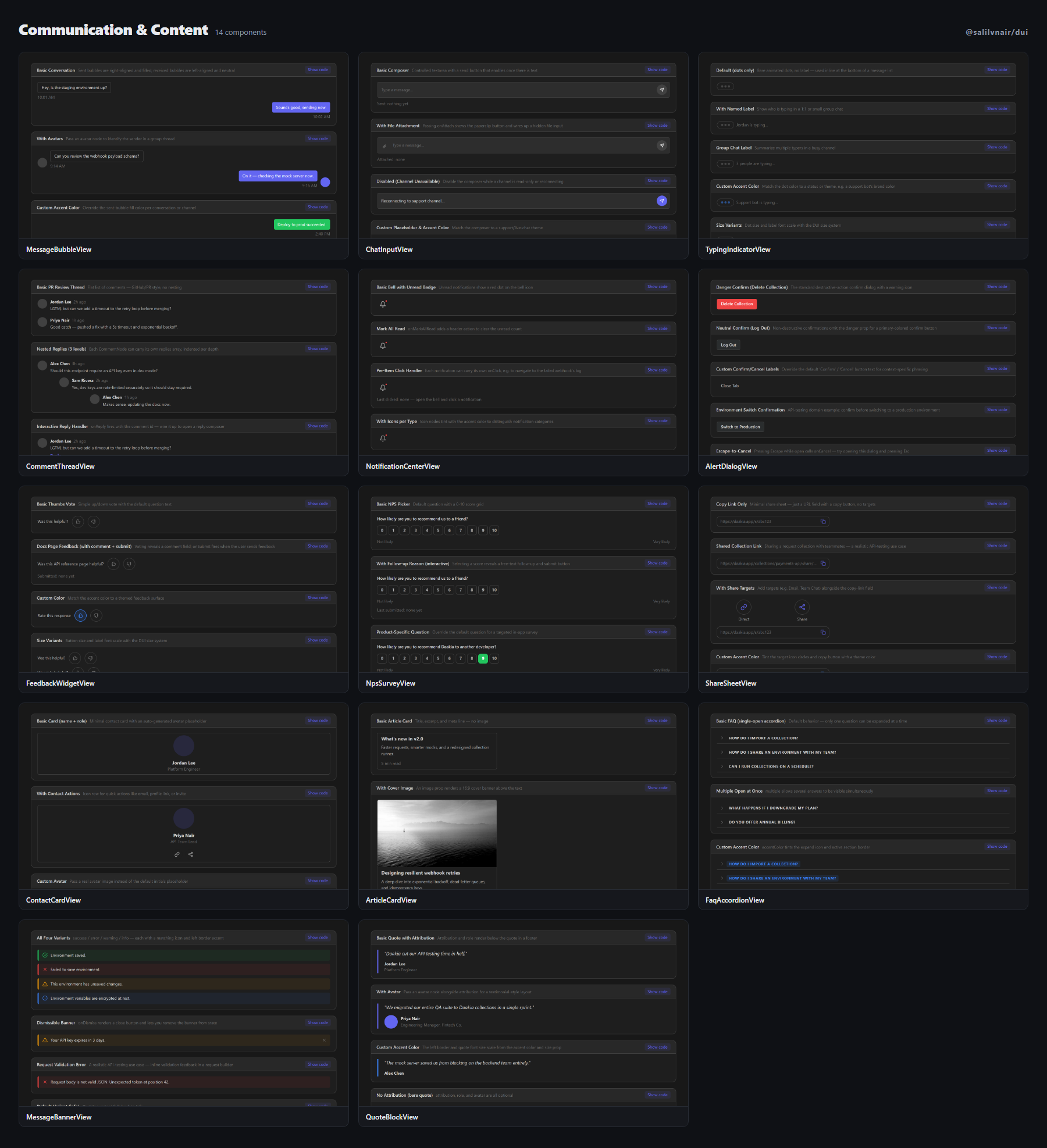
| Component | What it is |
| --- | --- |
| MessageBubbleView | Chat message bubble — sent (right, filled) / received (left, neutral). |
| ChatInputView | Message composer — auto-growing textarea + attach + send. |
| TypingIndicatorView | Animated "…is typing" dots. |
| CommentThreadView | Nested comment thread with reply action — GitHub/PR-style. |
| NotificationCenterView | Bell icon + dropdown notification list, unread-count badge. |
| AlertDialogView | Pre-built confirm/cancel dialog with danger styling — the standard "Are you sure?" pattern. |
| FeedbackWidgetView | Thumbs up/down + optional comment micro-survey. |
| NpsSurveyView | 0-10 Net Promoter Score picker with an optional follow-up text field. |
| ShareSheetView | Social share row + copy-link field. |
| ContactCardView | Avatar + name + role + contact-icon row card. |
| ArticleCardView | Image + title + excerpt + meta preview card — blog/article listing. |
| FaqAccordionView | Pre-styled Q&A accordion, built directly on AccordionGroupView. |
| MessageBannerView | Inline success/error/info/warning message strip. |
| QuoteBlockView | Styled blockquote with an optional avatar + attribution line. |
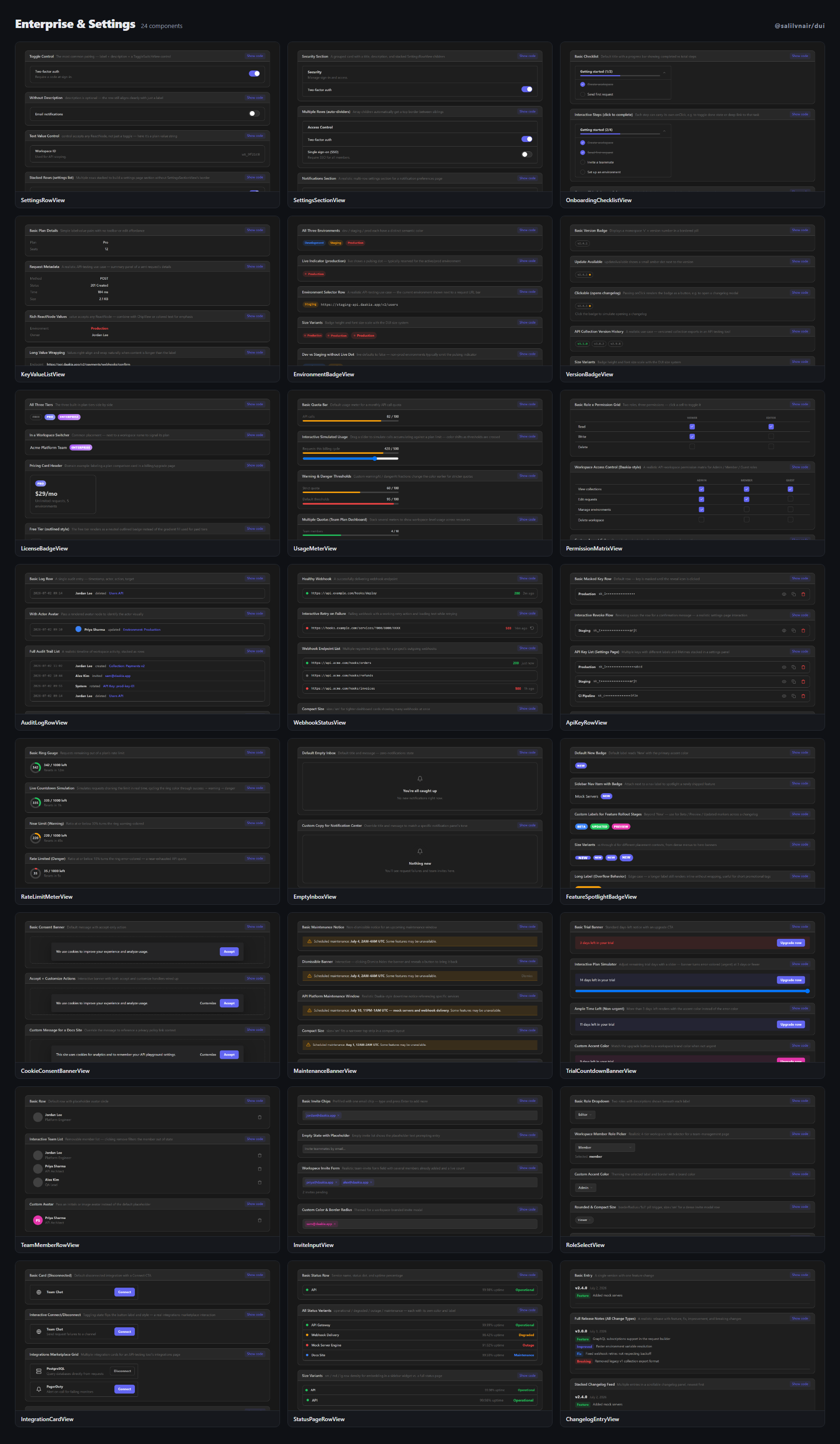
| Component | What it is |
| --- | --- |
| SettingsRowView | Label + description + control row — the standard settings-page primitive. |
| SettingsSectionView | Grouped settings card with a header — pairs with SettingsRowView. |
| OnboardingChecklistView | Collapsible "getting started" progress checklist. |
| KeyValueListView | Lightweight label:value stacked list — no edit, no toolbar. |
| EnvironmentBadgeView | Colored environment chip with an optional pulsing live indicator. |
| VersionBadgeView | Version number chip with an "update available" dot indicator. |
| LicenseBadgeView | Plan/tier ribbon badge — Free / Pro / Enterprise. |
| UsageMeterView | Quota bar (used/limit) with warning-color thresholds. |
| PermissionMatrixView | Role x permission checkbox grid. |
| AuditLogRowView | Timestamped actor+action+target log row — audit trail primitive. |
| WebhookStatusView | Webhook endpoint health row — last delivery, status code, retry action. |
| ApiKeyRowView | Masked API key row with reveal/copy/revoke actions. |
| RateLimitMeterView | Requests-remaining ring gauge with a reset countdown label. |
| EmptyInboxView | Zero-notifications empty state — pre-styled variant of EmptyStateView. |
| FeatureSpotlightBadgeView | Pulsing "New" badge for recently shipped features. |
| CookieConsentBannerView | Fixed bottom cookie-consent bar with accept/customize actions. |
| MaintenanceBannerView | Scheduled-downtime notice strip. |
| TrialCountdownBannerView | "N days left in trial" strip with an upgrade CTA. |
| TeamMemberRowView | Avatar + name + role + remove-action row — team management list item. |
| InviteInputView | Email-chip input specialized for multi-invite forms. |
| RoleSelectView | Role dropdown with a per-option description shown beneath the label. |
| IntegrationCardView | Logo + name + connect/disconnect card — integrations/marketplace listing. |
| StatusPageRowView | Service + uptime% + status-dot row — status page primitive. |
| ChangelogEntryView | Version + date + change-type badges + description block. |
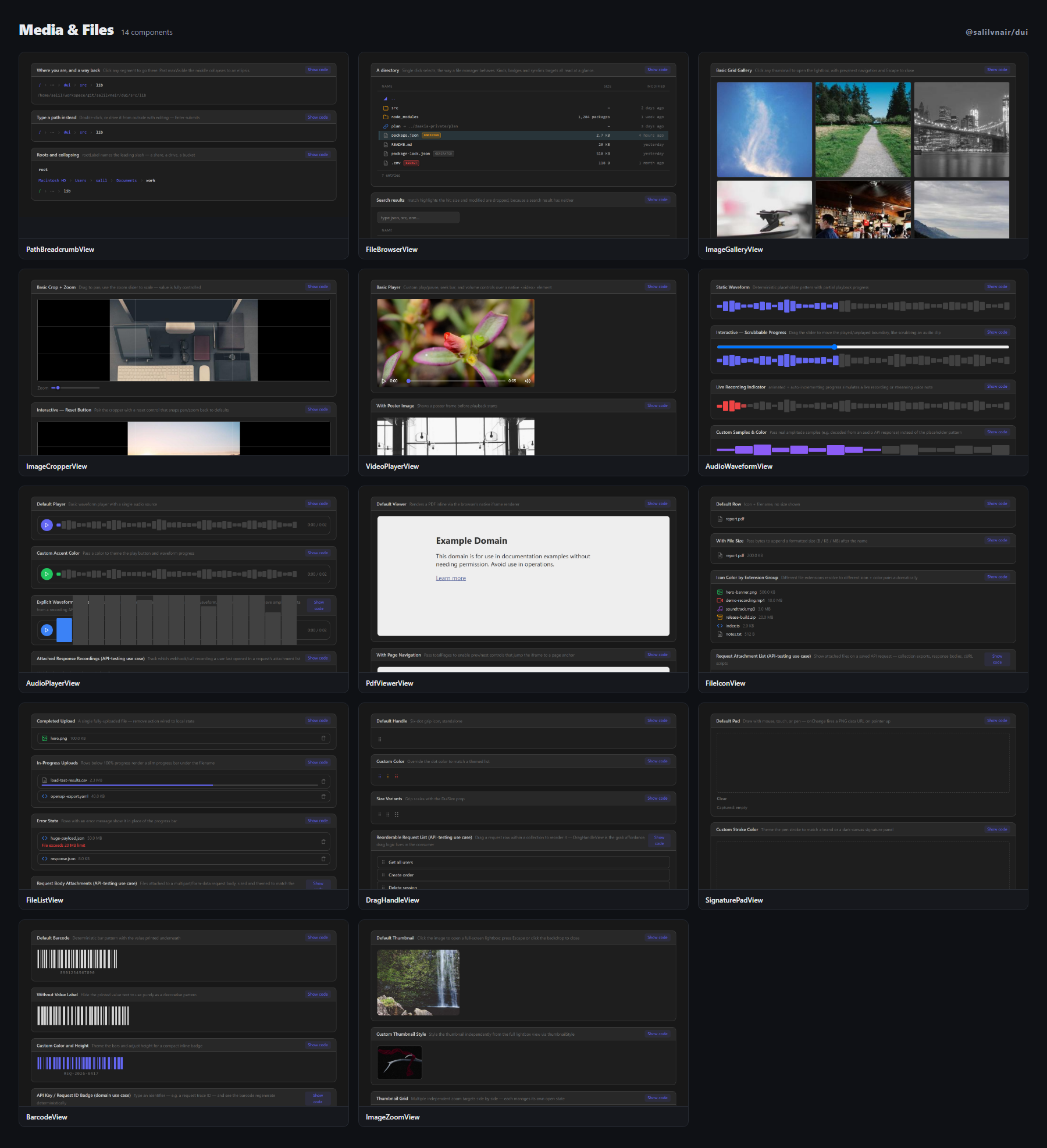
| Component | What it is |
| --- | --- |
| PathBreadcrumbView | The path bar above a file listing — every segment a link back, and a double-click turns the whole thing into a text box. |
| FileBrowserView | A directory listing — files, folders and symlinks, with selection and arrival as two separate states in two separate… |
| ImageGalleryView | Grid gallery with a click-to-open lightbox — prev/next navigation, Escape to close. |
| ImageCropperView | Drag-crop + zoom image editor — fixed crop frame, pannable/zoomable image. |
| VideoPlayerView | Custom video controls wrapper — play/pause, seek, volume. |
| AudioWaveformView | Static or animated waveform visualization primitive. |
| AudioPlayerView | Waveform + play/pause/seek audio player. |
| PdfViewerView | Paginated PDF preview wrapper — browser native iframe renderer (needs a real PDF URL in production). |
| FileIconView | Extension-based file-type icon + name + size row. |
| FileListView | Uploaded-files list with per-row progress and remove action. |
| DragHandleView | Grab-handle primitive for reorderable lists — six-dot grip icon. |
| SignaturePadView | Canvas signature capture — draw with mouse/touch/pen, exports a PNG data URL. |
| BarcodeView | Deterministic bar-pattern generator, visually representative — not a scannable encoder. |
| ImageZoomView | Click-to-zoom lightbox for a single image. |
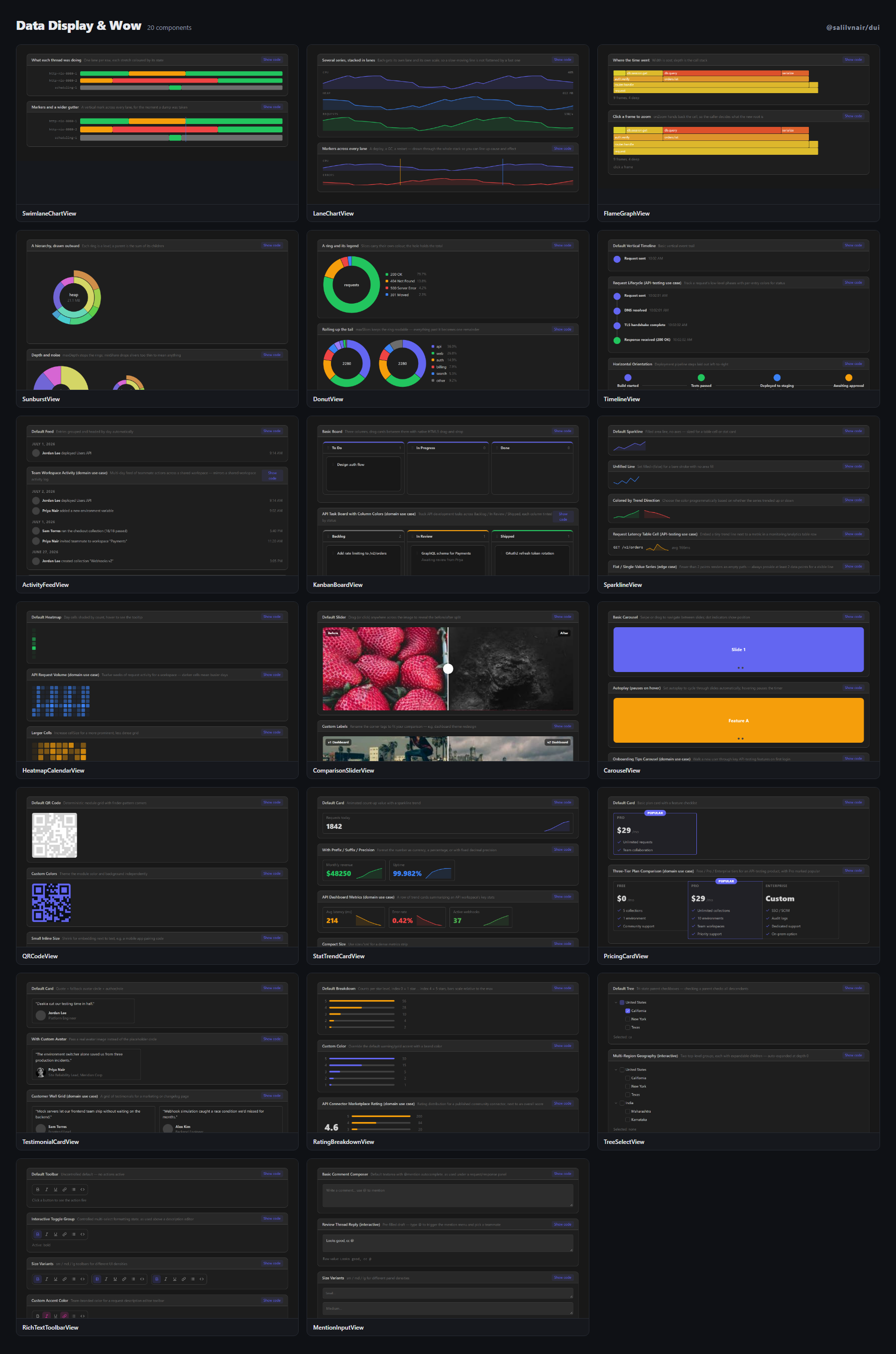
| Component | What it is |
| --- | --- |
| SwimlaneChartView | What each of several things was doing over a period — threads by state, pods by phase — each stretch coloured by the… |
| LaneChartView | Several metrics over the same period, each in its own lane with its own scale — so a small signal is not flattened by… |
| FlameGraphView | The profiler flame graph — a frame is as wide as it is expensive, and clicking one makes it the new root. |
| SunburstView | Where a total went, one level at a time — a ring per level, drawn outward. |
| DonutView | A share-of-total ring, with maxSlices to roll the unreadable tail into one named remainder. |
| TimelineView | Event trail with icon nodes — vertical (default) or horizontal. |
| ActivityFeedView | Chronological activity feed, entries grouped by day. |
| KanbanBoardView | Draggable columns + cards board, native HTML5 drag-and-drop. |
| SparklineView | Tiny inline SVG trend line, no axes — for table cells / stat cards. |
| HeatmapCalendarView | GitHub-style contribution heatmap — day cells shaded by count, tooltip on hover. |
| ComparisonSliderView | Before/after drag slider for image comparison. |
| CarouselView | Swipeable card carousel with dot indicators — autoplay pauses on hover. |
| QRCodeView | QR-style module grid with finder-pattern corners — visual, not spec-compliant/scannable. |
| StatTrendCardView | Animated count-up number + sparkline trend — distinct from the static StatsCardView. |
| PricingCardView | Plan comparison card with a "popular" ribbon. |
| TestimonialCardView | Quote + avatar testimonial card. |
| RatingBreakdownView | 5-star rating distribution bars — App Store-style rating breakdown. |
| TreeSelectView | Checkbox-driven hierarchical select — tri-state parent checkboxes over a folder-style tree. |
| RichTextToolbarView | Formatting toolbar primitive — bold/italic/underline/link/list/code. |
| MentionInputView | @mention autocomplete textarea. |
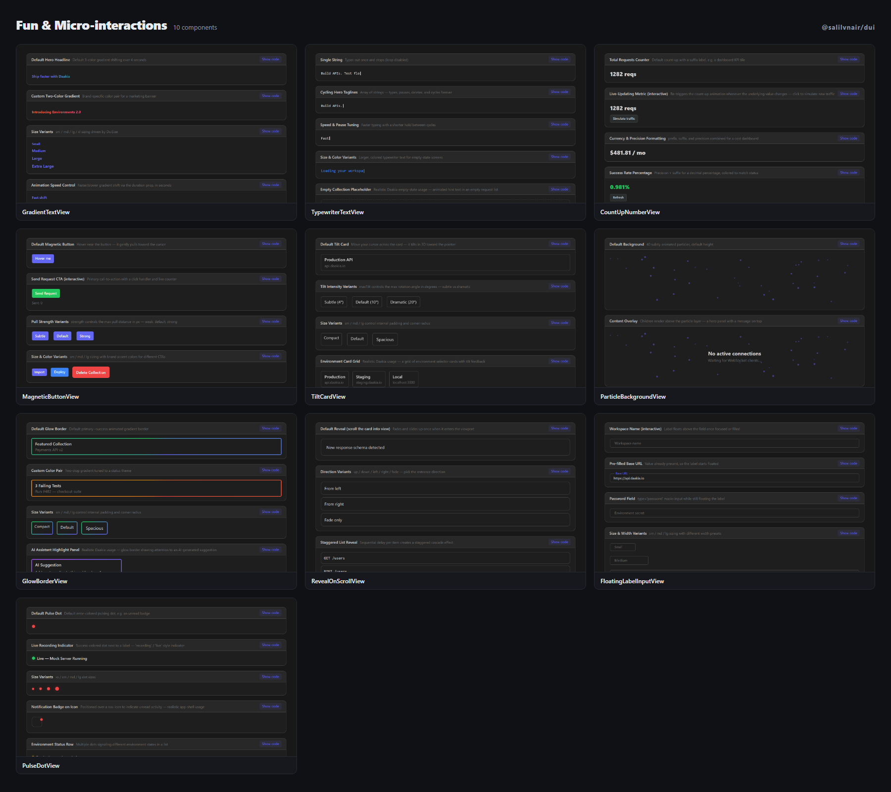
| Component | What it is |
| --- | --- |
| GradientTextView | Animated gradient-shifting text. |
| TypewriterTextView | Animated typing-effect text. |
| CountUpNumberView | Standalone animated number count-up primitive. |
| MagneticButtonView | Cursor-attraction hover button effect. |
| TiltCardView | 3D perspective tilt-on-hover card. |
| ParticleBackgroundView | Subtle animated particle/dot background. |
| GlowBorderView | Animated gradient glowing-border wrapper. |
| RevealOnScrollView | Fade/slide-in-on-scroll wrapper. |
| FloatingLabelInputView | Floating-label input, distinct from TextInputView's static placeholder. |
| PulseDotView | Attention-grabbing pulsing dot primitive — complements StatusIndicatorView. |
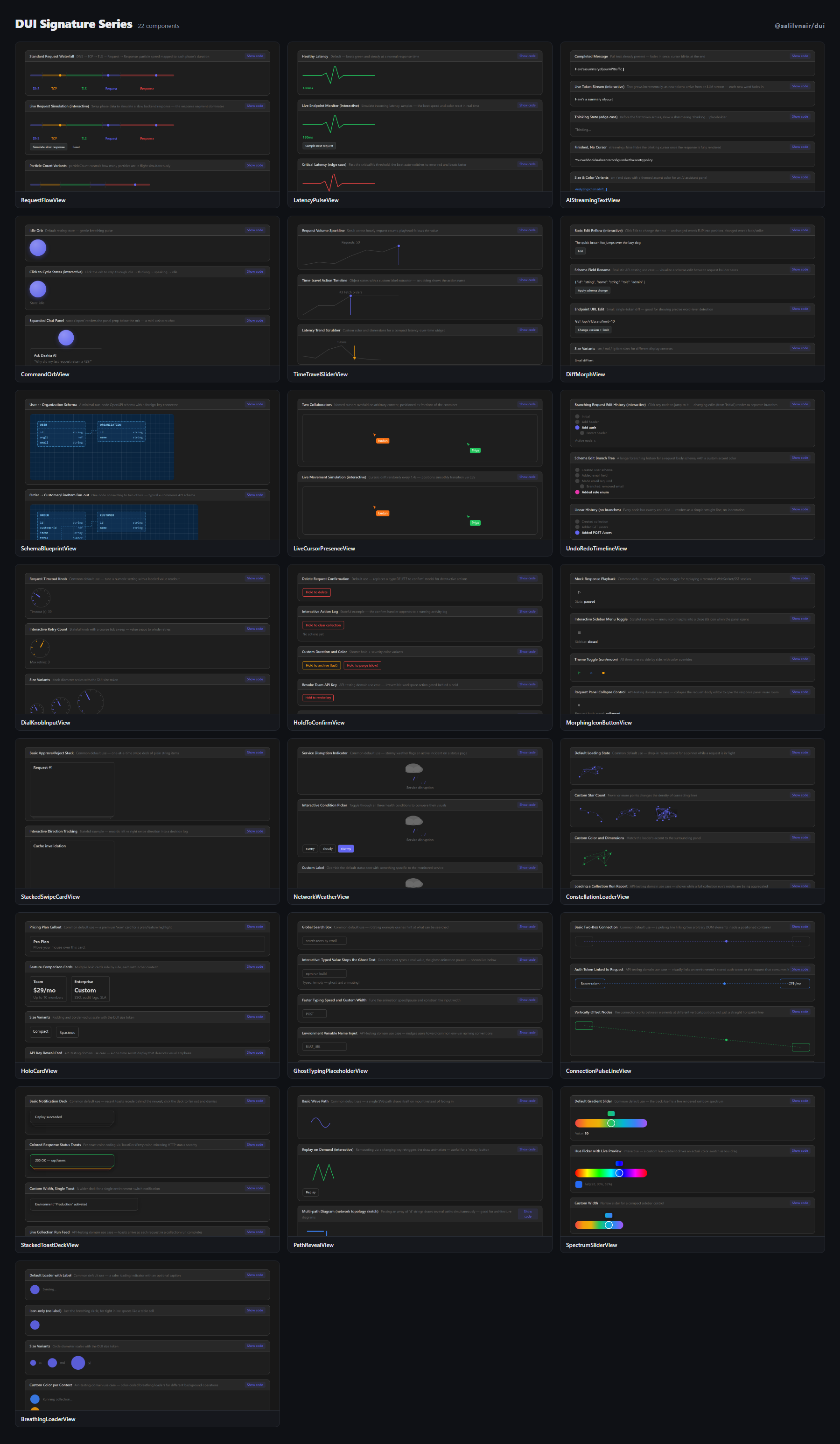
| Component | What it is |
| --- | --- |
| RequestFlowView | Animated network waterfall — particles travel a DNS→TCP→TLS→Request→Response pipe, speed/color mapped to real phase t… |
| LatencyPulseView | EKG/vitals-monitor style live pulse line for request latency — a metric that visually "beats" instead of a static lin… |
| AIStreamingTextView | Token-by-token LLM output renderer — per-token fade-in, thinking shimmer, soft blink cursor. |
| CommandOrbView | Floating, breathing circular AI-assistant orb — idle pulse → thinking ripple → speaking waveform, expands into a chat… |
| TimeTravelSliderView | Scrub a draggable playhead across a sparkline of past states — a time-travel state scrubber, generalized into a reusa… |
| DiffMorphView | Old→new text FLIP-animates unchanged words into their new position while changed words fade/strike — an edit visually… |
| SchemaBlueprintView | JSON Schema / OpenAPI spec rendered as an architectural blueprint — graph-paper background, dashed right-angle connec… |
| LiveCursorPresenceView | Collaborative cursors with name tags, overlaid on arbitrary content. |
| UndoRedoTimelineView | History rendered as a branching git-log graph — jump to any node, diverging edits show as visible branches instead of… |
| DialKnobInputView | Rotary analog knob (drag in a circle) with snap-ticks and a haptic-style micro-bounce at each notch — for tactile num… |
| HoldToConfirmView | Press-and-hold with a radial fill that must complete before the destructive action fires — replaces "type DELETE to c… |
| MorphingIconButtonView | The icon itself SVG-path-morphs between two states (play↔pause, menu↔close, sun↔moon) instead of a crossfade/swap. |
| StackedSwipeCardView | Swipeable card stack for one-at-a-time approve/reject flows. |
| NetworkWeatherView | System health/error-rate expressed as literal weather (sunny → cloudy → stormy) instead of a number or status dot. |
| ConstellationLoaderView | Loading dots drift and connect into shifting constellation lines — ties back to NetworkGraphView's node-link visual i… |
| HoloCardView | A card with a mouse-position-reactive holographic/iridescent sheen — pure premium-feel "wow" for pricing/feature call… |
| GhostTypingPlaceholderView | An input placeholder that types out rotating example queries, pauses, then backspaces into the next one. |
| ConnectionPulseLineView | A dashed/gradient SVG line connecting two arbitrary DOM elements, with a traveling pulse dot — visually links spatial… |
| StackedToastDeckView | Toasts don't stack vertically — older ones shrink and recede behind the newest like a physical card deck; click the d… |
| PathRevealView | Generic SVG stroke-draw reveal primitive — any path/diagram/signature "draws itself" on mount instead of just fading in. |
| SpectrumSliderView | The slider track itself is a live rendered gradient spectrum, and the handle shows a magnified live-color preview bub… |
| BreathingLoaderView | An ultra-minimal loading state — a single circle slowly scales/fades in a breathing rhythm — a calmer alternative to… |
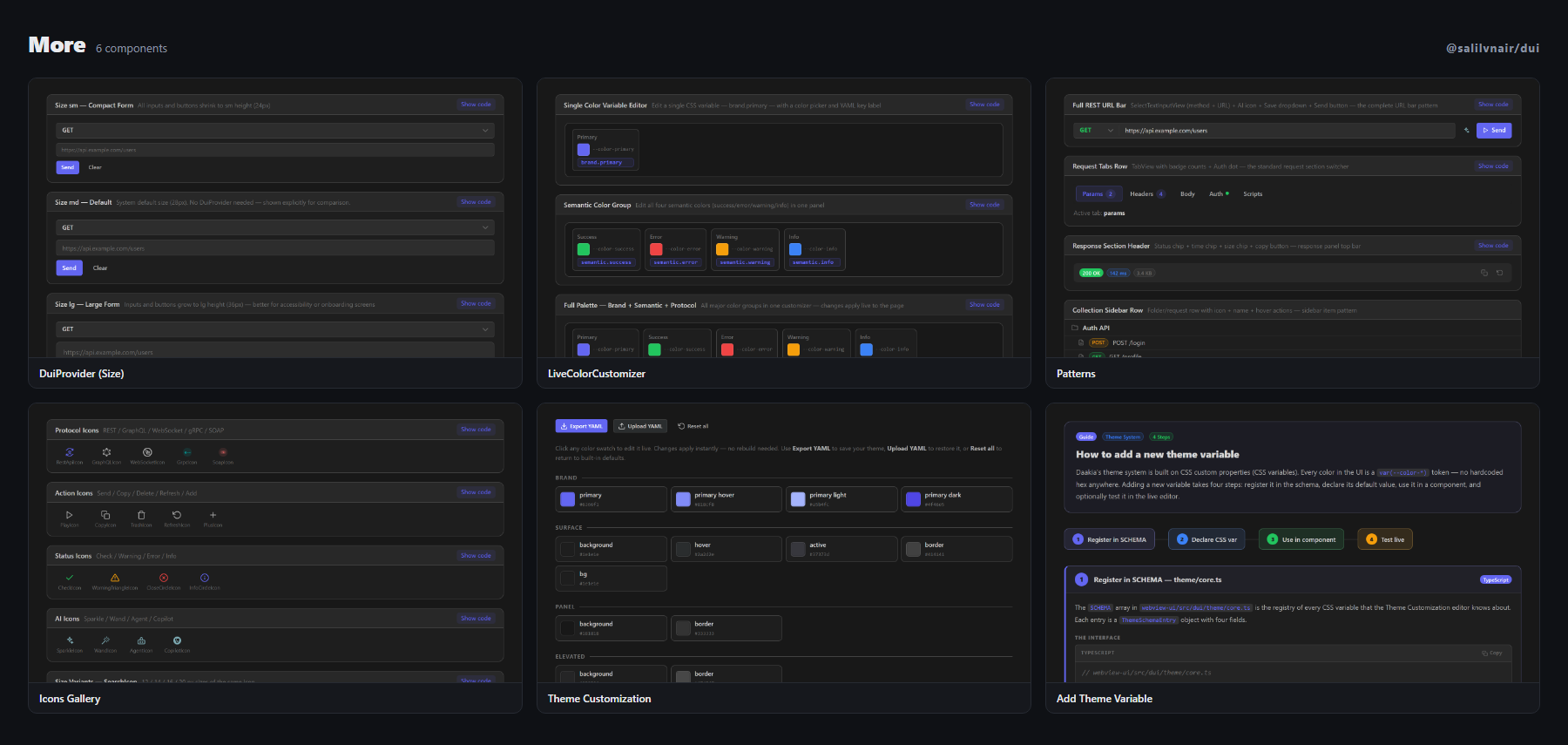
| Component | What it is |
| --- | --- |
| DuiProvider (Size) | Wrap any subtree with and ALL nested DUI components inherit that size — no prop dril… |
| LiveColorCustomizer | Interactive color editor that applies CSS custom property changes directly to the document root in real time. |
| Patterns | How DUI components assemble into actual Daakia UI — URL bar · tabs · tree. |
| Icons Gallery | All Daakia icons — searchable by name — click to copy icon name. |
| Theme Customization | Export / upload YAML theme files — all 63 CSS color vars, live hot-swap, no rebuild. |
| Add Theme Variable | Step-by-step guide: register a new CSS color variable in SCHEMA, declare it in index.css, use it in any DUI component… |
Every component ships full TypeScript prop types — explore them via your
editor's autocomplete, in the live demo,
or by browsing src/lib in this repo.
Theming
All design tokens are CSS custom properties, defined via Tailwind v4's
CSS-first @theme syntax and shipped in dist/style.css:
:root {
  --color-primary: #6366f1;
  --color-surface: #1e1e1e;
  --color-surface-border: #414141;
  /* … */
}
Override any subset on :root (global) or on a wrapping element (scoped — e.g.
to theme one panel differently). Programmatic helpers live under the theme/*
subpath exports:
import { SCHEMA } from '@salilvnair/dui/theme/core';        // token schema (group/key/cssVar/comment)
import { generateYaml } from '@salilvnair/dui/theme/utils';  // export the current theme as YAML
import { ThemeVarEditor } from '@salilvnair/dui/theme/editor'; // UI for adding a new theme variable
Light and dark are the same mechanism: dist/style.css defines both sets and
document.documentElement's data-theme attribute chooses between them.
The code editor — Monaco is optional
EditorView, DiffEditorView, and DebugEditorView do not require
@monaco-editor/react or monaco-editor to be installed. Without them, these
components render a lightweight plain-text fallback (a styled <textarea> and
a small line-diff view) — fully functional for basic editing, just without
IntelliSense, breakpoints, or Monaco's diff engine.
import { EditorView } from '@salilvnair/dui';

// Works immediately, zero extra installs — renders the plain-text fallback.
<EditorView value={code} onChange={setCode} language="json" />
To get the real Monaco-backed editor:
npm install @monaco-editor/react monaco-editor// once, at app bootstrap — before any EditorView renders
import '@salilvnair/dui/monaco-setup';That import self-hosts Monaco: inline workers (no CDN — works under a strict
CSP, e.g. inside a VS Code extension webview), a VS Code–accurate dark/light
theme, and registration of the real editor implementation. EditorView
automatically starts rendering the Monaco-backed version the moment this import
has run; skip it and everything still works, just without Monaco.
Why not auto-install Monaco, or fall back to a CDN? @monaco-editor/react
defaults to lazy-loading Monaco assets from a public CDN when you don't
self-host — a reasonable default for a plain public web page, but wrong for
CSP-restricted environments (webviews, offline apps, intranets) where that CDN
is unreachable. Rather than silently guess, this library requires an explicit
opt-in (monaco-setup) and never attempts the CDN path at all.
Bundle boundary, verified, not assumed: dist/index.js (the main entry —
everything except EditorView internals) contains zero references to
@monaco-editor/react or monaco-editor. Only dist/monaco-setup.js does.
This is checked as part of the release process, not just documented — see
Publishing.
Extending MarkdownView's language support
MarkdownView ships syntax highlighting for a curated set of ~16 languages
(js/ts/json/xml/html/css/bash/yaml/python/sql/ruby/rust/csharp/kotlin/graphql/markdown)
via highlight.js/lib/core, rather than highlight.js's full ~190-language
bundle, to keep the library small. Add more without waiting on a release:
import { registerMarkdownLanguage } from '@salilvnair/dui';
import lua from 'highlight.js/lib/languages/lua';

registerMarkdownLanguage('lua', lua); // once, at app startup
It registers on its own highlight.js instance, so it will not reconfigure a parser your app is already using elsewhere.
TypeScript
Full type declarations ship in dist/, generated from source — no
@types/@salilvnair__dui needed. peerDependencies cover react, react-dom,
and zustand; @monaco-editor/react, monaco-editor, vis-data and
vis-network are peerDependenciesMeta.optional peers (see above).
Local development
git clone https://github.com/salilvnair/dui.git
cd dui
npm install
npm run dev            # the showcase at localhost:5173
Every panel has an address, so you can go straight to one:
| URL | What it opens |
| --- | --- |
| #/chips | ChipView, on the Live tab |
| #/chips/examples | …its examples |
| #/chips/docs | …its props table |
| #/chips?theme=light | …on the light ground |
| #/chips?capture=1 | the component alone, no chrome — what the catalog images are of, and what the demo site embeds |
npm run build           # builds the showcase app
npm run build:demo      # the same, into demo-dist/ — this is what the demo site serves
npm run build:lib       # builds the publishable library into dist/
npm test                # vitest