
@sandlada/material-design-css
v3.0.0-20260611.b
Published
A ready-made npm package for a collection of css styles in the material design style.


Readme
@sandlada/material-design-css
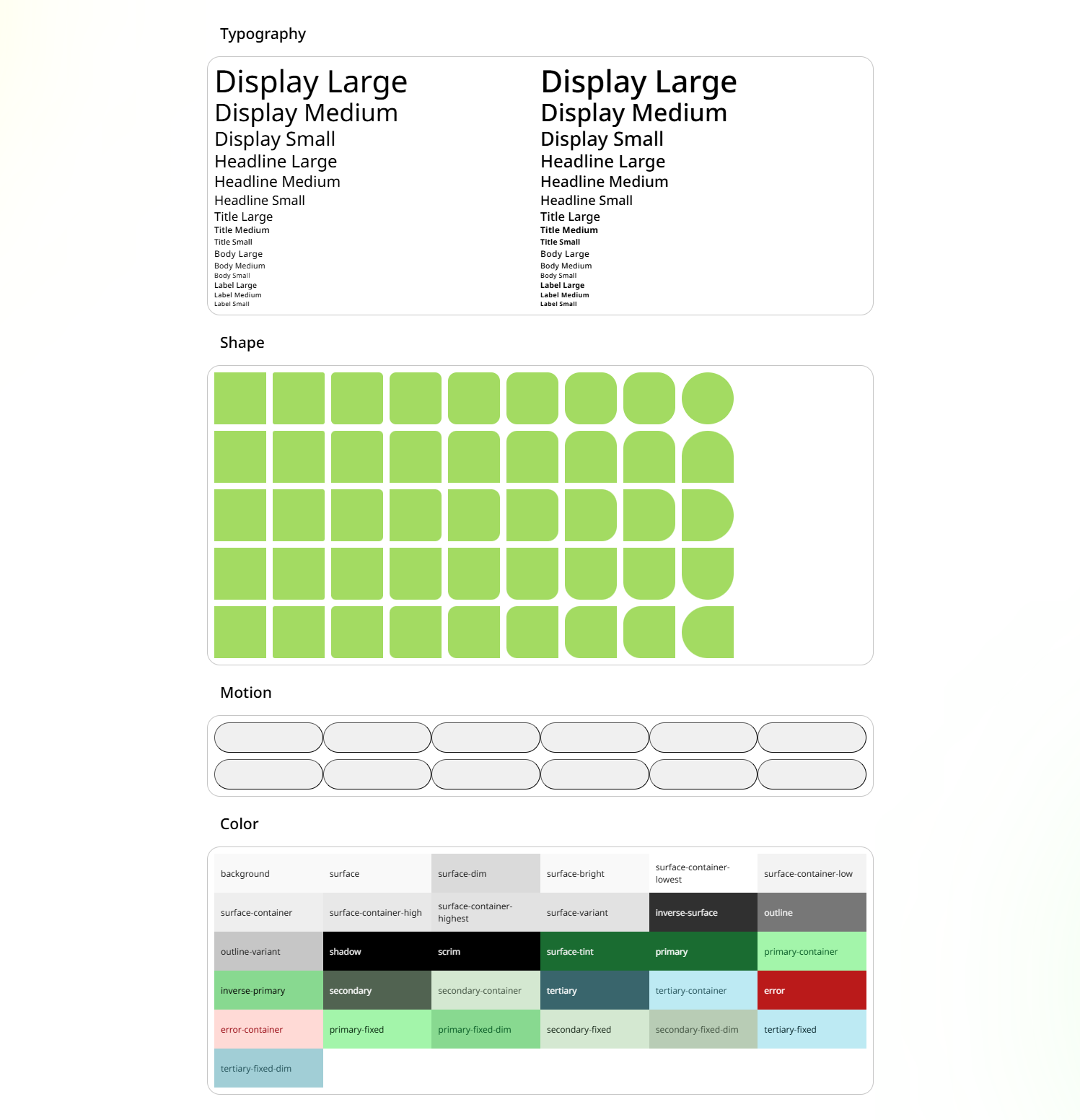



@sandlada/material-design-css is a CSS npm package for Material Design Tokens, styles include:
- Color
- Palette
- Motion
- Shape
- Spacing
- Typography
- Prebuilt Colors
- Prebuilt Palettes
It also supports TailwindCSS v4.
Documentation
For more information on how to use, please visit the project's official website
Installation
npm i @sandlada/material-design-cssImport
For CSS
// TypeScript File
// If you are using Vite or Webpack.
// In CSS file, use @import instead. (You may need to adjust the path depending on your setup, e.g., `@import "../node_modules/@sandlada/material-design-css/preset.css";`)

/**
 * Load preset before color or prebuilt-color utilities.
 *
 * :root:not([dark]) {
 *     color-scheme: light;
 * }
 *
 * :root[dark] {
 *     color-scheme: dark;
 * }
 */
import "@sandlada/material-design-css/preset.css"

// text-on-surface & bg-surface
import "@sandlada/material-design-css/color/utilities.css"

// See more details on the /prebuilt-colors page.
import "@sandlada/material-design-css/prebuilt-colors/tonal-spot/h0-2025.css"

// text-primary-0 & bg-primary-100
import "@sandlada/material-design-css/palette/utilities.css"

// Prebuilt Palettes. See more details on the /prebuilt-palettes page.
import "@sandlada/material-design-css/prebuilt-palettes/tonal-spot/h0-2025.css"

// display-large
import "@sandlada/material-design-css/typography/utilities.css"
import "@sandlada/material-design-css/typography/variables.css"

// rounded-medium
import "@sandlada/material-design-css/shape/utilities.css"
import "@sandlada/material-design-css/shape/variables.css"

// animation-easing-expressive-fast-spatial & transition-easing-expressive-fast-spatial
import "@sandlada/material-design-css/motion/utilities.css"
import "@sandlada/material-design-css/motion/variables.css"

// spacing utilities
import "@sandlada/material-design-css/spacing/utilities.css"
import "@sandlada/material-design-css/spacing/variables.css"
For TailwindCSS v4
@import "tailwindcss";

/**
 * Optional ready-made palette.
 * Replace the path with any file under prebuilt-colors/.
 */
@import "@sandlada/material-design-css/prebuilt-colors/tonal-spot/h0-2025.css";
@import "@sandlada/material-design-css/prebuilt-palettes/tonal-spot/h0-2025.css";

/**
 * bg-primary
 * text-on-primary
 */
@import "@sandlada/material-design-css/color/tw.css";

/**
 * bg-primary-90
 * text-primary-10
 */
@import "@sandlada/material-design-css/palette/tw.css";

/* rounded-medium */
@import "@sandlada/material-design-css/shape/tw.css";

/* spacing */
@import "@sandlada/material-design-css/spacing/tw.css";

/*
 * display-large
 * font-display-large
 * text-display-large
 * tracking-display-large
 * leading-display-large
 * font-weight-display-large
 */
@import "@sandlada/material-design-css/typography/tw.css";

/**
 * ease-emphasized
 * duration-[var(--duration-medium1)]
 */
@import "@sandlada/material-design-css/motion/tw.css";
Naming Conventions
- Color utilities use
bg-*andtext-*. - Prebuilt color files use the filenames from
prebuilt-colors/as described above. - Prebuilt palette files are organized under
prebuilt-palettes/{variant}/. Most variants useh{hue}-{year}.css/h{hue}-{year}-minimal.css;contentandfidelityuseh{hue}c{chroma}t{tone}-{year}.css/h{hue}c{chroma}t{tone}-{year}-minimal.css;monochromeusesblack-{year}.css/black-{year}-minimal.css. - Shape utilities use
rounded-*plus directional suffixes like-t,-r,-b, and-l. - Motion utilities use
animation-*andtransition-*withduration-*andeasing-*tokens. - Spacing utilities use
space-*andgap-*. - Typography utilities use
emphasized-*for emphasized variants and the base type scale names for standard variants.
Usage
Copy this code into your configured project and you will see a button with color and rounded corners.
<button class="rounded-medium bg-primary text-on-primary">
    A rounded button
</button>
Prebuilt Colors
Prebuilt colors are ready-made color palettes generated by Material Design's color system. Each CSS file contains light/dark schemes and three contrast levels (default, low-contrast, high-contrast) built in.
To use a prebuilt color, import preset.css first, then import the desired prebuilt color file, followed by the color utilities.
import '@sandlada/material-design-css/preset.css'

import '@sandlada/material-design-css/prebuilt-colors/tonal-spot/h0-2025.css'
import '@sandlada/material-design-css/color/text-utilities.css'
import '@sandlada/material-design-css/color/bg-utilities.css'
Toggle the dark attribute on :root to switch between light and dark themes, or use low-contrast / high-contrast attributes to adjust contrast.
Naming Conventions for Prebuilt Colors
Prebuilt colors are organized into 9 variants under prebuilt-colors/:
| Variant | Directory | Description |
| ----------- | -------------- | --------------------------------- |
| Monochrome | monochrome/ | Single-tone grayscale palette |
| Neutral | neutral/ | Neutral palette with a subtle hue |
| Tonal Spot | tonal-spot/ | Balanced tonal palette |
| Vibrant | vibrant/ | Highly saturated palette |
| Expressive | expressive/ | Expressive and dynamic palette |
| Rainbow | rainbow/ | Rainbow-inspired palette |
| Fruit Salad | fruit-salad/ | Diverse multi-hue palette |
| Content | content/ | Content-color aligned palette |
| Fidelity | fidelity/ | Fidelity-optimized palette |
There are two filename patterns depending on the variant:
Pattern A — Hue + Year (monochrome is a special case)
Used by: neutral, tonal-spot, vibrant, expressive, rainbow, fruit-salad
h{hue}-{year}.css{hue}: Hue angle in degrees. Available values:0,30,60,90,120,150,180,210,240,270,300,330,360{year}: Material Design spec version. Values:2021or2025
Example filenames:
prebuilt-colors/tonal-spot/h0-2025.cssprebuilt-colors/vibrant/h180-2021.css
Note: Each file internally contains three contrast modes: default (
:root),low-contrast(:root[low-contrast]), andhigh-contrast(:root[high-contrast]).
Special case — monochrome
prebuilt-colors/monochrome/black.cssOnly one file exists for monochrome.
Pattern B — Hue + Chroma + Tone + Year
Used by: content, fidelity
h{hue}c{chroma}t{tone}-{year}.css{hue}: Hue angle (0,30,60,90,120,150,180,210,240,270,300,330,360){chroma}: Chroma value in HCT color space. Values:30,60,90{tone}: Tone value in HCT color space. Values:20,50,80{year}: Material Design spec version. Values:2021or2025
Example filenames:
prebuilt-colors/content/h0c30t20-2025.cssprebuilt-colors/fidelity/h180c60t50-2021.css
Each file also contains three built-in contrast levels.
Examples by Variant
Monochrome
import '@sandlada/material-design-css/preset.css'
import '@sandlada/material-design-css/prebuilt-colors/monochrome/black.css'
Neutral / Tonal Spot / Vibrant / Expressive / Rainbow / Fruit Salad
import '@sandlada/material-design-css/preset.css'
import '@sandlada/material-design-css/prebuilt-colors/neutral/h120-2025.css'
import '@sandlada/material-design-css/prebuilt-colors/tonal-spot/h0-2025.css'
import '@sandlada/material-design-css/prebuilt-colors/vibrant/h240-2025.css'
Content / Fidelity
import '@sandlada/material-design-css/preset.css'
import '@sandlada/material-design-css/prebuilt-colors/content/h0c30t20-2025.css'
import '@sandlada/material-design-css/prebuilt-colors/fidelity/h180c60t50-2025.css'
preset.css also defines the light and dark color-scheme contract used by the color utilities. Toggle the dark attribute on :root to switch themes.
Prebuilt Palettes
Prebuilt palettes provide raw reference tonal palettes generated by Material Design's color system. Unlike prebuilt colors, these are not semantic color schemes — they are low-level palette data you can use to build custom designs.
Each file defines CSS custom properties for six reference palettes:
--md-ref-palette-primary-{tone}: #hex;
--md-ref-palette-secondary-{tone}: #hex;
--md-ref-palette-tertiary-{tone}: #hex;
--md-ref-palette-error-{tone}: #hex;
--md-ref-palette-neutral-{tone}: #hex;
--md-ref-palette-neutral-variant-{tone}: #hex;
Where {tone} ranges from 0 to 100.
There are 9 variants, organized into subdirectories under prebuilt-palettes/:
| Variant | Directory | Filename Pattern | Description |
| ----------- | -------------- | --------------------------------------------------------------------------------- | --------------------------------- |
| Monochrome | monochrome/ | black-{year}.css / black-{year}-minimal.css | Single-tone grayscale palette |
| Neutral | neutral/ | h{hue}-{year}.css / h{hue}-{year}-minimal.css | Neutral palette with a subtle hue |
| Tonal Spot | tonal-spot/ | h{hue}-{year}.css / h{hue}-{year}-minimal.css | Balanced tonal palette |
| Vibrant | vibrant/ | h{hue}-{year}.css / h{hue}-{year}-minimal.css | Highly saturated palette |
| Expressive | expressive/ | h{hue}-{year}.css / h{hue}-{year}-minimal.css | Expressive and dynamic palette |
| Rainbow | rainbow/ | h{hue}-{year}.css / h{hue}-{year}-minimal.css | Rainbow-inspired palette |
| Fruit Salad | fruit-salad/ | h{hue}-{year}.css / h{hue}-{year}-minimal.css | Diverse multi-hue palette |
| Content | content/ | h{hue}c{chroma}t{tone}-{year}.css / h{hue}c{chroma}t{tone}-{year}-minimal.css | Content-color aligned palette |
| Fidelity | fidelity/ | h{hue}c{chroma}t{tone}-{year}.css / h{hue}c{chroma}t{tone}-{year}-minimal.css | Fidelity-optimized palette |
Parameters:
{hue}: Hue angle in degrees. Available values:0,30,60,90,120,150,180,210,240,270,300,330,360{chroma}: Chroma value in HCT color space. Values:30,60,90(only forcontentandfidelity){tone}: Tone value in HCT color space. Values:20,50,80(only forcontentandfidelity){year}: Material Design spec version. Values:2021or2025
Versions:
| Version | Suffix | Tone values |
| ------- | ---------- | ---------------------------------------------------------- |
| Full | (none) | 0 ~ 100 (101 tones) |
| Minimal | -minimal | 0–5, 10, 20, 30, 40, 50, 60, 70, 80, 90, 95–100 (21 tones) |
Example filenames:
prebuilt-palettes/tonal-spot/h0-2025.cssprebuilt-palettes/tonal-spot/h180-2025-minimal.cssprebuilt-palettes/content/h0c30t20-2025.cssprebuilt-palettes/fidelity/h180c60t50-2025-minimal.cssprebuilt-palettes/monochrome/black-2025.css
import '@sandlada/material-design-css/prebuilt-palettes/tonal-spot/h0-2025.css'Then use the palette tokens in your styles:
.my-element {
    background-color: var(--md-ref-palette-primary-40);
    color: var(--md-ref-palette-primary-90);
}