
@schedulespark/date-picker
v0.0.2-beta-1-0-1
Published
Framework-free month-grid calendar/date picker for ScheduleSpark scheduling forms.

Maintainers
 mstephenn
Readme
ScheduleSpark Date Picker
Framework-free month-grid calendar/date picker for ScheduleSpark forms.
Full documentation: https://docs.schedulespark.com/docs/date-picker
Screenshots
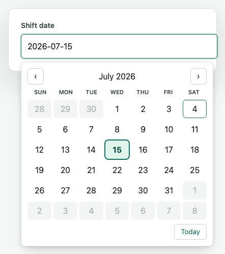
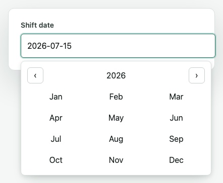
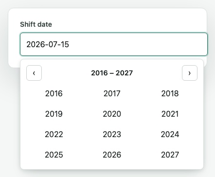
Only the labeled input shows by default; the picker opens as an anchored popover on focus. Screenshots below show the popover open, in each view.
Day view
Month view
Year view
Usage
import { createDatePicker } from "@schedulespark/date-picker";
import "@schedulespark/date-picker/styles.css";

const picker = createDatePicker({
  label: "Start date",
  value: "2026-07-04",
  minDate: "2026-01-01",
  maxDate: "2026-12-31",
  weekStartsOn: 0,
  onChange: (value) => {
    console.log(value); // YYYY-MM-DD
  }
});

picker.mount(document.querySelector("#date-picker"));
Theming
Every visual value is a CSS custom property on .ssp-date-picker, each falling back to the
default shown below. Override any subset in your own stylesheet — no JavaScript configuration
needed.
| Variable | Default | Affects |
|---|---|---|
| --ssp-date-picker-text | #18211f | Root text, day/month/year option text |
| --ssp-date-picker-label-text | #33413d | Field label, weekday header |
| --ssp-date-picker-border | #c7d1cc / #d8e0dc | Input, nav button, popover, and today-button borders |
| --ssp-date-picker-bg | #fff | Button, popover backgrounds |
| --ssp-date-picker-accent | #11735f | Focus ring, today indicator, focused-day outline |
| --ssp-date-picker-accent-bg | #dff4eb | Selected day/month background |
| --ssp-date-picker-accent-text | #0a4f42 | Selected day/month text |
| --ssp-date-picker-disabled-bg | #eef2f0 | Disabled option background |
| --ssp-date-picker-disabled-text | #8a9692 | Disabled/outside-month option text |
| --ssp-date-picker-radius | 0.5rem | Popover corner radius |
| --ssp-date-picker-popover-shadow | 0 12px 24px -12px rgb(10 30 25 / 25%), 0 2px 8px rgb(10 30 25 / 10%) | Popover drop shadow |
| --ssp-date-picker-z-index | 20 | Popover stacking order — raise this if the picker opens inside a modal or drawer with a higher stacking context |
| --ssp-date-picker-popover-min-width | 18rem | Popover minimum width |
| --ssp-date-picker-popover-max-width | min(94vw, 22rem) | Popover maximum width |
| --ssp-date-picker-day-size | 2.25rem | Day/month/year option minimum height |
Dark mode example
.my-dark-page .ssp-date-picker {
  --ssp-date-picker-text: #e7f1ee;
  --ssp-date-picker-label-text: #b7c4bf;
  --ssp-date-picker-border: #33413d;
  --ssp-date-picker-bg: #17211e;
  --ssp-date-picker-accent: #4fd1a5;
  --ssp-date-picker-accent-bg: #163a2f;
  --ssp-date-picker-accent-text: #8ff0c7;
  --ssp-date-picker-disabled-bg: #1f2926;
  --ssp-date-picker-disabled-text: #5b6b66;
}
API
createDatePicker(options) returns:
mount(host)renders the picker inside an element.setValue(value)updates the picker value. Rejects unparseable input rather than blanking the field.setDisabled(disabled)toggles disabled state.setRange(minDate, maxDate)updates the min/max bounds in place, without rebuilding the picker — use this when bounds change dynamically (e.g. cross-field range wiring between two pickers) instead of re-creating the instance.destroy()removes the picker DOM.
Options:
value: current date asYYYY-MM-DD.onChange: receives normalizedYYYY-MM-DD.minDate/maxDate: inclusive bounds. Out-of-range days are visibly disabled, not hidden.isDateDisabled:(date: string) => booleanpredicate for arbitrary custom disabling (e.g. holidays).weekStartsOn:0-6,0=Sunday..6=Saturday, default0.label,id,name,placeholder,required,disabled.
Keyboard navigation
- Arrow Left/Right: move focus ±1 day.
- Arrow Up/Down: move focus ±1 week.
- Home/End: move focus to the start/end of the visible week.
- Page Up/Down: move focus ±1 month.
- Shift+Page Up/Down: move focus ±1 year.
- Enter/Space: commit the focused day.
- Escape: close without changing the value.
Standalone publishing
This package has zero runtime dependencies — not React, not @schedulespark/time-picker, not
any third-party date library — so it can be published and consumed independently of the rest of
the ScheduleSpark monorepo.