
@sekizlipenguen/react-native-popup-confirm-toast
v2.2.6
Published
Popup, toast stack (ActionToast), bottom sheet (SPSheet), and drawer for React Native. Queue/stack toasts, positions, animations. Legacy Toast.show redirects to ActionToast.
Maintainers
 sekizpenguen
Keywords
Readme


@sekizlipenguen/react-native-popup-confirm-toast
A flexible popup, toast, action toast, bottom sheet (SPSheet), and drawer for React Native — iOS / Android / Web.
v2.2 highlights: ActionToast stack/queue, multi-position, animations, full style/CTA customization. Legacy banner Toast.show redirects to ActionToast (old UI removed).
v2.1 highlights: hook-based SPSheet, animated Popup cards, configurable mask color/opacity, Fabric-safe static dims, Popup portal above open sheets.
Note: This package has been moved to the @sekizlipenguen scope for improved organization and better support for future updates.
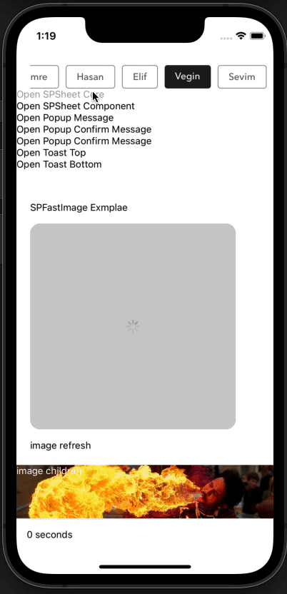
Example Bottom Sheet
| Custom Example 1 | Custom Example 2 | Custom Example 3 | Custom Example 4 |
|:----------------------:|:----------------------:|:----------------------:|:----------------------:|
|  |
|  |
|  |
|  |
|
Example Drawer
| Drawer Left | Drawer Right | Drawer Top | Drawer Bottom |
|:-----------------------:|:-----------------------:|:-----------------------:|:-----------------------:|
|  |
|  |
|  |
|  |
|
Example Popup Message
| Example Message | Example Confirm Message | Example Message AutoClose | Example Custom Body Component |
|:----------------------:|:-----------------------:|:-------------------------:|:-----------------------------:|
| 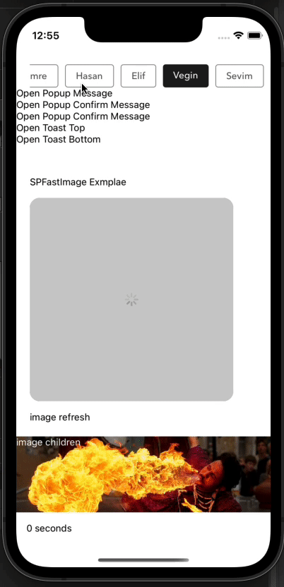 |
|  |
| 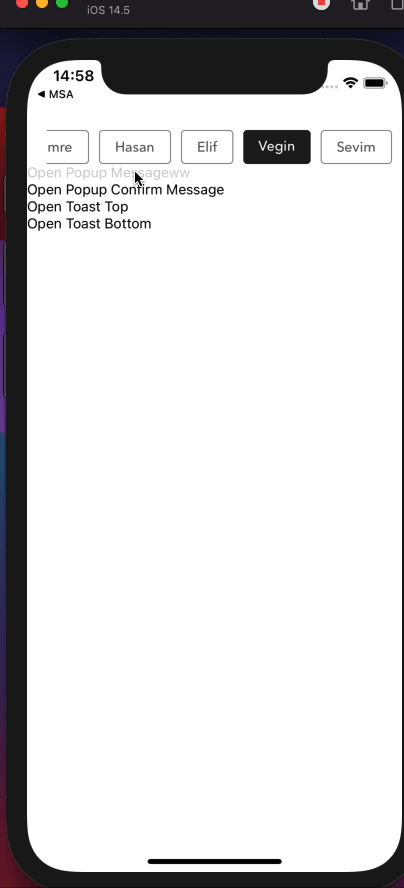 |
|  |
|
Example ActionToast (v2.2)
Stack / queue, positions, animations, types, CTA, and the playground visual tour:
| ActionToast Playground |
|:----------------------:|
| 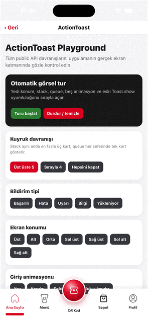 |
|
Example Toast Message (legacy)
Legacy banner visuals (pre-v2.2). Toast.show now redirects to ActionToast cards — see the demo above.
| Example Toast Top | Example Toast Bottom |
|:-----------------:|:--------------------:|
|  |
|  |
|
ActionToast (v2.2)
Card toast host (stack or queue) with positions, animations, icons, colors, and optional CTA — mounted automatically in Root. iOS uses react-native-screens FullWindowOverlay; Android/Web use a transparent Modal so cards stay above the native stack.
See the Example ActionToast demo above for the playground visual tour.
import { ActionToast, TOAST_POSITIONS } from '@sekizlipenguen/react-native-popup-confirm-toast';

// Cart / CTA (legacy white bar when action is set without type/backgroundColor)
ActionToast.show({
  message: 'Ürün sepete eklendi',
  duration: 4000,
  bottomOffset: 80,
  action: {
    node: <YourIcon size={20} color="#fff" />,
    backgroundColor: '#D6001F',
    onPress: () => navigation.navigate('Cart'),
  },
});

// Colored notification + stack
ActionToast.show({
  type: 'success',
  title: 'Başarılı',
  message: 'Sipariş numarası kopyalandı',
  position: TOAST_POSITIONS.bottom,
  animation: 'spring',
  mode: 'stack',
  maxVisible: 3,
  backgroundColor: '#6CA22C',
});

const toastId = ActionToast.show({ message: 'Kaydedildi' });
ActionToast.hide(toastId);
ActionToast.hide();      // newest
ActionToast.clear();     // all
ActionToast.setDefaults({ position: 'bottom', maxVisible: 3, mode: 'stack' });
| Key | Type | Description | Default |
|-----|------|-------------|---------|
| id | string/number | Replace same id if already queued/visible | auto |
| title | string | Optional title | — |
| message / text | string | Body | '' |
| type | string | success | error | warning | info | loading | — |
| icon | node | string | null | Overrides type glyph; null hides | preset |
| backgroundColor / textColor / iconColor | string | Override type colors | preset |
| duration | number | Auto-hide ms; 0 = sticky | 4000 |
| position | enum | top bottom center topLeft topRight bottomLeft bottomRight | bottom |
| animation | enum | slide fade fadeSlide spring none | spring |
| mode | enum | stack | queue | stack |
| maxVisible | number | Concurrent cards in stack mode | 3 |
| offset / bottomOffset | number | Edge inset | 16 |
| onPress | function | Whole-card press | — |
| pressDismiss | boolean | Dismiss after onPress | true if onPress |
| action | object | Side CTA { node, onPress, backgroundColor, … } | null |
| closeable | boolean | Show × | true |
| styles | object | { wrap, bar, title, message, icon, actionButton, closeButton } | {} |
| onOpen / onOpenComplete / onClose / onCloseComplete | function | Lifecycle | — |
queue always keeps one card visible. A new queue toast temporarily interrupts the current card(s); interrupted cards resume one by one after it closes. Stack cards shown while a queue toast is active wait behind it.
Git-only test screen
The repository includes a ready-to-use
ActionToast Playground
with all positions, stack/queue, animations, CTA, id replacement, legacy
Toast.show, and an automatic visual tour. Copy it into a development-only
navigation route. The examples/ directory is intentionally excluded from the
npm package.
Legacy Toast → ActionToast shim
Full-width banner Toast UI was removed in v2.2. Toast.show / Toast.hide still work and map to ActionToast:
| Legacy | Maps to |
|--------|---------|
| title | title |
| text | message |
| timing | duration |
| position top/bottom | same |
| backgroundColor / icon | same |
| timeColor, statusBar* | ignored |
// Still valid — renders as ActionToast card
Toast.show({
  title: "I'm Eight!",
  text: 'Hello',
  backgroundColor: '#702c91',
  timing: 3000,
  position: 'top',
});
Prefer ActionToast.show for new code.
SPSheet (v2.1)
Hook-based sheet with auto height, measure-before-open, keyboard-aware positioning, and customizable sheet open/close animations.
Fabric note: The dim/mask uses a static
backgroundColoron the Modal root (WIDTH × HEIGHT). Sheet motion (slide / fade / spring) still animates with the native driver. This is intentional — Animated opacity on the dim is unreliable inside RN Modal on New Architecture.
Quick start — fixed height
SPSheet.show({
  height: 320,
  dragTopOnly: true,
  closeOnPressMask: true, // tap dim to close (default)
  closeOnDragDown: true,  // swipe handle / sheet to close (default)
  component: MySheetBody,
});
Animations
import {
  SPSheet,
  SHEET_ANIMATIONS,
  SHEET_FROM,
  BACKDROP_ANIMATIONS,
  LAYER_Z,
} from '@sekizlipenguen/react-native-popup-confirm-toast';

// Classic bottom sheet (default)
SPSheet.show({
  height: 360,
  animation: SHEET_ANIMATIONS.slide, // slide | fade | fadeSlide | spring | none
  from: SHEET_FROM.bottom,           // bottom | top | left | right | center
  backdropAnimation: BACKDROP_ANIMATIONS.none, // API kept; dim is static on Fabric
  closeOnPressMask: true,
  component: MySheetBody,
});

// Fade + slide from top
SPSheet.show({
  height: 280,
  animation: 'fadeSlide',
  from: 'top',
  duration: 320,
  closeDuration: 220,
  component: MySheetBody,
});

// Center modal-style sheet with spring
SPSheet.show({
  autoHeight: true,
  animation: 'spring',
  from: 'center',
  bounciness: 8,
  speed: 12,
  component: MySheetBody,
});

// Detailed override
SPSheet.show({
  height: 400,
  sheetAnimation: {
    type: 'spring',
    from: 'bottom',
    duration: 300,
    closeDuration: 220,
    bounciness: 6,
    speed: 14,
  },
  zIndex: LAYER_Z.sheet, // default 10; Popup uses 100 so alerts cover the sheet
  component: MySheetBody,
});
Popup above SPSheet
When a sheet is open, Popup.show() does not open a second Modal (iOS often fails). Instead it portals into the sheet Modal:
- Popup gets its own full-screen dim above the drawer
- Default
zIndex: sheet10, popup100(LAYER_Z) - Closing the popup leaves the sheet open; closing the sheet also clears any portal popup
SPSheet.show({ autoHeight: true, component: ReviewForm });
// later, from inside the sheet:
Popup.show({ type: 'warning', title: 'Uyarı', textBody: 'Yorum en az 20 karakter olmalı' });
Popup card animations + mask config
Mask is static (Fabric-safe). Only the card animates.
import {
  Popup,
  POPUP_ANIMATIONS,
  POPUP_FROM,
} from '@sekizlipenguen/react-native-popup-confirm-toast';

Popup.show({
  type: 'warning',
  title: 'Uyarı',
  textBody: 'Bir şeyler ters gitti',
  // Card motion
  animation: POPUP_ANIMATIONS.fadeSlide, // slide | fade | fadeSlide | spring | none
  from: POPUP_FROM.center,               // bottom | top | left | right | center
  duration: 260,
  closeDuration: 200,
  // Static mask (never animated)
  background: 'rgba(0,0,0,0.5)', // or:
  maskColor: '#000',
  maskOpacity: 0.45,
  // mask: { color: '#111', opacity: 0.6 },
  closeOnPressMask: true,
});
Same mask knobs work on SPSheet:
SPSheet.show({
  height: 360,
  background: 'rgba(0,0,0,0.5)',
  maskColor: '#000000',
  maskOpacity: 0.4,
  component: MySheetBody,
});
Dismiss behaviour
| Option | Default | Behaviour |
|--------|---------|-----------|
| closeOnPressMask | true | Tap the dimmed area outside the sheet → close |
| closeOnDragDown | true | Drag along the entry axis past ~25% → close |
| closeOnPressBack | true | Android hardware back / Modal onRequestClose → close |
| dragTopOnly | false | When true, only the handle captures the pan gesture |
SPSheet.show({
  height: 320,
  closeOnPressMask: true,
  closeOnDragDown: true,
  closeOnPressBack: true,
  dragTopOnly: true,
  component: MySheetBody,
});

SPSheet.hide();
SPSheet.isOpen(); // boolean
Auto height (recommended for forms)
Content is measured off-screen first, then the sheet opens once at the correct height — no small-then-grow flicker.
SPSheet.show({
  autoHeight: true,
  allowHeightShrink: true,
  keyboardHeightAdjustment: true,
  dragTopOnly: true,
  closeOnDragDown: true,
  closeOnPressMask: true,
  component: ProductReviewSheetBody,
});
Inside the body component:
function ProductReviewSheetBody({ sheetProps }) {
  const insets = useSafeAreaInsets();
  const sheetHeight = sheetProps?.sheetHeight || 0;
  const isMeasuring = sheetProps?.measuring === true;

  return (
    <ScrollView
      style={sheetHeight && !isMeasuring ? { maxHeight: sheetHeight - 17 } : undefined}
      contentContainerStyle={{ paddingBottom: insets.bottom }}
    >
      <View
        onLayout={(e) => {
          const h = e.nativeEvent.layout.height;
          // First layout: report immediately (no debounce) for measure-before-open
          SPSheet.reportContentHeight(h + 17 + insets.bottom);
        }}
      >
        {/* form content */}
      </View>
    </ScrollView>
  );
}
SPSheet API highlights
| Key | Type | Description | Default |
|-----|------|-------------|---------|
| height | number | Fixed height (px). Ignored when autoHeight: true | min 100 |
| autoHeight | boolean | Content-driven height | false |
| maxHeight | number | Max sheet height | 92% of screen |
| allowHeightShrink | boolean | Allow height to decrease after open | true |
| keyboardHeightAdjustment | boolean | Lift sheet above keyboard (iOS + Android) | false |
| dragTopOnly | boolean | Drag handle only (not whole sheet) | false |
| closeOnDragDown | boolean | Drag to dismiss | true |
| closeOnPressMask | boolean | Tap dim outside sheet to close | true |
| closeOnPressBack | boolean | Android back / Modal request close | true |
| component | FC | Body component; receives sheetProps | null |
| background | string | Static mask color | rgba(0,0,0,0.5) |
| maskColor | string | Mask color override | — |
| maskOpacity / opacity | number | Mask opacity 0–1 | — |
| mask | object | { color, opacity } | — |
| animation | string | slide | fade | fadeSlide | spring | none | slide |
| from | string | bottom | top | left | right | center | bottom |
| backdropAnimation | string | object | API kept; dim is static on Fabric Modal | fade |
| sheetAnimation | object | Full override: { type, from, duration, closeDuration, bounciness, speed } | — |
| zIndex | number | Stack order inside Modal host | 10 |
| onOpen / onOpenComplete / onClose / onCloseComplete | function | Lifecycle callbacks | — |
Static methods
| Method | Description |
|--------|-------------|
| SPSheet.show(config) | Open sheet |
| SPSheet.hide() | Close sheet |
| SPSheet.setHeight(height, onComplete?) | Change height after open |
| SPSheet.reportContentHeight(height, onComplete?) | Same as setHeight; use from body onLayout |
| SPSheet.isOpen() | true while Modal is open |
sheetProps passed to body
| Key | Type | Description |
|-----|------|-------------|
| sheetHeight | number | Current sheet height |
| keyboardInset | number | Active keyboard lift (px) |
| measuring | boolean | true during off-screen measure phase |
| animation | object | Resolved sheet animation config |
| from | string | Entry direction |
Keyboard behaviour (iOS)
When keyboardHeightAdjustment: true:
- Sheet lifts via bottom inset above the keyboard.
- White fill covers the rounded gap between sheet and keyboard top edge.
- Combine with a bounded
ScrollView+ scroll-to-focused-field in your body for best UX.
Using npm:
npm install @sekizlipenguen/react-native-popup-confirm-toast react-native-screensUsing yarn:
yarn add @sekizlipenguen/react-native-popup-confirm-toast react-native-screensreact-native-screens >= 3.16.0 is a peer dependency used by ActionToast on iOS. Projects using React Navigation usually already have it. After a new native installation, run pod install in the iOS directory.
Usage
Wrap your root component in Provider from @sekizlipenguen/react-native-popup-confirm-toast. If you have a vanilla React Native project, it's a good idea to add it in the component which is passed to AppRegistry.registerComponent. This will usually be in the index.js file. If you have an Expo project, you can do this inside the exported component in the App.js file.
Example Provider
import * as React from 'react';
import { AppRegistry } from 'react-native';
import {Root as PopupRootProvider} from '@sekizlipenguen/react-native-popup-confirm-toast';
import { name as appName } from './app.json';
import App from './src/App';

export default function Main() {
  return (
    <PopupRootProvider>
      <App />
    </PopupRootProvider>
  );
}

AppRegistry.registerComponent(appName, () => Main);
Example Bottom Sheet
import { Root, SPSheet } from '@sekizlipenguen/react-native-popup-confirm-toast'

const component = (props) => {
    //hook or class
    return (<Text>Hi, SekizliPenguen</Text>);

    //props.spSheet.hide();
    //props.spSheet.setHeight(150,()=>alert('nice'));
};

<View>
    <TouchableOpacity
        onPress={() => {
            const spSheet = SPSheet;
            spSheet.show({
                component: () => component({...this.props, spSheet}),
                dragFromTopOnly: true,
                onCloseComplete: () => {
                    alert('onCloseComplete');
                },
                onOpenComplete: () => {
                    alert('onOpenComplete');
                },
                height:260
            });
        }
    >
        <Text>Open SPSheet Message</Text>
    </TouchableOpacity>
</View>
Example Message
import {Popup} from '@sekizlipenguen/react-native-popup-confirm-toast'
<View>
    <TouchableOpacity
        onPress={() =>
          Popup.show({
            type: 'success',
            title: 'Success!',
            textBody: 'Mutlak özgürlük, kendi başına hiçbir anlam ifade etmez. ',
            buttonText: 'OK',
            callback: () => Popup.hide()
          })
        }
    >
        <Text>Open Popup Message</Text>
    </TouchableOpacity>
</View>
Example Confirm Message
import {Popup} from '@sekizlipenguen/react-native-popup-confirm-toast'
<View>
<TouchableOpacity
onPress={() =>
Popup.show({
type: 'confirm',
title: 'Dikkat!',
textBody: 'Mutlak özgürlük, kendi başına hiçbir anlam ifade etmez. ',
buttonText: 'Tamam',
confirmText: 'Vazgeç',
callback: () => {
alert('Okey Callback && hidden');
Popup.hide();
},
cancelCallback: () => {
alert('Cancel Callback && hidden');
Popup.hide();
},
})
}
>
<Text>Open Popup Confirm Message</Text>
</TouchableOpacity>
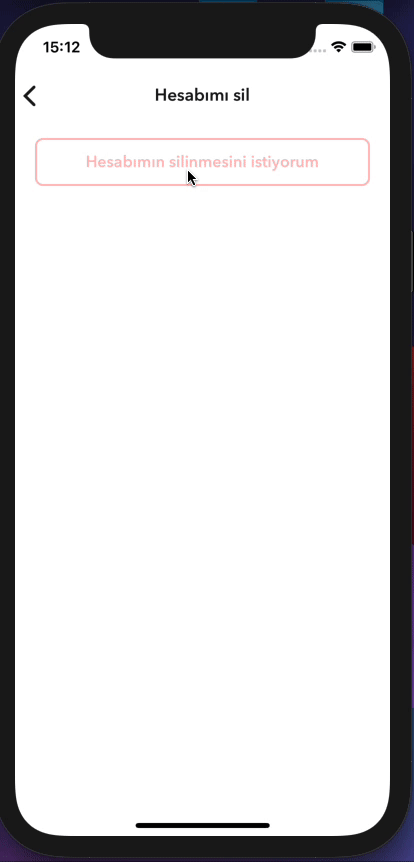
</View>Example Custom Body Component
import { Root, Popup } from '@sekizlipenguen/react-native-popup-confirm-toast'
//hooks or class component
const bodyComponent = ({props,bodyProps}) => {
    return (
        <View onLayout={(e}=>bodyProps.onLayout(e)}>
        <Text>Mustafa Kemal ATATÜRK</Text>
        </View>
    );
}

<Root>
    <View>
        <TouchableOpacity
            onPress={() => {
                const popup = Popup;
                popup.show({
                    type: 'confirm',
                    textBody: 'Hesabınızın silinme işlemini onaylamak için şifrenizi giriniz.',
                    bodyComponent: (bodyProps) => bodyComponent({...props,bodyProps,popup}),
                    confirmText: 'Cancel',
                    iconEnabled: false,
                    buttonEnabled: false,
                });
            }}
        >
            <Text>Open Popup Confirm Message</Text>
        </TouchableOpacity>
    </View>
</Root>
Toast
import { Root, Toast } from '@sekizlipenguen/react-native-popup-confirm-toast'
    <Root>
        <View>
            <TouchableOpacity
onPress = {()
=>
                      Toast.show({
                          title: 'I\'m Eight!',
                          text: 'The best gift I received in this life are the codes. They are worlds inside the worlds.',
                          backgroundColor: '#702c91',
                          timeColor: '#440f5f',
                          timing: 3000,
                          icon: <Icon name={'check'} color={'#fff'} size={31}/>,
                          position: 'bottom',
                          statusBarType:'dark-content',
                          onCloseComplete: () => {
                            alert('onCloseComplete');
                          },
                          onOpenComplete: () => {
                            alert('onOpenComplete');
                          },
                        })
                }
            >
                <Text>Open Bottom Toast</Text>
            </TouchableOpacity>

            <TouchableOpacity
                onPress={() =>
                    Toast.show({
                      title: 'I\'m Eight!',
                      text: 'The best gift I received in this life are the codes. They are worlds inside the worlds.',
                      backgroundColor: '#702c91',
                      timeColor: '#440f5f',
                      timing: 3000,
                      icon: <Icon name={'check'} color={'#fff'} size={31}/>,
                      position: 'top',
                      statusBarTranslucent: false,
                      statusBarType:'light-content',
                      onCloseComplete: () => {
                        alert('onCloseComplete');
                      },
                      onOpenComplete: () => {
                        alert('onOpenComplete');
                      },
                    })
                }
            >
                <Text>Open Top Toast</Text>
            </TouchableOpacity>

        </View>
    </Root>
Drawer
import {Root, Drawer} from '@sekizlipenguen/react-native-popup-confirm-toast'

const DrawerContent = ({onClose}) => {
  return (
      <View style={{flex: 1, padding: 20}}>
        <Text>Custom Drawer Content</Text>
        <TouchableOpacity onPress={onClose}>
          <Text>Close Drawer</Text>
        </TouchableOpacity>
      </View>
  );
};

<Root>
  <View>
    <TouchableOpacity
        onPress={() => {
          Drawer.show({
            component: DrawerContent,
            position: 'left',
            drawerWidth: 300,
            backgroundColor: 'rgba(0, 0, 0, 0.5)',
            drawerColor: '#ffffff',
            duration: 300,
            backdropPressToClose: true,
            onOpenComplete: () => {
              console.log('Drawer opened');
            },
            onCloseComplete: () => {
              console.log('Drawer closed');
            },
          });
        }}
    >
      <Text>Open Left Drawer</Text>
    </TouchableOpacity>

    <TouchableOpacity
        onPress={() => {
          Drawer.show({
            component: DrawerContent,
            position: 'right',
            drawerWidth: 280,
          });
        }}
    >
      <Text>Open Right Drawer</Text>
    </TouchableOpacity>

    <TouchableOpacity
        onPress={() => {
          Drawer.show({
            component: DrawerContent,
            position: 'top',
            drawerWidth: 200,
          });
        }}
    >
      <Text>Open Top Drawer</Text>
    </TouchableOpacity>

    <TouchableOpacity
        onPress={() => {
          Drawer.show({
            component: DrawerContent,
            position: 'bottom',
            drawerWidth: 250,
          });
        }}
    >
      <Text>Open Bottom Drawer</Text>
    </TouchableOpacity>
  </View>
</Root>
Features & Documentation
SPSheet
| Key | Type | Description | Default |
|----------------------------|--------------------------|---------------------------------------------------------------------------|--------------------|
| background | string | Static mask color | rgba(0, 0, 0, 0.5) |
| maskColor | string | Mask color override | — |
| maskOpacity / opacity | number | Mask opacity 0–1 | — |
| mask | object | { color, opacity } | — |
| height | number | auto height (min: 250) | 250 |
| duration | number | open animation duration | 280(ms) |
| closeDuration | number | close animation duration | 240(ms) |
| animation | string | slide | fade | fadeSlide | spring | none | slide |
| from | string | bottom | top | left | right | center | bottom |
| backdropAnimation | string | object | API kept; dim is static on Fabric Modal (see note above) | fade |
| sheetAnimation | object | detailed override for sheet motion | — |
| zIndex | number | stack order inside Modal (Popup default 100) | 10 |
| closeOnDragDown | boolean | Drag along entry axis to close | true |
| closeOnPressMask | boolean | Tap dimmed area outside sheet to close | true |
| closeOnPressBack | boolean | Android back / Modal onRequestClose | true |
| dragTopOnly | boolean | use only the top area of the draggable icon to close the window | false |
| component | component(hook or class) | custom modal component container | null |
| onOpen | function | works after the window is opened | null |
| onOpenComplete | function | works after the window is opened | null |
| onClose | function | works after window is closed | null |
| onCloseComplete | function | works after window is closed | null |
| customStyles | object | { container, draggableIcon, draggableContainer, backdrop, overlay, handle } | {} |
| timing | number | deprecated alias for duration | — |
| keyboardHeightAdjustment | boolean | Lift sheet above keyboard; iOS gap fill | false |
| autoHeight | boolean | Content-driven height; measure-before-open | false |
| maxHeight | number | Maximum sheet height (px) | 92% of screen |
| allowHeightShrink | boolean | Allow height to decrease after open | true |
Popup
| Key | Type | Description | Default |
|--------------------------|------------------------------------|----------------------------------------------------------------------------------------------------|---------------------------------------------------------------------------------------------------------------------------|
| title | string | | false |
| textBody | string | | false |
| bodyComponent | component(hook or class) | custom modal component container | null |
| bodyComponentForce | boolean | The component you specify covers the entire space | false |
| onLayout | (event: LayoutChangeEvent) => void | Triggers automatically to calculate and adjust the height of the popup component during rendering. | - |
| type | enum | enum(success, info, danger, warning, confirm) | warning |
| buttonText | string | | Ok |
| confirmText | string | | Cancel |
| callback | function | ok button press | popupHidden |
| cancelCallback | function | cancel button press | popupHidden |
| background | string | Static mask color (Fabric-safe) | rgba(0, 0, 0, 0.5) |
| maskColor | string | Mask color override | — |
| maskOpacity / opacity| number | Mask opacity 0–1 | — |
| mask | object | { color, opacity } | — |
| animation | string | Card: slide | fade | fadeSlide | spring | none | fadeSlide |
| from | string | Card entry: bottom | top | left | right | center | center |
| popupAnimation | object | Detailed card animation override | — |
| closeOnPressMask | boolean | Tap mask to close | true |
| timing | number | 0 > autoClose | 0 |
| iconEnabled | boolean | | true |
| iconHeaderStyle | object | | {height: 75, width: 100, backgroundColor: '#fff'} |
| icon | requireUrl | | require('../assets/{type}.png') |
| containerStyle | object | | { position: 'absolute', zIndex: 10, backgroundColor: 'rgba(0, 0, 0, 0.5)', alignItems: 'center', top: 0, left: 0,} |
| modalContainerStyle | object | | { width: '90%',backgroundColor: '#fff', borderRadius: 8, alignItems: 'center', overflow: 'hidden', position: 'absolute'}} |
| buttonContentStyle | object | | {} |
| okButtonStyle | object | | {backgroundColor: '#702c91'} |
| confirmButtonStyle | object | | default |
| okButtonTextStyle | object | | default |
| confirmButtonTextStyle | object | | default |
| titleTextStyle | object | | default |
| descTextStyle | object | | default |
| bounciness | number | | 15 |
| onClose | function | when the popup is first closed | false |
| onCloseComplete | function | | false |
| onOpen | function | when the popup is first opened | false |
| onOpenComplete | function | | false |
| duration | boolean | | 100 |
| closeDuration | boolean | | 100 |
Toast (legacy shim → ActionToast)
| Key | Type | Notes |
|-----|------|-------|
| title / text / timing / position / backgroundColor / icon | — | Mapped to ActionToast |
| timeColor, statusBar*, hiddenDuration, startDuration | — | Ignored |
| Prefer | — | ActionToast.show |
Drawer
| Key | Type | Description | Default |
|------------------------|--------------------------|----------------------------------------------------|--------------------|
| component | component(hook or class) | custom drawer component (receives onClose as prop) | null |
| position | enum | enum(left, right, top, bottom) | left |
| drawerWidth | number | width or height of drawer depending on position | 80% of screen |
| backgroundColor | string | backdrop background color | rgba(0, 0, 0, 0.5) |
| drawerColor | string | drawer background color | #ffffff |
| duration | number | animation duration in milliseconds | 300(ms) |
| backdropPressToClose | boolean | close drawer when pressing backdrop | true |
| onOpen | function | works when the drawer starts opening | null |
| onOpenComplete | function | works after the drawer is fully opened | null |
| onClose | function | works when the drawer starts closing | null |
| onCloseComplete | function | works after the drawer is fully closed | null |
Methods
| Component Name | Method Name | Example | Description | |----------------|-------------|------------------------------------------------------------------------|-------------------------------------| | SPSheet | show | const spSheet = SPSheet; spSheet.show(config); | | | SPSheet | hide | const spSheet = SPSheet; spSheet.hide(); | | | SPSheet | setHeight | SPSheet.setHeight(500, onComplete) | Change height after open | | SPSheet | reportContentHeight | SPSheet.reportContentHeight(500, onComplete) | Same as setHeight; use from body | | SPSheet | isOpen | SPSheet.isOpen() | Whether sheet Modal is open | | ActionToast | show | ActionToast.show(config) | Show toast (stack/queue) | | ActionToast | hide | ActionToast.hide(id?) | Hide newest or by id | | ActionToast | clear | ActionToast.clear() | Clear all | | ActionToast | setDefaults | ActionToast.setDefaults(config) | Global defaults | | Popup | show | const popup = Popup; popup.show(config); | | | Popup | hide | const popup = Popup; popup.hide(); | | | Toast | show | Toast.show(config) | Legacy → ActionToast shim | | Toast | hide | Toast.hide() | Legacy → ActionToast.hide | | Drawer | show | const drawer = Drawer; drawer.show(config); | | | Drawer | hide | const drawer = Drawer; drawer.hide(); | |
Helper Function
import {getStatusBarHeight} from '@sekizlipenguen/react-native-popup-confirm-toast';Author
SekizliPenguen