
@sencorp/react-ui
v0.1.12
Published
React UI components from Sencorp, organized by component family.


Readme
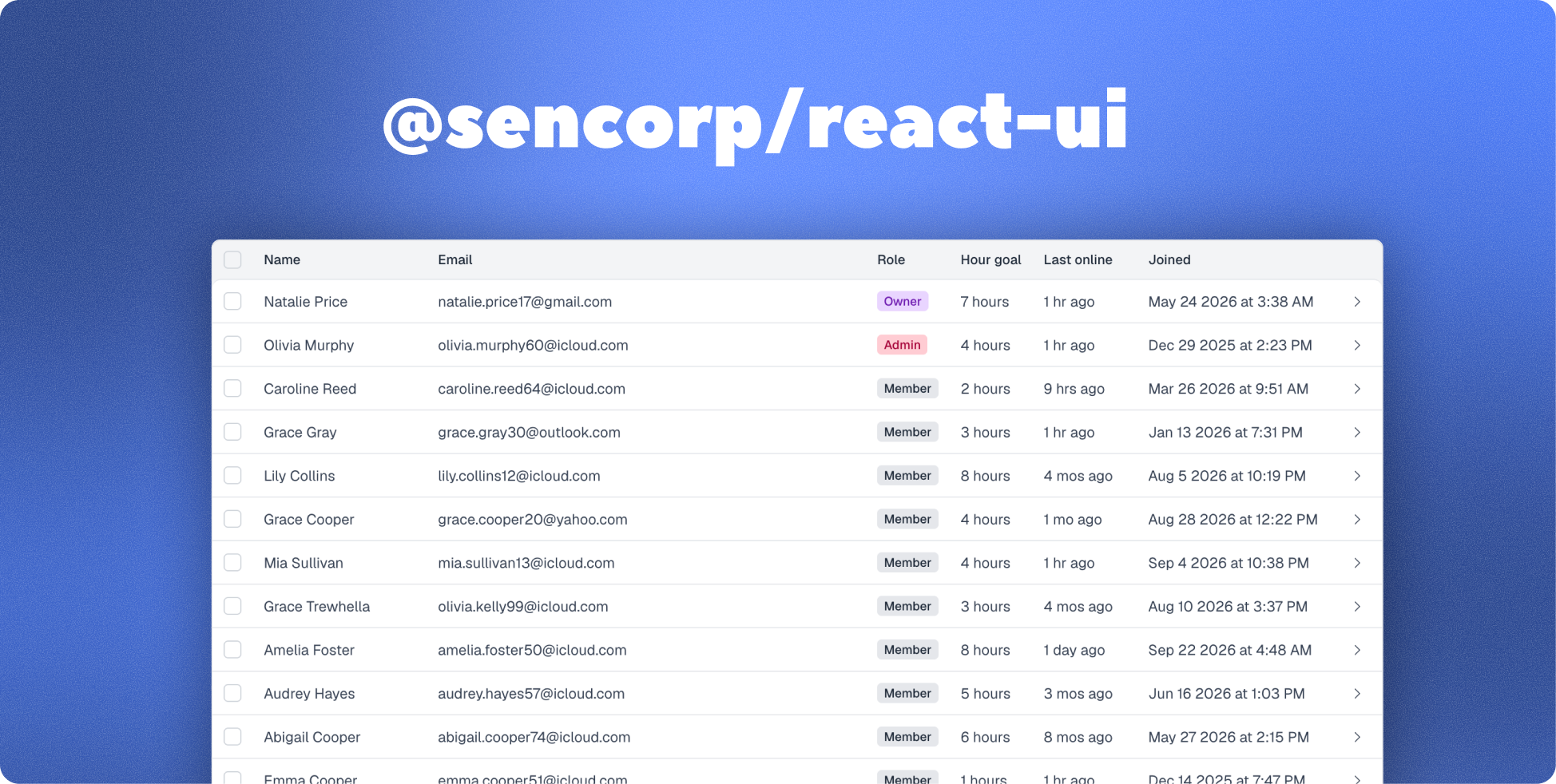
@sencorp/react-ui
Commonly used React UI components, ready to customize with your own design system.
Install
Use React 18 or 19. Install the package and Motion 12:
npm install @sencorp/react-ui "motion@^12.23.0"Choose a component
Follow the setup guide for each component you want to use:
| Component | Import path | Setup guide |
| --- | --- | --- |
| Table | @sencorp/react-ui/table | Table |
| Modal | @sencorp/react-ui/modal | Modal |
| Sidebar | @sencorp/react-ui/sidebar | Sidebar |
| Toast | @sencorp/react-ui/toast | Toast |
Import the shared stylesheet once at your app root. It includes styles for all components and does not require Tailwind:
import "@sencorp/react-ui/styles.css";Or import only the component styles you need:
import "@sencorp/react-ui/table/styles.css";
import "@sencorp/react-ui/modal/styles.css";
Sidebar and toast currently use inline styles and do not need a stylesheet.
For tables, wrap your table in TableThemeProvider.
For modals, register your components with ModalProvider at the app root and create a typed useModal wrapper.
For sidebars, register your components with SidebarProvider at the app root and create a typed useSidebar wrapper.
For toasts, mount ToastProvider once and call toast.show() with your content from any component or function.
Try the demo
Use Node.js 22.12 or newer. In this repository, run:
npm install
npm run dev
Open the local URL printed in your terminal.