
@shopex-ui/finder
v1.0.76
Published
+ Finder是对ElementUI组件的二次封装,封装了平常业务中一些重复的场景,加快了开发速度,开发者只需要专注一些定制化的开发 + 统一样式规范,减少UI层面的bug率

Readme
Finder组件简介
- Finder是对ElementUI组件的二次封装,封装了平常业务中一些重复的场景,加快了开发速度,开发者只需要专注一些定制化的开发
- 统一样式规范,减少UI层面的bug率
安装
npm install @shopex-ui/finder
使用
import { initFinder } from '@shopex-ui/finder'
import "@shopex-ui/finder/lib/finder.css"

// 初始化optons配置参数下面会有详解 options: Object
initFinder(Vue, options)
options参数配置
- fetchLibrary(必须):finder用于发起ajax的请求库,一般是axios的instance,亦或是实现了get、post、put、patch的其他请求库
- context: Object
- globalHooks: Object 全局的钩子函数
- beforeQuery: 在请求列表数据之前调用 (入参:当前页面的请求参数,出参:接口需要携带的参数)
- afterQuery: 在请求列表数据之后调用 (入参:接口返回的参数,出参:页面渲染的数据)
- beforeRequest: 在finder发起所有的请求之前调用
- afterRequest:在finder发起所有的请求之后调用
- searchComponent:Component 用于替换finder的搜索组件,传入一个异步加载的组件。例如: () => import('xx/x.vue')
- qs: Boolean 是否将请求参数封装到qs对象里面
- logger: Boolean 是否打印finder的内部运行日志
- locale: Object finder相关文案传入
- search 搜索 按钮文案
- reset 重置 按钮文案
- open 打开
- retract 收起
- operation 操作 操作列title
- globalHooks: Object 全局的钩子函数
简单使用
<template>
  <SpFinder
    :url="{
      setting: 'https://ecboot.it.shopex123.com/ecsAdminConnection/finder/setting',
      data: 'https://ecboot.it.shopex123.com/ecsAdminConnection/finder/list'
    }"
  >
  </SpFinder>
</template>- 如果后端也遵循finder的开发规范,那么表格列字段,数据、包括分页finder都会自动处理(前提是页面逻辑足够简单),只需要传入对应的finder的配置接口地址(setting)和数据的接口地址(data)
- setting配置项也可以单独传入 点击查看 Demo
- 这里是默认需要分页的,如果不需要分页请查看 不需要分页Demo
- 其他Demo请查看 更多demo
组件参数说明
- 一些复杂数据类型会在下面有单独定义
组件参数
| 名称 | 必须 | 类型 | 说明 | 默认值 | | --- | --- | --- | --- | --- | | title | 否 | String | 页面的title | null | | url | 是 | {setting: String, data: String} | 配置和数据的接口地址,data:为必填 | | | Id | 否 | String | Number | finder的唯一ID | null | | row-key | 否 | String | 行唯一标识,在多选模式下必填 | id | | columns | 否 | ColumnItem[] | 自定义传入columns,会和setting接口返回的合并 | [] | | actions | 否 | ActionItem[] | 配置行或批量操作的按钮 | [] | | search | 否 | SearchItem[] | 自定义搜索项,会和setting接口返回的search合并 | [] | | data | 否 | Object[] | 自己传入data数据 | [] | | show-filter | 否 | Boolean | 是否显示高级搜索部分 | True | | show-toolBar | 否 | Boolean | 是否显示表格上方的工具栏 | true | | show-pager | 否 | Boolean | 是否显示分页,不需要分页请查看 不需要分页Demo | true | | front-paging | 否 | Boolean | 是否开启前端分页,搭配data属性使用(默认_index为每行序号) | false | | tree | 否 | Boolean | 是否是树形结构 | false | | no-selection | 否 | Boolean | 是否隐藏表头多选框 | false | | use-global-search | 否 | Boolean | 是否在当前页面使用自定义的搜索组件 | false | | hooks | 否 | Hooks | 组件的局部钩子函数 | {} | | split-count | 否 | Number | actions分割数,超出将被放到更多里面显示 | 2 | | search-row-count | 否 | Number | 搜索区域显示的行数,超出指定行数将会被折叠 | 2 | | reserve-selection | 否 | Boolean | 记住当前页选择状态,即保持分页选择 | false | | fixed-row-action | 否 | Boolean | 是否固定操作列 | false | | row-actions-align | 否 | String | 操作列表头文案位置 | center | | row-actions-fixed-align | 否 | String | 操作列固定位置 | left | | row-actions-width | 否 | String | 操作列的宽度 | undfined | | row-actions-mini-width | 否 | String | 操作列的最小宽度,默认根据按钮字符数计算 | undfined | | fixed-selection | 否 | Boolean | 是否固定selection列 | true | | other-config | 否 | Object | 支持elementi-ui的所有属性配置,透传给el-table组件 | {} | | open-performance | 否 | Boolean | 是否开启高性能表格(finder-plus具备该属性, element-plus高版本不需要开启) | false | | show-pager-text | 否 | String | 展示页码左侧选中文案,文案为手动传入 使用方法 :show-pager-text="已选中${n}" ${n} 为选中数量的占位符 | undefined | | req-method | 否 | String | 列表页请求方式 get | post | get |
ColumnItem
- 单元格的可配置参数
- 部分复杂类型见ts类型定义
- 除了下面列出的属性以外,其他对应ElementUI组件支持的属性都可以传递
| 名称 | 必须 | 类型 | 说明 | | --- | --- | --- | --- | | name | 是 | String | 名称 | | key | 是 | String | 键 | | width | 否 | Number | 单元格宽度 | | minwWidth | 否 | Number | 单元格最小宽度 | | formatterType | 否 | FieldType | 格式化数据,例如:时间日期 | | render | 否 | Function(creatElement,scope) | 自定义渲染函数 | | showType | 否 | ColShowType | 显示类型。例如:输入框、图片、开关等。默认为文本 | | componentProps | 否 | ComponentProps | 配合 showType使用,传入一些参数给对应的组件 | | formatter | 否 | Function(value, row, col) | 自定义格式话函数 | | visible | 否 | boolean | 显示或隐藏该列 | | children | 否 | #### Array | 多级表头 |
ActionItem
- 操作按钮的配置参数
- 部分复杂参数件ts类型定义
- 除了下面列出的属性以外,其他对应ElementUI组件支持的属性都可以传递
| 名称 | 必须 | 类型 | 说明 | | --- | --- | --- | --- | | name | 是 | string | 名称 | | key | 是 | string | 唯一标识 | | slot | 否 | header | row | 默认row | | type | 是 | button | 显示类型 默认为button | | buttonType | 否 | primary | warning 等 | ElementUI按钮类型 | | action | 是 | Action | 配置点击后的操作 | | visible | 否 | Function | Boolean | 是否隐藏当前按钮,返回boolean |
SearchItem
- 搜索项的配置参数
- 部分复杂类型见ts类型定义
- 支持对应type类型组件的所有参数,可参考对应的element-ui问题
- 除了下面列出的属性以外,其他对应ElementUI组件支持的属性都可以传递
| 名称 | 必须 | 类型 | 说明 | | --- | --- | --- | --- | | name | 是 | string | 名称 | | key | 是 | string | key | | type | 否 | SearchType | 组件的类型 | | slot | 否 | string | 自定义插槽 | | start | 否 | string | 时间日期范围选择时候传入的开始时间key | | end | 否 | string | 时间日期范围选择时候传入的结束时间key | | options | 否 | Array | String | 可以传入一个接口地址,finder将自动获取对应的选项 | | labelKey | 否 | string | options为接口地址的时候需要从接口提取的label key (默认值:label) | | valueKey | 否 | string | options为接口地址的时候需要从接口提取的value key (默认值:value) | | transform | 否 | Function(res) | options为接口地址的时自定义转换为options |
Hooks
| 名称 | 必须 | 类型 | 说明 | | --- | --- | --- | --- | | beforeSearch | 否 | Function(params) | 搜索前执行,接收当前的搜索参数,返回新的参数 | | afterSearch | 否 | Function(res) | 搜索后执行,返回查询出的data |
显示类型定义
type FieldType = "string" | "date" | "datetime" | "boolean"

type ColShowType = "switch" | "input" | "image" | "clickable" | "editable" | "text" | "copiable" | "date-picker" | "date-time-picker" | "pop-editable"

type SearchType = "datetime" | "date-time-picker" | "date-picker" | "select" | "date-range" | "month-range" | "month" | "year" | "cascader"

type ElementScope = {
  row: object
  column: object
  $index: number
  store: object
}
Action
interface Action {
  type?: 'api' | 'link' | 'dialog' | 'viewDetail' // 枚举类型
  // 当type为viewDetail时候需要使用detail插槽自定义内容
  title?: string 											// 当type为 viewDetail、dialog 时候显示的title
  component?: () => Promise          	// 当type为dialog的时候需要传入的异步加载组件
  handler?: (rows) => boolean  				// 自定义处理函数,返回boolean决定只否继续往下执行
  path?: string 											// 当type为link|api的时的路由地址
  rowKey?: string 										// 当type为link的时候需要携带当前行的字段名称
  confirm?: boolean										// 是否显示操作确认提示弹窗
  method?: string											// 接口调用方法 默认 post
  getApiParams?: (rows) => object			// 返回接口所需参数 默认 取所有的ID
  actions?: any[]											// type为dialog时候的操作按钮 参数见elementUI文档
  // type为diaolog的时候elementUi的dialog属性都可以在这里使用...
}
ComponentProps
  interface ComponentProps extends ElInput {

    /**
     * select、input、switch change后调用的接口地址
     */
    url?: string

    /**
     * 自定义select、input、switch的change事件
     * @param v
     * @param row
     */
    handler?: (v: string, row: object) => void | boolean

    /**
     * 样式设置
     */
    style?: object

    /**
     * showType为clickable时候触发的action
     */
    action?: FinderAction

    /**
     * showType 为images时候需要显示的url的key
     */
    key: string

    /**
     * 图片的宽高
     */
    width?: number
    height?: number

    placeholder?: string

    maxlength?: number

    size?: "small" | "mini" | "medium" | "max"

    /**
     * showType 为select的下拉选项值
     * 该值可以是一个接口地址的字符串或者是数组
     */
    options?: string | {[key: string]: string}[]

    /**
     * option的label对应的key
     */
    labelKey?: string

    /**
     * option的value对应的key
     */
    valueKey?: string

    /**
     * 自定义options的转换方法
     */
    transform?: (res: any) => object[]

    /**
     * 调用接口需要传递的参数
     */
    getApiParams: (row: object) => object
  }
事件
- 除了下面列出的事件以外,其他对应ElementUI组件支持的事件都可以传递
| 名称 | 参数 | 说明 | | --- | --- | --- | | search | 当前页面搜索参数 | 点击搜索触发 | | reset | | 点击重置搜索触发 | | row-click | row | 点击行触发 | | selection-change | { selection, current } | 选中发生变化触发 | | header-dragend | newWidth, oldWidth, column, event | 当拖动表头改变了列的宽度的时候会触发该事件 | | select-all | selection | 当用户手动勾选全选 Checkbox 时触发的事件 | | select | selection, row | 当用户手动勾选数据行的 Checkbox 时触发的事件 | | row-contextmenu | row, column, event | 当某一行被鼠标右键点击时会触发该事件 |
方法
- 如果要获取el-table的原生方法可以通过**$refs**逐级获取
| 方法名称 | 入参 | 说明 | | --- | --- | --- | | setDefaultSelection | rows | 选中表格指定行 | | refresh | force: boolean | 刷新表格,清空勾选,force为true会重置页码 | | initData | force: boolean | 更新数据,不清空勾选项,常用在自定义分页(当前只支持finder-plus) | | clearSearchValue | | 清空搜索值 | | getSearchParams | | 获取搜索值 | | handleUpdateField | key, value | 设置搜索项的默认值 |
插槽
| 名称 | 位置 | 说明 | | --- | --- | --- | | tableTop | 表格的上方 | 用于自定义表格的上方的区域 | | detail | 详情的弹窗dialog | action.type = 'viewDetail'的时候显示 | | default | 搜索组件 | 替换当前finde的搜索 | | toolbar | toolbar | 替换toolbar |
Example
useDialog 使用
- finder内部提供了一个useDialog 函数,无需在去维护visible这些变量了,可以便捷的使用dialog组件
<script>
import { useDialog } from "@shopex-ui/finder"
export default {
  methods: {
    testUseDialog(params) {
      useDialog(this, {
       title: "title",
        dialogID: 'demo-id', // 同时有多个弹窗打开需要用到,否则只会打开一个弹窗
        component: () => import("@/xx/xx.vue"),
        actions: [
          {type: "default", label: "关闭", key: "close"},
          {type: "primary", label: "保存", key: "save"}
        ]
      }).then((...args) => console.log(...args)) // 输出 {test: "closed"}
    }
  }
};
</script>

// @/xx/xx.vue
<template>
// ...
</template>
<script>
  export default {
   // ...
    methods: {
      handleAction (conf) {
        try {
          const data = {}
          this.$emit('loading', true)
          await api(data)
          this.$message.success('成功')
          this.$emit('close', {test: "closed"})
        } finally{
          this.$emit('loading', false)
        }
        // if (conf.key === "close") {
        //   this.$emit("close", {test: "closed"})
        // } else {
        //   // ... key = save
        // }
      }
    }
  }
</script>
自定义全局的搜索组件
- 支持自定义实现搜索组件, 后续所有的finder组件都将默认使用自定义的
1、初始化的时候传入自定义组件
initFinder(Vue, {
  fetchLibrary: fetch,
  context: {
    // 在这里传入全局的搜索组件
    searchCmponent: () => import("@/views/component/custom-search")
  }
});
2、组件内部接收 fields 和 value参数,并且根据fields渲染对应的组件
<template>
  <div>
    <div
      v-for="(item, index) in fields"
      :key="index"
    >
      {{ item.name }}
      <el-select
        v-if="!item.type === 'select'"
        v-model="value[item.key]"
      >
        <el-option
          v-for="op in item.options"
          :key="op.value"
          :value="op.value"
          :label="op.label"
        />
      </el-select>
      <el-input
        v-else
        v-model="value[item.key]"
      />
    </div>
  </div>
</template>
<script>
  // custom-search.vue
export default {
  name: "custom-search",
  props: {
    fields: {
      type: Array,
      default: () => []
    },
    value: {
      type: Object,
      default: () => ({})
    }
  }
}
</script>
自定义配置和插槽
- 所有本地的自定义配置,都会和setting接口返回的进行合并
- 自定义配置项建议使用createSetting函数生成
<template>
  <SpFinder
    ref="finder"
    :url="{
      data: 'https://ecboot.it.shopex123.com/ecsAdminConnection/finder/list'
    }"
    :setting="setting"
    title="数据库连接配置"
    :show-tool-bar="false"
    :hooks="{
      beforeSearch: beforeSearch
    }"
  >
    <template v-slot:tableTop>
      <div>
        <el-tabs>
          <el-tab-pane label="标签一" />
          <el-tab-pane label="标签二" />
        </el-tabs>
      </div>
    </template>
    <template v-slot:sex="{ value }">
      <el-input v-model="value.sex" />
    </template>
  </SpFinder>
</template>
<script>
import {createSetting} from "@shopex-ui/finder"
export default {
  data () {
    return {
      setting: createSetting({
        search: [
        	{ key: 'datesel', name: '名称', type: 'input' },
          { key: 'test', name: '性别', slot: 'sex' } // 自定义插槽 名为sex
        ],
        actions: [
            {
              name: '测试按钮1',
              key: 'create',
              slot: 'header', // 配置了header表示插入到表格上方,默认是行内
              type: 'button',
              buttonType: 'primary',
              action: {
                handler: (par) => console.log(par)
              }
            }
        ]
      })
    }
  },
  methods: {
    beforeSearch (par) { // 搜索前进行拦截, 返回需要搜索的参数
      return { ...par, sse: 123 }
    }
  }
}
</script>
渲染输入框、图片、开关、文本Hover输入、可点击文本的使用
- 如过要在单元格显示组件,只需要配置对应的showType属性即可
// 显示输入框
const columns = [
	{
    name: "输入框",
    key: "name",
    showType: "input",
    componentProps: {
      url: "/name/${id}", // 如果需要把修改后的值传递给后端,就需要配置一个后端的接口地址
      size: "small",
			change: (v, row) => console.log() // 自定义处理修改后的值
	},
	{
    name: "图片",
    key: "log",
    showType: "image",
    componentProps: {
      key: "logo_key", // 需要显示的url的key
			width: 50,
			style: {}
	},
	{
    name: "开关",
    key: "test_switch",
    showType: "switch",
    componentProps: {
      inactiveValue: "1", // 同ElementUI的配置
			activeValue: "0",  // 同ElementUI的配置
			url: "/status/${id}/${test_switch}", // 如果需要把修改后的值传递给后端,就需要配置一个后端的接口地址
			change: (v, row) => console.log() // 自定义处理修改后的值
	},
	{
    name: "文本Hover输入",
    key: "hover_edit",
    showType: "editable",
    componentProps: {
      url: "/edit/${id}", // 如果需要把修改后的值传递给后端,就需要配置一个后端的接口地址
      size: "small",
      showIcon: false // 是否显示编辑图标
			change: (v, row) => console.log() // 自定义处理修改后的值
	},
	{
    name: "可点击文本",
    key: "clickable",
    showType: "editText",
    componentProps: {  // 和行的操作按钮的参数一样
      action: "link",
			path: "/detail/${id}"
	},
  {
    name: "hover可复制",
    key: "copy",
    showType: "copiable"
  },
  {
    name: "hover编辑popover",
    key: "updatedAt",
    showType: "pop-editable",
    componentProps: {
      popperClass: 'popper-class-edit',
      icon: 'el-icon-plus',
      change: (v, row) => {
        row.updatedAt = v
        console.log(v, row)
      }
    }
  },
  {
    name: "下拉选择",
    key: "select",
    showType: "select",
    componentProps: {  // 和行的操作按钮的参数一样
			url: "/select/${id}",
      options: []
	},
]
不需要分页-showPager为false
- 当不需要分页的时候接口需要返回的数据格式如下
{
	"msg": "success",
  "data": [],
  "code": 1
}
// show-pager 传入false即可
<SpFinder
ref="finder"
:url="{
setting: 'https://ecboot.it.shopex123.com/ecsAdminConnection/finder/setting',
data: 'https://ecboot.it.shopex123.com/ecsAdminConnection/finder/list'
}"
:show-pager="false"
/>// 前端分页 data 和 front-paging 搭配使用
<SpFinder
ref="finder"
row-key="id"
fixed-row-action
:data="tableData"
:front-paging="true"
:show-pager="tableData.length > 10"
:setting="config"
/>
// 注意 tableData赋值后 一般需要刷新表格
// ...
this.$nextTick(() => {
this.$refs.finder.refresh()
})
// ...formatterType的使用
- 如果列表显示的是时间、日期、boolean值这些,那么可以配置这个参数,将会自动转换
export const columns = [
	{
    name: "创建时间",
    key: "createdAt",
    formatterType: "dateTime",
]
多语言代码示例
// 大致代码
const options = {
  fetchLibrary: fetch,
  context: {
    qs: false,
    logger: false,
    globalHooks: {},
    locale: { // 举例 使用i18n的话 传入对应设置的语言
      search: '搜索1', //  t('finder.search')
      reset: '重置1', // t('finder.reset')
      open: '展开1',  // t('finder.open')
      retract: '收起1', // t('finder.retract')
      operation: '操作1' // t('finder.operation')
      enter:'请输入' // t('finder.enter')
      choose: '请选择' // t('finder.choose')
      more: '更多' // t('finder.more')
      empty:'不能为空' // t('finder.empty')
      return: '返回' // t('finder.return')
      save: '保存' // t('finder.save')
    }
  },
}
initFinder(Vue, options)
搜索项设置默认值
function initSearchData() {
  // 轮询的原因是因为组件加载需要时间 在设置数据得时候 可能会出现搜索组件未加载完成的情况
  let timer = setInterval(() => {
    const finder = (instance?.refs as any).finder
    const finderSearch = finder?.$refs?.finderSearch
    if (finderSearch) {
      try {
        finderSearch.clearSearchValue()
        const handleUpdateField = finderSearch?.handleUpdateField
        handleUpdateField('billStatus', 1)
        handleUpdateField('isLock', 2)
        handleUpdateField('orderLabels', 3)
        finder.refresh()
      } finally {
        clearInterval(timer)
      }
    }
  }, 200)
}
两个finder的交互实现(代码简写)
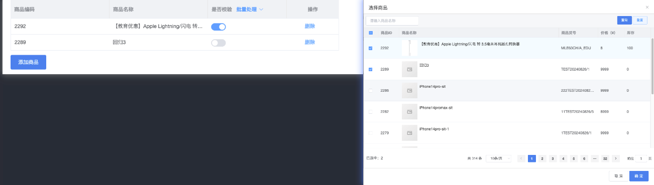
- finderA 数据从finderB来,拥有自己的额外的可编辑数据(这里是isValidSwitch)
- finderB 加载在弹窗中,数据从接口来可分页
- 两个finder 只以一个数据做交互 localSelection
methods: {
    async handleAddGoods() {
      // finderBLocalSelection 是finderB中选中的数据
      const data = finderBLocalSelection
      this.filterData(data)
    },
    /**
     * @description 格式化追加数据 保留数据状态
     * @description 以finderB数据为主 finderA存在相同数据 则将finderBr同id数据覆盖 最后替换到finderA
     * @param {Array} data finderB中选中数据
     * @param {Array} this.tableData finderA数据
     */
    filterData(data) {
      const orgData = JSON.parse(JSON.stringify(data))
      orgData.forEach(item => {
        // 设置默认值
        item.isValidSwitch = false
      })
      this.tableData.forEach(item => {
        const findex = orgData.findIndex(f => f.item_id === item.item_id)
        if(findex !== -1) {
          // 保留状态
          orgData[findex].isValidSwitch = item.isValidSwitch
        }
      })
      this.tableData = [...orgData]
    }
  }
}
<template>
<div>
<SpFinder
ref="finder"
reserve-selection
:row-key="rowKey"
url="/goods/items"
fixed-row-action
:setting="{
columns: [
{ name: '商品ID', key: rowKey, width: 80 }
]
}"
:hooks="{
afterSearch
}"
@select="onSelect"
@select-all="handleSelectAll"
/>
</div>
</template>
<script>
export default {
data() {
return {
localSelection: [],
rowKey: 'goods_id'
}
},
created() {
this.localSelection = cloneDeep(this.value.data) || []
this.rowKey = this.value?.rowKey || 'goods_id'
},
methods: {
// 设置勾选状态的回显
afterSearch(response) {
const { list } = response.data.data
if (this.localSelection.length > 0) {
const { finderTable } = this.$refs.finder.$refs
const ids = this.localSelection.map((m) => m[this.rowKey])
const selectRows = list.filter((item) => ids.includes(item[this.rowKey]))
setTimeout(() => {
finderTable.$refs.finderTable.setSelection(selectRows)
})
}
},
// 勾选得同时 同步改变localSelection中得值
onSelect(selection, row) {
const isAdd = selection.includes(row)
const idx = this.localSelection.findIndex((f) => f[this.rowKey] === row[this.rowKey])
if (isAdd && idx === -1) {
this.localSelection.push(row)
}
if (!isAdd) {
this.localSelection.splice(idx, 1)
}
},
/**
* @description 全选只针对当前页 那么在状态改变的时候 应该不考虑未来的选中数据
* @description 循环调用 onSelect 方法保存或删除当前页选中数据
* @param list 当前页勾选数据 如果localSelection存在未来页数据 那么页码切换的时候 list中也会有
*/
handleSelectAll(list) {
// 当前页得数据
const currentPageData = this.$refs.finder.$refs.finderTable.$refs.finderTable.list
const currentPageDataIds = currentPageData.map((m) => m[this.rowKey])
const currentPageSelectList = list.filter((item) => currentPageDataIds.includes(item[this.rowKey]))
// list 中需要排除掉未来页的数据 才能保证当前页全选或者反选
if (currentPageSelectList.length === 0) {
currentPageData.forEach((item) => this.onSelect([], item))
} else {
currentPageData.forEach((item) => this.onSelect(currentPageData, item))
}
},
}
}
</script>