
@sirpepe/dark-mode-toggle
v0.1.3
Published
A web component for switching between light and dark modes

Readme
<dark-mode-toggle>
A flexible web component for switching between light and dark modes. It keeps an internal state (called "mode") which reflects the user's preferences wrt. light/dark mode, using system preferences as a fallback. The element features TypeScript support, rich HTML, JS, content and CSS APIs to enable customization, a darkmodechange event, and can be controlled with touch, pointer devices and the keyboard.
Made by Peter Kröner | Mastodon | Bluesky | GitHub | LinkedIn
Installation
Install @sirpepe/dark-mode-toggle, then import the main module somewhere in the page. This will auto-register the element with the HTML tag <dark-mode-toggle>. If you need the tag name to be something else or want to change the custom element options, you can instead import the class DarkModeToggleElement from @sirpepe/dark-mode-toggle/lib and handle registration yourself.
Demo
Open demo.html from localhost to see several instances of this element in action.
Basic concepts
Mode state
The element's mode state is either "dark" or "light" and is computed as follows:
- If the user or the JavaScript API select a mode, this selection determines the element's mode
- If that's not done, the element's content attribute
modedetermines the element's mode - If the
modeattribute is not set (or set to"auto"or an invalid value), the mode is auto-detected via the prefers-color-scheme media feature and therefore dependent on system or browser preferences
The element is always either in dark mode or light mode, either of which may or may not have been chosen deliberately.
Auto state
The element's auto state is either true or false and reflects whether the current mode state has been chosen by the user or by the system/browser defaults. It is true if the user or the JS API have interacted with the element or if the mode content attribute is set to either "dark" or "light".
Content attributes
mode
Selects the default mode state. Its value, if valid, determines the mode state, unless either the user or the JS API select a different mode. Valid values are "light", "dark" or "auto". If the attribute is missing or set to an invalid value, the mode remains unchanged.
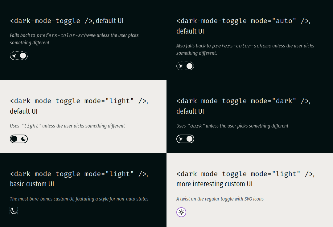
<!-- Auto-detects the mode from the system/browser preferences -->
<dark-mode-toggle></dark-mode-toggle>

<!-- Also auto-detects the mode from the system/browser preferences -->
<dark-mode-toggle mode="auto"></dark-mode-toggle>

<!-- Defaults to "light", ignoring the system/browser preferences -->
<dark-mode-toggle mode="light"></dark-mode-toggle>

<!-- Defaults to "dark", ignoring the system/browser preferences -->
<dark-mode-toggle mode="dark"></dark-mode-toggle>

<!-- Invalid value, falls back to system/browser preferences -->
<dark-mode-toggle mode="asdf"></dark-mode-toggle>

<!-- Defaults to "dark", ignoring the system/browser preferences, but is set to "light" via a script -->
<dark-mode-toggle mode="dark" class="scripted"></dark-mode-toggle>
<script>
  document.querySelector(".scripted").mode = "light";
</script>
Changes to the content attribute via setAttribute() and similar APIs only affect the mode state if the element has not yet been interacted with - just like value on <input>. The content attribute serve as a mere fallback or default value and is always overruled by user or script input.
Custom user interface
The default user interface is a simple toggle. You can replace it with a custom UI by adding markup between the opening and closing <dark-mode-toggle> tags. The following replaces the default UI with two SVG icons:
<dark-mode-toggle class="basic">
  <svg
    class="light"
    xmlns="http://www.w3.org/2000/svg"
    fill="none"
    viewBox="0 0 24 24"
    stroke-width="1.5"
    stroke="currentColor"
  >
    <path stroke-linecap="round" stroke-linejoin="round" d="..." />
  </svg>
  <svg
    class="dark"
    xmlns="http://www.w3.org/2000/svg"
    fill="none"
    viewBox="0 0 24 24"
    stroke-width="1.5"
    stroke="currentColor"
  >
    <path stroke-linecap="round" stroke-linejoin="round" d="..." />
  </svg>
</dark-mode-toggle>
You can use CSS states to style your custom UI to match the element's mode.
CSS States
The following custom states are supported by the element:
lightis set when the mode state is"light"darkis set when the mode state is"dark"autois set when the mode state is governed by system/browser preferences
These states can be used with the :state() pseudo class to style custom UIs. Assuming the HTML from the example above:
/* Scale the element for the SVGs */
dark-mode-toggle.basic {
  width: 24px;
  height: 24px;
}
/* Styles for light mode */
dark-mode-toggle.basic:state(light) {
  color: #000; /* sets the SVG line color */
  > svg.dark {
    display: none;
  }
}
/* Styles for dark mode */
dark-mode-toggle.basic:state(dark) {
  color: #fff; /* sets the SVG line color */
  > svg.light {
    display: none;
  }
}
/* Styles for non-auto */
dark-mode-toggle.basic:not(:state(auto)) {
  outline: 1px dotted skyblue;
}
/* Styles to maintain basic usability */
dark-mode-toggle:focus-within {
  box-shadow: 0 0 1em skyblue;
}
The :has() selector can be combined with the :state() pseudo class to tie a web page's CSS to the element state. The following example combines the above with the color-scheme property and the light-dark() color function to implement a minimal side-wide dark mode.
:root {
  color-scheme: light dark;
  color: light-dark(#031011, #efedea);
  background-color: light-dark(#efedea, #031011);
}
:root:has(dark-mode-toggle:state(light)) {
  color-scheme: only light;
}
:root:has(dark-mode-toggle:state(dark)) {
  color-scheme: only dark;
}
Because the element's mode state reflects the user's preferences with the system/browser defaults as fallback, the above CSS is entirely sufficient to implement dark/light mode - no more @media rules required.
CSS Variables
The default UI's accent color can be changed by setting --dark-mode-toggle-accent-color. It defaults to rebeccapurple.
JavaScript API
Getter mode
Returns the element's mode state (either "dark" or "light").
Setter mode
Sets the element's mode state. Valid values are "dark", "light", and "auto". Invalid values will be rejected with exceptions. The new value, if valid, determines the element's mode state.
Readonly property auto
Returns the element's auto state.
Event darkmodechange
✅ bubbles ✅ composed ❌ cancelable
The darkmodechange event is dispatched every time the element's mode changes. Its mode and auto properties reflect the element's new mode and auto states.
Limitations
The element currently relies on a global window and can therefore not easily be SSR'd.
Changelog
0.1.3
- Add viewBox for SVGs in default UI
- Add a changelog
0.1.2
- Add text to the (hidden) label inside the shadow DOM
0.1.1
- Fix screenshot in Readme for NPM
0.1.0
- Revamp default UI
0.0.3
- Initial public release