
@smashing/alert
v1.1.2
Published
Component used to give feedback to the user about an action or state.
Downloads
690


Readme
yarn add @smashing/alert
Default appearance
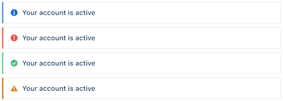
<Alert title="Your account is active" />
<Alert title="Your account is active" intent="danger" />
<Alert title="Your account is active" intent="success" />
<Alert title="Your account is active" intent="warning" />
Card appearance
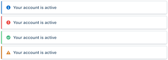
<Alert title="Your account is active" appearance="card" />
<Alert title="Your account is active" appearance="card" intent="danger" />
<Alert title="Your account is active" appearance="card" intent="success" />
<Alert title="Your account is active" appearance="card" intent="warning" />
Inline appearance
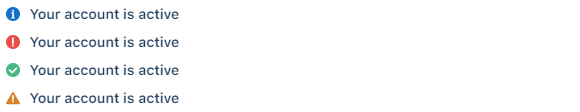
<Alert title="Your account is active" appearance="inline" />
<Alert title="Your account is active" appearance="inline" intent="danger" />
<Alert title="Your account is active" appearance="inline" intent="success" />
<Alert title="Your account is active" appearance="inline" intent="warning" />
With description
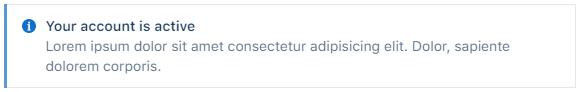
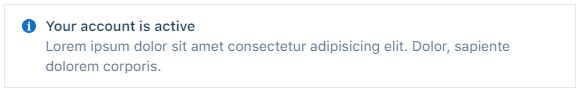
<Alert title="Your account is active">Lorem ipsum dolor sit amet.</Alert>Without icon
<Alert title="Your account is active" hasIcon={false}>
  Lorem ipsum dolor sit amet.
</Alert>
Without trim(border)
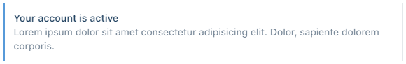
<Alert title="Your account is active" hasTrim={false}>
  Lorem ipsum dolor sit amet.
</Alert>