
@smashing/toaster
v1.0.5
Published
Component used for notifications


Readme
yarn add @smashing/toasterDefault appearance
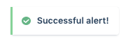
<Button onClick={() => toaster.success('Successful alert!')}>Success</Button>With Description
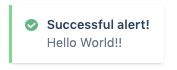
<Button
  onClick={() =>
    toaster.success('Successful alert!', {description: 'Hello World!'})
  }
/>
With custom duration
<Button onClick={() => toaster.success('Successful alert!', {duration: 5})}>
  Success 5s
</Button>
Close all toasters
<Button onClick={toaster.closeAll}>Close all</Button>Unique toast
<Button
  onClick={() =>
    toaster.success('Only one toaster will be shown', {id: 'forbidden-action'})
  }
>
  Success
</Button>