
@stanko/ctrls
v0.4.8
Published
Minimal library for controlling parameters, designed specifically for algorithmic art.
Maintainers
 stanko.tadic
Readme
Ctrls
Minimal library for controlling parameters, designed specifically for algorithmic art.
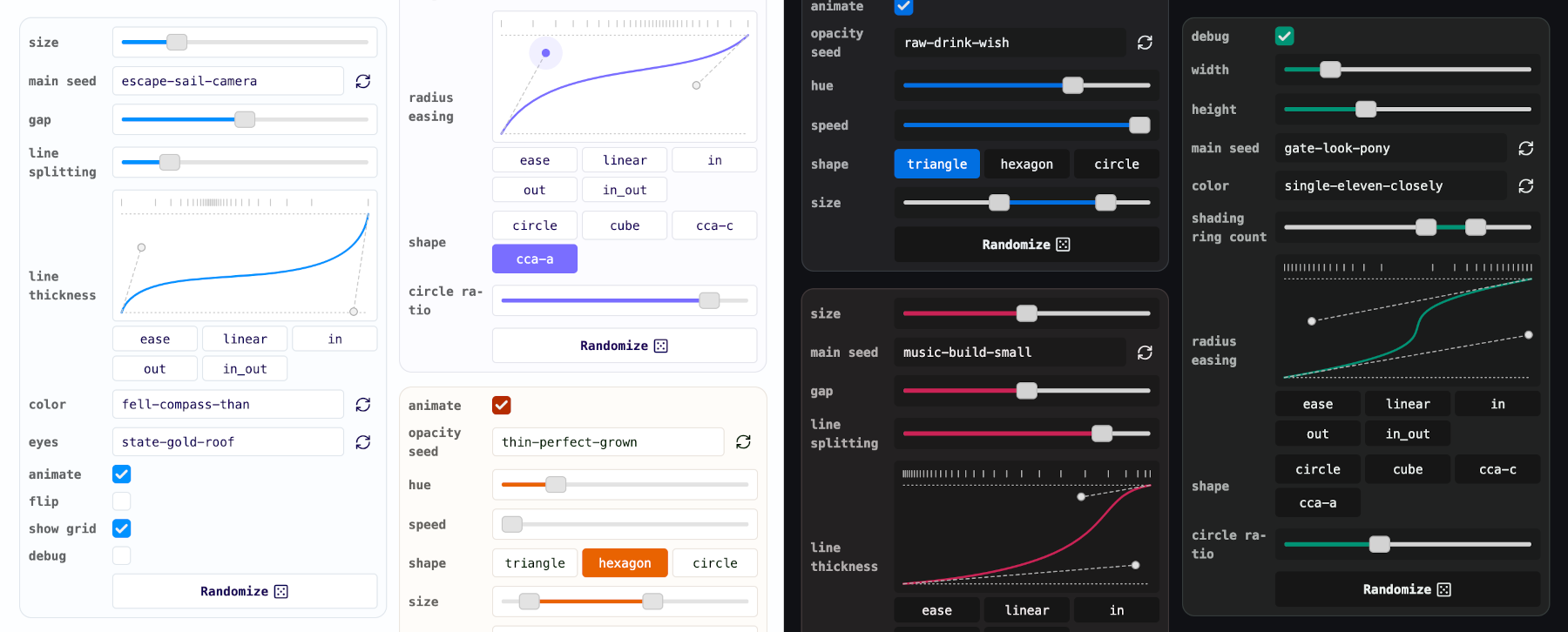
Made for algorithmic/generative art
I built Ctrls for my art projects. By default, the state is saved in the URL, which lets you navigate history and share links easily. Along with standard components like checkboxes and ranges, it includes two especially useful for generative work: RNG seed and easing. These not only let you adjust parameters but also expose functions (rng and easing) you can call directly.
Play with the live example above or check older versions I used for Space Invaders generator and Moon Phases.
Features
- Minimal API
- Eight components : RNG seed, easing, boolean, radio, range, dual range, file and custom HTML
- Fully typed, including dynamic typings for controlled properties
- Light and dark themes included, theming via CSS variables
Quick start
Install the library:
npm install @stanko/ctrlsDefine controls as an array, then instantiate the Ctrls class:
import { Ctrls } from "@stanko/ctrls";
import type { ConfigItem } from "@stanko/ctrls";

// Import CSS
import "@stanko/ctrls/dist/ctrls.css";

// Define configuration for controls
const config = [
  {
    type: "boolean",
    name: "animate",
    defaultValue: true,
    isRandomizationDisabled: true,
  },
  {
    type: "seed",
    name: "opacitySeed",
  },
  {
    type: "range",
    name: "hue",
    defaultValue: 220,
    min: 0,
    max: 360,
    step: 1,
  },
  // in the demo above there are three more components:
  // - speed, shape and size

  // Casting the config to enable editor's code completion
] as const satisfies readonly ConfigItem[];

// Create the instance of Ctrls
export const options = new Ctrls(config, {
  showRandomizeButton: true,
});

// Render Ctrls elements on the page
document.querySelector('.my-controls').appendChild(options.element);

// If you need to pass values you can export a type for them for convenience
export type Options = ReturnValue<options.getValues()>;
Add onChange or onInput handlers. If you need to get the current values, use .getValues().
options.onChange = (updatedValues: Partial<Options>) => {
  // Example: re-render your drawing
  render(options.getValues()); // Get all values and pass it to the render method
};

options.onInput = (updatedValues: Partial<Options>) => {
  // Example: update a CSS variable
  if (updatedValues.hue) {
    document.body.style.setProperty("--hue", updatedValues.hue);
  }
};
API
Constructor accepts two parameters - an array of control config object (see below for details) and an options object.
constructor(controls: Configs, options?: ControlsOptions)The available options are:
type ControlsOptions = {
  showRandomizeButton?: boolean; // default: true
  storage?: "hash" | "none"; // default: "hash"
  theme?: "system" | "light" | "dark"; // default: "system"
  parent?: Element; // element to append Ctrls' element to
  title?: string; // it will be rendered as a button which toggles the controls visibility
};
Public API:
// The main Ctrls element
.element: HTMLDivElement

// Change handler called whenever any of the values is changed.
// It's only parameter is an object containing the updated values.
// The only way this object can have multiple attributes is when using the hash storage.
.onChange(updatedValues)

// Input handler called while user is inputting values (while dragging a slider for example).
// Same as `onChange`, the only parameter is an object containing the updated values.
.onInput(updatedValues)

// Returns the values as an object, including rng and easing functions.
.getValues()

// Randomizes values for all controls that don't have randomization disabled.
.randomize()
Controls
All controls share the following properties:
{
  // --- Mandatory --- //
  type: CtrlType; // "seed" | "easing" | "boolean" | "range" | "dual-range" | "radio" | "group"
  // Name of the component.
  //
  // It will be converted to camel case and used in the values object
  // This might counter-intuitive for some people,
  // but it is my personal preference to have properties named in camel case when using them in code
  //
  // However, names are going to be converted to kebab case when used in the hash,
  // because it is nicer that URL be all lowercase
  name: string;

  // --- Optional --- //
  // If passed, it will be used instead of the name,
  // if not, name will be be converted to space case and used as a label.
  label?: string;
  // Depends on the control type, the default value for the control
  defaultValue?: T;
  // Disabled the value randomization (via randomize method or button)
  isRandomizationDisabled?: boolean; // default: false
}
Some controls will have a few more properties explained below.
Boolean
Checkbox control for boolean parameters.
{
  "type": "boolean",
  "name": "debug"
}
Seed
Text input that generates a random text seed and creates a seeded random number generator.
{
  "type": "seed",
  "name": "mainSeed"
}
A seeded RNG will be created and included in the values. For the example above .getValues() returns:
{
  mainSeed: "a-random-seed-value",
  mainSeedRng: () => number;
}
Easing
Cubic-bezier easing control that also generates an easing function. Includes five presets (configurable via the presets property). Pass an empty array to disable presets.
{
  // Optional
  presets?: Record<string, [number, number, number, number]>; // default: 1
}
Example:
{
  "type": "easing",
  "name": "distribution",
  "defaultValue": [0.8, 0.1, 0.2, 0.9],
  "presets": {
    "ease_in": [0.42, 0, 1, 1],
    "ease_out": [0, 0, 0.58, 1],
    "ease_in_out": [0.42, 0, 0.58, 1]
  }
}
Please note that the string ease_ will be removed from the preset labels.
An easing function will be created and included in the values. For the example above .getValues() returns:
{
  distribution: [0.8, 0.1, 0.2, 0.9],
  distributionEasing: (t: number) => number;
}
Range
Range slider that controls a number parameter. Accepts minimum, maximum and step values. It includes a few additional properties:
{
  // Mandatory
  min: number;
  max: number;

  // Optional
  step?: number; // default: 1
}
Example:
{
  "type": "range",
  "name": "width",
  "defaultValue": 5,
  "min": 0,
  "max": 10,
  "step": 1
}
Dual range
Range input with two handles that control minimum and maximum values. Includes the same additional properties as the range input. Uses my own dual-range-input library.
{
  // Mandatory
  min: number;
  max: number;

  // Optional
  step?: number; // default: 1
}
Example:
{
  "type": "dual-range",
  "name": "size",
  "defaultValue": { "min": 3, "max": 7 },
  "min": 0,
  "max": 10,
  "step": 1
}
Radio
Grid of radio buttons. Can be set to have between one and five columns.
{
  // Mandatory
  items: Record<string, string>; // Map of radio items (key -> value, value -> label)

  // Optional
  columns?: number; // default: 3
}
Example:
{
  "type": "radio",
  "name": "main shape",
  "items": {
    "triangle": "3",
    "rectangle": "4",
    "hexagon": "6",
    "octagon": "8",
    "circle": "32"
  },
  "columns": 2
}
File
File input.
{
  // Optional
  accept?: string; // a comma separated list of allowed file types
}
Example:
{
  "type": "file",
  "name": "background",
  "accept": "image/*"
}
Group
Collapsible group of controls. All values are going to be nested in an object using the group's name.
{
  // Mandatory
  controls: ConfigItem[];

  // Optional
  isCollapsed?: boolean;
}
Example:
{
  "type": "group",
  "name": "color",
  "controls": [
    {
      "type": "boolean",
      "name": "monochrome"
    },
    {
      "type": "easing",
      "name": "distribution"
    }
  ]
}
HTML
Custom HTML to be rendered. You'll need to create your element and add it to the config.
Doesn't influence the values object as it doesn't have a value.
{
  // Mandatory
  html: HTMLElement;
}
Example:
const downloadButton = document.createElement('button');
downloadButton.innerHTML = "PNG";
// Add your styles
downloadButton.addEventListener('click', () => {
  alert("Download button clicked");
})
{
"type": "html",
"name": "download",
"html": downloadButton
}Theming
Ctrls uses CSS variables for theming. There are many you can adjust, but I recommend starting with these four:
.ctrls {
  // Theme color's hue, default is blue
  --ctrls-h: 245;

  // Theme color's chroma
  --ctrls-c: 0.25;

  // Radius
  --ctrls-radius: 4px;
  --ctrls-range-thumb-radius: 4px;
}
Try tweaking these values live in this example. For convenience, the range thumb radius is set to half the main radius.
Check the source file to see all of the available variables.
Why?
You might ask why I made another library when dat.GUI and TweakPane already exist. Both target general use cases with extensive options and elaborate APIs, while I wanted something smaller and easier to adapt for my generative drawings.
I first hacked together a crude library with no plans to release it. Over time I polished it, ported it to TypeScript, and realized it could be useful to others. The code is solid, though I would love to add a few more features.
Ctrls is opinionated and tailored to my likings. I'm open to suggestions, but they need to fit algorithmic art use-case and align with my vision. It's not meant to be a general-purpose library - others already cover that space well.
Finally, I should note that I really like Tweakpane, and Ctrls’ homepage is heavily inspired by it.
Cheers!
Thank you for stopping by! If you end up using Ctrls, please let me know, I would love to see it.
TODO
- [ ] Add
add/removeEventListenerinstead of direct update ofonInputandonChange - [ ] Check if
onInputis triggered when it should - [ ] Allow users to pass a custom PRNG lib
- [ ] Hash storage - check if there is an instance using hash storage already
- [ ] Storage - local storage
- [*] Collapsing animation for the main element and groups
- [x] Use dom helpers everywhere
- [x]
toHtmlId(this.name)=>toHtmlId(this.id) - [x] Add
nameandidto inputs - [x] TypeDef bug - easing presets should be optional
- [x] Add title which collapses the controls
- [x] Prefix input names' with
ctrl_${id}_${name}to avoid collisions - [x] Demo - stop animation when not in viewport
- [x] Demo - favicon and metadata
- [x] Readme - screenshots
- [x] Use web safe / system fonts by default
- [x] Experiment with chroma for light and dark shades of the main color
- [x] On input event / handler
- [x] Revisit naming
controlsvsoptionsvsvalues - [x] Remove lucide as a dependency, swap with local SVGs
- [x] Add Alea PRNG instead of seedrandom
- [x] Storage options - none
- [x] Fix get random value float point error in dual range (modulo with floats)
- [x] Easing - fix handles jumping to previous positions after selecting preset (no storage)
- [x] Scope the CSS
- [x] Controls -> Ctrls
- [x] Easing - option to pass custom presets (or an empty array to disable them)
- [x] onChange - maybe add current options (?) - decided not to do