
@suntree/tarojs-painter
v1.0.5
Published
小程序painter的taro实现

Readme
Painter
简介
Taro-react写法的painter组件demo。
因项目需要,基于taro-painter项目修改。
小程序生成图片库,轻松通过 json 方式绘制一张可以发到朋友圈的图片,
基于小程序端适用的Painter项目
使用方式
将src/components/common/painter文件夹拷贝至你的项目文件中,直接调用
Painter 的优势
- 功能全,支持文本、图片、矩形、qrcode 类型的 view 绘制
- 布局全,支持多种布局方式,如 align(对齐方式)、rotate(旋转)
- 支持圆角,其中图片,矩形,和整个画布支持 borderRadius 来设置圆角
- 杠杠的性能优化,我们对网络素材图片加载实现了一套 LRU 存储机制,不用重复下载素材图片。
- 杠杠的容错,因为某些特殊情况会导致 Canvas 绘图不完整。我们对此加入了对结果图片进行检测机制,如果绘图出错会进行重绘。
TODO
- [x] borderWidth 和 borderColor 属性支持,可设置边框
- [x] image 加入 mode 属性
- [x] fontFamily 属性支持,使用方法见下方详细说明
- [x] 支持渐变色
- [x] 支持 box-shadow 和 text-shadow,统一使用 shadow 表示。具体说明请看下方。
- [x] text 加入 background 属性。具体说明请看下方。
- [x] 可获取 text 的宽度
- [x] 支持元素的相对定位方法
- [x] 可通过文本中的换行符进行主动换行
- [x] 生成的图片支持分辨率调节
使用 Painter
Palette 规范
如你使用 wxss + wxml 规范进行绘制一样,Painter 需要根据一定的规范来进行图片绘制。当然 Painter 的绘制规范要比 wxml 简单很多。
调色板属性
一个调色板首先需要给予一些整体属性
background: 可以是颜色值,也可以为网络图片的链接,默认为白色,支持渐变色
width: 宽度
height: 高度
borderRadius: 边框的圆角(该属性也同样适用于子 view)
views: 里面承载子 view
View 属性
当我们把整体的调色板属性构建起来后,里面就可以添加子 View 来进行绘制了。
| type | 内容 | description | 自有 css | | ------ | ------- | ------------------------------ | ----------------------------------------------------------------- | | image | url | 表示图片资源的地址,本地或网络 | 见 image 小节 | | text | text | 文本的内容 | 见 text 小节 | | rect | 无 | 矩形 | color: 颜色,支持渐变色 | | qrcode | content | 画二维码 | background: 背景颜色(默认为透明色)color: 二维码颜色(默认黑色) |
image
Painter 的 image 可以设置成本地图片或者网络图片,注意本地图片请使用绝对路径。并且如果未设置 image 的长宽,则长宽的属性值会默认设为 auto。若长宽均为 auto 则会使用图片本身的长宽来布局,大小为图片的像素值除以 pixelRatio 。
| 属性名称 | 说明 | 默认值 | | -------- | -------------------- | ---------- | | width | image 的宽度 | auto | | height | image 的高度 | auto | | mode | 图片裁剪、缩放的模式 | aspectFill |
scaleToFill:不保持纵横比缩放图片,使图片的宽高完全拉伸至填满 image 元素
aspectFill:保持纵横比缩放图片,只保证图片的短边能完全显示出来。也就是说,图片通常只在水平或垂直方向是完整的,另一个方向将会发生截取。
注:mode 属性和小程序 image 的 mode 属性功能一致,只是支持的类型只有两种,且默认值不同。 当 width 或 height 属性设置为 auto 时,mode 属性失效

export default class ImageExample {
  palette() {
    return ({
      width: '654rpx',
      height: '1000rpx',
      background: '#eee',
      views: [
        {
          type: 'image',
          url: '/palette/sky.jpg',
        },
        {
          type: 'text',
          text: '未设置height、width时',
          css: {
            right: '0rpx',
            top: '60rpx',
            fontSize: '30rpx',
          },
        },
        {
          type: 'image',
          url: '/palette/sky.jpg',
          css: {
            width: '200rpx',
            height: '200rpx',
            top: '230rpx',
          },
        },
        {
          type: 'text',
          text: "mode: 'aspectFill' 或 无",
          css: {
            left: '210rpx',
            fontSize: '30rpx',
            top: '290rpx',
          },
        },
        {
          type: 'image',
          url: '/palette/sky.jpg',
          css: {
            width: '200rpx',
            height: '200rpx',
            mode: 'scaleToFill',
            top: '500rpx',
          },
        },
        {
          type: 'text',
          text: "mode: 'scaleToFill'",
          css: {
            left: '210rpx',
            top: '560rpx',
            fontSize: '30rpx',
          },
        },
        {
          type: 'image',
          url: '/palette/sky.jpg',
          css: {
            width: '200rpx',
            height: 'auto',
            top: '750rpx',
          },
        },
        {
          type: 'text',
          text: '设置height为auto',
          css: {
            left: '210rpx',
            top: '780rpx',
            fontSize: '30rpx',
          },
        },
      ],
    });
  }
}
text
因为 text 的特殊性,此处对 text 进行单独说明。
| 属性名称 | 说明 | 默认值 | | -------------- | --------------------------------------------------------------------------------------------------------------------------------------------------- | ------------------- | | fontSize | 字体大小 | 20rpx | | color | 字体颜色 | black | | maxLines | 最大行数 | 不限,根据 width 来 | | lineHeight | 行高(上下两行文字 baseline 的距离) | fontSize 大小 | | fontWeight | 字体粗细。仅支持 normal, bold | normal | | textDecoration | 文本修饰,支持 underline、 overline、 line-through,也可组合使用 | 无效果 | | textStyle | fill: 填充样式,stroke:镂空样式 | fill | | fontFamily | 字体,如需加载网络字体,前提前使用 wx.loadFontFace 进行加载(https://developers.weixin.qq.com/miniprogram/dev/api/media/font/wx.loadFontFace.html) | sans-serif | | background | 文字背景颜色 | 无 | | padding | 文字背景颜色边际与文字间距 | 0rpx | | textAlign | 文字的对齐方式,分为 left, center, right,view 的对齐方式请看 align 属性 | left |
当文字设置 width 属性后,则文字布局的最大宽度不会超过该 width 。如果内容超过 width,则会进行换行,如果此时未设置 maxLines 属性,则会把所有内容进行换行处理,行数由内容和 width 决定。如果此时设置了 maxLines 属性,则最大展示所设置的行数,如果还有多余内容未展示出来,则后面会带上 ... 。
- 以下用个例子说下上述几个属性的用法
export default class LastMayday {
palette() {
return ({
width: '654rpx',
height: '700rpx',
background: '#eee',
views: [
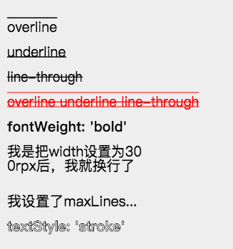
_textDecoration('overline', 0),
_textDecoration('underline', 1),
_textDecoration('line-through', 2),
_textDecoration('overline underline line-through', 3, 'red'),
{
type: 'text',
text: "fontWeight: 'bold'",
css: [{
top: `${startTop + 4 * gapSize}rpx`,
fontWeight: 'bold',
}, common],
},
{
type: 'text',
text: '我是把width设置为300rpx后,我就换行了',
css: [{
top: `${startTop + 5 * gapSize}rpx`,
width: '400rpx',
}, common],
},
{
type: 'text',
text: '我设置了maxLines为1,看看会产生什么效果',
css: [{
top: `${startTop + 7 * gapSize}rpx`,
width: '400rpx',
maxLines: 1,
}, common],
},
{
type: 'text',
text: "textStyle: 'stroke'",
css: [{
top: `${startTop + 8 * gapSize}rpx`,
textStyle: 'stroke',
fontWeight: 'bold',
}, common],
},
],
});
}
}
const startTop = 50;
const gapSize = 70;
const common = {
left: '20rpx',
fontSize: '40rpx',
};
function _textDecoration(decoration, index, color) {
return ({
type: 'text',
text: decoration,
css: [{
top: `${startTop + index * gapSize}rpx`,
color: color,
textDecoration: decoration,
}, common],
});
}布局属性
以上 View ,除去自己拥有的特别属性外,还有以下的通用布局属性
| 属性 | 说明 | 默认 | | ------------------------ | ---------------------------------------------- | --------------------- | | rotate | 旋转,按照顺时针旋转的度数 | 不旋转 | | width、height | view 的宽度和高度,其中 image 和 text 可不设置 | | | top、right、bottom、left | 如 css 中为 absolute 布局时的作用,可为 负值 | 默认 top 和 left 为 0 |

相对布局方法
很多人有获得文本宽度的需求,因为文本宽度随着字数不同而动态变化,如果想在文本后面加个图标,那么我们就需要获得文本宽度。Painter 的解决方案如下:
1,首先你需要为检测长度的文本添加一个 id。如下
{
  id: 'my-text-id',
  type: 'text',

2,然后在后面的 view 中,你可以在 left 和 right 属性中使用这个id。如下
left: ['10rpx', 'my-text-id', 比例]
表示布局在距离左边(10rpx + 该text文本宽度 * 比例) 的距离,比例默认为 1,可省去,你也可以使用负数或小数来做计算,最终的 left 会加上文本宽度乘以该数的值。

注意:比例一定为一个 number
如果想获得高度,top 也支持上述用法,并且除文本外,你可以对任何 view 设置一个 id,然后使用上述方法进行相对布局。
注:相对布局的那个 view 代码一定需要在被相对的 view 的下面。
border 类型
| 属性 | 说明 | 默认 | | ------------ | -------------------------------------------------------------- | ---------------------- | | borderRadius | 边界圆角程度,如果是正方形布局,该属性为一半宽或高时,则为圆形 | 0 | | borderWidth | 边界宽度,外边界 | 必设值,否则无边框效果 | | borderColor | 边框颜色 | black |

align
Painter 的 align 类型与 css 中的 align 有些许不同。在 Painter 中 align 表示 view 本身的对齐方式,而不像 css 中表示对其子 view 的操作。align 可以作用在 Painter 支持的所有 view 上。它以设置的 left、top、right、bottom 的位置为基准,然后做不同的对齐操作。并且 align 在文字多行情况下,会影响多行文字的对齐方式。
注意:如果布局使用了 right 确定位置,则该 view 会默认右对齐布局,但此时文字还是从左边绘制。

{
  width: '654rpx',
  height: '600rpx',
  background: '#eee',
  views: [
    {
      type: 'rect',
      css: {
        top: '40rpx',
        left: '327rpx',
        color: 'rgba(255, 0, 0, 0.5)',
        width: '5rpx',
        height: '500rpx',
      },
    },
    {
      type: 'image',
      url: '/palette/avatar.jpg',
      css: {
        top: '40rpx',
        left: '327rpx',
        width: '100rpx',
        height: '100rpx',
      },
    },
    {
      type: 'qrcode',
      content: '/palette/avatar.jpg',
      css: {
        top: '180rpx',
        left: '327rpx',
        width: '120rpx',
        height: '120rpx',
      },
    },
    {
      type: 'text',
      text: "align: 'left' 或者不写",
      css: {
        top: '320rpx',
        left: '327rpx',
        fontSize: '30rpx',
      },
    },
    {
      type: 'text',
      text: "align: 'right'",
      css: {
        top: '370rpx',
        left: '327rpx',
        align: 'right',
        fontSize: '30rpx',
      },
    },
    {
      type: 'text',
      text: "align: 'center'",
      css: {
        top: '420rpx',
        left: '327rpx',
        align: 'center',
        fontSize: '30rpx',
      },
    },
    {
      type: 'text',
      text: "在多行的情况下,align 会影响内部 text 的对齐,比如这边设置 align: 'center'",
      css: {
        top: '480rpx',
        right: '327rpx',
        width: '400rpx',
        align: 'center',
        fontSize: '30rpx',
      },
    },
  ],
}
CSS3 支持
shadow
Painter 中的 shadow 可以同时修饰 image、rect、text、qrcode 等 。在修饰 text 时则相当于 text-shadow;修饰 image 和 rect 时相当于 box-shadow;修饰 qrcode 时,则相当于二维码有效区域的投影。
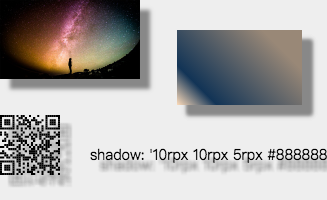
使用方法:
shadow: 'h-shadow v-shadow blur color';
h-shadow: 必需。水平阴影的位置。允许负值。
v-shadow: 必需。垂直阴影的位置。允许负值。
blur: 必需。模糊的距离。
color: 必需。阴影的颜色。
export default class ShadowExample {
palette() {
return ({
width: '654rpx',
height: '400rpx',
background: '#eee',
views: [{
type: 'image',
url: '/palette/sky.jpg',
css: {
shadow: '10rpx 10rpx 5rpx #888888',
}
},
{
type: 'rect',
css: {
width: '250rpx',
height: '150rpx',
right: '50rpx',
top: '60rpx',
shadow: '10rpx 10rpx 5rpx #888888',
color: 'linear-gradient(-135deg, #fedcba 0%, rgba(18, 52, 86, 1) 20%, #987 80%)',
}
},
{
type: 'qrcode',
content: 'https://github.com/Kujiale-Mobile/Painter',
css: {
top: '230rpx',
width: '120rpx',
height: '120rpx',
shadow: '10rpx 10rpx 5rpx #888888',
},
},
{
type: 'text',
text: "shadow: '10rpx 10rpx 5rpx #888888'",
css: {
left: '180rpx',
fontSize: '30rpx',
shadow: '10rpx 10rpx 5rpx #888888',
top: '290rpx',
},
},
],
});
}
}渐变色支持
你可以在画布的 background 属性或者 rect 的 color 属性中使用以下方式实现 css 3 的渐变色,其中 radial-gradient 渐变的圆心为 view 中点,半径为最长边,目前不支持自己设置。
linear-gradient(-135deg, blue 0%, rgba(18, 52, 86, 1) 20%, #987 80%)

radial-gradient(rgba(0, 0, 0, 0) 5%, #0ff 15%, #f0f 60%)
!!!注意:颜色后面的百分比一定得写。
其他技巧
文字竖行显示
因为 Painter 支持换行符,所以我们可以配合向字符之间插入换行符来达到竖排显示的效果,并且我们还能自由控制是从左到右或从右到左,如下图所示。

const text = '锄禾日当午汗滴禾下土谁知盘中餐粒粒皆辛苦';
export default class ImageExample {
  palette() {
    const views = [];
    let tmpText = '';
    let index = 0;
    for (let i = 0; i < text.length; i++) {
      tmpText = `${tmpText}${text[i]}\n`;
      if (i % 5 === 4) {
        views.push({
          type: 'text',
          text: tmpText,
          css: {
            right: `${50 + index}rpx`,
            top: '60rpx',
            fontSize: '40rpx',
            lineHeight: '50rpx',
          },
        });
        index += 50;
        tmpText = '';
      }
    }
    return ({
      width: '654rpx',
      height: '500rpx',
      background: '#eee',
      views: views,
    });
  }
}
Tips(一定要看哦~)
1,目前 Painter 中支持两种尺寸单位,px 和 rpx,代表的意思和小程序中一致,此处就不多说。
2,目前子 view 的 css 属性支持 object 或 array。所以意味着,你可以把几个子 view 共用的 css 属性提取出来。做到让 Palette 更加简洁。
3,因为我们的 palette 是以 js 承载的 json,所以意味着你可以在每一个属性中很方便的加上自己的逻辑。也可以把某些属性单独提取出来,让多个 palette 共用,做到模块化。
4,如果你只希望获得一张生成的图片来展示,可以把 Painter 挪动到屏幕外进行绘制,绘制完后得到一张图片再进行展示,如下面这样。
<painter style="position:fixed;top:-9999rpx" palette="{{userInfoTemplate}}" bind:imgOK="onImgOK" />举个栗子
{
  background: '#eee',
  width: '654rpx',
  height: '400rpx',
  borderRadius: '20rpx',
  views: [
  {
    type: 'image',
    url: 'https://qhyxpicoss.kujiale.com/r/2017/12/04/L3D123I45VHNYULVSAEYCV3P3X6888_3200x2400.jpg@!70q',
    css: {
      top: '48rpx',
      right: '48rpx',
      width: '192rpx',
      height: '192rpx',
    },
  }
  ...
  ],
}
绘制效果如下
