
@syncfusion/ej2-angular-grids
v34.2.8
Published
Feature-rich JavaScript datagrid (datatable) control with built-in support for editing, filtering, grouping, paging, sorting, and exporting to Excel. for Angular


Readme
Angular Data Grid Component
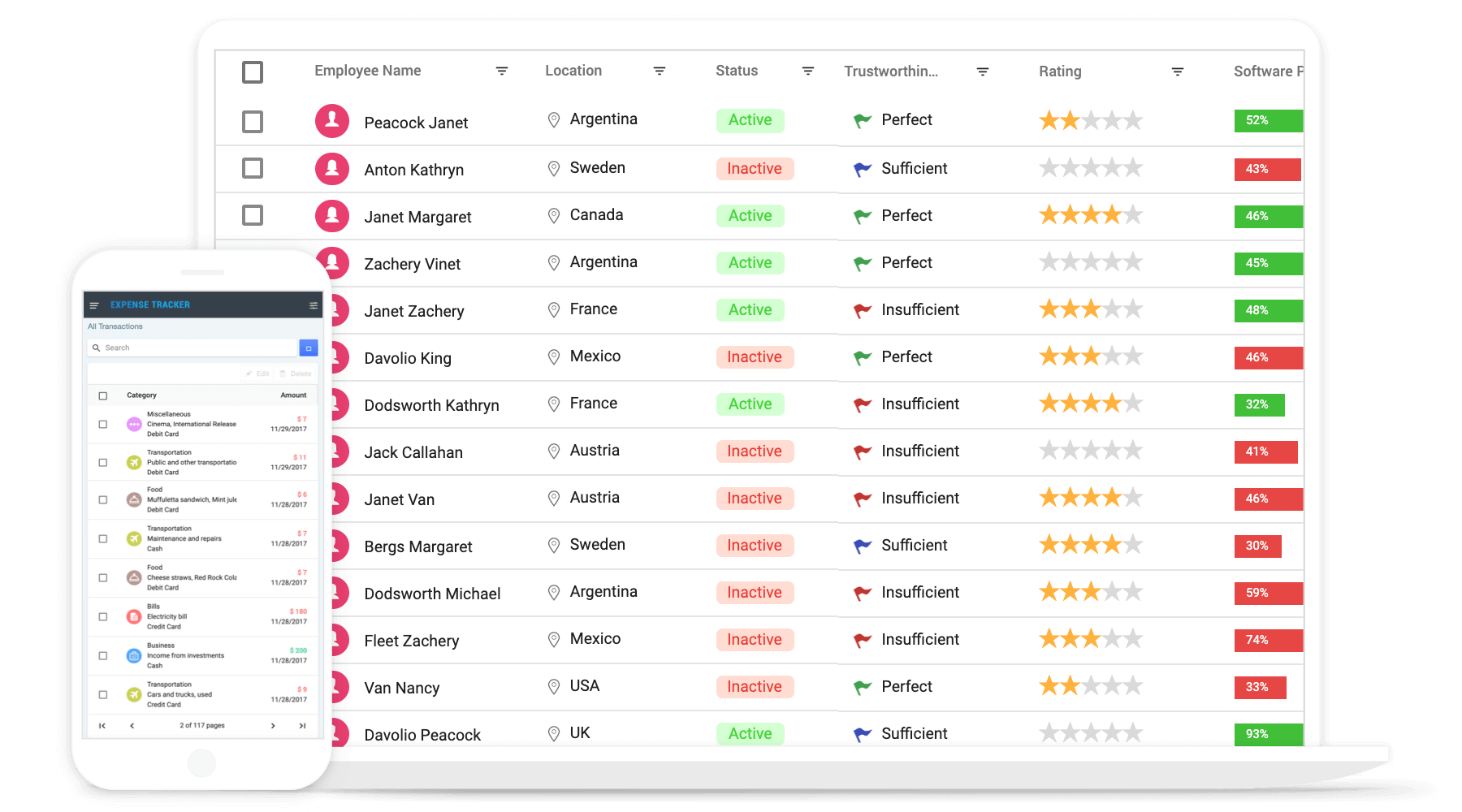
The Angular Data Grid is a high‑performance and flexible component for displaying and managing tabular data. It supports binding to a wide range of data sources, including arrays of JSON objects, OData web services, REST APIs, GraphQL endpoints, SQL databases, and more. This makes it easy to integrate the grid into applications and present data from different backends.
In addition to data binding, the Angular Data Grid includes features such as sorting, filtering, paging, grouping, editing, frozen rows and columns, virtualization, and more. These features help manage and present large datasets efficiently while maintaining ease of use.low you to easily manipulate and present large datasets in an efficient and user-friendly way.
Using this package with an AI coding agent
Before generating Syncfusion® code, ask your AI coding agent to run the Syncfusion® setup using the following prompt:
Set up this project for Syncfusion® before generating code. Fetch and follow the official instructions at https://ai.syncfusion.com/agent-setup/prompt.md, then report the detected platform, installed skill pack, MCP status, and any required licensing action.The setup detects your project’s platform and loads the appropriate Syncfusion® skill pack. No Syncfusion® account or MCP key is required to install or read Syncfusion® agent skills.
Platform reference: https://ai.syncfusion.com/angular/llms.txt
Prerequisites
- Node.js 24+ (LTS recommended).
- Syncfusion CLI.
Install the Syncfusion CLI
Install the Syncfusion CLI globally using the following command:
npm install -g @syncfusion/syncfusion-cliCreate a new Angular application using Syncfusion CLI
You can create an Angular application using the Syncfusion CLI.
sf new syncfusion-angular-app --framework angular --template gridThe above command creates an Angular application configured with the Syncfusion® Grid component.
Run the project
Once the project is created, navigate to the project directory and run the following commands in your terminal.
cd syncfusion-angular-app
npm install
ng serve
Supported frameworks
Grid component is also offered in the following list of frameworks.
| JavaScript | React | Vue | ASP.NET Core | ASP.NET MVC | | :-----: | :-----: | :-----: | :-----: | :-----: |
Showcase samples
Key features
- Data sources: Bind data seamlessly with various local and remote data sources such as JSON, OData, WCF, and RESTful web services with the help of DataManager.
- Async pipe: Bind the Grid component with
RxJS.Observableusing theasyncpipe. - High performance: Well thought out efforts, and focuses mainly on fast paced performance to load millions of records. Grid renders only the rows within the viewport, and loads additional data as the user scrolls vertically.
- Adaptive UI layout: UI is customized and redesigned for great views and usability on small screens. Filter, sort, search, and edit dialogs adaptive to the screen size and render row elements in a vertical direction.
- Sorting and grouping: Supporting N level of sorting and grouping can be useful for more complex data sets that have a deeper hierarchical structure or that need to be organized and analyzed in more detailed ways.
- Aggregation: Easily visualize the aggregates for column values by calculating and displaying summary statistics such as sums, averages, counts, etc. By default, the aggregate value can be displayed in the footer, group footer, or group caption of the grid.
- Filtering: The filter UIs, including the filter bar, menu, excel, and checkbox, are available at each column to filter data.
- Paging: Paging is used to view a segment of data from the assigned data source. It requests data on-demand when navigating to another page also allows to change the page size on the fly by using the page size dropdown in the pager.
- Editing: Grid supports create, read, update, and delete operations (CRUD). Also provides various edit modes such as inline, dialog, and batch edit (cell editing).
- Selection: Select rows or cells either by using checkbox or by simply clicking them. Select more than one row or cell by holding Ctrl or Shift or Command, or simply dragging the pointer over the cells, or programmatically.
- Hierarchical binding: Allows you to display table data in a hierarchical structure, allowing you to visualize the relationships between parent and child records in a clear and organized way.
- Templates: Using templates, users can create custom UI. It provides various template options to create custom headers, custom cell contents, custom rows, detail rows, toolbars, and custom editors for edit action.
- Row drag and drop: The Grid rows can be reordered while drag and drop the rows within the grid. Also allows to drop the dragged rows another Grid or custom component.
- Columns: Column definitions are used as the dataSource schema in the Grid. This plays a vital role in rendering column values in the required format.
- Reordering: Allows you to rearrange the columns in the grid by dragging and dropping them to a new position in the column header row.
- Column chooser: It provides a list of column names paired with check boxes that allow the visibility to be toggled on the fly.
- Resizing: Resizing allows changing column width on the fly by simply dragging the right corner of the column header.
- Frozen rows and columns: Provides the ability to freeze columns and rows to allow for easy scrolling and comparison of cell values. It also offers the option to freeze columns on either the left or right side, or on both sides, of the grid.
- Cell spanning: Grid cells can be spanned across multiple columns or rows in a grid layout to create a larger cell that takes up more space in the grid.
- Foreign key column binding: A column can display values from external or lookup data sources using foreign key/value mapping.
- Context menu: The context menu provides a list of actions to be performed in the grid. It appears when a grid cell, header, or the pager is right-clicked.
- Clipboard: Selected rows and cells can be copied from the grid without header using Ctrl + C or with header using Ctrl + Shift + H shortcut. This allows you to easily transfer data from the grid to other applications or documents as needed.
- Export to Excel and PDF: Provides the option to export grid data to Excel, PDF, and CSV formats.
- RTL support: Provides the right-to-left mode which aligns content in the Grid component from right to left.
- Accessibility: Designed to be accessible to users with disabilities, with features such as WAI-ARIA standard compliance and keyboard navigation to ensure that the grid can be effectively used with assistive technologies such as screen readers.
- Localization: The Localization library enables you to adapt the default text content of the grid to fit the language and cultural preferences of your target audience.
Resources
Support
Product support is available through the following mediums.
- Support ticket - Guaranteed Response in 24 hours | Unlimited tickets | Holiday support
- Community forum
- GitHub issues
- Request feature or report bug
- Live chat
Other Popular Angular Components
Explore other popular Syncfusion® Angular components curated from UI components, standalone SDKs, and document solution suites.
Changelog
Check the changelog here. Get minor improvements and bug fixes every week to stay up to date with frequent updates.
License and copyright
This is a commercial product and requires a paid license for possession or use. Syncfusion’s licensed software, including this component, is subject to the terms and conditions of Syncfusion's EULA. To acquire a license for 150+ Angular UI components, you can purchase or start a free 30-day trial.
A free community license is also available for companies and individuals whose organizations have less than $1 million USD in annual gross revenue and five or fewer developers.
See LICENSE FILE for more info.
© Copyright 2026 Syncfusion® Inc. All Rights Reserved. The Syncfusion® Essential Studio® license and copyright applies to this distribution.