
@taher28/react-native-spin-wheel
v1.3.3
Published
A customizable React Native Spin Wheel component with images and knob support
Downloads
89
Maintainers
 taher28
Readme
🎡 React Native Spin Wheel
A customizable Spin the Wheel / Wheel of Fortune component for React Native.
Supports images or text per segment, custom colors, external controls, and callbacks.
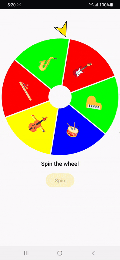
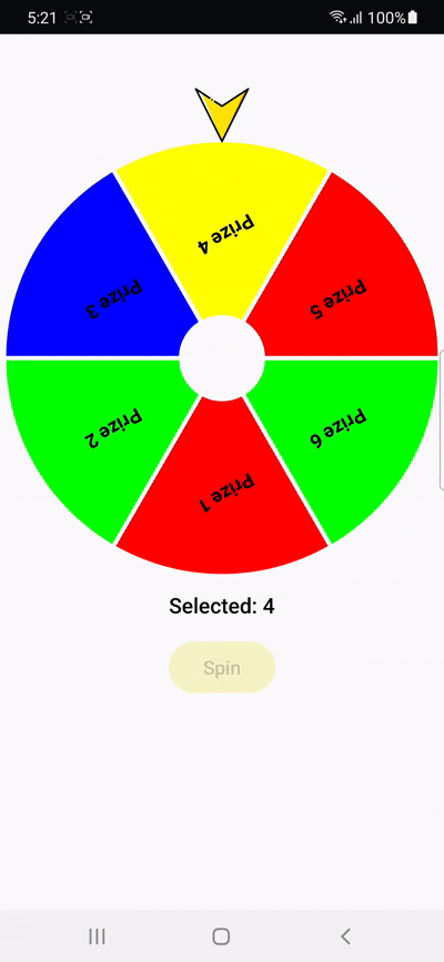
🎬 Demo
Image-based Segments
Text-based Segments
✨ Features
- 🎯 Smooth animated spinning
- 🖼 Display image or text inside each segment
- 🎨 Custom segment background colors
- 🔘 Optional spin button
- 📢 Spin result callback
- ⚙️ Fully configurable size & spin duration
- 🔧 Can trigger spin from outside using
ref
📦 Installation
npm install @taher28/react-native-spin-wheel
# or
yarn add @taher28/react-native-spin-wheel
🛠 Basic Usage
import React from 'react';
import { View } from 'react-native';
import SpinWheel from '@taher28/react-native-spin-wheel';

const data = [
  { id: '1', label: 'Prize 1' },
  { id: '2', label: 'Prize 2' },
  { id: '3', label: 'Prize 3' },
];

export default function App() {
  return (
    <View style={{ flex: 1, justifyContent: 'center', alignItems: 'center' }}>
      <SpinWheel
        data={data}
        onSpinEnd={(item) => console.log('Winner:', item)}
      />
    </View>
  );
}
⚡ Advanced Usage (External Control with ref)
import React, { useRef } from 'react';
import { View, Button } from 'react-native';
import SpinWheel, { SpinWheelRef } from '@taher28/react-native-spin-wheel';

const data = [
  { id: '1', label: 'Prize 1' },
  { id: '2', label: 'Prize 2' },
  { id: '3', label: 'Prize 3' },
];

export default function App() {
  const wheelRef = useRef<SpinWheelRef>(null);

  return (
    <View style={{ flex: 1, justifyContent: 'center', alignItems: 'center' }}>
      <SpinWheel
        ref={wheelRef}
        data={data}
        showSpinButton={false}
        onSpinEnd={(item) => console.log('Winner:', item)}
      />
      <Button title="Spin" onPress={() => wheelRef.current?.spin()} />
    </View>
  );
}
📝 Props
| Prop | Type | Default | Description |
|----|----|----|----|
| data | { id: string; label?: string; image?: any }[] | Required | Wheel segments |
| size | number | screen width * 0.9 | Wheel diameter |
| spinDuration | number | 6000 | Spin duration (ms) |
| knobComponent | ReactNode | Default arrow | Custom knob |
| onSpinEnd | (item, index) => void | — | Spin end callback |
| textColor | string | #000 | Text color |
| textSize | number | 16 | Text size |
| textFontWeight | string | 600 | Font weight |
| segmentBgColor | string \| string[] | #d3d3b8 | Segment colors |
| showResultText | boolean | true | Show result text |
| showSpinButton | boolean | true | Show spin button |
| onSpinPress | () => void | — | Spin press callback |
🚀 License
MIT