
@teamthunderfoot/wysiwyg-content-sanity
v0.0.7
Published
## Stylized blocks
Downloads
42


Readme
wysiwyg-content-sanity
Stylized blocks
Blocks
All blocks except utilities have 2 mixins, one for styles and the other one for colors and modifiers.
block-image
Styles the default sanity block.
Editable variables
- $image-block-margin-bottom: $measure*5
- $img-border-radius: default
- $image-with-caption-block-margin-bottom: $measure*5
- $size-small: 25%
- $size-medium: 50%
    @include block-image(
        $caption-font: g,
        $caption-margin-top: $measure*2,
        $caption-font-weight: 600,
        $image-block-margin-bottom: $measure*5,
        // $img-border-radius: false,
        // $image-with-caption-block-margin-bottom: $measure*5
        // $size-small: 25%,
        // $size-medium: 50%,
    );

    @include block-image-modifier($caption-color: map-get($color-options, f));
block-quote
Styles the default sanity block.
Editable variables
- $quote-font
- $quote-font-style
- $quote-font-weight: false by default
- $quote-padding: $measure*3 0 by default
- $quote-margin-top: $measure*5 by default
- $quote-margin-bottom: $measure*6 by default
Editable variables for Modifiers
- $quote-color
- $border-color
- $border-width
    @include block-quote(
        $quote-font: c,
        $quote-font-style: italic,
        // $quote-padding: $measure * 3 0,
        // $quote-margin-top: $measure*5,
        // $quote-margin-bottom: $measure*6,
        // $quote-font-weight: false,
    );
    @include block-quote-modifier(
        $quote-color: map-get($color-options, a), //* quote color
        $border-color: map-get($color-options, e),
        $border-width: 1px,
    );
headings
Styles the default sanity blocks.
Editable variables
- $h2-font
- $h3-font
- $h4-font
- $h5-font
- $h6-font
- $h2-padding-top: $measure*5 by default
- $h2-margin-bottom: $measure*3 by default
- $h3-padding-top: $measure*5 by default
- $h3-margin-bottom: $measure*3 by default
- $h4-padding-top: $measure*5 by default
- $h4-margin-bottom: $measure*2 by default
- $h5-padding-top: $measure*5 by default
- $h5-margin-bottom: $measure*2 by default
- $h6-padding-top: $measure*5 by default
- $h6-margin-bottom: $measure by default
- $h2-font-weight: false by default
- $h3-font-weight: false by default
- $h4-font-weight: false by default
- $h5-font-weight: false by default
- $h6-font-weight: false by default
- $h2-color
- $h3-color
- $h4-color
- $h5-color
- $h6-color
Editable variables for Modifiers
- $h2-color
- $h3-color
- $h4-color
- $h5-color
- $h6-color
    @include headings(
        $h2-font: a,
        $h3-font: b,
        $h4-font: c,
        $h5-font: d,
        $h6-font: d,
        // $h2-padding-top: $measure*5,
        // $h2-margin-bottom: $measure*3,
        // $h3-padding-top: $measure*5,
        // $h3-margin-bottom: $measure*3,
        // $h4-padding-top: $measure*5,
        // $h4-margin-bottom: $measure*2,
        // $h5-padding-top: $measure*5,
        // $h5-margin-bottom: $measure*2,
        // $h6-padding-top: $measure*5,
        // $h6-margin-bottom: $measure,
        // $h2-font-weight: false,
        $h3-font-weight: 500,
        $h4-font-weight: 500,
        $h5-font-weight: 900,
        // $h6-font-weight: false,
    );
    @include headings-modifier(
        $h2-color: map-get($color-options, a),
        $h3-color: map-get($color-options, a),
        $h4-color: map-get($color-options, a),
        $h5-color: map-get($color-options, e),
        $h6-color: map-get($color-options, f),
    );
links
Styles the default sanity block. With the links mixin, you can choose an existing class for the link. With the links-modifier mixin, you can add a modifier class to the link, you can add this mixin or not.
Note: All classes you add here must exist and be included in the entry before the c--content stylesheet
Editable variables
- $link-class
- $link-class-modifier
Editable variables for Modifiers
- $link-class-modifier
    @include links(
        $link-class: g--link-01
    );
    @include links-modifier(
        $link-class-modifier: g--link-01--second
    );
lists
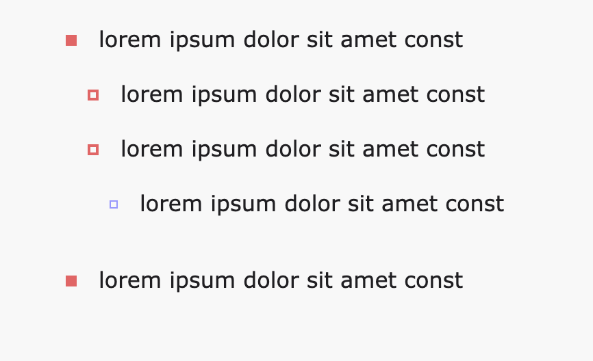
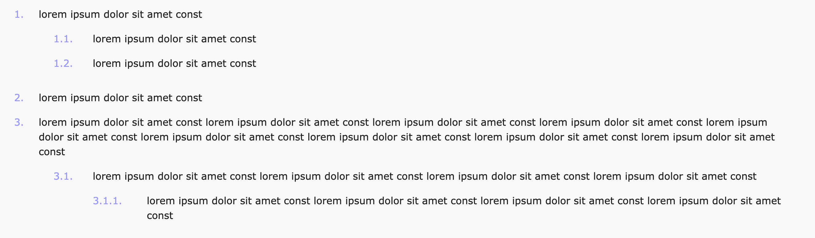
Styles the default sanity blocks. Unordered list artworks can be circles, squares or images, it depends on the variables we add ($X-artwork-X). If they're circles or squares they can be filled or just bordered.
Note: Variables named $second-level-artwork-X or $third-level-artwork-X should only be added in case we want a different value for them than for the other levels.
Editable variables
- $text-font
- $first-number-width
- $first-level-artwork-width
- $first-level-artwork-top
- $second-level-artwork-width: false by default
- $second-level-artwork-top: false by default
- $third-level-artwork-width: false by default
- $third-level-artwork-top: false by default
- $text-font-weight: false by default
- $text-color
- $lists-margin-bottom: $measure*4 by default
- $lists-items-margin-bottom: $measure*2 by default
- $number-color
- $first-level-artwork-image: false by default
- $first-level-artwork-border-radius: false by default
- $first-level-artwork-background: false by default
- $first-level-artwork-border-width: false by default
- $first-level-artwork-border-color: false by default
- $second-level-artwork-image: false by default
- $second-level-artwork-border-radius: false by default
- $second-level-artwork-background: false by default
- $second-level-artwork-border-width: false by default
- $second-level-artwork-border-color: false by default
- $third-level-artwork-image: false by default
- $third-level-artwork-border-radius: false by default
- $third-level-artwork-background: false by default
- $third-level-artwork-border-width: false by default
- $third-level-artwork-border-color: false by default
Editable variables for Modifiers
- $text-color
- $number-color
- $first-level-artwork-image
- $first-level-artwork-border-radius
- $first-level-artwork-background
- $first-level-artwork-border-width
- $first-level-artwork-border-color
- $second-level-artwork-image
- $second-level-artwork-border-radius
- $second-level-artwork-background
- $second-level-artwork-border-width
- $second-level-artwork-border-color
- $third-level-artwork-image
- $third-level-artwork-border-radius
- $third-level-artwork-background
- $third-level-artwork-border-width
- $third-level-artwork-border-color
    @include lists(
        $text-font: f,
        $first-number-width: 24px,
        $first-level-artwork-width: $measure,
        $first-level-artwork-top: 9px,
        // $lists-margin-bottom: $measure * 4,
        // $lists-items-margin-bottom: $measure * 2,
        // $second-level-artwork-width: false,
        // $second-level-artwork-top: false,
        $third-level-artwork-width: 6px,
        $third-level-artwork-top: 10px,
        // $text-font-weight: false,
    );
    @include lists-modifier(
        $text-color: map-get($color-options, a),
        $number-color: map-get($color-options, g),
        // $first-level-artwork-image: 'https://picsum.photos/20',
        // $first-level-artwork-border-radius: false,
        $first-level-artwork-background: map-get($color-options, f),
        // $first-level-artwork-border-width: false,
        // $first-level-artwork-border-color: false,
        // $second-level-artwork-image: false,
        // $first-level-artwork-border-radius: false,
        // $second-level-artwork-background: false,
        $second-level-artwork-border-width: 2px,
        $second-level-artwork-border-color: map-get($color-options, f),
        // $third-level-artwork-image: false,
        // $first-level-artwork-border-radius: false,
        // $third-level-artwork-background: false,
        $third-level-artwork-border-width: 1px,
        $third-level-artwork-border-color: map-get($color-options, g),
    );
Variables needed for circles:
- $first-level-artwork-width
- $first-level-artwork-top
- $first-level-artwork-border-radius
- $first-level-artwork-background (if its filled)
- $first-level-artwork-border-width and $first-level-artwork-border-color (if its bordered)
Variables needed for squares:
- $first-level-artwork-width
- $first-level-artwork-top
- $first-level-artwork-background (if its filled)
- $first-level-artwork-border-width and $first-level-artwork-border-color (if its bordered)
Variables needed for images:
- $first-level-artwork-width
- $first-level-artwork-top
- $first-level-artwork-image
paragraphs
Styles the default sanity block.
Editable variables
- $bold-font-weight
- $text-font
- $text-font-weight: false by default
- $text-color
- $paragraphs-margin-bottom: $measure*4 by default
- $paragraphs-before-lists-margin-bottom: $measure*3 by default
Editable variables for Modifiers
- $text-color
    @include paragraphs(
        $text-font: f,
        $bold-font-weight: 600,
        $paragraphs-margin-bottom: $measure * 3,
        // $paragraphs-before-lists-margin-bottom: $measure * 3,
        // $text-font-weight: 400,
    );
    @include paragraphs-modifier(
        $text-color: map-get($color-options, a)
    );
Use
Install package
npm i @teamthunderfoot/wysiwyg-content-sanityImport content mixins at the beginning of the c--content stylesheet
@import "@teamthunderfoot/wysiwyg-content-sanity/src/scss/_mixins.scss";Copy c--content styles and change parameters with the ones we want
.c--content-a {

    @include block-image(
        $caption-font: g,
        $caption-margin-top: $measure*2,
        $caption-font-weight: 600,
        $image-block-margin-bottom: $measure*5,
        // $img-border-radius: false,
        // $image-with-caption-block-margin-bottom: $measure*5
        // $size-small: 25%,
        // $size-medium: 50%,
    );

    @include block-image-modifier($caption-color: map-get($color-options, f));


    @include block-quote(
        $quote-font: c,
        $quote-font-style: italic,
        // $quote-padding: $measure * 3 0,
        // $quote-margin-top: $measure*5,
        // $quote-margin-bottom: $measure*6,
        // $quote-font-weight: false,
    );
    @include block-quote-modifier(
        $quote-color: map-get($color-options, a), //* quote color
        $border-color: map-get($color-options, e),
        $border-width: 1px,
    );


    @include headings(
        $h2-font: a,
        $h3-font: b,
        $h4-font: c,
        $h5-font: d,
        $h6-font: d,
        // $h2-padding-top: $measure*5,
        // $h2-margin-bottom: $measure*3,
        // $h3-padding-top: $measure*5,
        // $h3-margin-bottom: $measure*3,
        // $h4-padding-top: $measure*5,
        // $h4-margin-bottom: $measure*2,
        // $h5-padding-top: $measure*5,
        // $h5-margin-bottom: $measure*2,
        // $h6-padding-top: $measure*5,
        // $h6-margin-bottom: $measure,
        // $h2-font-weight: false,
        $h3-font-weight: 500,
        $h4-font-weight: 500,
        $h5-font-weight: 900,
        // $h6-font-weight: false,
    );
    @include headings-modifier(
        $h2-color: map-get($color-options, a),
        $h3-color: map-get($color-options, a),
        $h4-color: map-get($color-options, a),
        $h5-color: map-get($color-options, e),
        $h6-color: map-get($color-options, f),
    );

    @include links(
        $link-class: g--link-01
    );
    @include links-modifier(
        $link-class-modifier: g--link-01--second
    );

    @include lists(
        $text-font: f,
        $first-number-width: 24px,
        $first-level-artwork-width: $measure,
        $first-level-artwork-top: 9px,
        // $lists-margin-bottom: $measure * 4,
        // $lists-items-margin-bottom: $measure * 2,
        // $second-level-artwork-width: false,
        // $second-level-artwork-top: false,
        $third-level-artwork-width: 6px,
        $third-level-artwork-top: 10px,
        // $text-font-weight: false,
    );
    @include lists-modifier(
        $text-color: map-get($color-options, a),
        $number-color: map-get($color-options, g),
        // $first-level-artwork-image: 'https://picsum.photos/20',
        // $first-level-artwork-border-radius: false,
        $first-level-artwork-background: map-get($color-options, f),
        // $first-level-artwork-border-width: false,
        // $first-level-artwork-border-color: false,
        // $second-level-artwork-image: false,
        // $first-level-artwork-border-radius: false,
        // $second-level-artwork-background: false,
        $second-level-artwork-border-width: 2px,
        $second-level-artwork-border-color: map-get($color-options, f),
        // $third-level-artwork-image: false,
        // $first-level-artwork-border-radius: false,
        // $third-level-artwork-background: false,
        $third-level-artwork-border-width: 1px,
        $third-level-artwork-border-color: map-get($color-options, g),
    );

    @include paragraphs(
        $text-font: f,
        $bold-font-weight: 600,
        $paragraphs-margin-bottom: $measure * 3,
        // $paragraphs-before-lists-margin-bottom: $measure * 3,
        // $text-font-weight: 400,
    );
    @include paragraphs-modifier(
        $text-color: map-get($color-options, a)
    );


    & > h2:first-child,
    & > h3:first-child,
    & > h4:first-child,
    & > h5:first-child,
    & > h6:first-child,
    & > p:first-child  {
        padding-top: 0;
    }
    white-space: pre-line;
    *:last-child {
        margin-bottom: 0;
    }
}