@telenko/react-native-paper-autocomplete
v1.0.3
Published
Customizable components to organize autocomplete functionality based on react-native-paper components
Downloads
85
Maintainers
 andrii.telenko
Readme
General description
Library is a set of easy to use, customizable components (based on react-native-paper) which can help with building autocomplete/dropdown components.
Getting started
- Install library
npm install @telenko/react-native-paper-autocomplete --save- Import components
import {
Autocomplete,
FlatDropdown,
ModalDropdown,
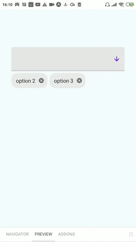
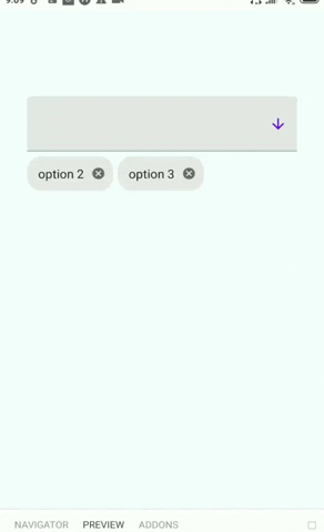
} from "@telenko/react-native-paper-autocomplete";- Using Autocomplete with multiple mode
const SomeForm: React.FC = () => {
  const [selectedIds, setIds] = useState([]);
  const options = useMemo(
    () => [
      { label: "option 1", value: "1" },
      { label: "option 2", value: "2" },
      { label: "option 3", value: "3" },
    ],
    []
  );
  return (
    <Autocomplete
      multiple
      value={selectedIds}
      onChange={setIds}
      options={options}
    />
  );
};- Using Autocomplete with single mode
const SomeForm: React.FC = () => {
  const [id, setId] = useState("");
  const options = useMemo(
    () => [
      { label: "option 1", value: "1" },
      { label: "option 2", value: "2" },
      { label: "option 3", value: "3" },
    ],
    []
  );
  return <Autocomplete value={id} onChange={setId} options={options} />;
};- For more examples go to showcase section or checkout stories of storybook
!Note, to run storybook follow such steps:
- Go to /storybook folder
- Run:
npm run <platrofm>(f.e.npm run android) - Expo application of storybook should run
API
Autocomplete
import { Autocomplete } from "@telenko/react-native-paper-autocomplete";Autocomplete props:
multiple
- Type: boolean
- Required: false
- Default: false
- Description: Sets whether component will work in multiple or single mode
value
- Type: string (single mode) | string[] (multiple mode)
- Required: true
- Default: "" (single mode) | [] (multiple mode)
- Description: Sets value of autocomplete
onChange
- Type: (v: string) => void (single mode) | (v: string[]) => void (multiple mode)
- Required: true
- Default: -
- Description: Sets value of autocomplete
renderHelper
- Type: () => React.ReactElement
- Required: false
- Default: -
- Description: Element will be rendered between host/trigger input and chips (can be useful for validation)
renderDropdown
- Type: (props: DropdownProps) => React.ReactElement
- Required: false
- Default: uses FlatDropdown for single mode | uses ModalDropdown for multiple mode
- Description: Renders dropdown component
renderOption
- Type: ({ value, label, selected, onSelect }, optionItem) => React.ReactElement
- Required: false
- Default: uses inner widget
- Description: Renders single option inside dropdown
filterOptions
- Type: (options: any[], inputV: string) => any[]
- Required: false
- Default: local implementation, checks that option label includes query input string
- Description: Filters options list depending on text input value
labelExtractor
- Type: (item: any) => string
- Required: false
- Default: item => item.label
- Description: Gets option view text from option item
...Inherits all other common dropdown props
Multiple mode specific props
renderSelectedItem
- Type: ({ value, label, style, onDelete }, optionItem: any) => React.ReactElement
- Required: false
- Default: Renders Chip component
- Description: Renders single selected item (below dropdown)
Dropdown
import {
  FlatDropdown, // used as default dropdown for single mode
  ModalDropdown, // used as default dropdown for multiple mode
} from "@telenko/react-native-paper-autocomplete";
Dropdown props:
inputValue
- Type: string
- Required: true
- Description: Value for text input inside dropdown
options
- Type: any[]
- Required: true
- Description: options list
renderOption
- Type: ({ item: any, index: number }) => React.ReactElement
- Required: false
- Default: uses Menu.Item component of react-native-paper
- Description: Renders single option
renderHost
- Type: (props: TextInputProps) => React.ReactElement
- Required: false
- Default: uses TextInput of react-native-paper
- Description: Renders main trigger element
renderNoItems
- Type: () => React.ReactElement
- Required: false
- Default: uses internal layout
- Description: Renders when no items available in dropdown
noItemsLabel
- Type: string
- Required: false (will be used only if renderNoItems is not specified)
- Default: "No items"
- Description: Sets string value of noItems default widget
onPress
- Type: () => void
- Required: false
- Default: -
- Description: Triggered when user presses on dropdown
keyExtractor
- Type: (item: any) => string
- Required: false
- Default: item => item.value
- Description: Used to generate uniq key for each option
openOnMount
- Type: boolean
- Required: false
- Default: false
- Description: Will open dropdown options after initial render
...Inherits all TextInput props
All TextInput props will be applied to host and search inputs
FlatDropdown specific props
menuOffset
- Type: number
- Required: false
- Default: 65
- Description: Offset of menu from trigger (host) element
ModalDropdown specific props
renderSearchInput
- Type: (props: TextInputProps) => React.ReactElement
- Required: false
- Default: uses TextInput of react-native-paper
- Description: Renders search input inside modal (by default looks same as trigger/host input)
Showcase
- Default modal mode
<Autocomplete
  multiple
  value={value}
  onChange={setValue}
  style={{ width: 300 }}
  options={[
    { value: "1", label: "option 1" },
    { value: "2", label: "option 2" },
    { value: "3", label: "option 3" },
  ]}
/>
- Flat mode
<Autocomplete
  multiple
  renderDropdown={(props) => <FlatDropdown menuOffset={40} {...props} />}
  value={value}
  onChange={setValue}
  style={{ width: 300 }}
  options={[
    { value: "1", label: "option 1" },
    { value: "2", label: "option 2" },
    { value: "3", label: "option 3" },
  ]}
/>
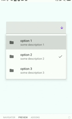
- Custom option
<Autocomplete
  multiple
  value={value}
  onChange={setValue}
  style={{ width: 300 }}
  options={[
    {
      value: "1",
      label: "option 1",
      description: "some description 1",
    },
    {
      value: "2",
      label: "option 2",
      description: "some description 2",
    },
    {
      value: "3",
      label: "option 3",
      description: "some description 3",
    },
  ]}
  renderOption={({ selected, onSelect, label }, { description }) => {
    return (
      <List.Item
        onPress={onSelect}
        title={label}
        description={description}
        left={(props) => <List.Icon {...props} icon="mail" />}
        right={
          selected
            ? (props) => <List.Icon {...props} icon="check" />
            : undefined
        }
      />
    );
  }}
/>
- Custom option + flat mode + custom filter
<Autocomplete
  multiple
  value={value}
  onChange={setValue}
  style={{ width: 300 }}
  options={[
    {
      value: "1",
      label: "option 1",
      description: "some description 1",
    },
    {
      value: "2",
      label: "option 2",
      description: "some description 2",
    },
    {
      value: "3",
      label: "option 3",
      description: "some description 3",
    },
  ]}
  filterOptions={(options, input) => {
    if (!input) {
      return options;
    }
    const includesIgnoreNoWhiteSpaceCase = (a: string, b: string): boolean => {
      const optionQuery = (a || "").replace(/\s/g, "").toUpperCase();
      const inputQuery = (b || "").replace(/\s/g, "").toUpperCase();
      return (
        optionQuery.includes(inputQuery) || inputQuery.includes(optionQuery)
      );
    };
    return options.filter((option) => {
      return (
        includesIgnoreNoWhiteSpaceCase(option.label, input) ||
        includesIgnoreNoWhiteSpaceCase(option.description, input)
      );
    });
  }}
  renderDropdown={(props) => <FlatDropdown menuOffset={40} {...props} />}
  renderOption={({ selected, onSelect, label }, { description }) => {
    return (
      <List.Item
        onPress={onSelect}
        title={label}
        description={description}
        left={(props) => <List.Icon {...props} icon="folder" />}
        right={
          selected
            ? (props) => <List.Icon {...props} icon="check" />
            : undefined
        }
      />
    );
  }}
/>
- Custom search input for modal mode
<Autocomplete
  multiple
  renderDropdown={(props) => (
    <ModalDropdown
      {...props}
      renderSearchInput={(props) => (
        <TextInput
          {...props}
          left={<TextInput.Icon name="arrow-down" size={20} />}
        />
      )}
    />
  )}
  value={value}
  onChange={setValue}
  style={{ width: 300 }}
  options={[
    { value: "1", label: "option 1" },
    { value: "2", label: "option 2" },
    { value: "3", label: "option 3" },
  ]}
/>
- Custom chips
<Autocomplete
  multiple
  renderSelectedItem={({ label, value, onDelete }) => (
    <Chip key={value} icon="folder" mode="outlined" onClose={onDelete}>
      {label}
    </Chip>
  )}
  value={value}
  onChange={setValue}
  style={{ width: 300 }}
  options={[
    { value: "1", label: "option 1" },
    { value: "2", label: "option 2" },
    { value: "3", label: "option 3" },
  ]}
/>
- Validation
<Autocomplete
  multiple
  onOpen={() => {}}
  onClose={() => {}}
  value={value}
  error={value.length !== 2}
  renderHelper={
    value.length !== 2
      ? () => (
          <HelperText type="error" visible>
            You should select 2 items
          </HelperText>
        )
      : null
  }
  onChange={setValue}
  style={{ width: 300 }}
  options={[
    { value: "1", label: "option 1" },
    { value: "2", label: "option 2" },
    { value: "3", label: "option 3" },
  ]}
/>
- Single selection autocomplete
<Autocomplete
  menuOffset={40}
  value={value}
  onChange={setValue}
  style={{ width: 300 }}
  options={[
    { value: "1", label: "option 1" },
    { value: "2", label: "option 2" },
    { value: "3", label: "option 3" },
  ]}
/>
- Custom host element
<Autocomplete
  menuOffset={15}
  renderHost={() => (
    <Button mode="contained">
      {value
        ? options.find((op) => op.value === value)?.label
        : "Select value..."}
    </Button>
  )}
  filterOptions={(options) => options}
  onOpen={() => {}}
  onClose={() => {}}
  value={value}
  onChange={setValue}
  style={{ width: 300 }}
  options={options}
/>
- Plain Dropdown Component (Modal)
<ModalDropdown
  onOpen={() => {}}
  onClose={() => {}}
  onChangeText={setInput}
  style={{ width: 300 }}
  inputValue={input}
  options={[
    { value: "1", label: "option 1" },
    { value: "2", label: "option 2" },
    { value: "3", label: "option 3" },
  ]}
  renderOption={({ item }) => (
    <Menu.Item onPress={() => {}} title={item.label} />
  )}
/>
- Plain Dropdown Component (Flat)
<FlatDropdown
  onOpen={() => {}}
  onClose={() => {}}
  onChangeText={setInput}
  menuOffset={40}
  style={{ width: 300 }}
  inputValue={input}
  options={[
    { value: "1", label: "option 1" },
    { value: "2", label: "option 2" },
    { value: "3", label: "option 3" },
  ]}
  renderOption={({ item }) => (
    <Menu.Item onPress={() => {}} title={item.label} />
  )}
/>
- Writing Autocomplete which works in mixed mode (flat+modal)
import {
  FlatDropdown,
  ModalDropdown,
  Autocomplete,
  AutocompleteProps,
} from "@telenko/react-native-paper-autocomplete";
import React, { useState } from "react";

const AutocompleteMixed: React.FC<AutocompleteProps> = (props) => {
  const [modal, setModal] = useState(false);
  const [currentOpen, setCurrentOpen] = useState(props.openOnMount);
  return (
    <Autocomplete
      renderDropdown={(props) =>
        modal ? (
          <ModalDropdown openOnMount={currentOpen} {...props} />
        ) : (
          <FlatDropdown openOnMount={currentOpen} menuOffset={40} {...props} />
        )
      }
      onClose={() => {
        setCurrentOpen(false);
        setModal(false);
      }}
      onChangeText={(v) => {
        setCurrentOpen(true);
        setModal(v.length > 0);
      }}
      {...props}
    />
  );
};