@thedoctorweb/enhanced-fluid-bottom-navigation-bar-mod
v0.2.6
Published
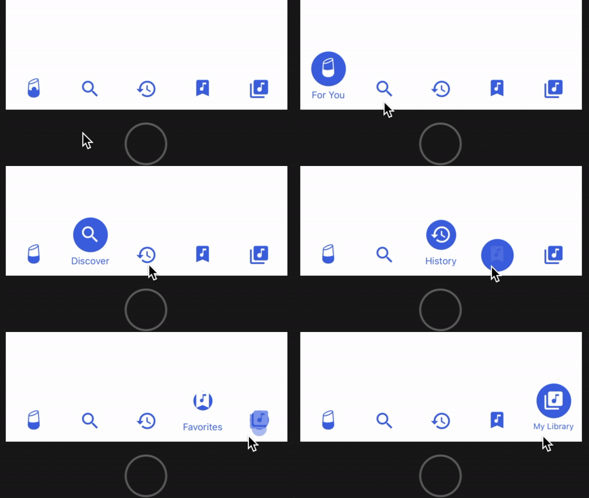
Enhanced version of 10clouds' FluidBottomNavigation for React Native
Maintainers
Readme
Enhanced Fluid Bottom Navigation Bar
This project improves the customization of 10clouds' fluid tab bar for React Native.
What's New in 0.2.6:
- Update/mod packages version
What's New in 0.2.5:
- Start The Doctor Web customizations
- Fix missing "useNativeDriver: false" in index.js
What's New in 0.2.4:
- ?
What's New in 0.2.2/0.2.3:
- Fixed and issue where
Zocialicons were not being rendered properly. - Formatting and linting.
- Optimized dependencies.
Changelog:
- Added Expo compatibility by removing
react-native-view-overflowand the need to link it. - Added integrated vector icons via @expo/vector-icons so you don't have to supply your own icons.
- Tab bar now auto-selects first tab index on mount (this behavior is customizable).
- Tab bar background color is now fully customizable.
- Icon highlight color on select is now fully customizable.
- Icon font size and font family is now fully customizable.
- Deprecated the ability to provide image sources for icon images.
- Removed example project in favor of expanded usage documentation.
- Fixed an issue where the default font family causes an
expo-fonterror in newer versions of Expo. - Fixed an issue where font scales poorly for long tab names when font size is not specified.

Installation
yarn (recommended)
yarn add enhanced-fluid-bottom-navigation-bar-modnpm
npm i enhanced-fluid-bottom-navigation-bar-modUsage
Rendering Component
This component requires just 2 props:
onPress: a function that should handle rendering tabs.values: an array of objects that contains the title and icon properties for each tab.
<TabBar
  onPress={tabIndex => { this._handlePress(tabIndex) }}
  values={[
    {
      title: 'News',      // required
      icon: 'news',       // required
      iconSet: 'Entypo',  // required
      size: 32            // required (icon will be size x size)
    }
  ]}
/>
Look up valid icon names and their corresponding icon set at the @expo/vector-icons directory.
Integration with react-navigation
- Define a custom component that renders
TabBarwith thevaluesyou want. React's tab navigator will passnavigationandonTabPressprops to your component when hooked up; use these to implement theonPresscallback to navigate to the appropriate route:
import TabBar from 'enhanced-fluid-bottom-navigation-bar-mod';

class FluidTabBar extends Component {
  render() {
    return (
      <TabBar
        onPress={tabIndex => {
          const route = this.props.navigation.state.routes[tabIndex];
          this.props.onTabPress({route});
        }}
        values={[
          {
            title: 'Tab 1',
            icon: 'star',
            iconSet: 'MaterialIcons',
            size: 32
          }, {
            title: 'Tab 2',
            icon: 'check',
            iconSet: 'AntDesign',
            size: 32
          }
        ]}
      />
    );
  }
}
In this case, pressing a tab in FluidTabBar navigates to the route that shares the same array index.
- Create a tab navigator and supply our custom component to
tabBarComponent.
import {createBottomTabNavigator} from 'react-navigation-tabs';

const myTabNavigator = createBottomTabNavigator(
  {  // RouteConfigs
    Tab1: { screen: Tab1Screen },
    Tab2: { screen: Tab2Screen },
  },
  {
    initialRouteName: 'Tab1',
    tabBarComponent: FluidTabBar,
  }
);- Create an app container from your tab navigator and use it as your top-level component.
import {createAppContainer} from 'react-navigation';

const myAppContainer = createAppContainer(myTabNavigator)
Customization
Prop | Type | Default | Description --- | --- | --- | --- tintColor | String | rgb(76, 83, 221) | Icon bubble background color and text color. selectColor | String | rgb(255, 255, 255) | Icon tint or highlight color when selected. backgroundColor | String | rgb(255, 255, 255) | Tab bar background color. autoSelect | Number | 0 | Auto-selects the tab at this index on mount. fontSize | Number | undefined | Font size for tab captions. fontFamily | String | undefined | Font family for tab captions.
NOTE: fontSize and fontFamily default to React Native's standard font size and font face.
Author
Original Author: Patryk Mierzejewski
Modifications By: Victor Li
License
Available under the MIT license. See the LICENSE file for more info.


