
@theoneabove0/nepalidatepicker-react
v0.1.4
Published
Thin React wrappers for nepalidatepicker datepicker core.


Readme
@theoneabove0/nepalidatepicker-react


A lightweight, fully customizable Nepali date picker for React. Built for BS dates from the ground up, with shared calendar logic that avoids the common month/day mismatches found in many Nepali date picker implementations.
Live Demo & Documentation · npm Package · GitHub
Installation
The package can be installed via npm:
npm install @theoneabove0/nepalidatepicker-react @theoneabove0/nepalidatepicker react react-domOr via yarn:
yarn add @theoneabove0/nepalidatepicker-react @theoneabove0/nepalidatepicker react react-domYou'll need to install React and React DOM separately since those dependencies aren't included in the package.
Basic Configuration
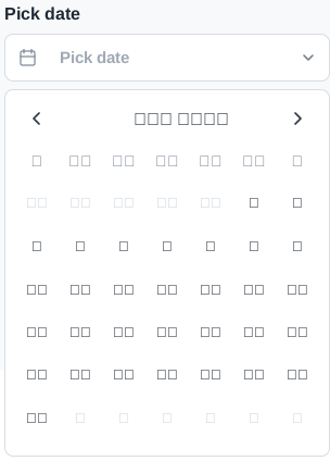
Below is a simple example of how to use the DatePicker in a React view. The most basic use of the DatePicker can be described with:
import { useState } from 'react';
import { DatePickerInput } from '@theoneabove0/nepalidatepicker-react';
import '@theoneabove0/nepalidatepicker-react/style.css';
import { CalendarDays, ChevronDown } from 'lucide-react';

export function App() {
  const [value, setValue] = useState(null);

  return (
    <DatePickerInput
      label="Pick date"
      placeholderText="Pick date"
      leftSection={<CalendarDays size={16} />}
      rightSection={<ChevronDown size={16} />}
      value={value}
      onChange={setValue}
      min="2082-01-01"
      max="2084-12-30"
    />
  );
}
The base NepaliDatePicker also supports input popup mode by default and inline calendar mode with inline.
See the main website for a full list of props that may be passed to the component.
Time Picker
You can also include a time picker or use a standalone time picker.
import { useState } from 'react';
import { DateTimePicker, TimePicker } from '@theoneabove0/nepalidatepicker-react';

export function DateTimeExample() {
  const [value, setValue] = useState({
    date: { year: 2083, month: 1, day: 30 },
    time: '15:22',
  });

  return (
    <DateTimePicker
      label="Pick date and time"
      placeholderText="Pick date and time"
      firstDayOfWeek={0}
      timeFormat="12h"
      value={value}
      onChange={setValue}
    />
  );
}

export function TimeExample() {
  return <TimePicker label="Pick time" format="24h" withSeconds />;
}
Customization
Available components to import:
DatePicker,DatePickerInput,DateInputDateTimePickerMonthPicker,MonthPickerInputYearPicker,YearPickerInputTimePicker,TimeInputCalendar
Common Customization Props
typeable(allow typing date directly in input mode)size("sm" | "md" | "lg" | "xl" | number)monthNames,weekdayNames,weekdayShortNamesclearable/isClearableincludeDates,excludeDates,holidays,filterDatemin/maxfirstDayOfWeek(0-6, where0is Sunday)numeralSystem(Easily switch between Devanagari and English numerals)
<DatePickerInput
  value={value}
  onChange={setValue}
  label="Holiday dates"
  holidays={[
    { date: '2083-01-01', label: 'New year', className: 'holiday-accent' },
    { date: '2083-01-15', label: 'Office closed', disabled: true },
  ]}
/>
Styling API
Easily customize the look and feel using CSS variables, inline styles, or class names:
<DatePickerInput
  variables={{
    '--nepali-date-picker-accent': '#c97012',
    '--nepali-date-picker-input-radius': '18px',
    '--nepali-date-picker-calendar-radius': '22px',
  }}
  styles={{
    inputShell: { paddingInline: '4px' },
    day: { borderRadius: '14px' },
  }}
  classNames={{
    calendar: 'brand-calendar',
    day: 'brand-day',
  }}
/>
Browser Support & Note
All grid/navigation/constraint logic is delegated to @theoneabove0/nepalidatepicker/datepicker-core, ensuring consistent and bug-free date math across environments. The date picker is compatible with all modern browsers.
License
Copyright (c) 2024-Present and individual contributors. Licensed under Apache-2.0 license.