@thomasbfrd/dropdown
v1.0.10
Published
A simple and fully customizable dropdown component for React, built with Typescript
Maintainers
 thomasbfrd
Readme
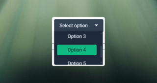
React Dropdown Component
A simple and fully customizable dropdown component for React, built with Typescript
Installation
In your project, copy and paste this line :
npm i @thomasbfrd/dropdownFeatures
- Modern dropdown UI with select options
Usage
You need to import the component and the style. Available props:
export interface DropdownProps {
    placeholder?: string; // The placeholder text in the input
    options?: Array<string | number>; // Data to pass to the component (it can only be strings or numbers)
    height?: number; // The height of the unrolled dropdown
    width?: number; // the width of the dropdown
    paddingY?: number; // Padding of the dropdown for Y
    paddingX?: number; // Padding of the dropdown for X
    primaryColor?: string; // Primary color displayed to the dropdown
    secondaryColor?: string; // Secondary color displayed to the dropdown
    backgroundPrimaryColor?: string; // Background color displayed to the dropdown button
    backgroundSecondaryColor?: string; // Background color displayed to the dropdown content options
    hoverColor?: string; // Hover color of button
    itemHoverColor?: string; // Hover color of item options
    onDropdownItemSelected?: (option: string | number) => void; // Callback that returns the selected data
}
Importation :
import { Dropdown } from "@thomasbfrd/dropdown";
import "@thomasbfrd/dropdown/dist/dropdown.css";
Example:
<Dropdown
    options={options}
    onDropdownItemSelected={onDropDownItemSelected}
    primaryColor="#e2e8f0"
    secondaryColor="#0f172a"
    backgroundPrimaryColor="#1e293b"
    backgroundSecondaryColor="#334155"
    itemHoverColor="#10b981"
    hoverColor="#10b981"
/>
Customization
You can override the default styles by passing your own color props.
Demo