@thomasbfrd/modal
v1.0.0
Published
A simple, customizable React modal component built with Typescript
Maintainers
 thomasbfrd
Readme
React Modal Component
A simple, customizable React modal component built with Typescript
Installation
In your project, just copy and paste this line :
npm i @thomasbfrd/modalFeatures
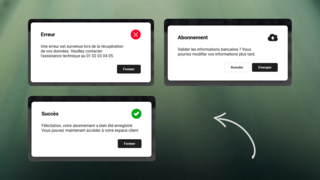
- Success Modal: Displays a success message with a single confirmation button
- Error Modal: Shows error messages with a close button
- Submit Modal: Confirmation dialog with both confirm and cancel options
Usage
type: 'success' | 'error' | 'submit'
title: string;
body: string;
cancelButton?: string;
okButton: string;
onCancel?: () => void;
onOk: () => void;
Importation :
import { Modal } from "@thomasbfrd/modal";
import "@thomasbfrd/modal/dist/modal.css";
Success Modal
<Modal
type="success"
title="Success!"
body="Operation completed successfully"
okButton="Close"
onOk={() => {}}
/>
Error Modal
<Modal
type="error"
title="Error"
body="Something went wrong"
okButton="Close"
onOk={() => {}}
/>
Submit Modal (with confirmation)
<Modal
type="submit"
title="Confirm"
body="Are you sure?"
okButton="Confirm"
cancelButton="Cancel"
onOk={() => {}}
onCancel={() => {}}
/>Customization
:root {
    --modal-background-color: #1E293B;
    --modal-primary-color: #F8FAFC;
    --modal-secondary-color: #1E293B;
    --modal-button-primary-color: #1e1e1e;
    --modal-button-secondary-color: #1E293B;
}
Demo