
@tnbt/quill-editor
v1.0.8
Published
A rich text editor component built on Quill that can be integrated into any React application
Maintainers
 tiennguyen12g
Readme
@tnbt/quill-editor
A powerful, feature-rich rich text editor component built on Quill that can be integrated into any React application. This package provides a flexible, callback-based API that works with any backend (REST, GraphQL, Firebase, MongoDB, etc.).


✨ Features
- 🎨 Rich Text Editing: Full-featured WYSIWYG editor based on Quill
- 🖼️ Image Support: Upload, resize, align (left, right, center), and manage images with custom callbacks
- 📝 Multiple Modes: Create, edit, and readonly modes with preview toggle
- 🔄 Auto-save: Built-in auto-save functionality with configurable intervals
- 🎯 TypeScript: Full TypeScript support with exported types
- 🔌 Flexible Backend: Works with any backend via callback-based architecture
- 🎨 Customizable: Extensive customization options and styling
- 📱 Responsive: Works on desktop and mobile devices
- 😊 Emoji Picker: Built-in emoji picker with categorized emojis
- 💬 Blockquote: Custom blockquote feature with styled rendering
- 🎨 Image Layouts: Support for image-left-content, image-right-content, and centered image layouts
- 📋 Code Blocks: Syntax highlighting and copy functionality for code blocks
- ✨ Highlight Content: Custom highlight content feature
- 🔄 Undo/Redo: Custom undo/redo functionality
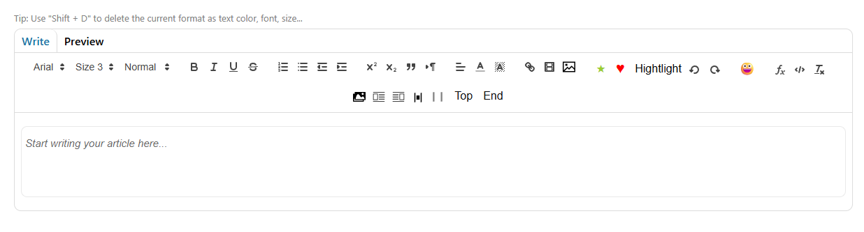
📸 Screenshot
🎥 Demo Video
📦 Installation
npm install @tnbt/quill-editor
# or
yarn add @tnbt/quill-editor
# or
pnpm add @tnbt/quill-editor
Requirements
- React: >=18.0.0 (compatible with React 18, 19, and future versions)
- React DOM: >=18.0.0
The package uses React as a peer dependency, so make sure you have React installed in your project:
npm install react react-dom⚠️ React 19 Compatibility Note
If you're using React 19, you need to add a polyfill for findDOMNode (which was removed in React 19). Add this to your app's entry point before other imports:
// main.tsx or App.tsx
import ReactDOM from 'react-dom';

// Polyfill for React 19
if (!ReactDOM.findDOMNode) {
  (ReactDOM as any).findDOMNode = function(componentOrElement: any) {
    if (!componentOrElement) return null;
    if (componentOrElement.nodeType === 1 || componentOrElement.nodeType === 3) {
      return componentOrElement;
    }
    if (componentOrElement.current) return componentOrElement.current;
    if (componentOrElement.stateNode) return componentOrElement.stateNode;
    return null;
  };
}

// Now import your app
import App from './App';
🚀 Quick Start
Basic Usage
import React, { useState } from 'react';
import { QuillEditorTNBT_DefaultCss } from '@tnbt/quill-editor';
import '@tnbt/quill-editor/styles'; // Import styles

function MyEditor() {
  const [content, setContent] = useState('');

  const handleCreate = async (data) => {
    // Your save logic - works with ANY backend!
    const response = await fetch('/api/articles', {
      method: 'POST',
      headers: { 'Content-Type': 'application/json' },
      body: JSON.stringify({
        content: data.content,
        title: data.metadata?.title,
      }),
    });

    const result = await response.json();
    return {
      success: true,
      articleId: result.id,
      message: 'Article created!',
    };
  };

  const handleImageUpload = async (file: File) => {
    const formData = new FormData();
    formData.append('image', file);

    const response = await fetch('/api/upload-image', {
      method: 'POST',
      body: formData,
    });

    const { url } = await response.json();
    return url;
  };

  return (
    <QuillEditorTNBT_DefaultCss
      value={content}
      onChange={setContent}
      onCreate={handleCreate}
      onImageUpload={handleImageUpload}
      articleMetadata={{
        title: 'My Article',
        tags: ['tech', 'tutorial'],
      }}
      defaultImageWidth={600}
    />
  );
}
📚 Components
QuillEditorTNBT_DefaultCss
The main editor component with default styling. This is the recommended component to use.
import { QuillEditorTNBT_DefaultCss } from '@tnbt/quill-editor';
import '@tnbt/quill-editor/styles';
QuillEditorTNBT
The base editor component without default CSS. Use this if you want to provide your own styling.
import { QuillEditorTNBT } from '@tnbt/quill-editor';ConvertDocProperly
Utility component for converting editor content with custom syntax (blockquotes, image layouts, etc.) into proper HTML.
import { ConvertDocProperly } from '@tnbt/quill-editor';

function Preview({ content }) {
  return (
    <div dangerouslySetInnerHTML={{
      __html: ConvertDocProperly({ documentValue: content })
    }} />
  );
}
📖 Usage Examples
Create Article
import { QuillEditorTNBT_DefaultCss } from '@tnbt/quill-editor';
import '@tnbt/quill-editor/styles';

function CreateArticle() {
  const handleCreate = async (data) => {
    // data.content - HTML content
    // data.plainText - Plain text version
    // data.images - Array of image data
    // data.wordCount - Word count
    // data.metadata - Article metadata

    const response = await fetch('/api/articles', {
      method: 'POST',
      body: JSON.stringify({ content: data.content }),
    });

    return { success: true, articleId: '123' };
  };

  return (
    <QuillEditorTNBT_DefaultCss
      onCreate={handleCreate}
      onImageUpload={async (file) => {
        // Upload image and return URL
        return 'https://example.com/image.jpg';
      }}
      defaultImageWidth={600}
    />
  );
}
Edit Article
import { QuillEditorTNBT_DefaultCss } from '@tnbt/quill-editor';
import '@tnbt/quill-editor/styles';

function EditArticle({ articleId, initialContent }) {
  const handleUpdate = async (data, id) => {
    const response = await fetch(`/api/articles/${id}`, {
      method: 'PUT',
      body: JSON.stringify({ content: data.content }),
    });

    return { success: true };
  };

  return (
    <QuillEditorTNBT_DefaultCss
      mode="edit"
      value={initialContent}
      onUpdate={handleUpdate}
      onImageUpload={async (file) => {
        return 'https://example.com/image.jpg';
      }}
    />
  );
}
Read-Only Mode with Preview
import { QuillEditorTNBT_DefaultCss, ConvertDocProperly } from '@tnbt/quill-editor';
import '@tnbt/quill-editor/styles';

function ViewArticle({ content }) {
  return (
    <QuillEditorTNBT_DefaultCss
      mode="readonly"
      value={content}
      showPreview={true}
    />
  );
}

// Or render converted content directly
function ArticlePreview({ content }) {
  const convertedContent = ConvertDocProperly({ documentValue: content });
  return <div dangerouslySetInnerHTML={{ __html: convertedContent }} />;
}
Using Ref Methods
import { useRef } from 'react';
import { QuillEditorTNBT_DefaultCss, type QuillEditorRef } from '@tnbt/quill-editor';

function EditorWithRef() {
  const editorRef = useRef<QuillEditorRef>(null);

  const handleSave = async () => {
    // Get content
    const content = editorRef.current?.getContent();
    const wordCount = editorRef.current?.getWordCount();

    // Save/Create/Update
    await editorRef.current?.create();
    // or
    await editorRef.current?.update('article-id');
    // or
    await editorRef.current?.save();

    // Utility methods
    const validation = editorRef.current?.validate();
    editorRef.current?.focus();
    editorRef.current?.clear();
  };

  return (
    <>
      <button onClick={handleSave}>Save</button>
      <QuillEditorTNBT_DefaultCss ref={editorRef} />
    </>
  );
}
🔧 API Reference
Props
| Prop | Type | Default | Description |
|------|------|---------|-------------|
| value | string | - | Controlled content value |
| defaultValue | string | - | Uncontrolled default content |
| onChange | (html: string) => void | - | Called on every content change |
| onContentChange | (html: string) => void | - | Debounced version of onChange (optional) |
| mode | 'create' \| 'edit' \| 'readonly' | 'create' | Editor mode |
| showPreview | boolean | true | Show preview mode toggle |
| showToolbar | boolean | true | Show/hide toolbar |
| onCreate | (data: EditorData) => Promise<CreateResult> | - | Create article callback |
| onUpdate | (data: EditorData, id: string) => Promise<UpdateResult> | - | Update article callback |
| onSave | (data: EditorData) => Promise<SaveResult> | - | Generic save callback |
| onImageUpload | (file: File) => Promise<string> | - | Image upload callback (must return URL) |
| defaultImageWidth | number | 500 | Default width for inserted images |
| articleMetadata | ArticleMetadata | - | Article metadata (title, tags, etc.) |
| autoSave | boolean | false | Enable auto-save |
| autoSaveInterval | number | 30000 | Auto-save interval (ms) |
| onAutoSave | (data: EditorData) => Promise<void> | - | Auto-save callback |
| placeholder | string | "Write something awesome..." | Editor placeholder |
| onSuccess | (message: string) => void | - | Success callback |
| onError | (error: EditorError) => void | - | Error callback |
| onModeChange | (mode: 'write' \| 'preview') => void | - | Mode change callback |
| className | string | - | Custom CSS class |
Ref Methods (QuillEditorRef)
interface QuillEditorRef {
  // Content Methods
  getContent: () => string;
  getPlainText: () => string;
  setContent: (html: string) => void;
  clear: () => void;

  // Editor Methods
  focus: () => void;
  blur: () => void;
  getSelection: () => any;
  getEditor: () => any; // Get Quill instance

  // Save Methods
  save: () => Promise<SaveResult>;
  create: () => Promise<CreateResult>;
  update: (articleId: string) => Promise<UpdateResult>;

  // Preview Methods
  switchToPreview: () => void;
  switchToWrite: () => void;

  // Image Methods
  insertImage: (url: string, width?: number) => void;
  extractImages: () => ImageData[];

  // Utility Methods
  getWordCount: () => number;
  getCharacterCount: () => number;
  validate: () => ValidationResult;
}
Types
import type {
  QuillEditorTNBTProps,
  QuillEditorRef,
  EditorData,
  ImageData,
  ArticleMetadata,
  SaveResult,
  CreateResult,
  UpdateResult,
  EditorError,
  ValidationResult,
  ToolbarConfig,
} from '@tnbt/quill-editor';

interface EditorData {
  content: string;           // HTML content
  plainText: string;          // Plain text version
  images: ImageData[];        // Extracted images info
  wordCount: number;
  characterCount: number;
  metadata?: ArticleMetadata;
}

interface ImageData {
  src: string;
  alt?: string;
  width?: number;
  height?: number;
  file?: File;
}

interface ArticleMetadata {
  title?: string;
  tags?: string[];
  coverImage?: File | string;
  category?: string;
  [key: string]: any;
}
Utility Functions
import {
  processImagesInContent,
  extractImageUrls,
  hasBase64Images,
} from '@tnbt/quill-editor';

// Process images in HTML content (extract base64, upload, replace)
const processedContent = await processImagesInContent(
  htmlContent,
  uploadCallback
);

// Extract image URLs from HTML
const imageUrls = extractImageUrls(htmlContent);

// Check if content has base64 images
const hasBase64 = hasBase64Images(htmlContent);
🎨 Styling
Import Default Styles
import '@tnbt/quill-editor/styles';Custom CSS (Optional)
If the style does not show correctly, you add code below to index.css file. If you need additional styling, you can add custom CSS:
/* fix quill-editor-tnbt/styles.css */
.top-and-bottom{
  margin-top: 0px !important;
  top: 100px !important;
  margin-left: -20px !important;
}

/* Quill Editor List Styles for Preview Mode */
.ql-editor ol,
.ql-editor ul,
.ql-preview ol,
.ql-preview ul,
[class*="ql-"] ol,
[class*="ql-"] ul {
  padding-left: 1.5em !important;
  margin: 1em 0 !important;
  list-style-position: outside !important;
}

.ql-editor ol li,
.ql-editor ul li,
.ql-preview ol li,
.ql-preview ul li,
[class*="ql-"] ol li,
[class*="ql-"] ul li {
  margin: 0.5em 0 !important;
  line-height: 1.6 !important;
  display: list-item !important;
}

.ql-editor ol {
  list-style-type: decimal !important;
}

.ql-editor ul {
  list-style-type: disc !important;
}

.ql-preview ol {
  list-style-type: decimal !important;
}

.ql-preview ul {
  list-style-type: disc !important;
}

/* Ensure list styles are preserved in preview/content areas */
.article-content ol,
.article-content ul {
  padding-left: 1.5em !important;
  margin: 1em 0 !important;
  list-style-position: outside !important;
}

.article-content ol li,
.article-content ul li {
  margin: 0.5em 0 !important;
  line-height: 1.6 !important;
  display: list-item !important;
}

.article-content ol {
  list-style-type: decimal !important;
}

.article-content ul {
  list-style-type: disc !important;
}

/* Quill Editor Blockquote Styles for Preview Mode */
.ql-editor blockquote,
.ql-preview blockquote,
[class*="ql-"] blockquote {
  border-left: 4px solid #d1d5db !important; /* Gray vertical line */
  padding-left: 1.5em !important;
  margin: 1em 0 !important;
  color: #374151 !important; /* Gray text */
  font-style: normal !important;
  background-color: transparent !important;
}

.dark .ql-editor blockquote,
.dark .ql-preview blockquote,
.dark [class*="ql-"] blockquote {
  border-left-color: #4b5563 !important; /* Darker gray for dark mode */
  color: #d1d5db !important; /* Lighter gray text for dark mode */
}

/* Article content blockquote styles */
blockquote {
  border-left: 4px solid #d1d5db !important; /* Gray vertical line */
  padding-left: 1.5em !important;
  margin: 1em 0 !important;
  color: #374151 !important; /* Gray text */
  font-style: normal !important;
  background-color: transparent !important;
}

.dark .article-content blockquote {
  border-left-color: #4b5563 !important; /* Darker gray for dark mode */
  color: #d1d5db !important; /* Lighter gray text for dark mode */
}
🎯 Features in Detail
Image Alignment
The editor supports three image alignment options:
- Left: Image on the left, content on the right
- Right: Image on the right, content on the left
- Center: Image centered horizontally
These are available via toolbar buttons and render properly in preview mode.
Emoji Picker
Access a categorized emoji picker from the toolbar. Click the emoji button to open a dropdown with emojis organized by category.
Blockquote
Insert styled blockquotes using the blockquote button. Blockquotes render with a gray vertical line, background color, and proper spacing.
Code Blocks
Code blocks support syntax highlighting and include a copy button for easy code sharing.
Highlight Content
Use the highlight feature to emphasize important content with custom styling.
🔗 TypeScript Support
Full TypeScript support with exported types:
import {
  QuillEditorTNBT_DefaultCss,
  QuillEditorTNBT,
  ConvertDocProperly,
  QuillEditorRef,
  EditorData,
  ImageData,
  ArticleMetadata,
  processImagesInContent,
  extractImageUrls,
  hasBase64Images,
} from '@tnbt/quill-editor';
📝 License
MIT
🤝 Contributing
Contributions are welcome! Please feel free to submit a Pull Request.
📧 Support
For issues and questions, please open an issue on GitHub.
🔗 Links
Made with ❤️ using Quill and React