
@trixwell/ngx-data-gridx
v2.5.0
Published
Highly customizable Angular Material data grid component


Readme
NgxDataGridx Component Documentation
Overview
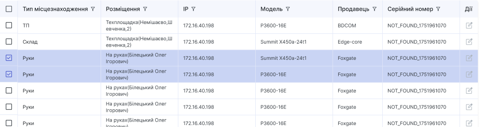
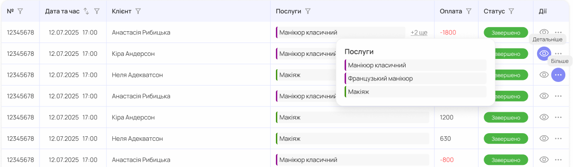
NgxDataGridx is an Angular component that renders data in a highly customizable and interactive data table. It supports features such as filtering, sorting, pagination, CSV export, expandable sub-grids, and integration with Angular Material components.
🔗 GitHub Repository: Trixwell/data-grid
Installation
To use NgxDataGridx, ensure you have Angular and Angular Material installed. Then, import the component into your module:
npm install ngx-data-gridxRequired peer dependencies:
npm install @angular/material @angular/forms @angular/common rxjsIn your app.module.ts:
import { NgxDataGridx } from 'ngx-data-gridx';

@NgModule({
  declarations: [AppComponent],
  imports: [NgxDataGridx],
  bootstrap: [AppComponent],
})
export class AppModule {}
Inputs (@Input)
| Name | Type | Description |
| -------------------- | --------------------------------------------- |--------------------------------------------------------|
| url | string | API endpoint to load data from. |
| exportCsvUrl | string | URL to export the current filtered data in CSV format. |
| data | GridProperty[] | Configuration for grid columns. |
| limit | number | Number of rows per page. |
| listKey | string | Response key holding the rows (default list). |
| totalsUrl | string \| null | Optional endpoint returning { response: { totals } }; overrides totals from the list response. |
| sort | string | Sort direction: asc or desc. |
| sidx | string | Field name to sort by. |
| grid_name | string | Unique identifier for the grid. |
| multiselect | boolean | Enables row multi-selection. |
| showFilters | boolean | Toggle filter visibility. |
| subUrlParams | { paramName: string; columnName: string }[] | Parameters to pass to sub-grid requests. |
| currentRow | object | Parent row context for sub-grid data. |
| showHistoryFilters | boolean | Display history of applied filters. |
| expandedElement | object | Row currently expanded to show sub-grid. |
| expandableAll | boolean | Allow several open sub-grids (default: one at a time). |
| noDataPlaceholder | string | Message to display when no data is found. |
| parentGridFilters | object | Filters from a parent grid to apply in a sub-grid context. |
| gridTitle | string \| null | Title shown in the grid header when grid_name is not set. Set automatically for sub-grids from SubGridSettings.title. |
Totals footer row
The grid renders a bold, grey footer row when the list response contains totals. Totals are calculated by the server over the whole filtered set, so they ignore pagination.
{ "response": { "list": [], "total": 120, "totals": { "quantity": 28, "amount": 73100 } } }- Keys of
totalsare column names. A column without a key gets an empty footer cell. - Each cell is rendered with the column
callback, which receives thetotalsobject as the row. - The row is hidden when there are no rows. The PDF export appends it as the last bold row.
totalsUrl: when set, the grid requests it with the same filter params as the list request but withoutpage,limit,sidxandsort, and expects{ "response": { "totals": { ... } } }. These totals override the ones from the list response. They are refetched on filter, search, refresh and auto-refresh, not on page change.- Sub-grids: set
subTotalsUrlinSubGridSettings; it is passed to the sub-grid astotalsUrl.
Sub-grid summary row
A sub-grid can show a summary row for its parent row while it is filtered. The row sits between the parent row and the sub-grid, is aligned under the parent grid columns and uses the totals footer look. It is hidden while the sub-grid is not filtered by one of the configured columns, and when the row is collapsed.
new SubGridSettings({
  suburl: '/api/movements',
  subUrlParams: [{ paramName: 'spec_id', columnName: 'spec_id' }],
  summary: {
    url: '/api/specs',
    filterColumns: ['manager_fio'],
    label: (values) => `Data for manager filtered by ${values['manager_fio']}`,
  },
});summary.url: endpoint shaped like the parent list. It is requested with the parent grid filters, thesubUrlParamsmapping of the parent row and the active values offilterColumns, without paging. The first element ofresponse[listKey](or ofresponsewhen it is an array) is used as the summary row.summary.filterColumns: sub-grid columns (filter or search) that trigger the row. Changes to other columns do not touch it.summary.label: text for the first cell of the row whose column has no value in the summary row. Return no value for the leading parent columns to make room for it.- Every other cell is rendered with the parent column
callback, which receives the summary row; columns without a key stay empty. - The row is refetched when the parent reloads (refresh, auto-refresh, filters, paging) and requests that are superseded are cancelled.
- The sub-grid emits
filtersChange(Record<string, string>with its active filter params, debounced by 300 ms), also once after it is created. A sub-grid restores its filters from localStorage, and sub-grids with equal columns share one key, so a restored filter shows the summary for the parent row it is opened under, matching the rows the sub-grid displays.
Key Methods
loadData(page, limit)— Fetches data fromurlwith filters, sorting, and pagination applied.onFilterChange(column, type, label, value)— Applies a filter to a column.onDateRangeChange(column, formGroup)— Applies date range filtering.clearAllFilters()— Resets all applied filters.exportCsvAction()— Initiates export of filtered data to CSV.setCurrentGridColumn(column, row)— Toggles sub-grid view for a row. By default opening a sub-grid on another row closes the open one; withexpandableAllother open rows stay open.
Template Structure
- Filter Controls: Positioned above the table; supports input search, select, checkbox, and date-range.
- Table Body: Built with
<mat-table>. Each column is defined usingmatColumnDef. Rows are populated usingMatTableDataSource. - Expandable Rows: Sub-grids can be rendered by expanding a row.
- Actions: Built-in buttons for filtering, clearing, and exporting.
Uses Angular Material components: mat-table, mat-paginator, mat-form-field, mat-select, mat-checkbox, mat-icon, mat-progress-bar, mat-date-range-input, etc.
Animations & Interactions
- Row Expansion: Smooth expansion/collapse using Angular animations (
@detailExpand). - Filtering: Debounced reactive search using
Subject+debounceTimefor responsive UX. - Multi-select: Row selection via
mat-checkbox. - CSV Export: Filtered results can be exported with one click.
Example Usage
Component Setup
@Component({
  selector: 'app-root',
  templateUrl: './app.component.html',
})
export class AppComponent {
  apiUrl = '/api/items';
  columnConfig: GridProperty[] = [
    new GridProperty({
      name: 'id',
      displayName: 'ID',
      type: GridPropertyType.Number,
      sort: true,
    }),
    new GridProperty({
      name: 'title',
      displayName: 'Title',
      type: GridPropertyType.Text,
      search: true,
    }),
    new GridProperty({
      name: 'category',
      displayName: 'Category',
      type: GridPropertyType.Text,
      filter: [
        { label: 'Category', type: 'select' },
      ],
      filterValues: [[
        { label: 'Books', value: 'books' },
        { label: 'Music', value: 'music' },
      ]],
    }),
    new GridProperty({
      name: 'created_at',
      displayName: 'Created',
      type: GridPropertyType.Date,
      filter: [
        { label: 'Date range', type: 'date' },
      ]
    }),
    new GridProperty({
      name: 'details',
      displayName: 'Details',
      type: GridPropertyType.Text,
      ident: true,
      subGridSettings: new SubGridSettings({
        suburl: '/api/items/details',
        subUrlParams: [{ paramName: 'item_id', columnName: 'id' }],
        title: (row) => `Details for item ${(row as any).id}`,
        subGridProps: {
          multiselect: false,
          limit: 5,
          search: true,
          showFilters: true
        }
      }),
      subGridPropertyList: [
        new GridProperty({
          name: 'detail_id',
          displayName: 'Detail ID',
          type: GridPropertyType.Number
        }),
        new GridProperty({
          name: 'description',
          displayName: 'Description',
          type: GridPropertyType.Text
        })
      ]
    })
  ];
}
SubGridSettings.title accepts a string or a function (row) => string and is shown in the header of the nested grid.
Template
<ngx-data-gridx
  [url]="apiUrl"
  [data]="columnConfig"
  [limit]="10"
  sidx="created_at"
  sort="desc"
  [multiselect]="true"
  [showFilters]="true"
  [expandableAll]="true"
  grid_name="ExampleGrid">
</ngx-data-gridx>
[expandableAll]="true" lets several rows keep their details sub-grid open at once; omit it (default false) to allow only one open sub-grid at a time.