
@uicopilot/storybook-addon
v0.18.3
Published
Catch design drift between Figma and Storybook before it ships.

Maintainers
 eransc
Readme
UI Parity for Storybook
Catch design drift between Figma and Storybook before it ships. A clear traffic-light verdict per component — right inside the Storybook you already have.




Why
Your design system is the contract. When a button ships with the wrong brand color or 4px too much padding, nobody notices until it's in production — or a designer files a ticket weeks later. UI Parity checks each component against its Figma frame inside Storybook, so drift shows up while you're still in the story.
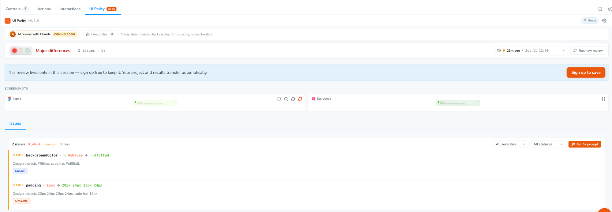
You get a traffic-light verdict and an exact list of what's off (Expected vs. Actual, per property) — not a fuzzy pixel diff you have to eyeball.
The short version: point a story at its Figma frame once, then press a button to find out whether the code still matches the design. No baselines to approve, no snapshots to maintain.
Install
Guided (recommended)
npx uiparity initThe CLI installs the addon, registers it in .storybook/main.ts, and hands you off to the in-Storybook setup wizard.
Manual
npm install --save-dev @uicopilot/storybook-addonRegister it in .storybook/main.ts:
export default {
  addons: ['@uicopilot/storybook-addon'],
};
That's it — no other config. Restart Storybook and you'll see a UI Parity tab in the addon panel and a toolbar button on every story.
Just want to see it work?
Scaffold a throwaway Storybook that's already wired up:
npx uiparity demo                    # prompts for a template
npx uiparity demo --template radix   # Radix UI Themes
npx uiparity demo --template mui     # Material UI
npx uiparity demo --template cbds    # CBDS Components (ships with a Figma kit)
npx uiparity list                    # see every template
Templates also exist for Ant Design, Mantine, Carbon (IBM), Chakra UI, and Paste (Twilio). The cbds template is the fastest end-to-end demo because it includes a matching Figma kit — no design file of your own required.
Quick start
- Open the UI Parity panel on any story and sign in with Google — or hit "Try without signing in" to start a guest session.
- Connect Figma and pick the pages to index. The setup wizard walks you through it: connect Figma, paste your file URL, choose which pages to sync, and it indexes the frames in those pages.
- Map the story to its Figma frame (one click, "Map to Figma"). This tells UI Parity what the component is supposed to look like.
- Click "Compare to design." You get a traffic-light verdict —
Matches design·Minor differences·Major differences— and a list of exactly which properties drifted (Expected vs. Actual).
Mapping is a one-time cost per component. After that, every re-check is one click.
What it checks
Compare to design is the free, deterministic check. It diffs the story's computed styles against the Figma spec — no screenshots, no AI, no credits:
| Catches today | Property |
| -------------------------- | ----------------------------------------------------------------------------------------------------------------- |
| Wrong brand / token colors | color, fill, background (banded by ΔE, so a barely-visible shift is a minor, a wrong brand color is a critical) |
| Off typography | font-family, size, weight |
| Spacing drift | padding, gap, margins (sub-10px diffs are downgraded a severity level) |
| Corner radius | border-radius |
| Borders | width, color, style |
Because it reads the computed styles off the rendered DOM, it doesn't care how you wrote them. Tailwind classes, CSS Modules, styled-components, vanilla-extract, plain CSS, inline styles — all produce the same computed values, and that's what gets compared.
AI visual review — catching layout, shadows, missing elements, and icon drift from a screenshot comparison — is rolling out next. Today the deterministic spec-diff is what everyone gets, free.
The verdict
Every review resolves to a single traffic light — the worst difference found sets the color, so it can never hide a real failure behind a bunch of clean checks:
| Light | Verdict | What it means | | ----- | -------------------------------- | ---------------------------------------------------------------------------- | | 🟢 | Matches design | No differences — or only tiny size diffs / near-identical colors | | 🟡 | Minor differences | Cosmetic only — barely-visible color or spacing drift, nothing visibly off | | 🔴 | Major / critical differences | At least one clearly-wrong value — wrong brand color, font, size, or spacing |
Severities are perceptually adjusted first — color diffs by perceptual ΔE distance, dimension diffs by pixel distance — so a barely-visible shift stays a minor, and only a real, visible problem turns the light red.
Every difference is reported as a concrete Expected vs. Actual pair on a named property, so there's nothing to interpret: background-color — expected #ea580c, actual #f97316.
Where the verdict shows up
The result isn't buried in one panel. Once a story has been checked, you see it in three places:
- The addon panel — the full verdict plus the property-by-property difference list.
- The story sidebar — each checked story gets a colored marker in Storybook's tree, and stories with differences show a count badge in the worst severity's color. You can scan the whole sidebar and see where the drift is without opening anything.
- The toolbar — a UI Parity button on every story, so a check is always one click away.
Review every story at once
UI Parity registers a test provider in Storybook's Testing module (the same sidebar area Storybook's own test widgets use). Hit Run and it checks every mapped story in one pass, streaming results into the sidebar as each one lands.
This is the "did anything drift?" sweep — run it after a design-system bump, a token change, or a dependency upgrade, and read the answer off the sidebar. The Run button stays disabled until you're connected and have at least one mapped story.
Works with any Storybook framework
The check reads the rendered DOM, not your source, so the renderer doesn't matter:
react · vue · angular · web-components · html · svelte · preact · react-native
React is optional as a peer dependency — the addon's own UI is bundled and does not force a React version on your project. It runs against React 16.8 through 19 in a React Storybook, and against non-React Storybooks with no React in your app at all.
How this differs from visual regression testing
Both are useful, and they answer different questions.
| | Visual regression (snapshots) | UI Parity | | --- | --- | --- | | Compares against | The last approved screenshot of your own component | The Figma frame — the design source of truth | | Catches | Any change from the previous build | Divergence from what the design says, even if it's been wrong for months | | Output | A pixel diff image to eyeball | Named properties with Expected vs. Actual values | | Needs | Baselines to approve and re-approve | A one-time story → frame mapping | | Blind spot | A component that never matched the design still passes forever | Anything not expressed as a comparable style property |
Snapshot tools tell you something changed. UI Parity tells you it doesn't match the design — which is the question that comes up in design review, not code review. Teams run both.
Review history
Each story keeps its past checks. Open the history dropdown in the panel to pull up an earlier review and see what the verdict and differences were then — useful for confirming that a fix actually moved the light, or for finding when a component started drifting.
Requirements
- Storybook
9.0or newer (works with Storybook 9 and 10) - A Figma account with a Dev or Full seat — free/Viewer seats can't grant the design-read access UI Parity needs to index your components
- A free UI Parity account — sign in with Google, or start as a guest and sign up to save your results
- No Figma plugin to install. UI Parity reads your file through Figma's API — signed-in users connect via OAuth, guests paste a Figma personal access token.
Configuration
All configuration is optional. Set these through env in .storybook/main.ts:
export default {
  addons: ['@uicopilot/storybook-addon'],
  env: (config) => ({
    ...config,
    STORYBOOK_UICOPILOT_URL: 'https://your-dashboard.example.com',
  }),
};
| Variable | Purpose |
| --- | --- |
| STORYBOOK_UICOPILOT_URL | Point the addon at your own dashboard deployment instead of https://app.uiparity.com. |
| STORYBOOK_UICOPILOT_FIGMA_KIT | A reference Figma community-file URL to surface in the project setup screen as a copyable starting kit. Set automatically by npx uiparity demo templates that ship one. |
| STORYBOOK_UICOPILOT_NO_PUPPETEER | Set to true to disable server-side screenshot capture and fall back to in-browser capture. Debug/troubleshooting flag. |
Self-hosting the dashboard
The addon talks to https://app.uiparity.com by default. STORYBOOK_UICOPILOT_URL (above) is the only change needed to point it at your own deployment — the addon has no other hardcoded endpoint.
What leaves your machine
Worth knowing before you point it at a private design system:
- The free spec-diff check sends a compact tree describing the rendered component — element tag names, class/id selectors, any short visible text (truncated), and the element's computed style values (colors, sizes, spacing, fonts) — along with the story ID and the mapped Figma node ID. It does not upload your source files or stylesheets, and it does not send screenshots.
- Figma data is fetched server-side using the credentials you connected, and only for the pages you explicitly chose to sync during setup.
- Screenshots, when captured, are taken locally — the addon runs a capture endpoint inside your own Storybook dev server (via Puppeteer, if it's installed in your project).
- Self-hosting the dashboard keeps all of the above inside your own infrastructure.
Troubleshooting
The UI Parity panel doesn't appear.
Confirm the addon is in the addons array of .storybook/main.ts and restart Storybook. If you've changed the addon version, clear the cache: rm -rf node_modules/.cache .cache storybook-static.
"Compare to design" is disabled. The story isn't mapped to a Figma frame yet. Map it from the panel first.
Figma won't connect / no frames show up after sync. Two usual causes: a Figma Viewer or free seat (a Dev or Full seat is required for design-read access), or the frames live on a page you didn't select during setup. Re-run the Figma step and include the page.
Everything comes back as a difference. This is almost always a mapping problem — the story is pointed at the wrong Figma variant. Open the mappings list and confirm the story is mapped to the frame you actually meant.
The sidebar markers look like Storybook's own test statuses. They share the same status glyph. UI Parity only recolors markers for stories it actually has a status for, so anything untouched is your test runner's, not ours.
Screenshots fail or time out.
Server-side capture needs puppeteer installed in your project (it's an optional peer dependency). Install it, or set STORYBOOK_UICOPILOT_NO_PUPPETEER=true to use the in-browser fallback.
Links
- uiparity.com — product & sign-up
- app.uiparity.com — the dashboard
uiparityCLI —initanddemoscaffolding- [email protected] — questions, bugs, feature requests
License
MIT © UI Parity