
@uiwwsw/virtual-keyboard
v0.7.1
Published
**A revolutionary virtual keyboard solution for React that solves the Korean `composition` issue.**
Maintainers
 brewstar
Readme
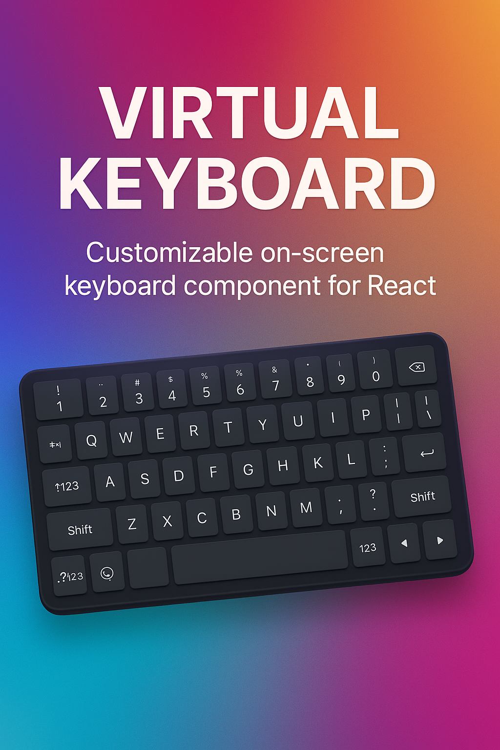
virtual-keyboard
A revolutionary virtual keyboard solution for React that solves the Korean composition issue.


📱 데모 페이지에는 모바일 고정 키보드와 숫자·다이얼러 전용 모드를 직접 전환해 볼 수 있는 섹션이 준비되어 있습니다. 실제 모바일 기기 혹은 DevTools 기기 모드(User-Agent 를 모바일로 전환)에 맞춰 접속하면 네이티브 키보드 대신 이 라이브러리의 가상 키보드가 표시됩니다.
virtual-keyboard is a React component library that provides a custom virtual keyboard and input field, specifically designed to solve the infamous Korean composition event issues in web environments. It offers a seamless and native-like typing experience, free from common bugs like character duplication, cursor jumping, and broken compositions.
Key Features
- ❤️ **Without **: No input, No contentEditable. Just div.
- ✨ Composition-Free Input: Directly handles Korean character composition, bypassing native IME events to prevent common bugs.
- 🎹 Customizable Keyboard UI: Provides a default keyboard and supports fully custom layouts for any use case (e.g., number pads, phone keypads).
- 📱 Mobile-First: Blocks the native mobile keyboard for a consistent and controlled user experience in web apps.
- ⚛️ React-Friendly API: Simple, component-based architecture using
ProviderandInputfor easy integration.
Installation
npm install @uiwwsw/virtual-keyboardUsage
Wrap your input fields with the VirtualInputProvider. This provider manages the keyboard's state and renders the UI.
Basic Usage
Use the default QWERTY keyboard for Korean and English input.
import { VirtualInput, VirtualInputProvider } from "@uiwwsw/virtual-keyboard";

function App() {
  return (
    <VirtualInputProvider>
      <p>Your virtual input is here:</p>
      <VirtualInput placeholder="텍스트를 입력하세요..." />
    </VirtualInputProvider>
  );
}
Custom Layout
You can provide a custom layout for specialized inputs, such as a number pad for phone numbers.
import { VirtualInput, VirtualInputProvider } from "@uiwwsw/virtual-keyboard";

const numberPadLayout = [
  [{ value: "1" }, { value: "2" }, { value: "3" }],
  [{ value: "4" }, { value: "5" }, { value: "6" }],
  [{ value: "7" }, { value: "8" }, { value: "9" }],
  // You can define special keys like 'Backspace'
  [{ value: "010" }, { value: "0" }, { value: "Backspace", type: "action" }],
];

function App() {
  return (
    <VirtualInputProvider layout={numberPadLayout}>
      <p>Enter your phone number:</p>
      <VirtualInput placeholder="010-0000-0000" />
    </VirtualInputProvider>
  );
}
Components API
<VirtualInputProvider />
The main provider that manages the keyboard state and UI.
| Prop | Type | Description |
| :--------- | :--------------------- | :-------------------------------------------------- |
| layout | Key[][][] (optional) | A 2D array to define a custom keyboard layout. |
| children | ReactNode | Must contain at least one VirtualInput component. |
<VirtualInput />
The replacement for the standard <input> element. It accepts all standard input element props like value, defaultValue, placeholder, onChange, etc.