
@vedix/ui
v1.0.4
Published
A Vedix UI component library CLI
Downloads
371
Maintainers
 ratneshkumar987
Readme
Vedix UI
Vedix UI is a modern, developer-first UI component system for React applications.
It provides a powerful CLI that allows developers to quickly add production-ready components into their projects while maintaining full control over the source code.
Unlike traditional UI frameworks, Vedix UI copies the component source directly into your project so you can customize, extend, and maintain your UI without limitations.
🌐 Live Documentation
Explore all components with examples and usage guides.
👉 https://vedix-ui.vercel.app
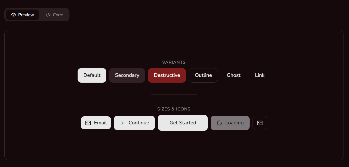
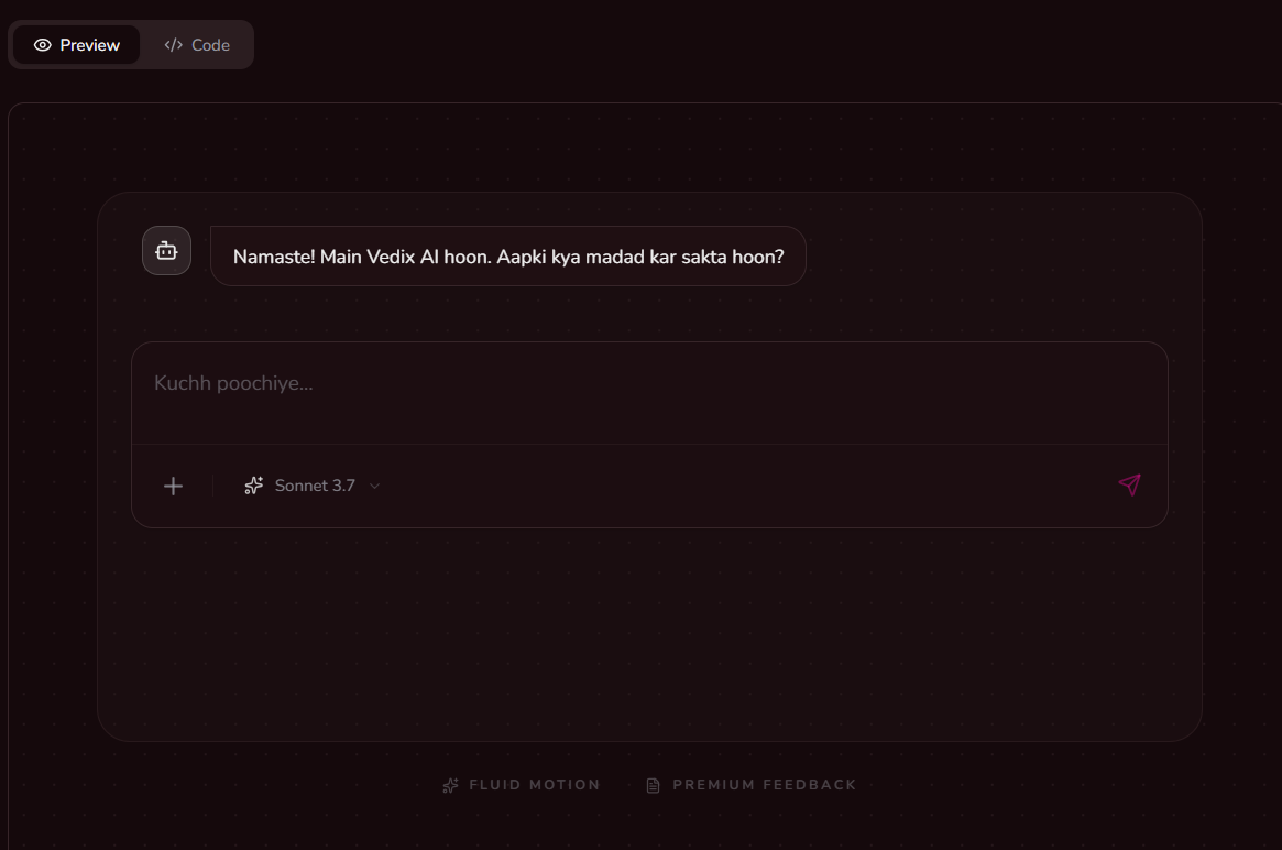
✨ Preview

🚀 Features
- Developer-First CLI – Add components instantly using a simple command.
- Copy-Paste Architecture – Components are added directly into your project.
- Custom Theming – Built-in support for light and dark themes.
- Tailwind CSS Powered – Clean and modern styling using Tailwind.
- Accessible Components – Built on top of Radix UI primitives.
- TypeScript Ready – Fully typed components for a better developer experience.
- Modular System – Install only the components you need.
📦 Installation
Install the Vedix UI package in your project:
npm install @vedix/uiOr run the CLI directly using npx:
npx @vedix/ui init⚡ Quick Start
1. Initialize Vedix UI
Run the initialization command in your project root:
npx @vedix/ui initThis command will:
- Create a
vedix.config.jsonconfiguration file - Set up global styles and theme variables
- Create utility helpers
- Install required dependencies
You will also be asked where to store your UI components.
Default path:
src/components/ui2. Add Components
Use the CLI to add components from the Vedix UI registry.
Example:
npx @vedix/ui add button
npx @vedix/ui add dialog
npx @vedix/ui add form
The CLI will automatically:
- Copy the component source code into your project
- Install required dependencies
- Configure imports if necessary
🧩 Example Usage
After adding a component, you can use it like this:
import { Button } from "@/components/ui/button"

export default function Page() {
  return (
    <div>
      <Button>Click me</Button>
    </div>
  )
}
📚 Available Components
Vedix UI includes a rich collection of modern UI components.
General
- Button
- Badge
- Label
- Separator
Forms
- Input
- Textarea
- Checkbox
- Select
- Switch
- Radio Group
- Form
Layout
- Card
- Tabs
- Accordion
- Scroll Area
- Table
Feedback
- Alert
- Progress
- Skeleton
- Tooltip
Overlay
- Dialog
- Popover
- Alert Dialog
- Hover Card
- Sheet
- Context Menu
- Dropdown Menu
Advanced
- Command
- Calendar
- Navigation Menu
- Sidebar
🛠 Technology Stack
Vedix UI is built using modern frontend technologies:
- React
- Tailwind CSS
- Radix UI
- React Hook Form
- Framer Motion
- Lucide Icons
🎯 Use Cases
Build Your Own Design System
Vedix UI is ideal for teams building custom design systems. Since components are copied into your project, you have full control over them.
Rapid Prototyping
Quickly build modern interfaces without spending time implementing complex UI components.
Production Applications
All components are production-ready and designed with accessibility and performance in mind.
💡 Project Philosophy
Vedix UI follows a simple principle:
Developers should own their UI components.
Instead of locking you into a framework, Vedix UI gives you full control of the code.
🗺 Roadmap
Upcoming improvements for Vedix UI:
- Component playground
- Theme generator
- Figma design kit
- Additional components
- Improved CLI tooling
📄 License
MIT License