
@veryaustin/tool-tiles
v0.1.0
Published
A collection of React components displaying development tools/technology logos & tiles
Maintainers
 veryaustin
Readme
Tool Tiles
A collection of React components displaying development tools/technology logos & tiles


Installation:
Install this package into your project:
npm i @veryaustin/tool-tilesComponents:
Grid Component
Description:
Container component that displays a grid of tiles.
Props:
|Prop|Type|Default|Description| |---|---|---|---| |tools|array|null|Array of strings of the logoNames|
Example:
import React from 'react';
import { Grid } from '@veryaustin/tool-tiles';

const Page = () => {
  const sampleData = [
    'html',
    'css',
    'chrome',
    'email',
    'bootstrap',
    'github',
    'adobeillustrator',
    'node',
    'react',
    'slack',
    'babel',
  ]
  return (
    <Grid tools={sampleData} />
  )
}
Tile Component
Description:
Displays a square tile with logo.
Props:
|Prop|Type|Default|Description| |---|---|---|---| |icon|string|'pdf'|Defines the logo/tile color that will be displayed| |color|string|logoColor of the icon|Defines the tile background color|
Example:
import React from 'react';
import { Tile } from '@veryaustin/tool-tiles';

const Page = () => {
  return (
    <Tile icon="html" />
  )
}
Icon Component
Description:
Displays a SVG logo/icon.
Props:
|Prop|Type|Default|Description| |---|---|---|---| |icon|string|'pdf'|Defines the SVG logo/icon to be displayed| |color|string|logoColor of the icon|Defines the color of the SVG/icon|
Example:
import React from 'react';
import { icon } from '@veryaustin/tool-tiles';

const Page = () => {
  return (
    <Icon icon="html" color="red" />
  )
}
Project Development:
Build the Project:
npm run buildView components in Storybook:
npm run storybookRun Test Suite:
npm run test Run Test Suite in Watch Mode:
npm run test:watch Generate Test Suite Code Coverage:
npm run test:coverage Generate Test Suite Output for Storybook:
npm run test:generate-output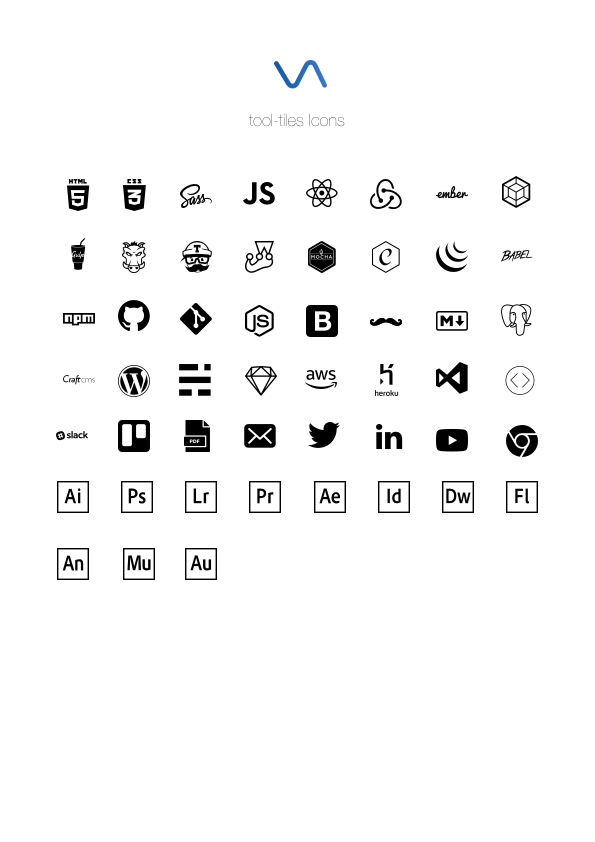
The names and logos of products and companies shown in this package are the property of their respective owners and may also be trademarks.
Licenses/Attribution:
- HTML logo is licensed from W3C under Creative Commons Attribution v3.0. Logo has been adapted for this project
- CSS logo is licensed from Wikimedia Commons under Creative Commons Attribution v3.0 Unported
- SASS logo is licensed from Sass under Attribution-NonCommercial-ShareAlike v3.0 Unported
- JavaScript
- React logo is licensed from Facebook under Creative Commons Attribution v4.0 International
- Redux logo is public domain and licensed under Creative Commons Zero v1.0 Universal
- Ember logo & name is a trademark of Tilde Inc. This package is unaffiliated with the Ember project.
- Webpack logo and project name are trademarks of the JS Foundation.
- Gulp logo is licensed from Gulp under MIT
- Grunt logo is licensed from Grunt under MIT
- Travis CI logo is a trademark of Travis CI
- Jest logo is licensed from Facebook under MIT
- Mocha logo is licensed under Creative Commons Attribution v4.0 International
- Chai logo is licensed under MIT
- jQuery logo is a trademark of the jQuery Foundation.
- Babel logo is licensed under MIT
- NPM logo is a trademark of npm, inc
- GitHub logo is a trademark of Github
- Git logo by Jason Long is licensed under Creative Commons Attribution v3.0 Unported
- Node logo is a registered trademark of the Node.js Foundation
- Bootstrap logo is licensed under Creative Commons Attribution v3.0 Unported
- Handlebars logo is licensed under MIT
- Markdown
- PostgreSQL logo is licensed under the PostgreSQL License
- Craft CMS logo is a trademark of Pixel & Tonic, Inc
- Wordpress logo is licensed from the WordPress Foundation under GNU General Public License
- Ghost logo is a trademark of The Ghost Foundation
- Sketch logo is a trademark of Bohemian Coding
- Amazon Web Services is a registered trademark of Amazon
- Heroku logo is a registered trademark of Heroku
- VSCode logo is licensed from Microsoft under MIT
- CodeKit logo is property of Bryan Jones
- Slack logo is a trademark of Slack
- Trello logo is a trademark of Atlassian
- Twitter logo and name is a registered trademark of Twitter
- LinkedIn logo and name is a registered trademark of Microsoft
- YouTube logo and name is a registered trademark of Alphabet
- Chrome logo and name is a registred trademark of Google
- Adobe Illustrator logo is a trademark of Adobe
- Adobe Photoshop logo is a trademark of Adobe
- Adobe Lightroom logo is a trademark of Adobe
- Adobe Premiere logo is a trademark of Adobe
- Adobe After Effects logo is a trademark of Adobe
- Adobe InDesign logo is a trademark of Adobe
- Adobe Dreamweaver logo is a trademark of Adobe
- Adobe Flash logo is a trademark of Adobe
- Adobe Animate logo is a trademark of Adobe
- Adobe Muse logo is a trademark of Adobe
- Adobe Audition logo is a trademark of Adobe