
@vladsolomon/tdot
v1.0.6
Published
Minimal runtime-configurable typography system for React + Tailwind

Maintainers
 vladsolomon
Readme
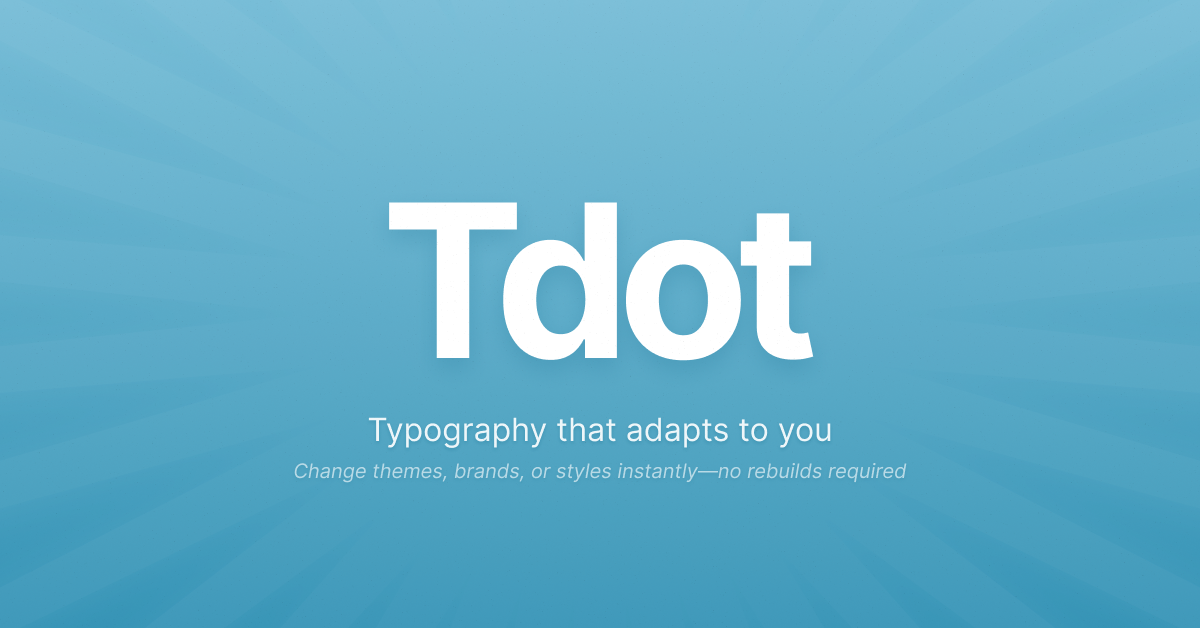
Runtime-configurable typography system for React + Tailwind CSS
import { TdotProvider, T } from "@vladsolomon/tdot";

const config = {
    Hero: { tag: "h1", classes: "text-6xl font-black text-gray-900" },
    Subtitle: { tag: "h2", classes: "text-xl text-gray-600" },
    Body: { tag: "p", classes: "text-base leading-relaxed" },
};

function App() {
    return (
        <TdotProvider config={config}>
            <T.Hero>Welcome to the future</T.Hero>
            <T.Subtitle>Typography that adapts to you</T.Subtitle>
            <T.Body>
                Change themes, brands, or styles instantly—no rebuilds required.
            </T.Body>
        </TdotProvider>
    );
}
Why Tdot?
🎯 Runtime Configuration
Change your entire typography system with a state update. Perfect for theming, A/B testing, or multi-tenant apps.
🧬 Smart Inheritance
Build typography hierarchies with extends. DRY principles for your design system.
✨ Clean SyntaxT.ComponentName - simple, discoverable, and no file pollution.
🛡️ Typography-Focused
Only typography elements allowed. Keeps your system focused and intentional.
⚡ Zero Build Time
Pure runtime configuration. No compilation, no CSS generation, just JavaScript.
Installation
npm install @vladsolomon/tdotQuick Start
1. Wrap your app with TdotProvider
import { TdotProvider } from "@vladsolomon/tdot";

const typographyConfig = {
    PageTitle: { tag: "h1", classes: "text-4xl font-bold text-gray-900" },
    SectionHeading: {
        tag: "h2",
        classes: "text-2xl font-semibold text-gray-800",
    },
    BodyText: { tag: "p", classes: "text-base leading-relaxed text-gray-700" },
};

function App() {
    return (
        <TdotProvider config={typographyConfig}>{/* Your app */}</TdotProvider>
    );
}
2. Use your typography components
import { T } from "@vladsolomon/tdot";

function HomePage() {
    return (
        <div>
            <T.PageTitle>About Our Company</T.PageTitle>
            <T.SectionHeading>Our Mission</T.SectionHeading>
            <T.BodyText>
                We believe in making typography systems that actually work.
            </T.BodyText>
        </div>
    );
}
Advanced Features
Inheritance with extends
Build typography hierarchies that make sense:
const config = {
    // Base paragraph
    Paragraph: {
        tag: "p",
        classes: "text-base leading-relaxed max-w-prose",
    },

    // Extends base paragraph
    IntroText: {
        extends: "Paragraph",
        classes: "text-lg font-medium text-gray-900", // Merges with Paragraph classes
    },

    // Chain inheritance
    HighlightText: {
        extends: "IntroText",
        classes: "text-purple-600 italic",
    },
};
Runtime Theme Switching
Change your entire typography system instantly:
function App() {
    const [theme, setTheme] = useState("default");

    const themes = {
        default: {
            Heading: { tag: "h1", classes: "text-4xl font-bold text-gray-900" },
            Body: { tag: "p", classes: "text-base text-gray-700" },
        },
        dark: {
            Heading: { tag: "h1", classes: "text-4xl font-bold text-white" },
            Body: { tag: "p", classes: "text-base text-gray-300" },
        },
        brand: {
            Heading: {
                tag: "h1",
                classes: "text-4xl font-black text-purple-600",
            },
            Body: { tag: "p", classes: "text-base text-purple-100" },
        },
    };

    return (
        <TdotProvider config={themes[theme]}>
            <button onClick={() => setTheme("dark")}>Dark Mode</button>
            <T.Heading>This changes instantly!</T.Heading>
            <T.Body>No rebuilds required.</T.Body>
        </TdotProvider>
    );
}
Custom Fonts with Tailwind CSS v4
@import url("https://fonts.googleapis.com/css2?family=Inter:wght@400;500;600&family=Playfair+Display:wght@400;700&display=swap");
@import "tailwindcss";

@theme {
    --font-display: "Playfair Display", serif;
    --font-body: "Inter", sans-serif;
}
const config = {
Hero: { tag: "h1", classes: "font-display text-6xl font-bold" },
Content: { tag: "p", classes: "font-body text-base leading-relaxed" },
};Supported HTML Elements
Tdot only allows typography-focused elements to keep your system intentional:
Headings: h1, h2, h3, h4, h5, h6
Text blocks: p, blockquote
Inline text: span, strong, b, em, i, u, small, mark, del, s, ins, sub, sup
Code elements: code, kbd, samp, var
Semantic text: cite, q, abbr, dfn, time, address
Try to use a non-typography element? Tdot will warn you and skip rendering.
Use Cases
🎨 Design Systems
Build consistent typography across your entire application with runtime flexibility.
🏢 Multi-tenant Apps
Different typography for different clients, switched instantly.
🧪 A/B Testing
Test typography variants without deployments.
🌍 Internationalization
Different font stacks for different languages.
♿ Accessibility
User-customizable text sizes and fonts.
🎭 White-label Products
Complete typography rebrand with a config change.
API Reference
<TdotProvider>
<TdotProvider config={typographyConfig}>{children}</TdotProvider>Props:
config- Object defining your typography components
T
Proxy object that creates typography components on-demand:
<T.ComponentName className="additional-classes" {...htmlProps}>
    Content
</T.ComponentName>
Config Object
const config = {
    ComponentName: {
        tag: "h1", // Required: HTML tag to render
        classes: "text-xl font-bold", // Optional: Tailwind classes
        extends: "ParentComponent", // Optional: Inherit from another component
    },
};
Performance
- Component caching: Components are created once and cached
- Smart inheritance: Config resolution is cached with circular dependency protection
- Minimal re-renders: Only re-renders when config actually changes