
@vstyler96/system.css
v2.0.0
Published
A design system for building retro Apple interfaces

Maintainers
 vstyler96
Readme
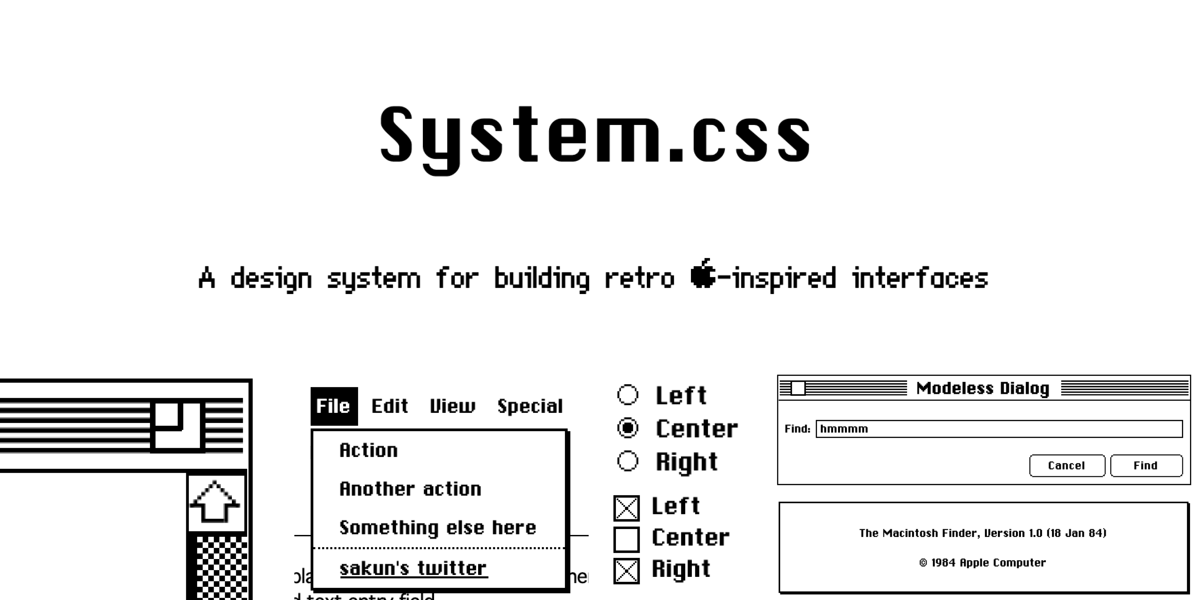
System.css is a CSS library for building interfaces that resemble Apple's System OS, which ran from 1984 to 1991. It is based on System 6, the last monochrome version of the Mac OS. Where System 6 had no such widget (tabs, sliders, balloons), components borrow from System 7 or are drawn in the same 1-bit style.
It uses no JavaScript and works with any front-end framework. It shares one markup API with 98.css, XP.css, 7.css and x.css: the same HTML renders in each library's look.
Version 2.0.0 · scope class .sys · CSS variable prefix --sys-
Getting Started


CDN
<link rel="stylesheet" href="https://unpkg.com/@vstyler96/system.css@2/dist/system.css" />
<!-- or -->
<link rel="stylesheet" href="https://cdn.jsdelivr.net/npm/@vstyler96/system.css@2/dist/system.css" />
npm
npm install @vstyler96/system.cssimport "@vstyler96/system.css/dist/system.css";<div class="window active" style="width: 30rem">
<div class="title-bar">
<div class="title-bar-text">System.css</div>
<div class="title-bar-controls">
<button aria-label="Close"></button>
<button aria-label="Maximize"></button>
</div>
</div>
<div class="window-body has-space">Hello world!</div>
<div class="window-footer" style="text-align: right">
<button>Cancel</button>
<button class="default">OK</button>
</div>
</div>Builds
| File | What it is |
|---|---|
| dist/system.css | Everything. CSS variables stay live, so you can theme by overriding them. |
| dist/system.scoped.css | Every selector scoped under .sys: styles only apply inside <div class="sys">. |
| dist/system.inline.css | Variables resolved to plain values. |
| dist/gui/<component>.css | One file per component (button.css, window.css, ...), variables resolved. |
Fonts: the CSS loads Chicago, Chicago_12, Geneva_9 and Monaco from fonts/ relative to itself. Serve dist/fonts/ next to the main files (dist/gui/fonts/ for the per-component files). Icons are inlined, so nothing else needs copying.
Prefix: use the scope class .sys with the scoped build. Every variable starts with --sys-. The palette is --sys-primary (white), --sys-secondary (black), --sys-tertiary and --sys-disabled (greys). Fonts are --sys-font, --sys-font-small and --sys-font-mono, and the surface is --sys-surface. Component variables follow --sys-<component>-<property>-<state>, e.g. --sys-el-bd-d, --sys-lv-bg-h.
:root { --sys-secondary: #224; } /* navy instead of black */Components
| Component | Markup | Modifiers / states |
|---|---|---|
| Window | .window > .title-bar + .window-body + .window-footer (or footer) | .window.active (racing stripes, black controls), .window-body.has-space |
| Title bar | .title-bar > .title-bar-text + .title-bar-controls > button[aria-label="Close\|Maximize\|Restore\|Minimize\|Help"] | .is-close, .is-maximize, .is-restore, .is-minimize, .is-help. Close is always on the left and the title is centred. A disabled control is hidden but keeps its space. |
| Status bar | .status-bar > .status-bar-field | Under the title bar = Finder info line; last child = bottom bar |
| Dialog | .window[role=dialog] / .window[role=alertdialog] > .window-body | .is-modal (double outline). Hidden until targeted: <a href="#id"> |
| Button | button, [role=button], label[role=button] > input[type=file], input[type=file] | .default, .active, .focused, :disabled |
| Checkbox | input[type=checkbox] + label | :checked, :disabled |
| Radio button | input[type=radio] + label | :checked, :disabled |
| Text box | input[type=text\|url\|email\|number\|password], textarea | :focus (double border), :disabled |
| Search box | input[type=search], or .searchbox > input[type=search] + button[aria-label=search] | |
| Combobox | .combobox > input[type=text] + button | |
| Dropdown | select | :disabled |
| Listbox | ul[role=listbox] > li[role=option], or select[multiple] | [aria-selected], .has-hover, .has-shadow |
| Listview | table > thead + tbody | .has-shadow, .is-striped (dithered alternate rows), .has-hover (inverted row hover), .is-full (100% width), th/td.is-center, th.highlighted, .indicator / .indicator.up, tr.highlighted (stays above stripes and hover) |
| Groupbox | fieldset > legend | .field-row, .field-row-stacked, .group |
| Tabs | menu[role=tablist] > button[role=tab] + sibling [role=tabpanel] | [aria-selected=true], .justified |
| Tree view | ul.tree-view > li (details > summary + ul for branches) | .has-container, .has-connector, .has-collapse-button |
| Collapse | details > summary | [open] |
| Menu | ul[role=menubar] > li[role=menuitem] > ul[role=menu] > li[role=menuitem] | .can-hover, .has-divider, [aria-haspopup], [aria-disabled], checkbox/radio items |
| Progress bar | div[role=progressbar] > div (width = value) | .paused, .error, .animate, .marquee (no inner div) |
| Slider | input[type=range] | .has-box-indicator, wrap in .is-vertical |
| Spinner | .spinner (or .loader) | .animate |
| Balloon | [role=tooltip] | .is-top, .is-left |
| Start button | button.start-button (the Apple menu logo) | [aria-expanded="true"] (inverted, menu open) |
| Scrollbar | .has-scrollbar on the scrolling element | WebKit/Blink only |
| Typography | .instruction, .instruction-primary, .header-document, .header-group, a | |
| Extras | .outer-border > .inner-border (double frame), span.apple (Apple logo) | |
See the documentation for live examples of each.
Makefile
| Command | Does |
|---|---|
| make build | Installs dependencies if package-lock.json changed, then npm run build (all four outputs + docs). |
| make preview | Builds, then runs the live-reload docs server on http://localhost:3000. |
| make publish | npm run release: builds and publishes to npm. |
| make deploy | npm run deploy: builds and pushes dist/ to GitHub Pages. |
| make clean | Removes dist/. |
Styles live in gui/, one partial per component (gui/_button.scss, gui/_window.scss, ...), imported by gui/index.scss. They are plain PostCSS (nesting + imports), not Sass. Icons are in gui/icon/, fonts in gui/fonts/.
Migrating from 0.1.x
2.0.0 is a clean break: the old class names are gone, with no aliases.
- The package moved from
@sakun/system.cssto@vstyler96/system.css.
| 0.1.x | 2.0.0 |
|---|---|
| button.btn | button |
| button.btn.btn-default | button.default |
| .title-bar > button.close + h1.title + button.resize | .title-bar > .title-bar-text + .title-bar-controls > button[aria-label="Close"] + button[aria-label="Maximize"] |
| button.hidden in the title bar | button[aria-label="Maximize"][disabled] (hidden, keeps its space) |
| .inactive-title-bar | .title-bar in a .window without .active; stripes need .window.active |
| .separator | removed: the title bar draws its own bottom line |
| .window-pane | .window-body.has-space.has-scrollbar (set overflow/height yourself) |
| .details-bar > span | .status-bar > .status-bar-field |
| .standard-dialog | .window > .window-body.has-space (no title bar) |
| .modeless-dialog | .window[role=dialog] with a title bar |
| .modal-dialog.outer-border > .inner-border > .modal-contents | .window.is-modal[role=dialog] > .window-body |
| .alert-box.outer-border > .inner-border > .alert-contents | .window[role=alertdialog] > .window-body |
| ul[role=menu-bar] > li[role=menu-item] | ul[role=menubar] > li[role=menuitem] |
| li[role=menu-item].divider | li[role=menuitem].has-divider |
| .heading, h1, h2 global fonts | removed; use .header-document, .instruction-primary, or --sys-font |
| .standard-button, .menu-items | removed |
| --primary, --secondary, --tertiary, --disabled | --sys-primary, --sys-secondary, --sys-tertiary, --sys-disabled |
Other behaviour changes:
[role=dialog]/[role=alertdialog]windows are fixed, centred and hidden until the URL fragment targets them (<a href="#my-dialog">), like 7.css.- The library no longer styles
body(grid wallpaper),h1,h2,hr,formor the page scrollbar. Scrollbars are opt-in with.has-scrollbar. - The base font is 16px Chicago 12 everywhere (0.1.x mixed 18px and 24px).
.windowis a flex column with no default margin or min-width.- Native radios are now hidden correctly.
- Text inputs are only styled for the types listed above.
Contributing, Credits, etc.
Thanks for checking this project out! This library was made in good fun and was largely inspired by 98.css. The Chicago 12pt and Geneva 9pt fonts are recreations by @blogmywiki
I recreated components based on Apple's Human Interface Guidelines. However, there's still a pretty good chance that I might've missed/overlooked something essential. I've also had to recreate most of the assets, which can also be found here.
If you find a bug, consider opening an issue. If there's something that you'd like to add, please feel free to create a PR!
If you'd like to see what else I'm up to, consider following me on Twitter or checking out my personal site :)
Sponsors

CSS Scan: The fastest and easiest way to check, copy and edit CSS