
@waveful-app/luckyui
v0.1.2
Published
A comprehensive Next.js/React design system package by Waveful - scalable and consistent UI components for modern applications
Maintainers
 waveful-app
Readme
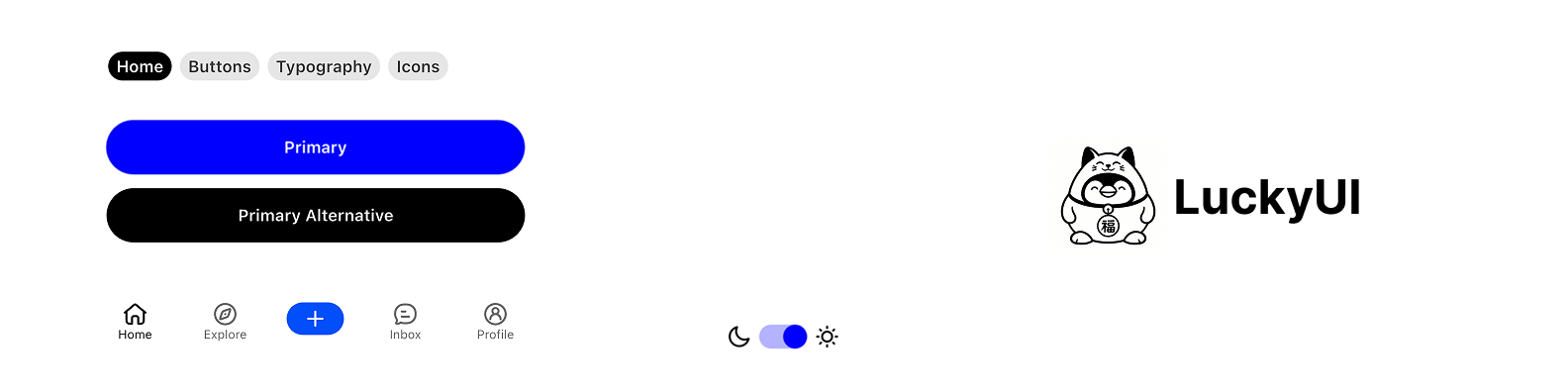
LuckyUI Next.js
A comprehensive Next.js design system package created by Waveful, providing scalable and consistent UI components for modern React applications.
Overview
LuckyUI is a complete design system that offers a cohesive set of components, themes, and design tokens to help developers build beautiful and consistent Next.js applications. Built with scalability and maintainability in mind, LuckyUI provides everything you need to create professional-grade web applications.
Features
🎨 Design System Foundation
- Comprehensive Color Palette: Pre-defined color tokens with semantic naming via CSS variables
- Typography System: Consistent text styles and hierarchy
- Spacing & Layout: Standardized spacing tokens and layout utilities via Tailwind CSS
- Theme Support: Light and dark mode support out of the box
🧩 UI Components
Buttons & Interactions
Button- Primary, secondary, destructive, outline, ghost, and gradient button stylesTextButton- Text-based button componentsIconButton- Icon-only buttons with various sizesSwitch- Customizable toggle switches
Form & Input Components
Input- Text input with icon support and validation statesSearchBar- Search input with built-in functionalityTextarea- Multi-line text inputLabel- Form labels with required indicatorCheckbox- Checkboxes with indeterminate stateRadioGroup- Radio button selection componentsSelect- Dropdown selection with searchSlider- Range slider components
Navigation & Layout
Tabs- Tab navigation implementationAccordion- Collapsible content sectionsCollapsible- Expandable content containersScrollArea- Custom scrollable areasSeparator- Visual separator components
Overlay Components
Dialog- Modal dialog systemSheet- Slide-out panel components (bottom sheet equivalent)DropdownMenu- Context and dropdown menu componentsTooltip- Hover tooltip componentsPopover- Click popover components
Indicators & Feedback
Badge- Notification badges and labelsRedDot- Notification dotsProgress- Progress indicatorsLoading- Loading spinner componentToast- Toast notification systemAlert- Alert and notification componentsSkeleton- Loading skeleton components
Data Display
Card- Card container component with header, content, and footerAvatar- Avatar component with image or letter fallback supportAvatarGroup- Grouped avatar displayTable- Data table componentsAspectRatio- Aspect ratio container
🎭 Animations
- Built-in animations via
tailwindcss-animate - Smooth transitions on all interactive components
- CSS-based micro-interactions
Getting Started
Installation
# Clone the repository
git clone https://github.com/Waveful/luckyui_nextjs.git

# Navigate to the directory
cd luckyui_nextjs

# Install dependencies
npm install

# Start the development server
npm run dev
Basic Usage
Import the components in your React file:
import { Button, Card, CardContent } from "@/components/ui";Quick Start Example
import {
  Button,
  Card,
  CardContent,
  CardHeader,
  CardTitle,
  Badge
} from "@/components/ui";

export default function MyApp() {
  return (
    <Card>
      <CardHeader>
        <CardTitle>
          Welcome to LuckyUI
          <Badge className="ml-2">New</Badge>
        </CardTitle>
      </CardHeader>
      <CardContent className="space-y-4">
        <p>This is a sample app using LuckyUI components.</p>
        <Button onClick={() => console.log("Clicked!")}>
          Get Started
        </Button>
      </CardContent>
    </Card>
  );
}
Component Examples
Buttons
import { Button, TextButton, IconButton } from "@/components/ui";
import { Search01Icon } from "hugeicons-react";

// Primary button
<Button>Primary Action</Button>

// Secondary button
<Button variant="secondary">Secondary Action</Button>

// Destructive button
<Button variant="destructive">Delete</Button>

// Text button
<TextButton>Text Action</TextButton>

// Icon button
<IconButton icon={Search01Icon} onClick={() => {}} />
Form Fields
import { Input, Label, SearchBar } from "@/components/ui";

// Standard input
<div className="space-y-2">
  <Label htmlFor="username">Username</Label>
  <Input
    id="username"
    placeholder="@username"
  />
</div>

// Search bar
<SearchBar
  placeholder="Search..."
  onChange={(e) => console.log(e.target.value)}
/>
Navigation
import { Tabs, TabsList, TabsTrigger, TabsContent } from "@/components/ui";

<Tabs defaultValue="home">
  <TabsList>
    <TabsTrigger value="home">Home</TabsTrigger>
    <TabsTrigger value="search">Search</TabsTrigger>
    <TabsTrigger value="profile">Profile</TabsTrigger>
  </TabsList>
  <TabsContent value="home">Home content</TabsContent>
  <TabsContent value="search">Search content</TabsContent>
  <TabsContent value="profile">Profile content</TabsContent>
</Tabs>
Feedback
import { useToast } from "@/hooks";
import { Button } from "@/components/ui";

function ToastExample() {
  const { toast } = useToast();

  return (
    <Button
      onClick={() => {
        toast({
          title: "Success!",
          description: "Your changes have been saved.",
          variant: "success",
        });
      }}
    >
      Show Toast
    </Button>
  );
}
Theming
LuckyUI provides a comprehensive theming system using CSS variables:
// In your layout.tsx
import { ThemeProvider } from "@/components/theme-provider";

export default function RootLayout({ children }) {
  return (
    <html lang="en" suppressHydrationWarning>
      <body>
        <ThemeProvider
          attribute="class"
          defaultTheme="system"
          enableSystem
        >
          {children}
        </ThemeProvider>
      </body>
    </html>
  );
}
Customizing Theme Colors
Modify src/app/globals.css to customize your theme:
:root {
  --primary: 142 76% 36%;
  --primary-foreground: 355 100% 100%;
  --secondary: 240 4.8% 95.9%;
  --background: 0 0% 100%;
  --foreground: 240 10% 3.9%;
  /* ... more variables */
}

.dark {
  --primary: 142 76% 46%;
  --background: 240 10% 3.9%;
  --foreground: 0 0% 98%;
  /* ... dark mode overrides */
}
Design Tokens
LuckyUI includes a comprehensive set of design tokens:
- Colors: Semantic color system with light/dark variants
- Typography: Consistent text styles and hierarchy
- Spacing: Standardized spacing values via Tailwind
- Border Radius: Consistent corner radius values
Hooks
LuckyUI provides useful React hooks:
import {
  useToast,           // Toast notifications
  useDebounce,        // Debounced values
  useLocalStorage,    // Persistent local storage
  useMediaQuery,      // Responsive breakpoints
  useIsMobile,        // Mobile detection
  useIsTablet,        // Tablet detection
  useIsDesktop        // Desktop detection
} from "@/hooks";
Utilities
cn() - Class Name Merger
import { cn } from "@/lib/utils";

<div className={cn(
  "base-class",
  condition && "conditional-class",
  variant === "primary" && "primary-styles"
)} />
Project Structure
src/
├── app/
│   ├── globals.css      # Global styles and CSS variables
│   ├── layout.tsx       # Root layout with providers
│   └── page.tsx         # Demo page
├── components/
│   ├── theme-provider.tsx  # Theme context provider
│   ├── icons.tsx           # Icon components
│   └── ui/
│       ├── button.tsx      # Button components
│       ├── card.tsx        # Card components
│       ├── dialog.tsx      # Dialog component
│       ├── ...             # Other components
│       └── index.ts        # Component exports
├── hooks/
│   ├── use-toast.ts        # Toast hook
│   ├── use-debounce.ts     # Debounce hook
│   ├── use-local-storage.ts # Local storage hook
│   ├── use-media-query.ts  # Media query hooks
│   └── index.ts            # Hook exports
└── lib/
    └── utils.ts            # Utility functions (cn, etc.)
Requirements
- Node.js >= 18.0.0
- Next.js >= 14.0.0
- React >= 18.0.0
Dependencies
next- React framework for productiontailwindcss- Utility-first CSS framework@radix-ui/*- Accessible component primitivesclass-variance-authority- Variant management for componentshugeicons-react- Comprehensive icon supporttailwind-merge- Intelligent class mergingtailwindcss-animate- Animation utilities
Please note that Hugeicons has its own license listed here. We support their React icon components. Use imports from hugeicons-react to reference them.
Scripts
npm run dev      # Start development server
npm run build    # Build for production
npm run start    # Start production server
npm run lint     # Run ESLint
Contributing
We welcome contributions to LuckyUI! Please feel free to submit issues, feature requests, or pull requests.
License
This project is licensed under the terms specified in the LICENSE file.
Support
For support, questions, or feature requests, please visit our GitHub repository or contact the Waveful team.
Made with ❤️ by Waveful