
@webbycrown/react-advanced-richtext-editor
v1.0.3
Published
Create professional content with this secure, customizable React rich text editor featuring plugin extensibility and modern editing capabilities.
Maintainers
 webbycrown
Readme
📦 React Advanced Richtext Editor - React Component
A production-ready, sanitised, and highly extensible rich text editor for React (and Next.js) projects. It ships with a polished UI, sensible defaults, powerful formatting tools, and a plugin system that lets you tailor the editing experience for any product surface.
- ⚛️ React 16.8+ (hooks) compatible & Next.js friendly
- 🔒 DOMPurify-powered sanitisation and tag whitelisting
- 🧩 Pluggable toolbar with custom commands, tags, and actions
- 🎨 Built-in theming, responsive layout, and extensive styling hooks
- 🧑💻 Fully controlled component with localStorage persistence
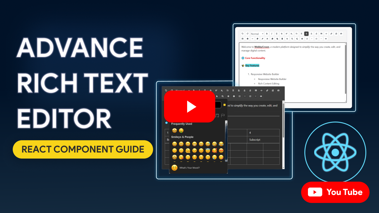
🎥 Demo Video
Watch the React Advanced Richtext Editor in action on YouTube:
📦 Installation
Install the package using npm or yarn:
npm install @webbycrown/react-advanced-richtext-editoror
yarn add @webbycrown/react-advanced-richtext-editorCompatibility Matrix
Framework / Runtime | React Version | Notes |
| ------------------- | ------------- | ----- |
| Next.js 10.x – 12.x | 16.8 – 17.x | Use --legacy-peer-deps or --force if needed |
| Next.js 13.x – 16.x | 18.x – 19.x | Fully supported (App Router + Client Components) |
| React (CRA/Vite/etc.) | 16.8+ | Works anywhere contentEditable is supported |
Requirements
- React & ReactDOM ≥ 16.8
- Browser with modern
contentEditable,localStorage, and ES2018 support
🚀 Quick Start
import React, { useState } from 'react';
import Editor from '@webbycrown/react-advanced-richtext-editor';
import '@webbycrown/react-advanced-richtext-editor/dist/styles.css';

function App() {
  const [content, setContent] = useState('');

  return (
    <div>
      <h1>My Rich Text Editor</h1>
      <Editor
        value={content}
        onChange={setContent}
        height={400}
        width="100%"
      />
    </div>
  );
}

export default App;
📖 Basic Usage
The editor is a controlled component that requires value and onChange props:
import React, { useState } from 'react';
import Editor from '@webbycrown/react-advanced-richtext-editor';
import '@webbycrown/react-advanced-richtext-editor/dist/styles.css';

function MyComponent() {
  const [content, setContent] = useState('');

  return (
    <Editor
      value={content}
      onChange={setContent}
      height={400}
      width="100%"
    />
  );
}
🔧 Props API
The Editor component accepts the following props:
| Prop | Type | Default | Description |
|------|------|---------|-------------|
| value | string | "" | The HTML content of the editor |
| onChange | function | undefined | Callback function when content changes. Receives the HTML string as parameter |
| height | string \| number | "auto" | Height of the editor. Can be "auto", "responsive", or a number in pixels |
| width | string \| number | "100%" | Width of the editor. Can be "auto", "responsive", or a number in pixels |
| minHeight | number | 200 | Minimum height of the editor in pixels |
| className | string | "" | Additional CSS class for the editor container |
| allowedTags | array | null | Array of allowed HTML tags. If null, all tags are allowed |
| storageKey | string | "rte-editor-content" | Key for localStorage to save content. Set to "" to disable auto-save |
| plugins | array | [] | Array of custom plugins to extend functionality |
Props Examples
// Fixed height editor
<Editor
  value={content}
  onChange={setContent}
  height={500}
  width="100%"
/>

// Responsive editor
<Editor
  value={content}
  onChange={setContent}
  height="responsive"
  width="responsive"
/>

// Editor with custom class
<Editor
  value={content}
  onChange={setContent}
  className="my-custom-editor"
/>

// Editor without auto-save
<Editor
  value={content}
  onChange={setContent}
  storageKey=""
/>
✨ Features
Core Features
Rich Text Formatting
- Bold, italic, underline, strikethrough
- Superscript and subscript
- Text color and highlighting
- Case conversion (uppercase/lowercase)
Text Structure
- Headings (H1-H6)
- Paragraphs
- Text alignment (left, center, right)
- Blockquotes with citation support
List Styles
Unordered Lists
- Disc (•)
- Circle (○)
- Square (■)
Ordered Lists
- Decimal (1, 2, 3)
- Lower Alpha (a, b, c)
- Upper Alpha (A, B, C)
- Upper Roman (I, II, III)
- Lower Roman (i, ii, iii)
Font Families
The editor includes 17 font families:
- Default (system default)
- Arial
- Courier New
- Georgia
- Impact
- Lucida Console
- Palatino
- Tahoma
- Times New Roman
- Trebuchet MS
- Verdana
- Comic Sans MS
- Helvetica
- Roboto
- Open Sans
- Lato
- Montserrat
- Poppins
Font Sizes
Available font sizes: 8pt, 9pt, 10pt, 11pt, 12pt, 14pt, 16pt, 18pt, 20pt, 22pt, 24pt, 26pt, 28pt, 36pt, 48pt, 72pt
Markdown Support
The editor supports markdown syntax in preview mode:
Headings:
# H1,## H2,### H3, etc.Bold:
**text**or__text__Italic:
*text*or_text_Strikethrough:
~~text~~Links:
[Link Text](URL)Code:
`code`Code Blocks:
```language\ncode\n```Blockquotes:
> quote textLists:
- itemor1. itemHorizontal Rule:
---(converts to<hr>)Media & Links
- Insert and edit images with customizable properties
- Image alignment and styling (border, margin, border-radius)
- Insert and remove links
- Links automatically open in new tab with security attributes
Tables
- Insert tables with customizable rows and columns
- Visual grid selector for table creation
Content Management
- Undo/Redo functionality
- Copy/Cut/Paste with HTML sanitization
- Search and highlight text within the editor
- Select all text
- Delete selected text
Advanced Features
- HTML code view toggle
- Emoji picker
- Preview mode (markdown preview)
- Horizontal rules
- Auto-save to localStorage
Security Features
- HTML Sanitization: Uses DOMPurify to sanitize HTML content
- Allowed Tags Control: Restrict which HTML tags can be used
- XSS Protection: Prevents cross-site scripting attacks
- Safe Paste: Cleans pasted content from Word and other sources
Customization Options
- Plugin System: Extend functionality with custom plugins
- Theme Support: Light and dark themes with automatic system preference detection
- Customizable Toolbar: Show/hide toolbar buttons based on allowed tags
- Responsive Design: Works on all screen sizes
- Tag Selector: Configure which HTML tags and actions are allowed
🔌 Plugins
The editor supports custom plugins to extend its functionality. Plugins can be defined in several ways:
Plugin Types
1. HTML Tag Plugin
Wraps selected text with a custom HTML tag:
{
  name: "highlight",
  icon: <FaHighlighter />,
  title: "Highlight Text",
  tag: "mark"
}
2. Command Plugin
Executes a document command:
{
  name: "heading2",
  icon: "H2",
  title: "Heading 2",
  cmd: "formatBlock",
  arg: "h2"
}
3. Action Plugin
Executes a custom function:
{
  name: "timestamp",
  icon: <FaClock />,
  title: "Insert Timestamp",
  action: (editor) => {
    const now = new Date();
    const timestamp = now.toLocaleString();
    document.execCommand("insertText", false, timestamp);
  }
}
4. Type Plugin
Uses built-in plugin types:
{
  name: "timestamp",
  icon: <FaClock />,
  title: "Insert Time",
  type: "timestamp"
}
Plugin Examples
Example 1: Multiple Plugins
import { FaHighlighter, FaClock } from 'react-icons/fa';

const customPlugins = [
  {
    name: "timestamp",
    icon: "⏱️",
    title: "Insert Timestamp",
    action: (editor) => {
      const now = new Date();
      const timestamp = now.toLocaleString();
      document.execCommand("insertText", false, timestamp);
    },
  },
  {
    name: "heading2",
    icon: "H2",
    title: "Heading 2",
    cmd: "formatBlock",
    arg: "h2"
  },
  {
    name: "underline",
    icon: "U",
    title: "Underline Text",
    cmd: "underline"
  },
  {
    name: "mark",
    icon: <FaHighlighter />,
    title: "Highlight",
    tag: "mark"
  },
  {
    name: "timestamp",
    icon: <FaClock />,
    title: "Insert Time",
    type: "timestamp"
  },
];

// Usage
<Editor
  value={content}
  onChange={setContent}
  plugins={customPlugins}
/>
Example 2: Custom Plugin with React Icons
import { FaCode, FaBold } from 'react-icons/fa';

const codePlugin = {
  name: "code",
  icon: <FaCode />,
  title: "Insert Code Block",
  action: (editor) => {
    const selection = window.getSelection();
    const selectedText = selection.toString();
    const codeBlock = `<pre><code>${selectedText || 'Your code here'}</code></pre>`;
    document.execCommand("insertHTML", false, codeBlock);
  }
};

<Editor
  value={content}
  onChange={setContent}
  plugins={[codePlugin]}
/>
🎨 Theming
The editor supports light and dark themes with automatic system preference detection.
Theme Features
- Automatic Theme Detection: Respects system color scheme preference
- Theme Persistence: Theme preference is saved to localStorage
- Global Theme: Theme is shared across all editor instances
- Manual Toggle: Users can toggle theme using the theme button in the toolbar
Theme Usage
The theme is automatically managed by the editor. Users can toggle between light and dark themes using the theme button (🌙/☀️) in the toolbar. The theme preference is saved and will persist across sessions.
📝 Examples
Basic Editor
import React, { useState } from 'react';
import Editor from '@webbycrown/react-advanced-richtext-editor';
import '@webbycrown/react-advanced-richtext-editor/dist/styles.css';

function BasicEditor() {
  const [content, setContent] = useState('');

  return (
    <div>
      <h2>Basic Editor</h2>
      <Editor
        value={content}
        onChange={setContent}
        height={400}
        width="100%"
      />
      <div>
        <h3>Output:</h3>
        <div dangerouslySetInnerHTML={{ __html: content }} />
      </div>
    </div>
  );
}
Editor with Restricted Tags
import React, { useState } from 'react';
import Editor from '@webbycrown/react-advanced-richtext-editor';
import '@webbycrown/react-advanced-richtext-editor/dist/styles.css';

function RestrictedEditor() {
  const [content, setContent] = useState('');

  return (
    <Editor
      value={content}
      onChange={setContent}
      height={300}
      width="100%"
      allowedTags={[
        'p', 'h1', 'h2', 'h3', 'h4', 'h5',
        'strong', 'em', 'table', 'img',
        'thead', 'tbody', 'tr', 'th', 'td',
        'br', 'u'
      ]}
      storageKey=""
    />
  );
}
Editor with Custom Plugins
import React, { useState } from 'react';
import Editor from '@webbycrown/react-advanced-richtext-editor';
import '@webbycrown/react-advanced-richtext-editor/dist/styles.css';
import { FaHighlighter, FaClock } from 'react-icons/fa';

function CustomPluginEditor() {
  const [content, setContent] = useState('');

  const customPlugins = [
    {
      name: "timestamp",
      icon: <FaClock />,
      title: "Insert Timestamp",
      type: "timestamp"
    },
    {
      name: "highlight",
      icon: <FaHighlighter />,
      title: "Highlight Text",
      tag: "mark"
    }
  ];

  return (
    <Editor
      value={content}
      onChange={setContent}
      plugins={customPlugins}
      height={400}
    />
  );
}
Form Integration
import React, { useState } from 'react';
import Editor from '@webbycrown/react-advanced-richtext-editor';
import '@webbycrown/react-advanced-richtext-editor/dist/styles.css';

function FormWithEditor() {
  const [formData, setFormData] = useState({
    title: '',
    message: ''
  });

  const handleEditorChange = (field, value) => {
    setFormData(prev => ({
      ...prev,
      [field]: value
    }));
  };

  const handleSubmit = (e) => {
    e.preventDefault();
    console.log('Form Data:', formData);
    // Submit your form data
  };

  return (
    <form onSubmit={handleSubmit}>
      <div>
        <label>Title:</label>
        <input
          type="text"
          value={formData.title}
          onChange={(e) => setFormData(prev => ({
            ...prev,
            title: e.target.value
          }))}
        />
      </div>

      <div>
        <label>Message:</label>
        <Editor
          value={formData.message}
          onChange={(value) => handleEditorChange('message', value)}
          height={300}
          width="100%"
          allowedTags={[
            'p', 'h1', 'h2', 'h3', 'strong', 'em',
            'table', 'img', 'ul', 'ol', 'li', 'br'
          ]}
          storageKey=""
        />
      </div>

      <button type="submit">Submit</button>
    </form>
  );
}
🔒 Security
The editor includes built-in security features:
- DOMPurify Integration: All HTML content is sanitized using DOMPurify
- XSS Protection: Prevents cross-site scripting attacks
- Tag Whitelisting: Control which HTML tags are allowed
- Safe Paste: Automatically cleans pasted content from external sources
Recommended Security Practices
- Restrict Allowed Tags: Use the
allowedTagsprop to limit which HTML tags can be used - Sanitize on Server: Always sanitize content on the server side before storing
- Validate Content: Validate editor content before processing or displaying
📚 Additional Resources
Supported HTML Tags
The editor supports the following HTML tags (when allowed):
- Text Formatting:
p,h1,h2,h3,h4,h5,h6,strong,em,u,s,sup,sub,span - Structure:
div,blockquote,pre,code,br,hr - Lists:
ul,ol,li - Links & Media:
a,img - Tables:
table,thead,tbody,tr,th,td
Browser Support
The editor works in all modern browsers that support:
- ContentEditable API
- localStorage
- ES6+ JavaScript features
🤝 Contributing
Contributions are welcome! Please feel free to submit a Pull Request.
📄 License
This project is open source and available under the MIT License.
💡 Tips
- Use
storageKey=""to disable auto-save if you're managing state externally - The
allowedTagsprop is useful for restricting formatting options based on your use case - Plugins are a great way to add custom functionality without modifying the core editor
- The theme automatically adapts to system preferences, but users can override it manually
🔖 Changelog
[1.0.3] - 2026-03-19
- 📚 Documentation
- https://www.webbycrown.com/guides/react-advanced-rich-text-editor/getting-started/
[1.0.2] - 2026-03-19
- 🎨 Color/Highlight picker positioning
- 😊 Emoji picker behavior
- 🔠 Uppercase/Lowercase cursor fix
[1.0.1] - 2025-12-03
- 🔤 Font family control: Choose from multiple font families directly from the toolbar
- 🔠 Font size control: Increase, decrease, and set explicit font sizes for selected text
- 🎛️ Improved toolbar UX: Grouped typography controls for a cleaner, more intuitive editing experience
- 🧹 Minor improvements: Small UI polish and internal refactors to keep the editor fast and stable
- 📚 Documentation: Comprehensive documentation updates including detailed usage guides, complete API reference, plugin system documentation, theming guide, security best practices, and demo video creation guide.
- 📝 Examples: Added multiple real-world integration and configuration examples to the documentation.
[1.0.0] - 2025-11-18
Initial Release ✨
- 🔧 Fully functional React rich text editor component
- 🎛️ Controlled component with value and onChange props
- ✍️ Core features: Bold, Italic, Underline, Strikethrough, Superscript, Subscript, Text color, Highlight, Case conversion
- 🗂️ Text structure support: Headings (H1–H6), Paragraphs, Blockquotes, Alignment
- 📋 List support: Ordered, Unordered, Nested
- 🖼️ Media & Links: Insert/Edit images, Image styling, Links (with target & security attrs)
- 🧩 Tables: Insert tables with customizable rows & columns
- 🔁 Content management: Undo/Redo, Copy/Cut/Paste, Search, Select All, Delete
- 🚀 Advanced features: HTML code view toggle, Emoji picker, Preview mode, Horizontal rules, Auto-save
- 🛡️ Security: DOMPurify integration, XSS protection, Safe Paste, Allowed HTML tags control
- 🎨 Customization: Plugin system, Theme support (Light / Dark), Customizable toolbar, Responsive design
- 🔌 Plugins included: HTML Tag, Command, Action, Type plugins
- 🧾 Form integration examples included
- 🔐 Recommended security practices documented
- 🌐 Browser support: Modern browsers with contentEditable & ES6+ features