
@widgetkit/booking-react
v0.0.3
Published
React booking scheduler component
Downloads
18

Maintainers
 sindreglo
Readme
@widgetkit/booking-react
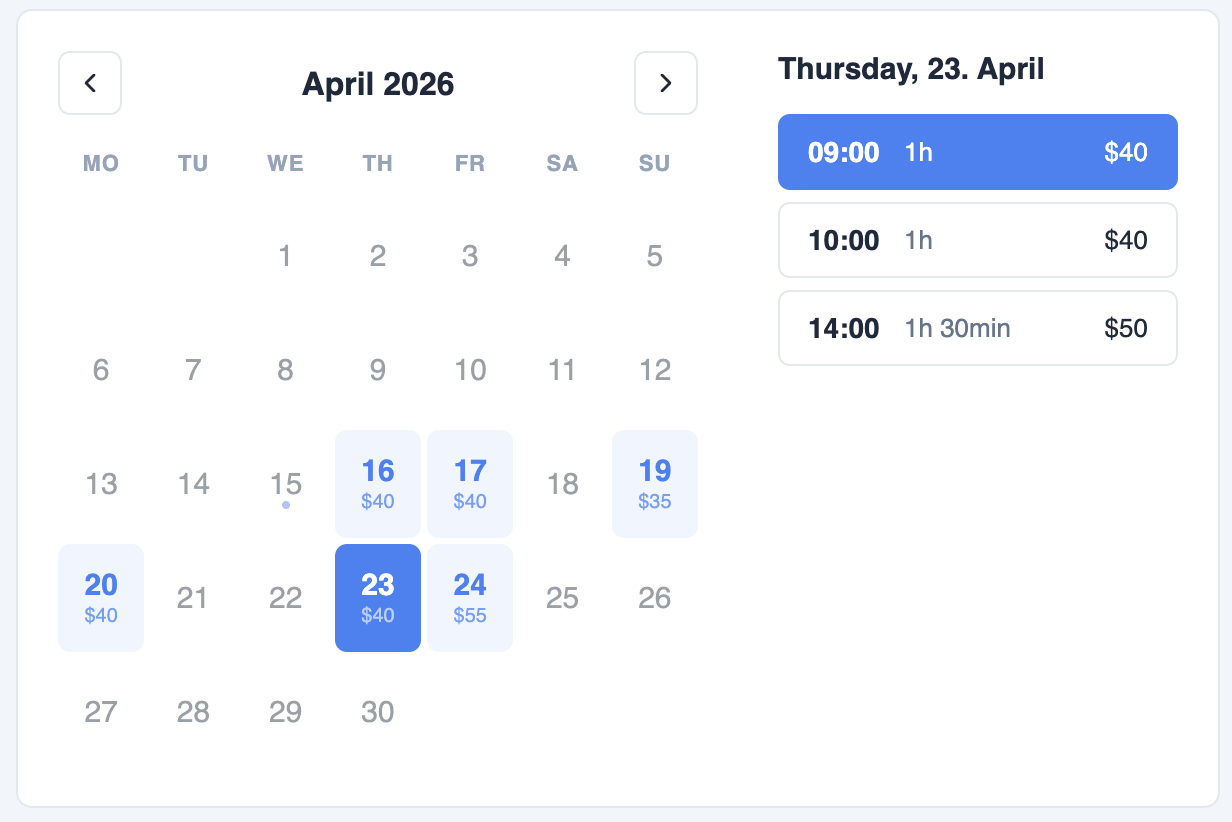
A clean, accessible booking scheduler component for React. Supports month + day views, per-slot pricing, variable durations, and flexible display modes — with zero dependencies beyond React itself.
Installation
npm install @widgetkit/booking-react
# or
pnpm add @widgetkit/booking-react
# or
yarn add @widgetkit/booking-react
Usage
Import the component and its stylesheet, then pass your availability data:
import { BookingScheduler } from "@widgetkit/booking-react";
import "@widgetkit/booking-react/styles.css";

const availability = [
  {
    date: "2025-06-10",
    available: true,
    price: "$40",
    slots: [
      { time: "09:00", available: true, duration: 60, price: "$40" },
      { time: "10:00", available: true, duration: 60, price: "$40" },
      { time: "11:00", available: false, duration: 60 },
      { time: "14:00", available: true, duration: 90, price: "$55" },
    ],
  },
];

export default function App() {
  return (
    <BookingScheduler
      availability={availability}
      onSelect={(selection) => console.log(selection)}
    />
  );
}
Props
Data
| Prop | Type | Required | Description |
| -------------- | ----------------- | -------- | ------------------------------------------------------ |
| availability | AvailabilityDay[] | Yes | Days and time slots to display. See types. |
Mode
| Prop | Type | Default | Description |
| ------ | ------------- | ------------- | ------------------------------------------------------------------------------------------------ |
| mode | BookingMode | 'month-day' | 'month-day' shows calendar + times side by side. 'month-only' shows only the calendar. 'day-only' shows only the time list for a fixed date. |
| date | Date | — | Required in day-only mode. The date whose slots are shown. |
Date range
| Prop | Type | Default | Description |
| -------------- | ------ | ------- | -------------------------------------------- |
| initialMonth | Date | today | The month shown on first render. |
| minDate | Date | — | Disable all days before this date. |
| maxDate | Date | — | Disable all days after this date. |
Display
| Prop | Type | Default | Description |
| -------------- | --------- | ------- | ---------------------------------------------------------------- |
| showPrice | boolean | true | Show prices on day cells and time slots. |
| showDuration | boolean | true | Show duration label on each time slot. |
| loading | boolean | false | Show a spinner over the calendar and slot list while data loads. |
Events
| Prop | Signature | Description |
| ---------------- | --------------------------------------- | ----------------------------------------------------------------------------------------------- |
| onSelect | (selection: BookingSelection) => void | Fired when the user selects a date (month-only) or a time slot (month-day, day-only). |
| onMonthChange | (year: number, month: number) => void | Fired when the user navigates to a different month. Use this to load availability data on demand. |
Loading availability on demand
onMonthChange is ideal for fetching availability from an API per month rather than passing all dates upfront:
const [availability, setAvailability] = useState<AvailabilityDay[]>([]);
const [loading, setLoading] = useState(false);

async function handleMonthChange(year: number, month: number) {
  setLoading(true);
  const data = await fetchAvailability(year, month);
  setAvailability(data);
  setLoading(false);
}

<BookingScheduler
  availability={availability}
  loading={loading}
  onMonthChange={handleMonthChange}
  onSelect={(s) => console.log(s)}
/>
Types
type BookingMode = 'month-day' | 'month-only' | 'day-only';

interface AvailabilityDay {
  date: string;              // 'YYYY-MM-DD'
  available: boolean;
  price?: number | string;   // Shown under the date in month view
  slots?: AvailabilitySlot[];
}

interface AvailabilitySlot {
  time: string;              // 'HH:mm'
  available: boolean;
  duration?: number;         // Minutes
  price?: number | string;
}

interface BookingSelection {
  date: string;              // 'YYYY-MM-DD'
  time?: string;             // 'HH:mm' — absent in month-only mode
  duration: number;          // Minutes — from the selected slot
}
Theming
Override CSS variables on .bk-root to match your brand:
.bk-root {
  --bk-accent: #6366f1;
  --bk-bg: #ffffff;
  --bk-border-color: #e2e8f0;
  --bk-text-color: #1e293b;
  --bk-muted-color: #64748b;
  --bk-hover-bg: #f1f5f9;
  --bk-available-bg: #eff6ff;
  --bk-max-width: 420px;
  --bk-day-max-height: 460px;
}
Utility
import { generateSlots } from "@widgetkit/booking-react";

// Generate slots from time windows
const slots = generateSlots(
  [{ from: "09:00", to: "17:00" }],
  60,   // duration in minutes
  30    // interval between slots (optional, defaults to duration)
);
// → [{ time: '09:00', available: true }, { time: '09:30', available: true }, ...]