
@widgetkit/scheduler-js
v0.0.2
Published
Vanilla JavaScript timeline scheduler component

Maintainers
 sindreglo
Readme
@widgetkit/scheduler-js
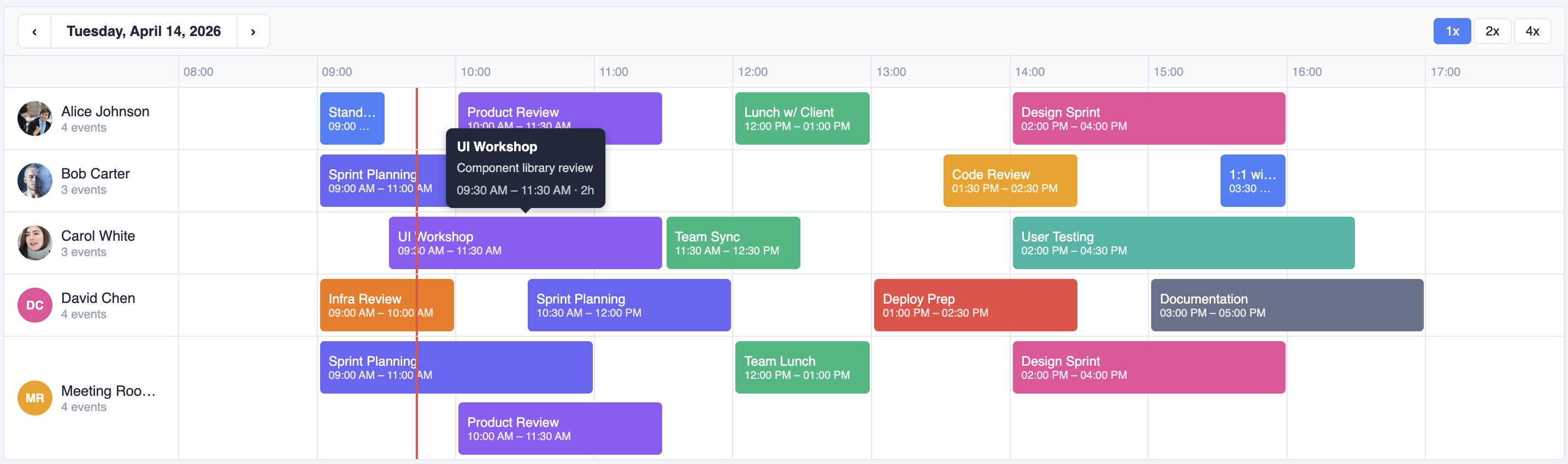
A vanilla JavaScript timeline scheduler. No framework required — works in any HTML page, React, Vue, Angular, or plain JS project.
Installation
npm install @widgetkit/scheduler-js
# or
pnpm add @widgetkit/scheduler-js
# or
yarn add @widgetkit/scheduler-js
Usage
<div id="scheduler" style="height: 400px"></div>import { createScheduler } from '@widgetkit/scheduler-js';
import '@widgetkit/scheduler-js/styles.css';
const scheduler = createScheduler(document.getElementById('scheduler'), {
resources: [
{ id: 'r1', name: 'Alice' },
{ id: 'r2', name: 'Bob' },
],
items: [
{
id: '1',
resourceId: 'r1',
name: 'Team standup',
color: '#6366f1',
start: new Date('2025-06-10T09:00'),
end: new Date('2025-06-10T09:30'),
},
],
date: new Date('2025-06-10'),
showNav: true,
onItemClick: ({ item }) => console.log(item),
onItemsChange: (items) => console.log(items),
});
// Update options at any time
scheduler.setOptions({ items: updatedItems });
// Clean up
scheduler.destroy();API
createScheduler(container, options)
Mounts the scheduler into container and returns a SchedulerInstance.
const scheduler = createScheduler(element, options);scheduler.setOptions(partial)
Update one or more options without remounting.
scheduler.setOptions({ items: newItems, zoom: 2 });scheduler.destroy()
Removes the scheduler from the DOM and cleans up all event listeners and timers.
Options
Data
| Option | Type | Required | Description |
| ----------- | ----------------- | -------- | ---------------------------- |
| resources | Resource[] | Yes | Rows in the timeline. |
| items | TimelineItem[] | Yes | Events to display. |
| date | Date | Yes | The day currently displayed. |
Time range
| Option | Type | Default | Description |
| ------------ | -------- | ------- | --------------------------------- |
| startHour | number | 0 | First hour shown on the timeline. |
| endHour | number | 24 | Last hour shown on the timeline. |
| snapMinutes| number | 15 | Drag/resize snap interval. |
Interaction
| Option | Type | Default | Description |
| -------------------- | --------- | ------- | ---------------------------------------------- |
| draggable | boolean | true | Allow items to be dragged. |
| resizable | boolean | false | Show resize handles on items. |
| creatable | boolean | false | Hold on empty space to create a new item. |
| editable | boolean | true | Show edit option in context menu. |
| readonly | boolean | false | Disables all interaction (drag, resize, create, edit, keyboard). Tooltips and hover events still work. |
| minDurationMinutes | number | 0 | Minimum item duration when resizing. |
| maxDurationMinutes | number | 0 | Maximum item duration (0 = unlimited). |
Display
| Option | Type | Default | Description |
| ---------------- | ------------- | ------- | ---------------------------------------- |
| showNav | boolean | false | Show date navigation and zoom controls. |
| showDateNav | boolean | true | Show prev/next/date buttons in nav bar. |
| showZoomControls| boolean | true | Show 1x/2x/4x zoom buttons in nav bar. |
| zoom | 1 \| 2 \| 4 | 1 | Horizontal zoom level. |
| showTime | boolean | true | Show start/end time on each item. |
| showAvatar | boolean | true | Show avatar/initials for each resource. |
| showEventCount | boolean | true | Show event count below resource name. |
| showTooltip | boolean | true | Show tooltip on item hover. |
| showNowLine | boolean | true | Show red line at current time. |
Callbacks
| Option | Signature | Description |
| -------------------- | ------------------------------------------------ | ------------------------------------ |
| onItemsChange | (items: TimelineItem[]) => void | Items were moved, resized, or edited.|
| onDateChange | (date: Date) => void | User navigated to a different date. |
| onZoomChange | (zoom: 1 \| 2 \| 4) => void | Zoom level changed. |
| onItemCreate | (detail: ItemCreateDetail) => void | New item created via hold-to-create. |
| onItemClick | (detail: ItemClickDetail) => void | Item was clicked. |
| onItemDblClick | (detail: ItemDblClickDetail) => void | Item was double-clicked. |
| onItemHover | (detail: ItemHoverDetail) => void | Pointer entered or left an item. |
| onItemContextMenu | (detail: ItemContextMenuDetail) => void | Item was right-clicked. |
| onItemDragStart | (detail: ItemDragStartDetail) => void | Drag started. |
| onItemDragEnd | (detail: ItemDragEndDetail) => void | Drag committed. |
| onItemResizeStart | (detail: ItemResizeStartDetail) => void | Resize started. |
| onItemResizeEnd | (detail: ItemResizeEndDetail) => void | Resize committed. |
Types
interface Resource {
  id: string;
  name: string;
  avatar?: string;
}

interface TimelineItem {
  id: string;
  resourceId: string;
  name: string;
  color: string;
  start: Date;
  end: Date;
  description?: string;
}
Theming
Override CSS variables on .tl-root:
.tl-root {
  --tl-bg: #ffffff;
  --tl-header-bg: #f8fafc;
  --tl-text-color: #1e293b;
  --tl-grid-line-color: #e2e8f0;
  --tl-time-label-color: #94a3b8;
  --tl-resource-col-width: 160px;
  --tl-resource-border-color: #e2e8f0;
  --tl-item-radius: 4px;
  --tl-item-text-color: #ffffff;
  --tl-item-opacity-dragging: 0.4;
  --tl-now-line-color: #ef4444;
  --tl-create-ghost-color: #3b82f6;
  --tl-tooltip-bg: #1e293b;
  --tl-tooltip-color: #ffffff;
  --tl-focus-color: #3b82f6;
  --tl-font-family: sans-serif;
}