
@widgetkit/scheduler-vue
v0.0.3
Published
Vue 3 timeline scheduler component
Maintainers
 sindreglo
Readme
@widgetkit/scheduler-vue
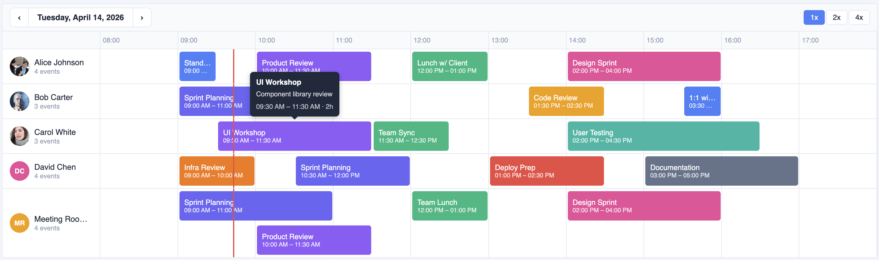
A fast, accessible timeline scheduler component for Vue 3. Supports drag-and-drop, resize, multi-row layouts, zoom, and full keyboard navigation — with zero dependencies beyond Vue itself.
Installation
npm install @widgetkit/scheduler-vue
# or
pnpm add @widgetkit/scheduler-vue
# or
yarn add @widgetkit/scheduler-vue
Usage
Import the component and its stylesheet, then pass resources and items:
<script setup lang="ts">
import { ref } from "vue";
import { SchedulerVue } from "@widgetkit/scheduler-vue";
import "@widgetkit/scheduler-vue/styles.css";

const resources = [
  { id: "alice", name: "Alice" },
  { id: "bob", name: "Bob" },
];

const date = ref(new Date());
const items = ref([
  {
    id: "1",
    resourceId: "alice",
    name: "Team meeting",
    color: "#6366f1",
    start: new Date("2024-06-10T09:00"),
    end: new Date("2024-06-10T10:30"),
  },
]);
</script>

<template>
  <SchedulerVue
    :resources="resources"
    v-model:items="items"
    v-model:date="date"
    draggable
    resizable
    creatable
  />
</template>
Custom item slot
<SchedulerVue :resources="resources" v-model:items="items" v-model:date="date">
  <template #item="{ item }">
    <span style="font-weight: bold">{{ item.name }}</span>
  </template>
</SchedulerVue>
Props
Data
| Prop | Type | Required | Description |
| ------------------------- | ---------------- | -------- | ------------------------------------------- |
| resources | Resource[] | Yes | Rows in the scheduler. See types. |
| items / v-model:items | TimelineItem[] | Yes | Events to display. See types. |
| date / v-model:date | Date | Yes | The day currently shown. |
Time range
| Prop | Type | Default | Description |
| ------------- | -------- | ------- | ------------------------------------- |
| startHour | number | 0 | First visible hour (0–23). |
| endHour | number | 24 | Last visible hour (1–24). |
| snapMinutes | number | 15 | Snap interval when dragging/creating. |
Interaction
| Prop | Type | Default | Description |
| -------------------- | --------- | ------- | ---------------------------------------------------------------------- |
| draggable | boolean | true | Allow items to be dragged to a new time or resource. |
| resizable | boolean | false | Allow items to be resized by dragging their edges. |
| creatable | boolean | false | Allow new items to be created by clicking and holding on an empty row. |
| editable | boolean | true | Show an edit modal on double-click. |
| readonly | boolean | false | Disable all interactions (drag, resize, create, edit, keyboard). Tooltips and hover events still work. |
| minDurationMinutes | number | 0 | Minimum item duration in minutes. 0 means no limit. |
| maxDurationMinutes | number | 0 | Maximum item duration in minutes. 0 means no limit. |
Display
| Prop | Type | Default | Description |
| ----------------------- | ------------- | ------- | ----------------------------------------------------------- |
| zoom / v-model:zoom | 1 \| 2 \| 4 | 1 | Horizontal zoom level. 2 = double width, 4 = quadruple. |
| showNav | boolean | false | Show previous/next day buttons. |
| showDateNav | boolean | true | Show the date header with navigation. |
| showZoomControls | boolean | true | Show zoom in/out buttons. |
| showTime | boolean | true | Show start and end time on each item. |
| showAvatar | boolean | true | Show resource avatar in the row header. |
| showEventCount | boolean | true | Show the number of events per resource. |
| showTooltip | boolean | true | Show a tooltip with item details on hover. |
| showNowLine | boolean | true | Show a line indicating the current time. |
Slots
| Slot | Props | Description |
| ------- | ------------------------ | -------------------------------------------------------- |
| #item | { item: TimelineItem } | Replace the default item content with a custom template. |
Events
| Event | Payload | Description |
| ------------------- | ------------------------------------ | ---------------------------------------------------------------------------- |
| update:items | TimelineItem[] | Emitted after a drag or resize completes (used by v-model:items). |
| update:date | Date | Emitted when the user navigates to a different day (used by v-model:date). |
| update:zoom | 1 \| 2 \| 4 | Emitted when the zoom level changes (used by v-model:zoom). |
| item-create | { resourceId, start, end } | Emitted when a new item is created via click-and-hold. |
| item-click | { item } | Emitted on single click. |
| item-dbl-click | { item } | Emitted on double-click. |
| item-hover | { item, type: 'enter' \| 'leave' } | Emitted on pointer enter/leave. |
| item-context-menu | { item, x, y } | Emitted on right-click. |
| item-drag-start | { item } | Emitted when a drag begins. |
| item-drag-end | { item, resourceId, start, end } | Emitted when a drag ends. |
| item-resize-start | { item } | Emitted when a resize begins. |
| item-resize-end | { item, start, end } | Emitted when a resize ends. |
Types
interface Resource {
  id: string;
  name: string;
  avatar?: string; // URL to an image shown in the row header
}

interface TimelineItem {
  id: string;
  resourceId: string; // Must match a Resource id
  name: string;
  color: string; // CSS color string
  start: Date;
  end: Date;
  description?: string;
}