
@widgetkit/spreadsheet-react
v0.0.1
Published
React spreadsheet component
Maintainers
 sindreglo
Readme
@widgetkit/spreadsheet-react
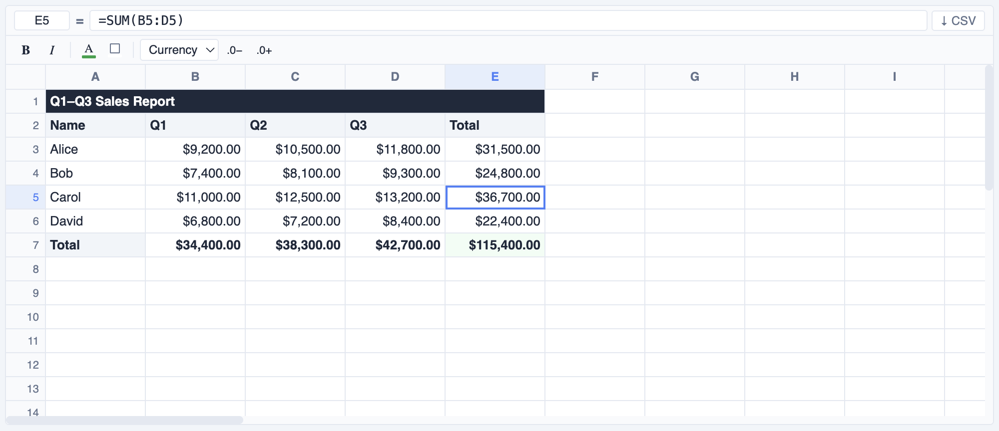
A fast, feature-rich spreadsheet component for React. Supports formulas, cell formatting, merged cells, copy/paste, undo/redo, frozen rows/columns, virtual scrolling, and full keyboard navigation — with zero dependencies beyond React itself.
Installation
npm install @widgetkit/spreadsheet-react
# or
pnpm add @widgetkit/spreadsheet-react
# or
yarn add @widgetkit/spreadsheet-react
Usage
Import the component and its stylesheet, then provide cell data:
import { useState } from "react";
import { Spreadsheet } from "@widgetkit/spreadsheet-react";
import "@widgetkit/spreadsheet-react/styles.css";
import type { CellMap } from "@widgetkit/spreadsheet-react";

export default function App() {
  const [cells, setCells] = useState<CellMap>({
    A1: "Product",  B1: "Q1",    C1: "Q2",    D1: "Q3",
    A2: "Widgets",  B2: 1200,    C2: 1450,    D2: 1800,
    A3: "Gadgets",  B3: 900,     C3: 1100,    D3: 1350,
    B4: "=SUM(B2:B3)", C4: "=SUM(C2:C3)", D4: "=SUM(D2:D3)",
  });

  return (
    <Spreadsheet
      cells={cells}
      onCellsChange={setCells}
      showToolbar
      height={400}
    />
  );
}
Uncontrolled mode
Pass defaultCells instead of cells to let the component manage its own state:
<Spreadsheet
  defaultCells={{ A1: "Hello", B1: "World" }}
  showToolbar
/>
Custom cell renderer
<Spreadsheet
  cells={cells}
  onCellsChange={setCells}
  renderCell={(ref, value, format) => (
    <span style={{ color: Number(value) < 0 ? "red" : undefined }}>
      {value}
    </span>
  )}
/>
Imperative API
import { useRef } from "react";
import { Spreadsheet, type SpreadsheetHandle } from "@widgetkit/spreadsheet-react";

const ref = useRef<SpreadsheetHandle>(null);

// Scroll to and select a cell
ref.current?.scrollToCell("B5");

// Start editing a cell programmatically
ref.current?.startEdit("A1");

// Export current data as CSV string
const csv = ref.current?.exportCsv();

<Spreadsheet ref={ref} cells={cells} onCellsChange={setCells} />
Props
Data
| Prop | Type | Description |
| ---------------- | ----------------------------- | --------------------------------------------------------------------- |
| cells | CellMap | Controlled cell data. Omit to use uncontrolled mode. |
| defaultCells | CellMap | Initial cell data for uncontrolled mode. |
| formats | Record<string, CellFormat> | Controlled cell format map (bold, italic, colors, number format). |
| defaultFormats | Record<string, CellFormat> | Initial formats for uncontrolled mode. |
| merges | Record<string, MergeRegion> | Controlled merged cell map. Keys are anchor refs (e.g. "B2"). |
| defaultMerges | Record<string, MergeRegion> | Initial merges for uncontrolled mode. |
Grid dimensions
| Prop | Type | Default | Description |
| --------------- | ----------------------- | ------- | ----------------------------------------------------- |
| rows | number | 50 | Number of rows. |
| cols | number | 26 | Number of columns. |
| rowHeight | number | 24 | Default row height in pixels. |
| defaultColWidth | number | 100 | Default column width in pixels. |
| colWidths | Record<number, number> | — | Per-column widths, keyed by 0-based column index. |
Layout & sizing
| Prop | Type | Default | Description |
| ----------- | ----------------- | ------- | --------------------------------------------------------------------------- |
| width | number \| string | — | Width of the component. Accepts any CSS value or "fill" for 100%. |
| height | number \| string | — | Height of the component. Accepts any CSS value or "fill" for 100%. |
| maxHeight | number | 400 | Max height in pixels when height is not set. Enables vertical scrolling. |
| className | string | — | Extra class name on the root element. |
| style | CSSProperties | — | Inline styles on the root element. |
Visibility
| Prop | Type | Default | Description |
| ----------------- | --------- | ------- | -------------------------------------- |
| showFormulaBar | boolean | true | Show the formula bar above the grid. |
| showToolbar | boolean | false | Show the formatting toolbar. |
| showRowNumbers | boolean | true | Show row number headers. |
| showColHeaders | boolean | true | Show column letter headers. |
| showContextMenu | boolean | true | Enable the right-click context menu. |
Interaction
| Prop | Type | Default | Description |
| --------------- | ------------------------- | --------- | ---------------------------------------------------------- |
| readOnly | boolean | false | Disable all editing interactions. |
| selectionMode | 'single' \| 'range' | 'range' | Restrict selection to a single cell or allow multi-cell. |
| resizableCols | boolean | true | Allow columns to be resized by dragging. |
| resizableRows | boolean | true | Allow rows to be resized by dragging. |
Frozen rows & columns
| Prop | Type | Default | Description |
| ------------ | -------- | ------- | --------------------------------------------------------------- |
| frozenRows | number | 0 | Number of rows that stay visible while scrolling vertically. |
| frozenCols | number | 0 | Number of columns that stay visible while scrolling horizontally. |
Auto-expand
| Prop | Type | Default | Description |
| ---------------- | --------- | ------- | ------------------------------------------------------------- |
| autoExpandRows | boolean | true | Add more rows automatically when scrolling near the bottom. |
| autoExpandCols | boolean | false | Add more columns automatically when scrolling near the right. |
| expandRowsBy | number | 10 | Number of rows added per auto-expand. |
| expandColsBy | number | 10 | Number of columns added per auto-expand. |
Custom rendering
| Prop | Type | Description |
| ------------ | ----------------------------------------------------------- | ---------------------------------------- |
| renderCell | (ref: string, value: CellValue, format?: CellFormat) => ReactNode | Replace default cell content. |
Editing hooks
| Prop | Type | Description |
| -------------- | ------------------------------------------------- | --------------------------------------------------------------- |
| onBeforeEdit | (ref: string, value: CellValue) => boolean | Return false to cancel editing before it starts. |
| onValidate | (ref: string, value: CellValue) => string \| null | Return an error message string to reject a commit, or null to accept. |
Context menu
| Prop | Type | Description |
| ------------------ | --------------------------------- | ------------------------------------------------ |
| contextMenuItems | Array<ContextMenuItem \| null> | Extra items appended to the built-in menu. Pass null to insert a separator. |
Accessibility
| Prop | Type | Description |
| ------------ | -------- | ------------------------------------ |
| aria-label | string | aria-label on the root element. |
Events
| Prop | Signature | Description |
| ------------------- | -------------------------------------------------------------- | ----------------------------------------------- |
| onCellsChange | (cells: CellMap) => void | Fired after any cell value changes. |
| onCellChange | (ref: string, value: string \| number \| null) => void | Fired for each individual cell that changes. |
| onFormatsChange | (formats: Record<string, CellFormat>) => void | Fired when cell formatting changes. |
| onMergesChange | (merges: Record<string, MergeRegion>) => void | Fired when cell merges change. |
| onSelectionChange | (ref: string) => void | Fired when the selection moves. Range format: "A1:C3". |
| onCellClick | (ref: string, value: CellValue, event: MouseEvent) => void | Fired on single click. |
| onCellDoubleClick | (ref: string, value: CellValue, event: MouseEvent) => void | Fired on double-click. |
| onKeyDown | (event: React.KeyboardEvent) => void | Custom keydown hook fired on every key press. |
Imperative API
Access via ref after attaching a React.RefObject<SpreadsheetHandle>:
| Method | Description |
| ------------------------- | ------------------------------------------------ |
| scrollToCell(ref) | Scroll to and select the given cell reference. |
| setSelection(ref) | Move selection to the given cell reference. |
| startEdit(ref) | Programmatically enter edit mode on a cell. |
| exportCsv(): string | Export the current grid as a CSV string. |
| getCells(): CellMap | Return a snapshot of the current cell data. |
Keyboard shortcuts
| Key | Action |
| -------------------- | ----------------------------------- |
| Arrow keys | Navigate between cells |
| Enter / F2 | Enter edit mode |
| Escape | Cancel edit |
| Tab / Shift+Tab | Move right / left |
| Delete / Backspace | Clear selected cell(s) |
| Ctrl+C/X/V | Copy / cut / paste (supports range) |
| Ctrl+Z / Ctrl+Y | Undo / redo (50-step history) |
| Ctrl+B / Ctrl+I | Bold / italic |
| Ctrl+A | Select all cells |
| Home / End | Jump to first / last column in row |
| Ctrl+Home/End | Jump to A1 / last cell |
| Page Up/Down | Scroll one page up / down |
Types
type CellValue = string | number | boolean | null;
type CellMap = Record<string, CellValue>;

interface CellFormat {
  bold?: boolean;
  italic?: boolean;
  color?: string;
  background?: string;
  numberFormat?: "general" | "number" | "currency" | "percent" | "date";
  decimalPlaces?: number;
}

interface MergeRegion {
  colSpan: number;
  rowSpan: number;
}

interface ContextMenuItem {
  label: string;
  action: (anchorRef: string) => void;
  disabled?: boolean;
}

interface SpreadsheetHandle {
  scrollToCell(ref: string): void;
  setSelection(ref: string): void;
  startEdit(ref: string): void;
  exportCsv(): string;
  getCells(): CellMap;
}